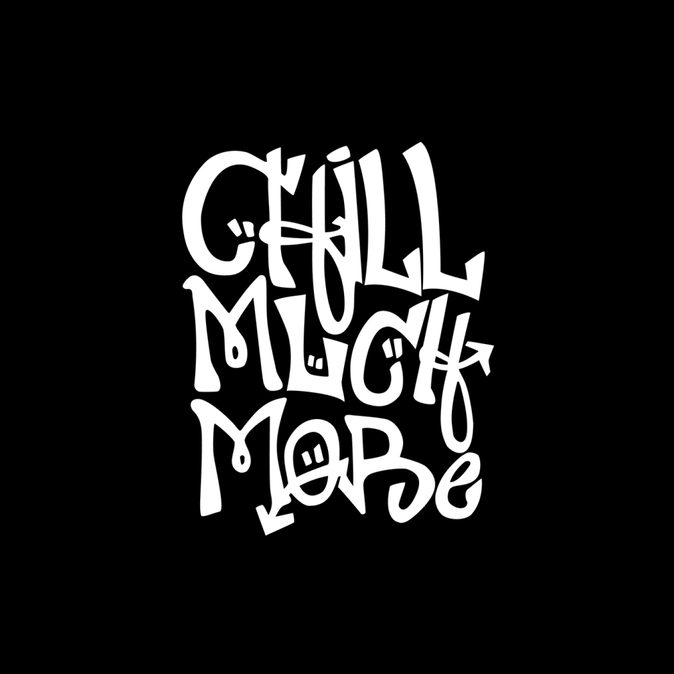
Logo and Art direction for Dj collective
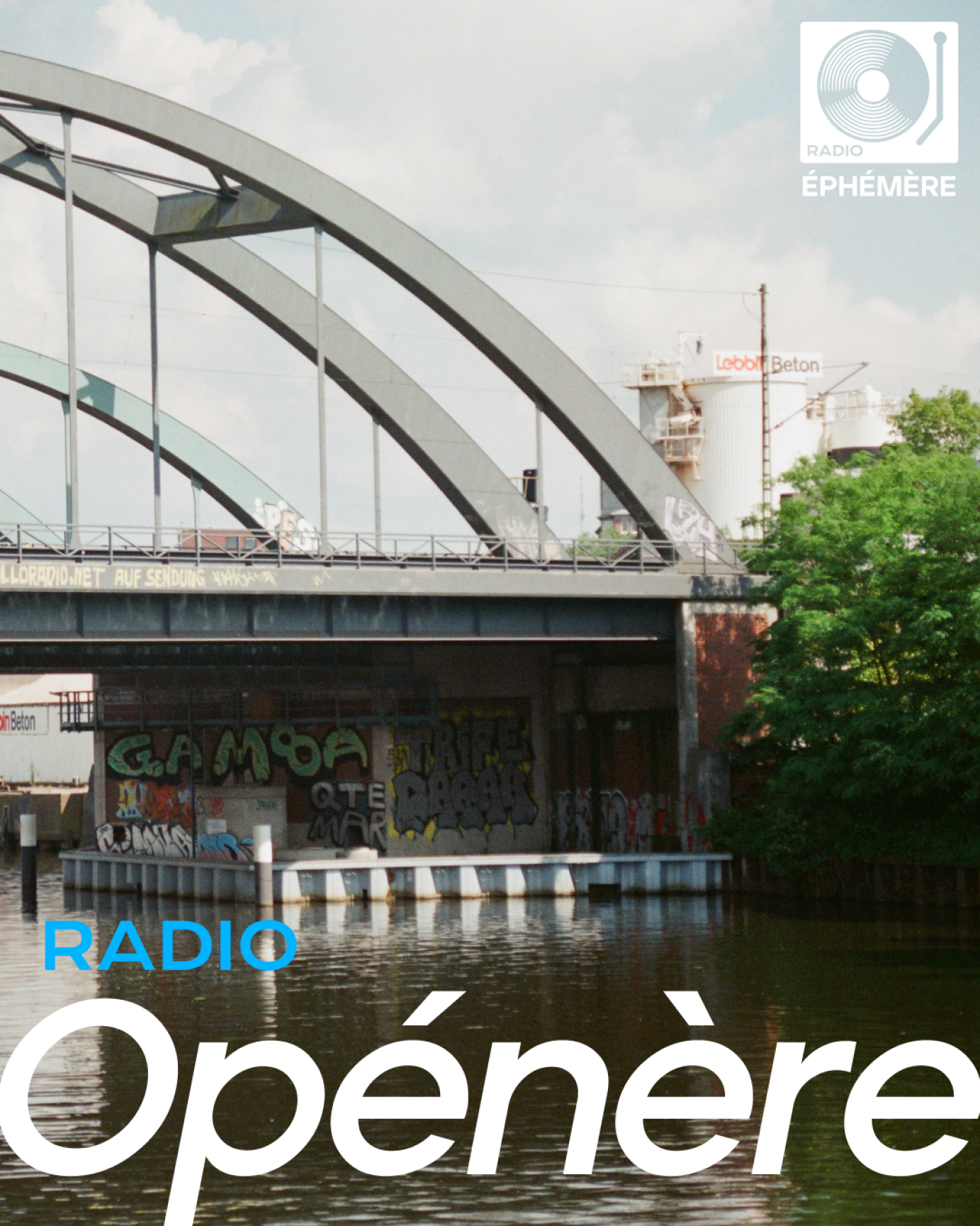
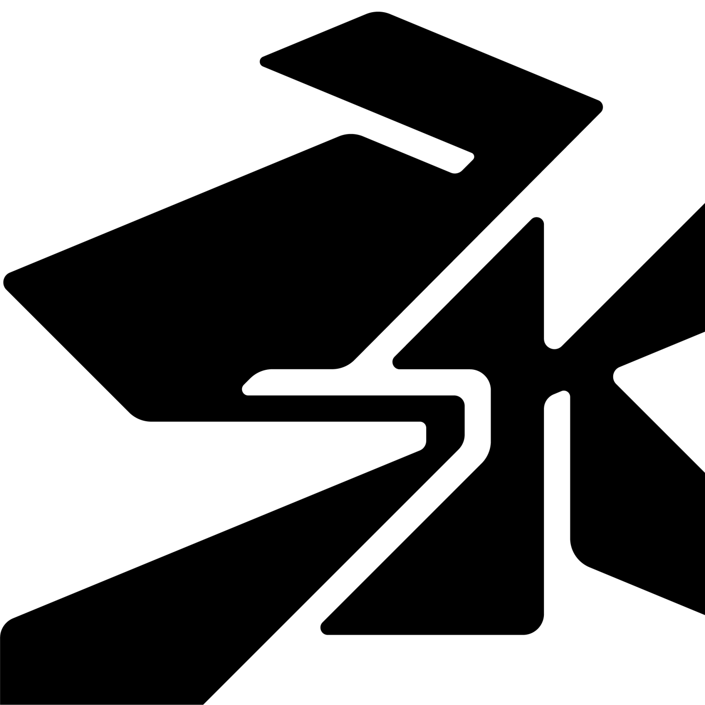
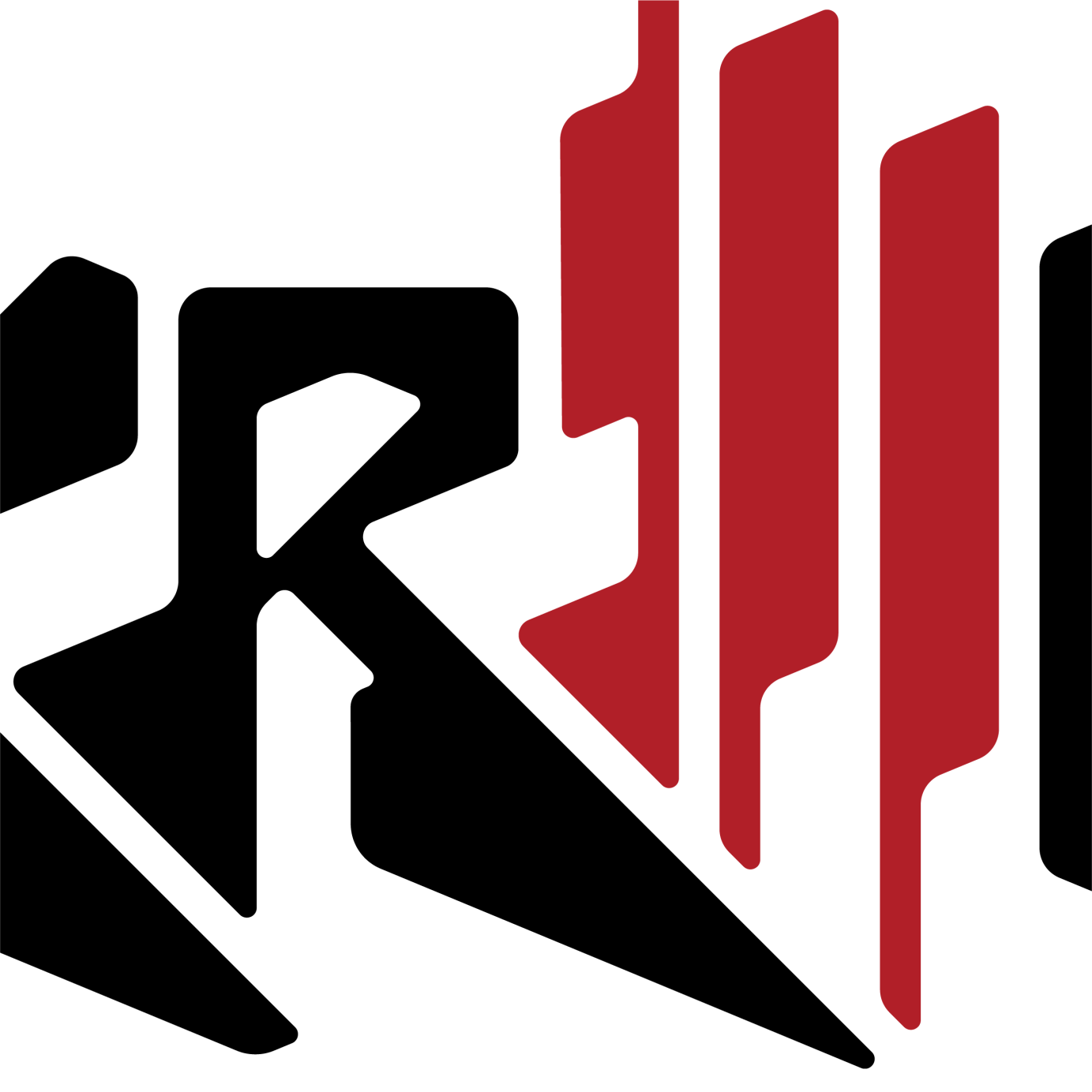
🎨 Art Direction for @radioephemere
Radio Éphémère is a Hamburg based Dj collective.
For this project, I contributed to shaping and refining the collective's evolving visual identity:
— Logo Renewal: Updated the logo to better reflect the group’s energy and evolving ethos.
— Event Key Visuals: Designed striking imagery to capture the tone and atmosphere of each event.
— Instagram Art Direction: Built a cohesive and compelling page presence to elevate their social media identity.
— Cover Template for Radio Series: Created a flexible visual system for their recurring SoundCloud radio show.
I’m currently open for collaborations with artists, producers, and labels seeking a tailored visual identity.
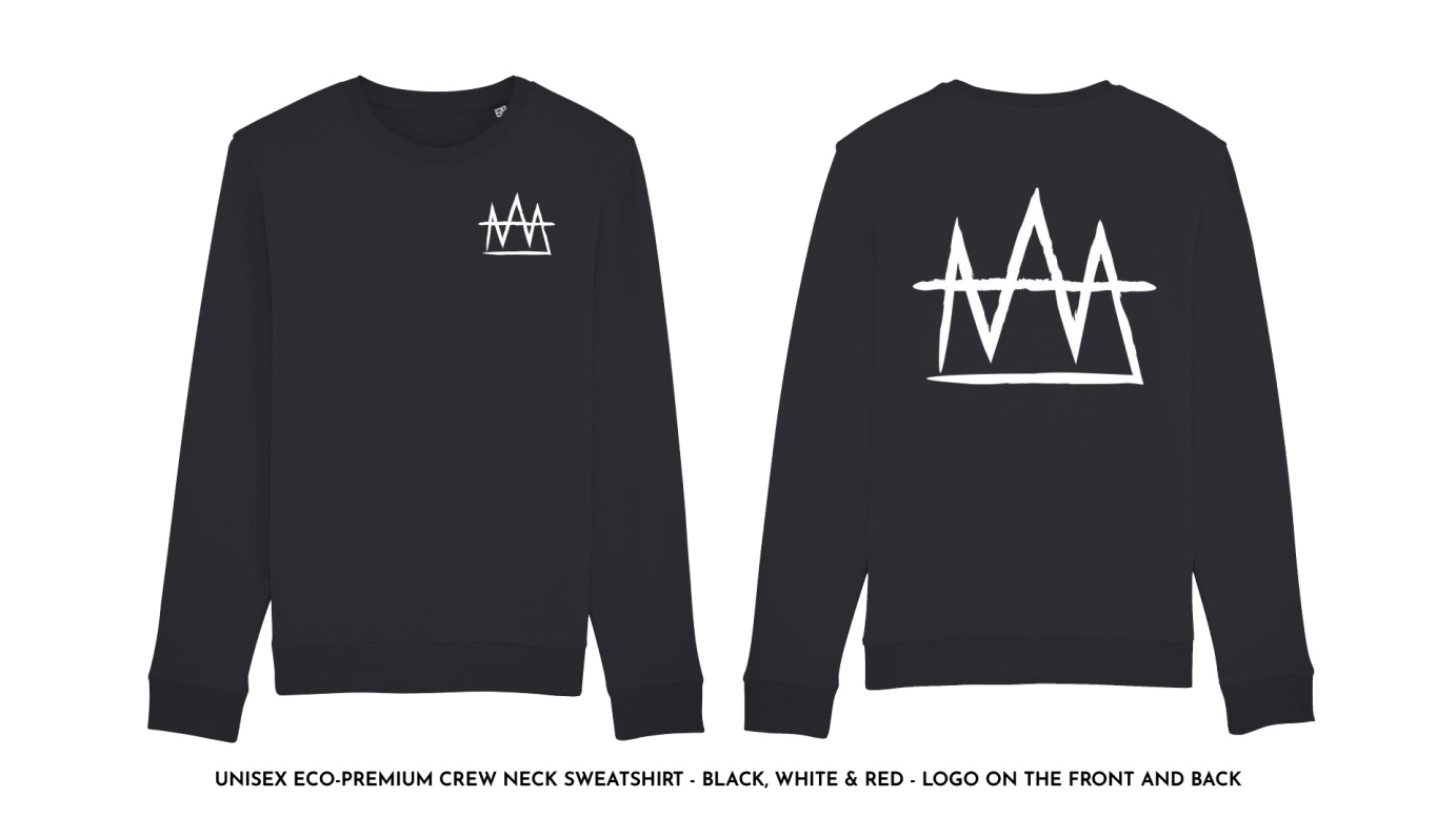
See the details on my website, find the link on my bio!8 months agoLogo and Tshirt design for Baby Draco
Created a logo and merch design for artist Baby Draco
1 year ago3D Logo and Artwork for Mk3 Dubz
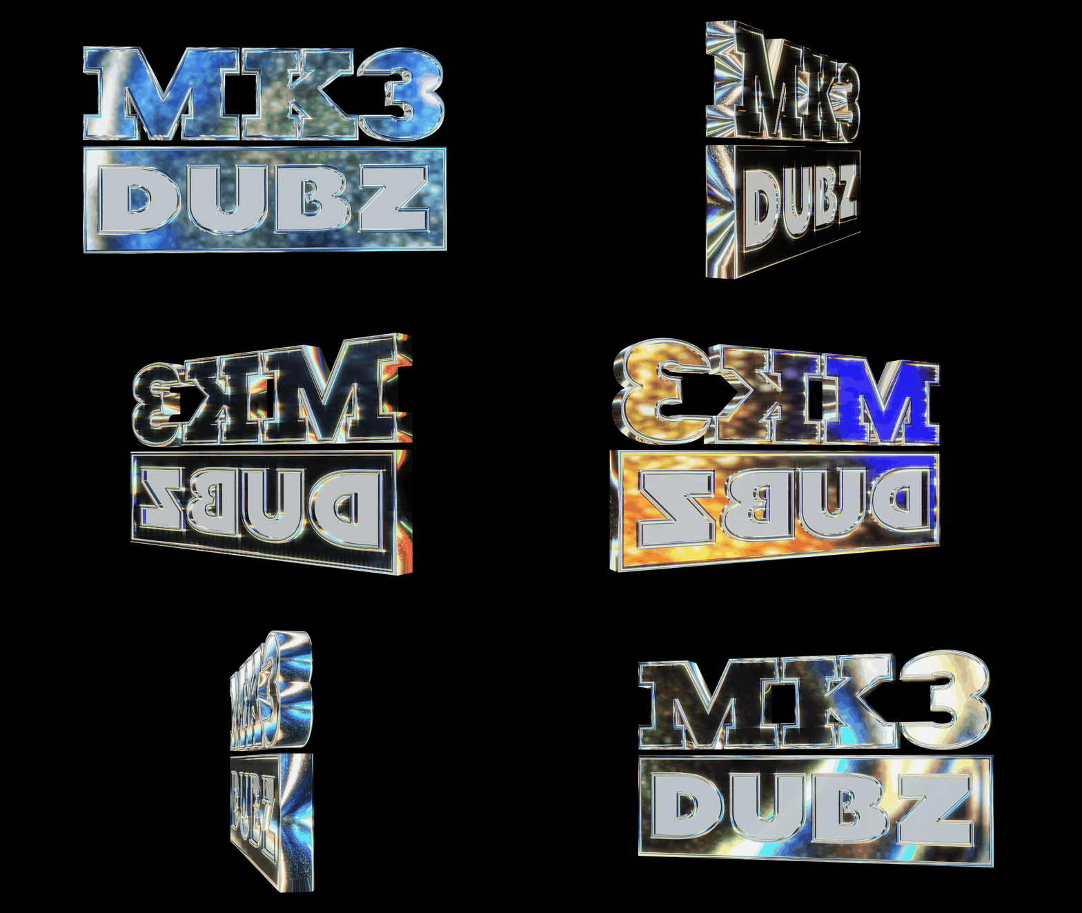
The artist sought a logo that exuded the same feel as a Golf GTI car badge. We decided to create a 3D logo, providing the flexibility to animate it for social media posts, set footage, and more.
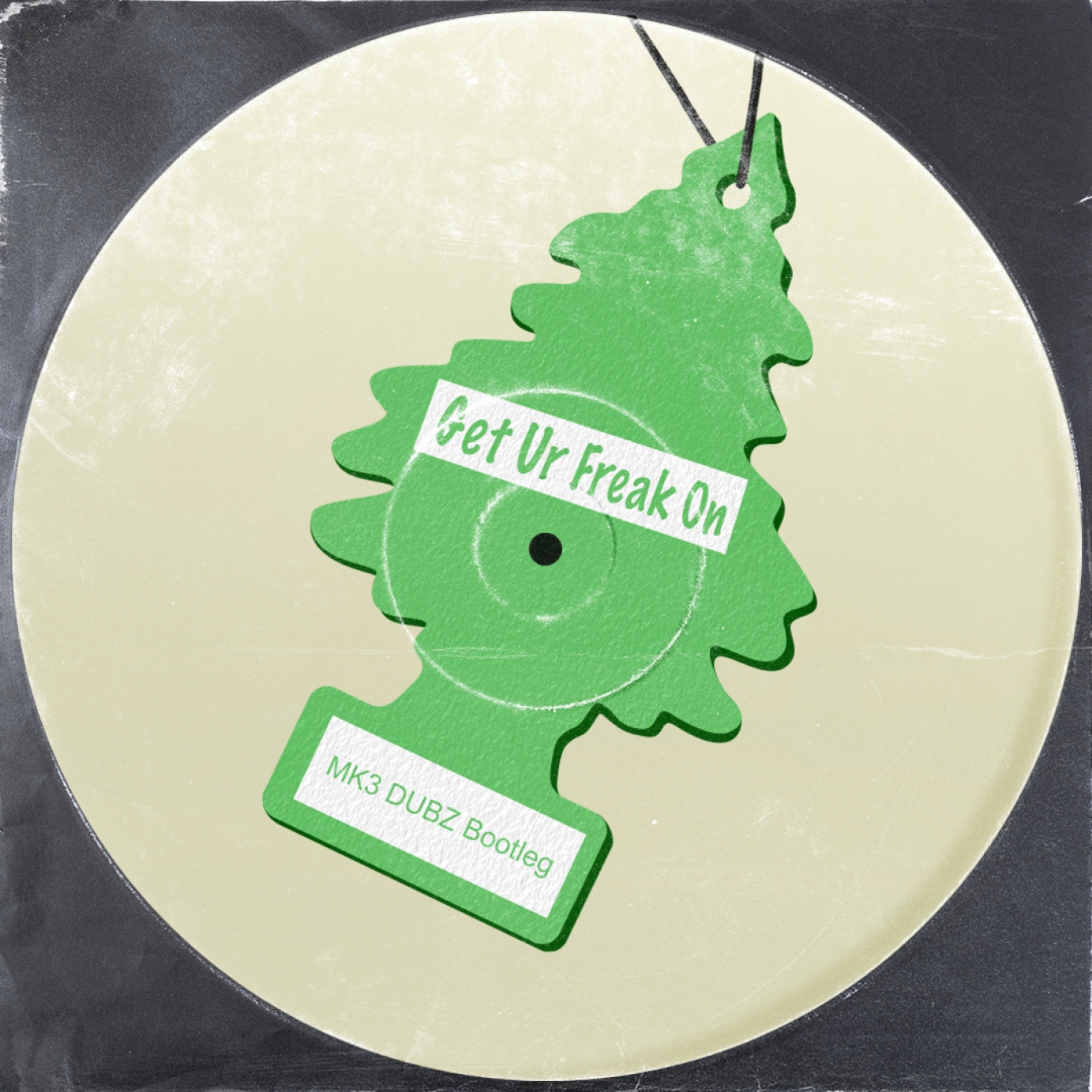
The design was inspired by the iconic 'Little Trees' car freshener to complement the car badge aesthetic.
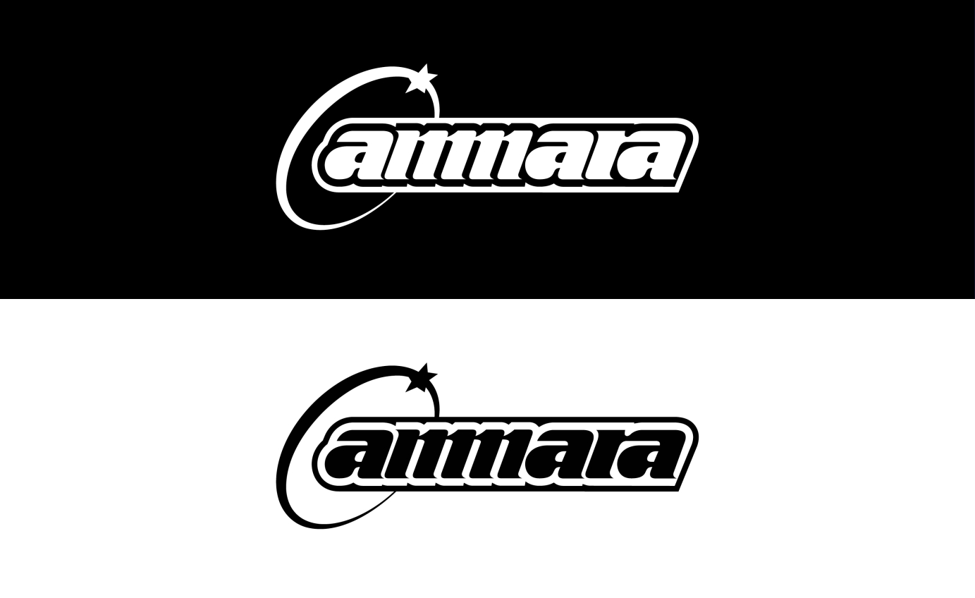
1 year agoAMMARA
Static and animated logo for London-based DJ and producer Amarra.
Commissioned by Triple Threat Management.
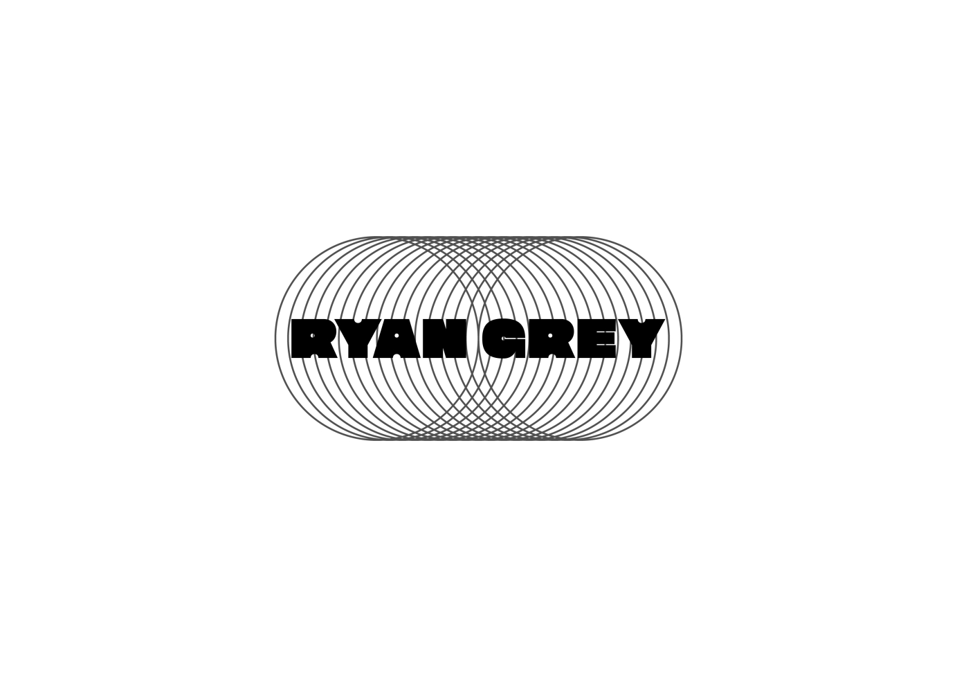
2 years agoRyan Grey Logo
Design Brief: 10138
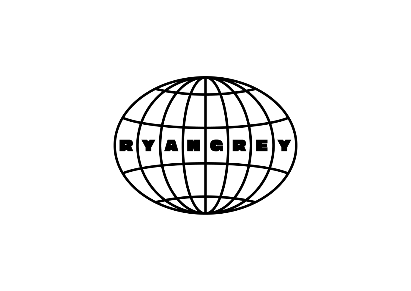
I was asked to design 3 logo variations for Toronto based producer Ryan Grey to be used across a variety of media / formats. Simple geometric forms paired with a Sans Serif typeface was the basis for the logos to give it a 90s vibe.
Commissioned by Agenda Management.
2 years agoanimation logo for Warner Chappell
to Animate logo in and Escher type style
Commissioned by Warner Chappell Production Music.
2 years agoBUBBLEGUM
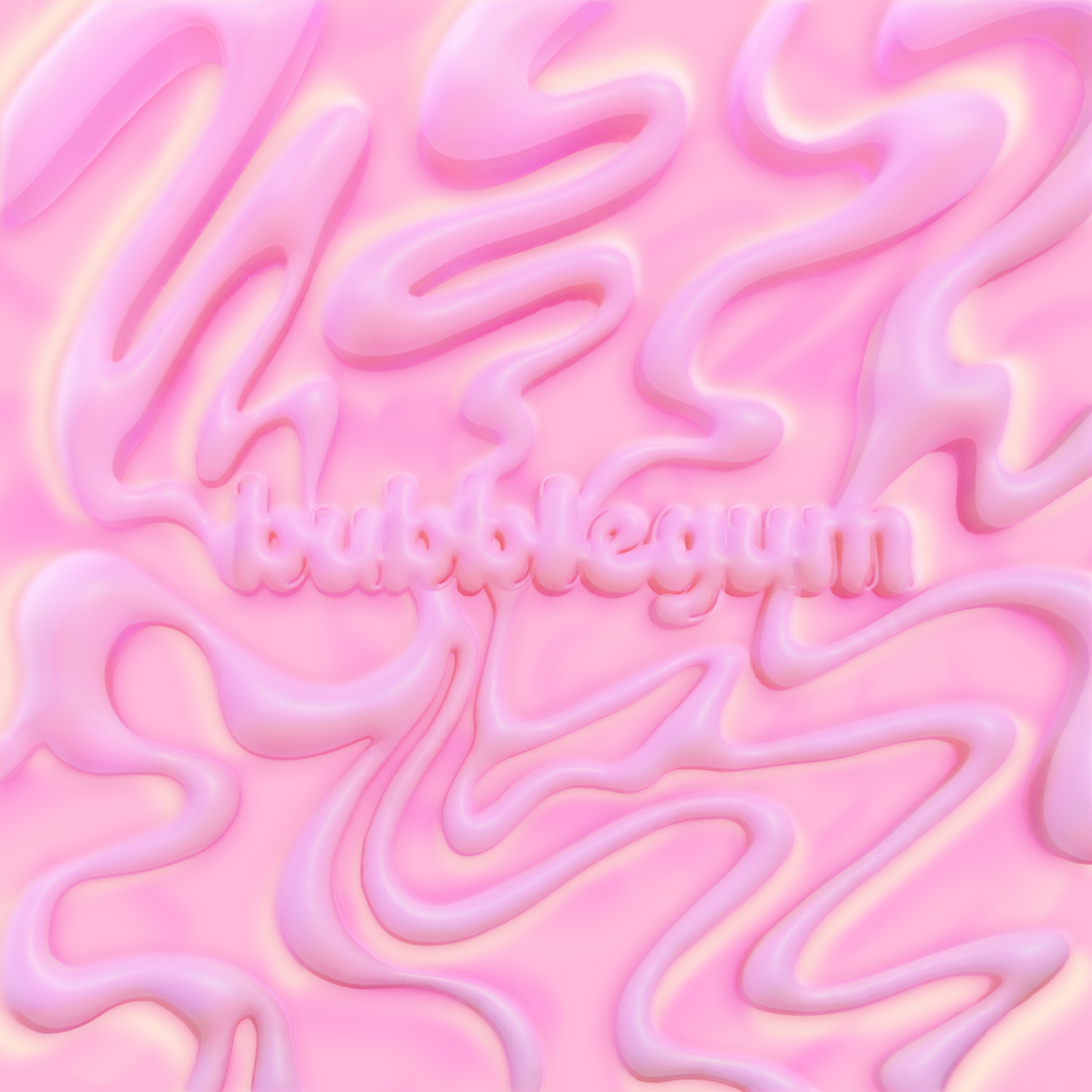
Single artwork for Lu's BUBBLEGUM
2 years agoOblivion Waits
Overview
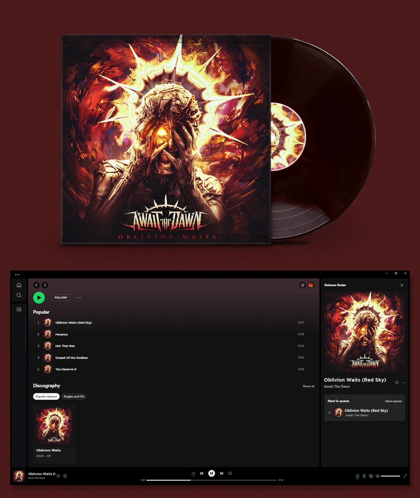
Await the Dawn is a metal band from Albuquerque, New Mexico. They approached me to create a logo for their band, a single cover, the EP cover for their first release, and a visualizer for Spotify. I guided the band through their first effort to brand themselves and led the creative direction for the band’s first artworks.
Await the Dawn released Oblivion Waits on Halloween of 2023.
Approach:
At the time the band approached me they were still very early in the process of creating music as a group. We tapped into the various elements of the members character, interests, and backgrounds to distinguish a starting direction for the band’s aesthetic and word mark.
Logo
Creating something that was distinct and legible, yet still aggressive were some of the main takeaways from my first meetings with the band. I designed their mark to have strong movement, and aggressive shapes without cluttering up the letters too much. Creating a strong symmetrical look helped the mark identify itself clearly with the rock/metal genres but more on the side of rock rather than extreme metal with the clean letters. Finally, roughing up the type gave it an even more aggressive look, and the iron sun at the top helped connect their mark with the sentiment of their name.
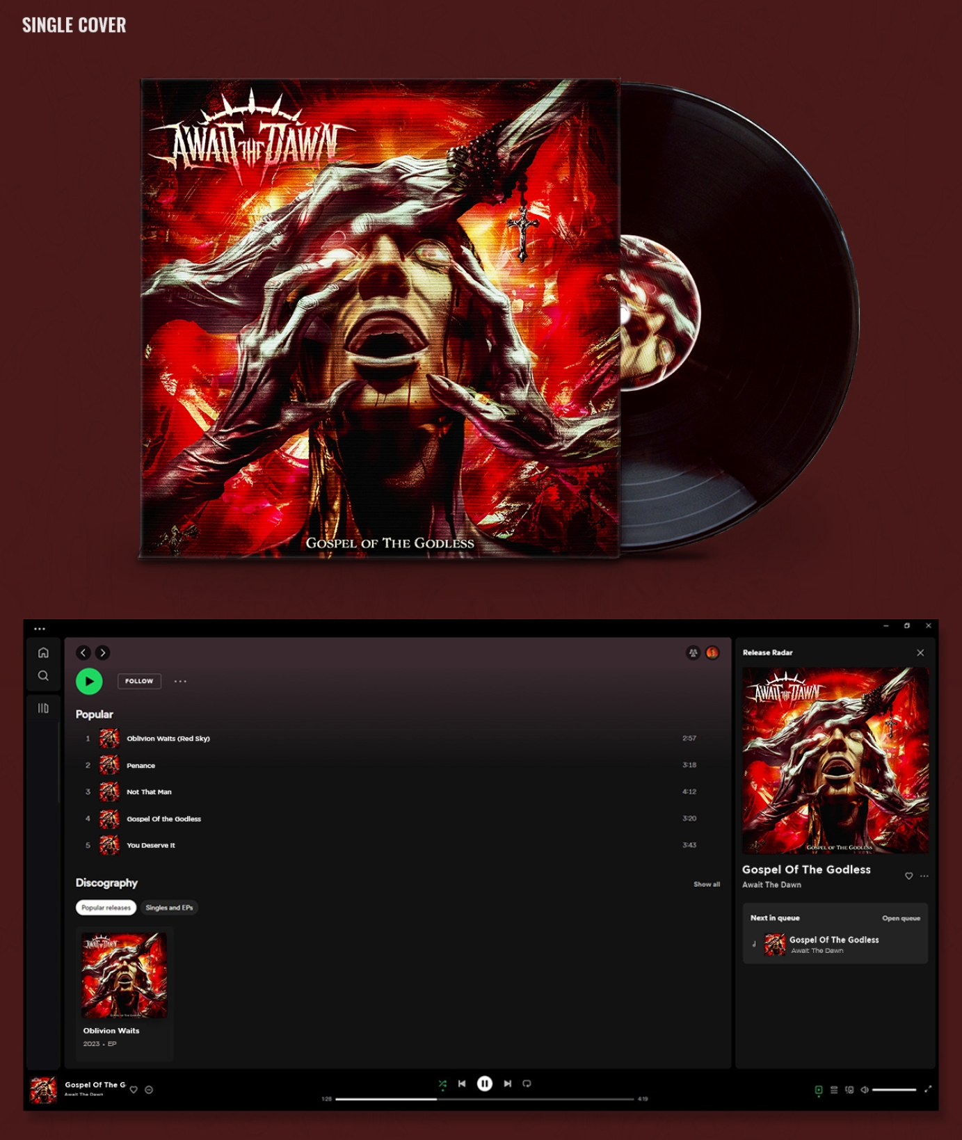
Gospel of the Godless (Single)
As their first piece of artwork we used the single cover as a playground to explore ideas. The song was written about the weaponization of religion so it has a lot of dark themes. I wanted to create strong imagery for the cover that would reflect those themes and illuminate them in a cool way. The final artwork depicts a fearful young human being slowly corrupted and overpowered by demonic, withered hands of religious creatures inside of a tortured fever dream-like reality.
Oblivion Waits (EP Cover)
After finding a good rhythm with the single cover, we embarked on the EP cover. The band had a few songs written at the time but not the complete EP. From what the band did have I was able to interpret a lot of themes of mental toil and struggle. Members of the band shared their individual stories and writings for the music to help illuminate the final direction for the art. The Oblivion Waits cover reflects those stories with a tortured character who wears a blinding crown of light battling a maelstrom of demons. This graphic captures the aggressive, tumultuous, and hopeful energy of the group I feel and creates a compelling visual motif for listeners to enjoy.
2 years agoKNV - Artist Logo
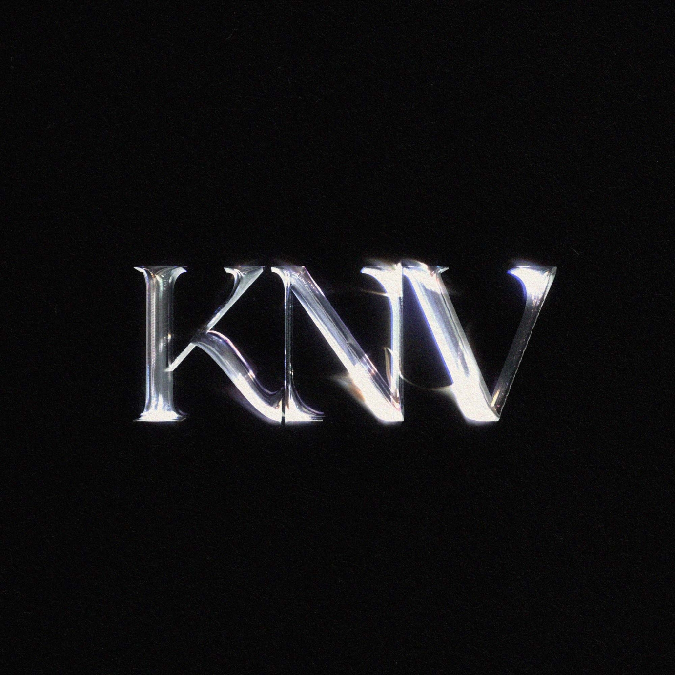
Artist logo for KNV
2 years agoBranding for Enzo
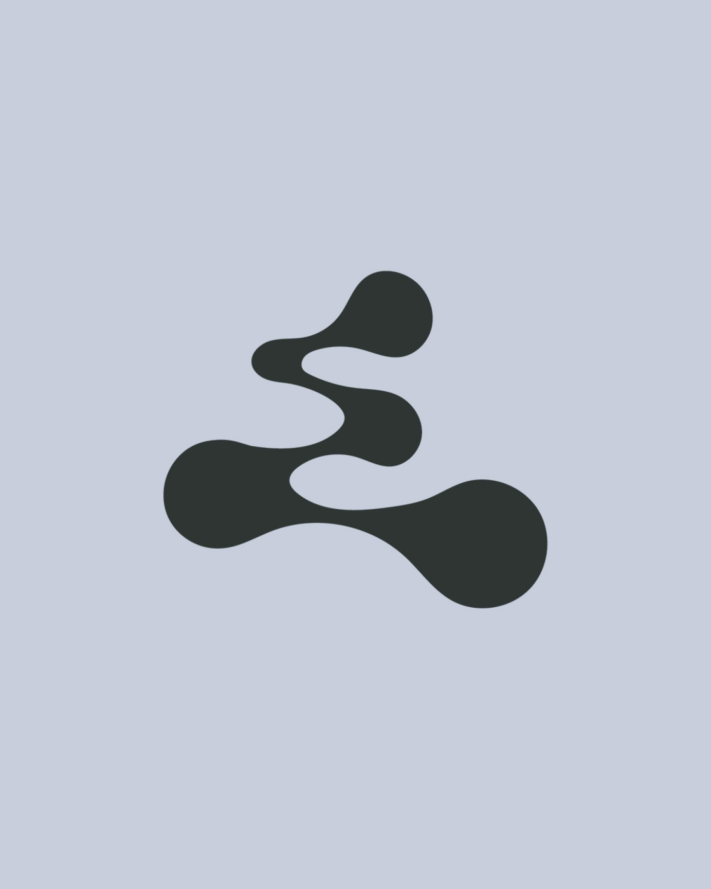
Logotype and Icon for UK producer Enzo. Drawing influence from digital and analogue audio recording equipment, as well as graffiti and street art to create the unique 'E' stamp.
Commissioned by E.47 Agency.
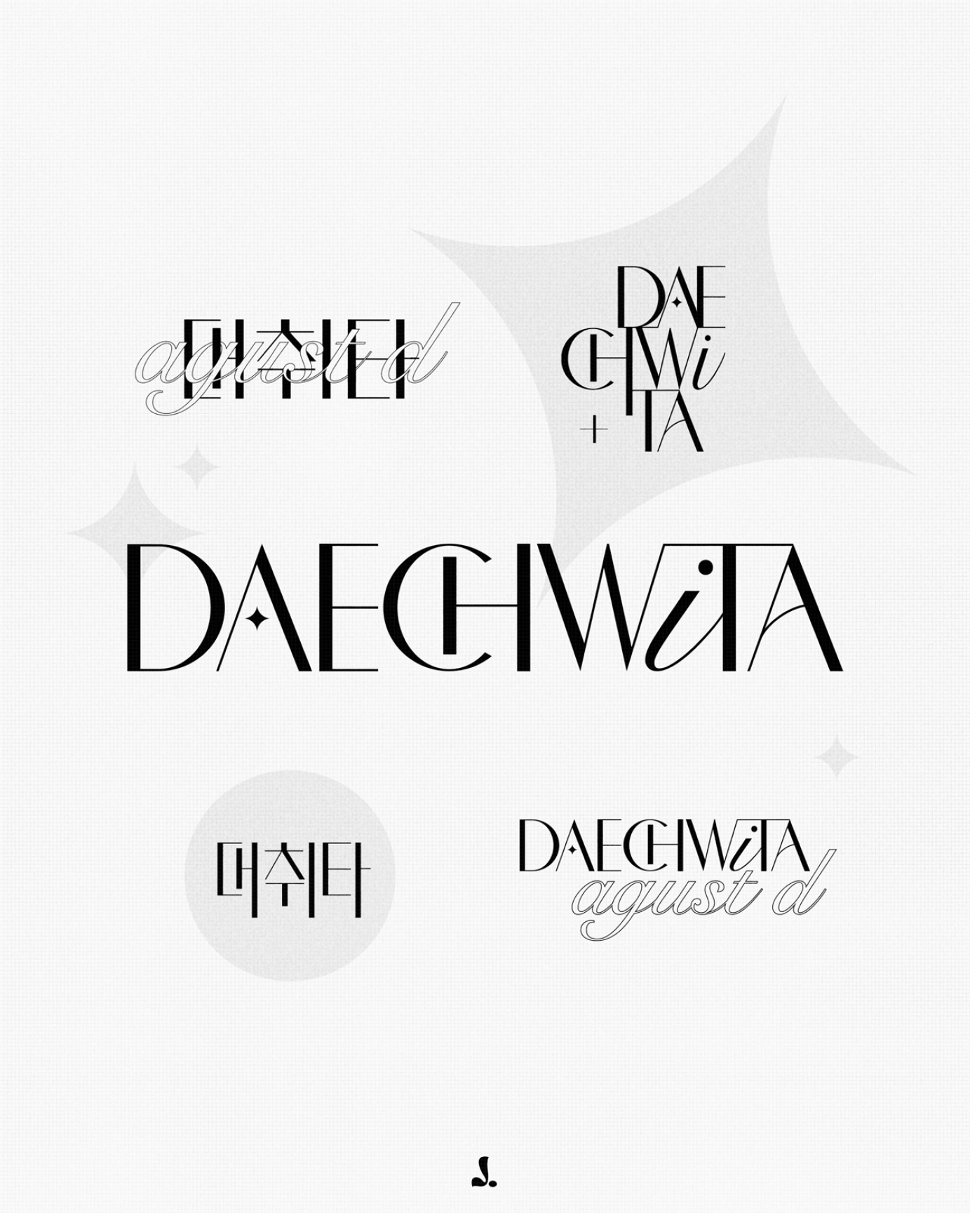
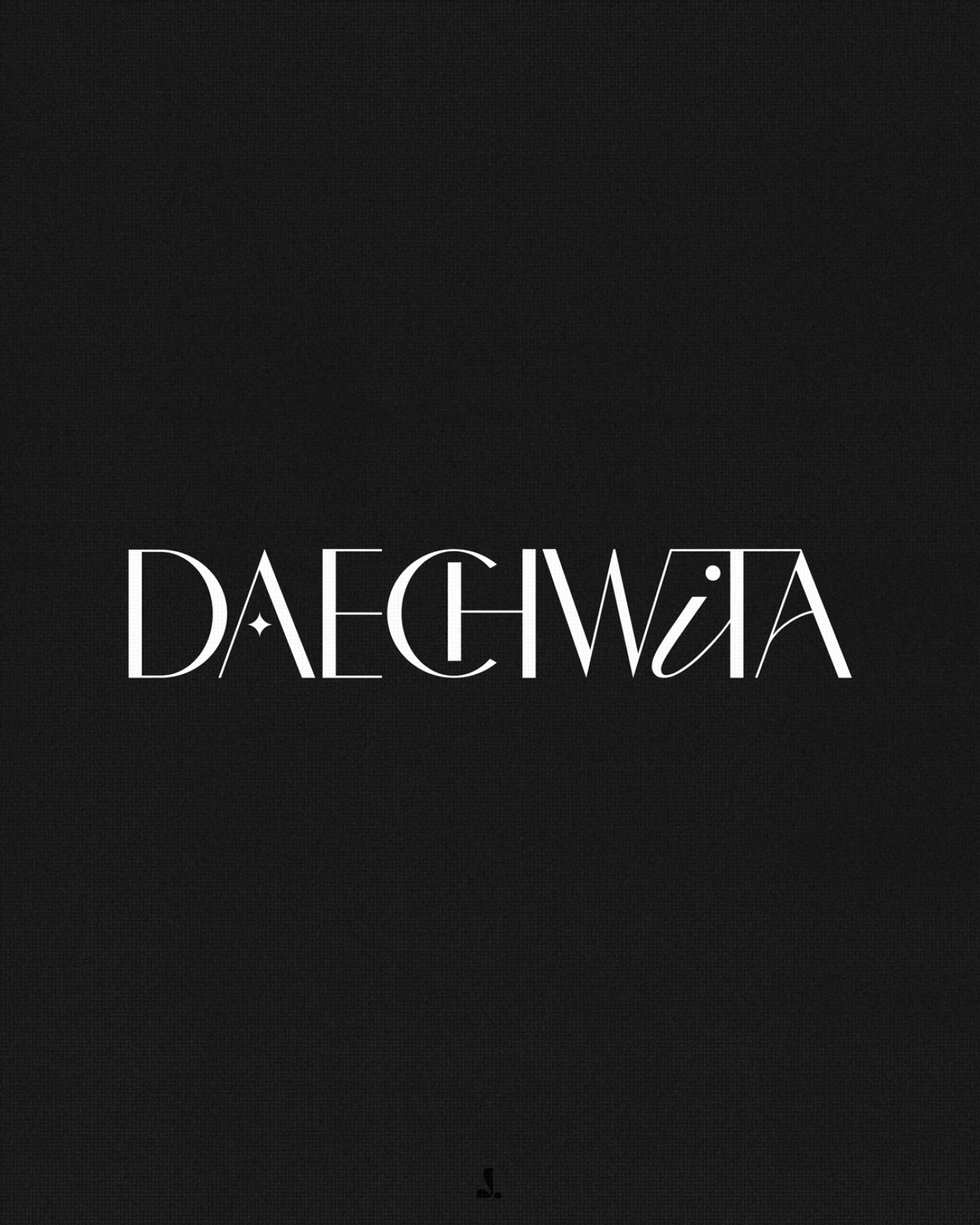
2 years agoBranding Design | Daechwita
A branding study for 'Daechwita' by Agust D.
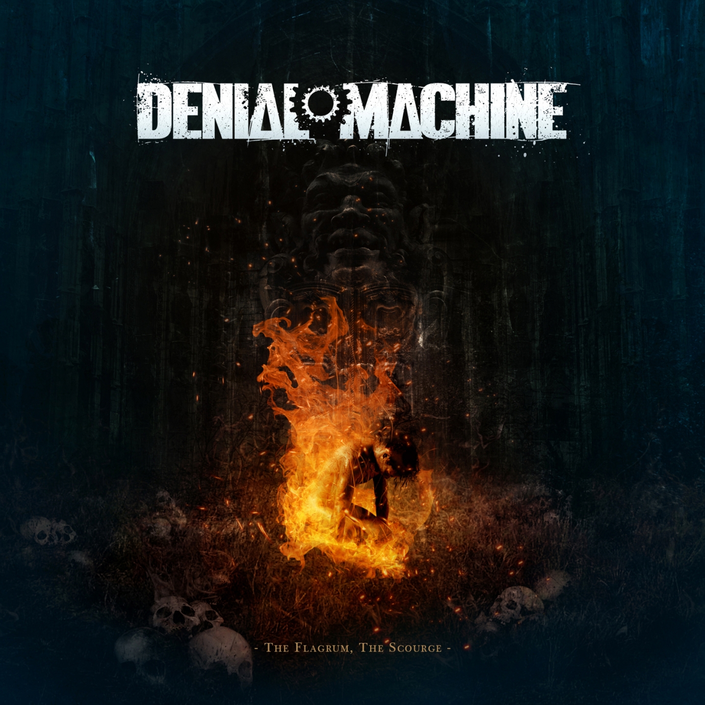
2 years agoArtwork & Logo Design | Denial Machine
Logo and cover art design for my long-time collaborators Denial Machine, an American metal band who have entrusted me with the cover art for all their releases.
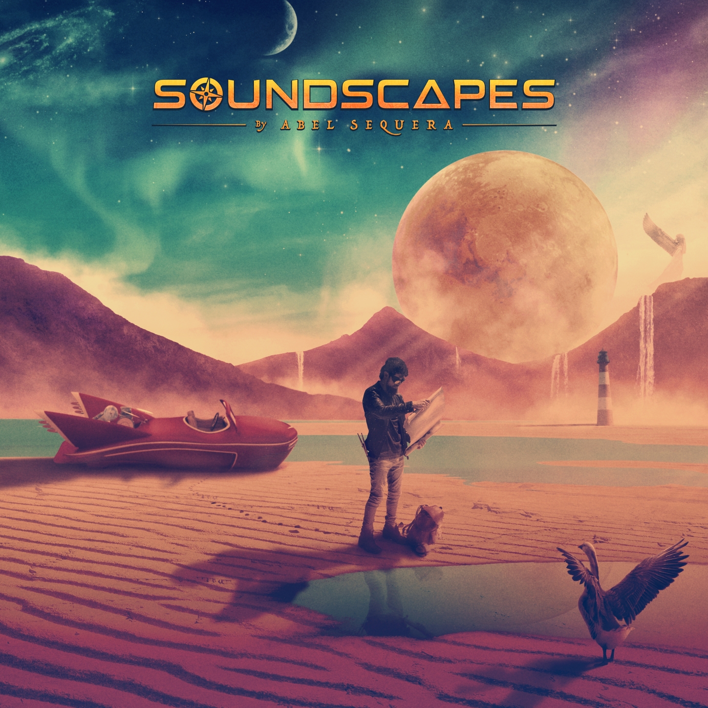
2 years agoArt Direction & Artwork | Soundscapes
Abel Sequera is one of the most talented drummers and composers coming out of the rock and metal scene in Spain. Alongside guitar player, producer and composer Carles Salse (and with the help of dozens of musicians from across the globe) they created Soundscapes, a conceptual progressive metal album that tells the story of the great spiritual and philosophical journey of a being roaming the unknown in search of new horizons.
I was brought on board of this ambitious and meticulous album to capture the story and translate it into images. The album includes a 44-page booklet featuring a series of double-page illustrations conceived specifically for each particular song. Making the most out of the panoramic format, the images are conceived like frames from a movie.
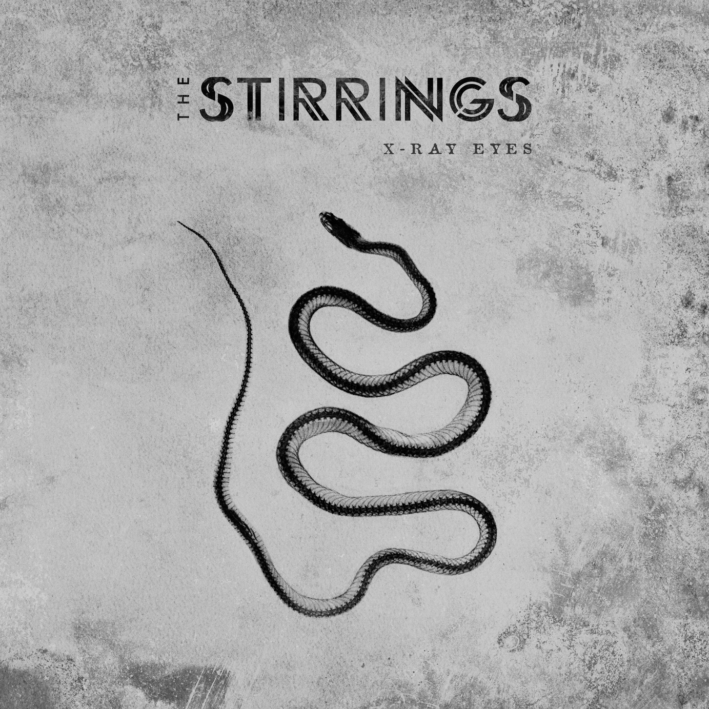
2 years agoArt Direction & Artwork | The Stirrings - X-Ray Eyes
Art direction, cover art, logo design, album layout, photo retouching and merchandise design for the debut album of The Stirrings, an experimental rock band from Madrid.
2 years agoPsychedelic Type
Psychedelic type logo for Young Martyrs.
2 years agoBig Blind
Album artwork and Logo design for fuzz riddled rock'n roll outfit Brother, Bite The Buffalo.
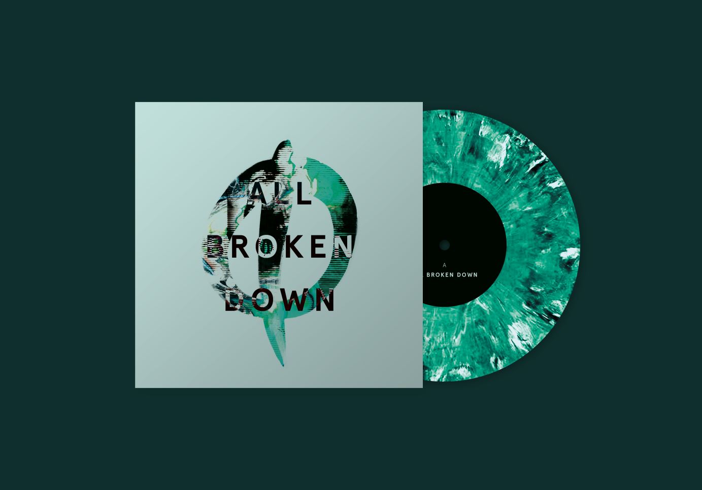
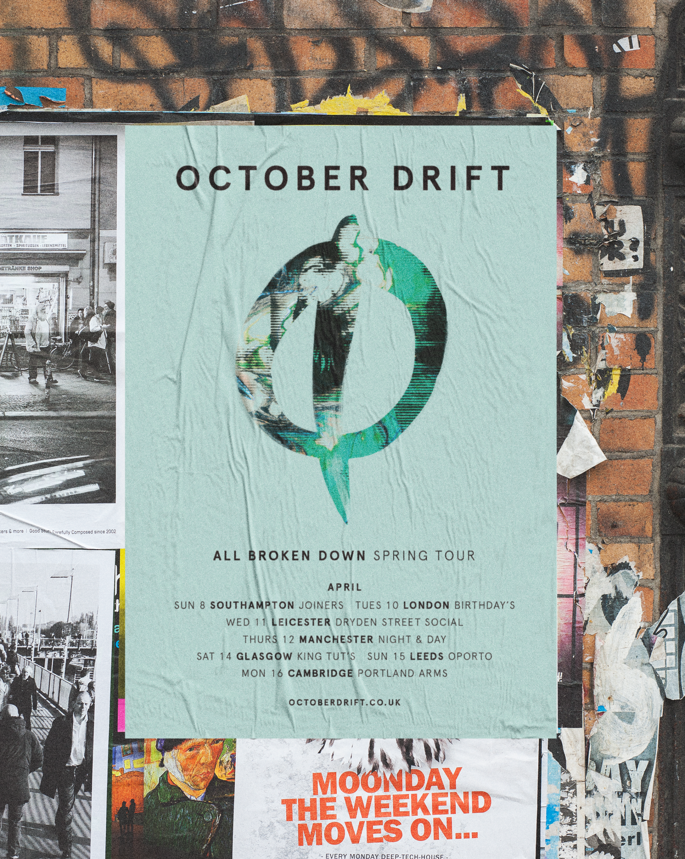
2 years agoAll Broken Down / Come and Find Me
Artwork and posters for single releases for Sugar coated power-rockers, October Drift.
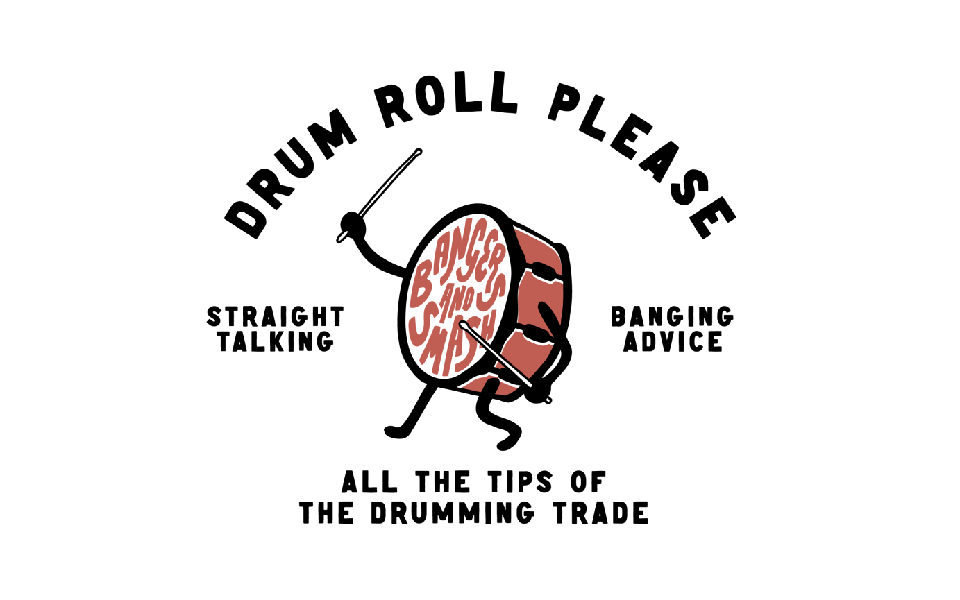
2 years agoBangers and Smash
Identity for a drumming masterclass
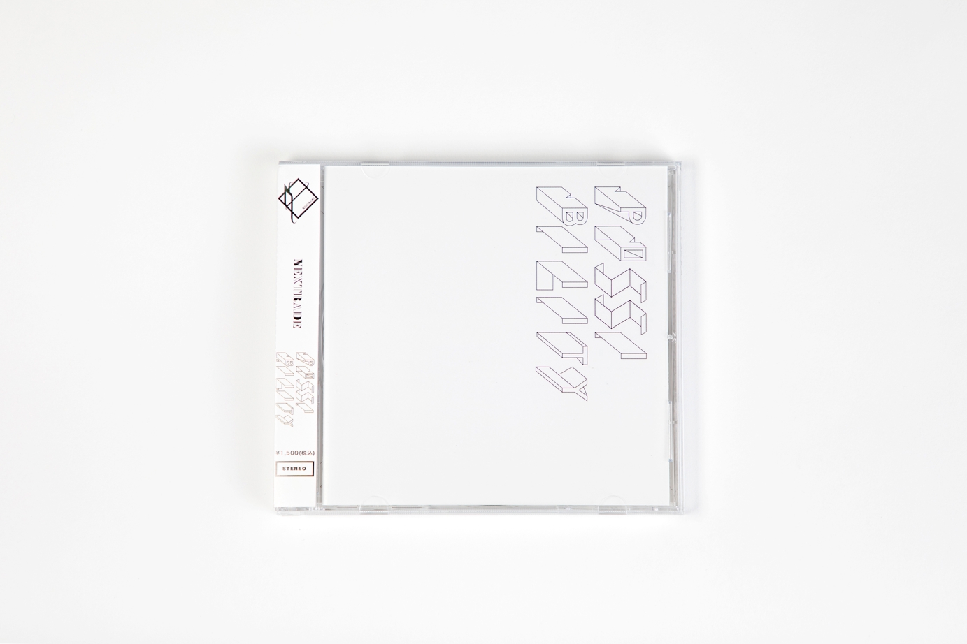
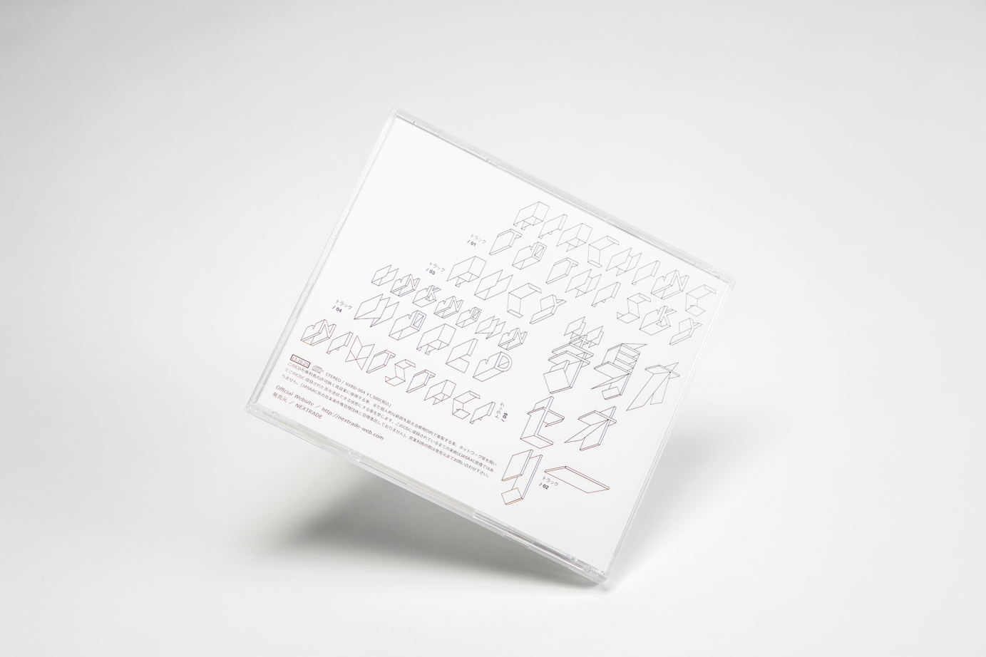
2 years agoNextrade / Possibilities
Client : LNP Records
Album packaging design for the Tokyo Indie band Nextrade on their latest album [Possibilities]. On the theme of “possibilities”, we explored design elements of organic polygonal graphic to represent their musical resilience and temperament.
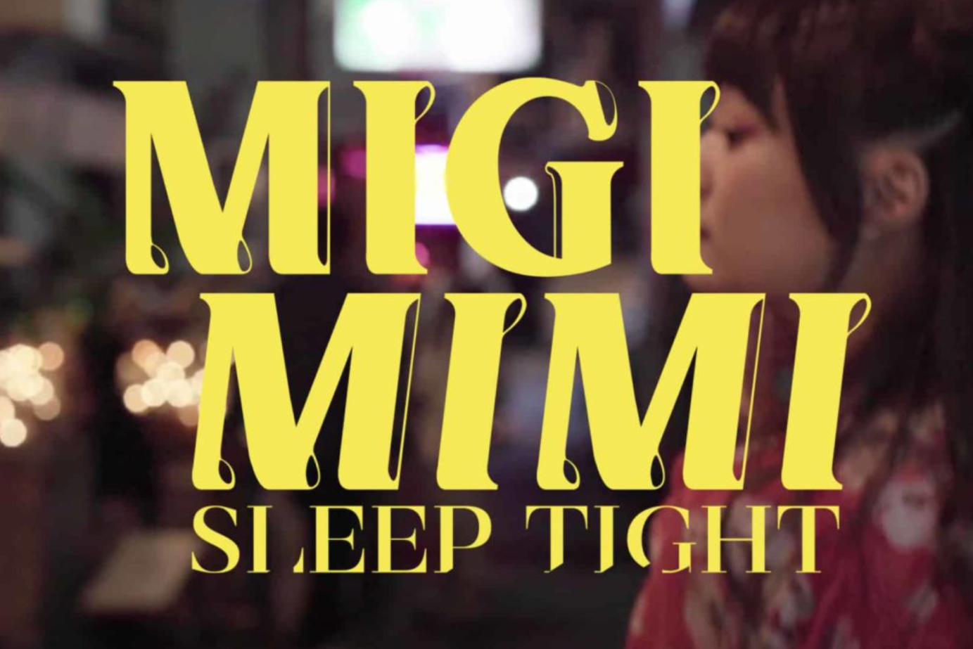
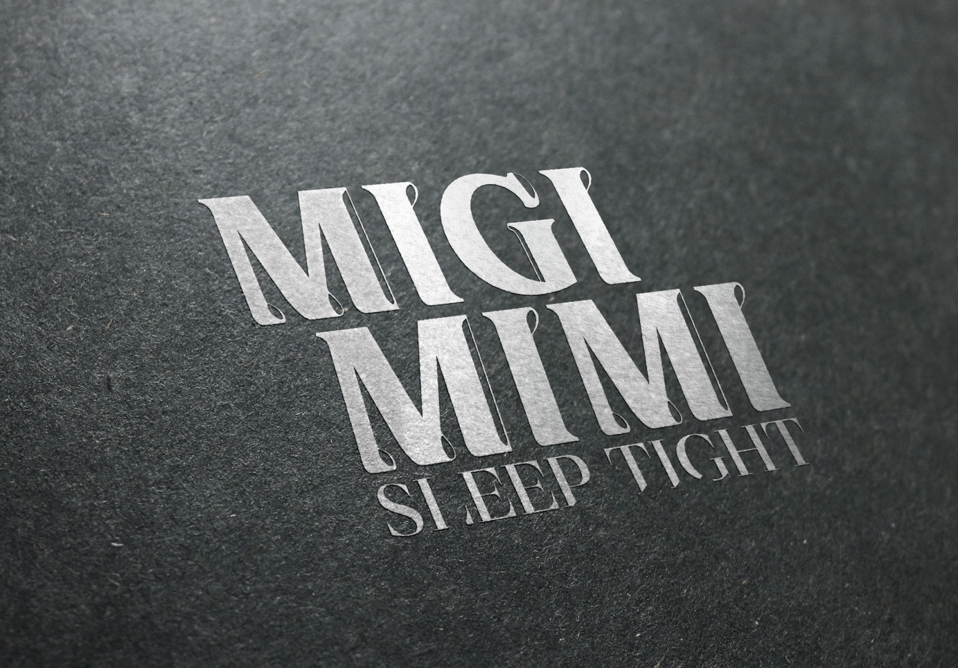
2 years agoMigimimi Sleep Tight / Logotype redesign
Client : Space Shower Music
Japanese Music Band Migimimi Sleep Tight since year 2016 has joined Japan’s largest Indie Music Group “Space Shower Music”. Throughout the years they are daring to experiment with different styles of music. In 2020, we were invited to create a new logo based on their more mature yet still playful development. From the nature of their music, we used chunky wording design with dynamic figures, creating an identifiable and modern logo.
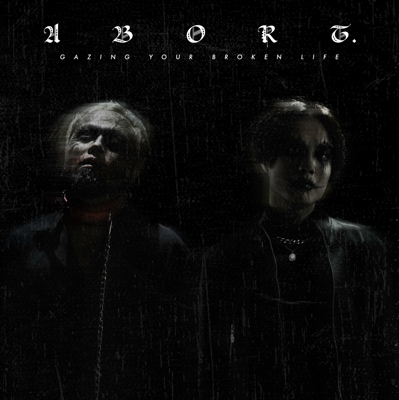
2 years agoabort. / Logotype design
Client : Hoover Records Japan
A Japanese Visual-Kei band going to release their brand new album soon, therefore they want to change their image and logo to the most strong identification one for their next adventure.2 years agod4vd Logo
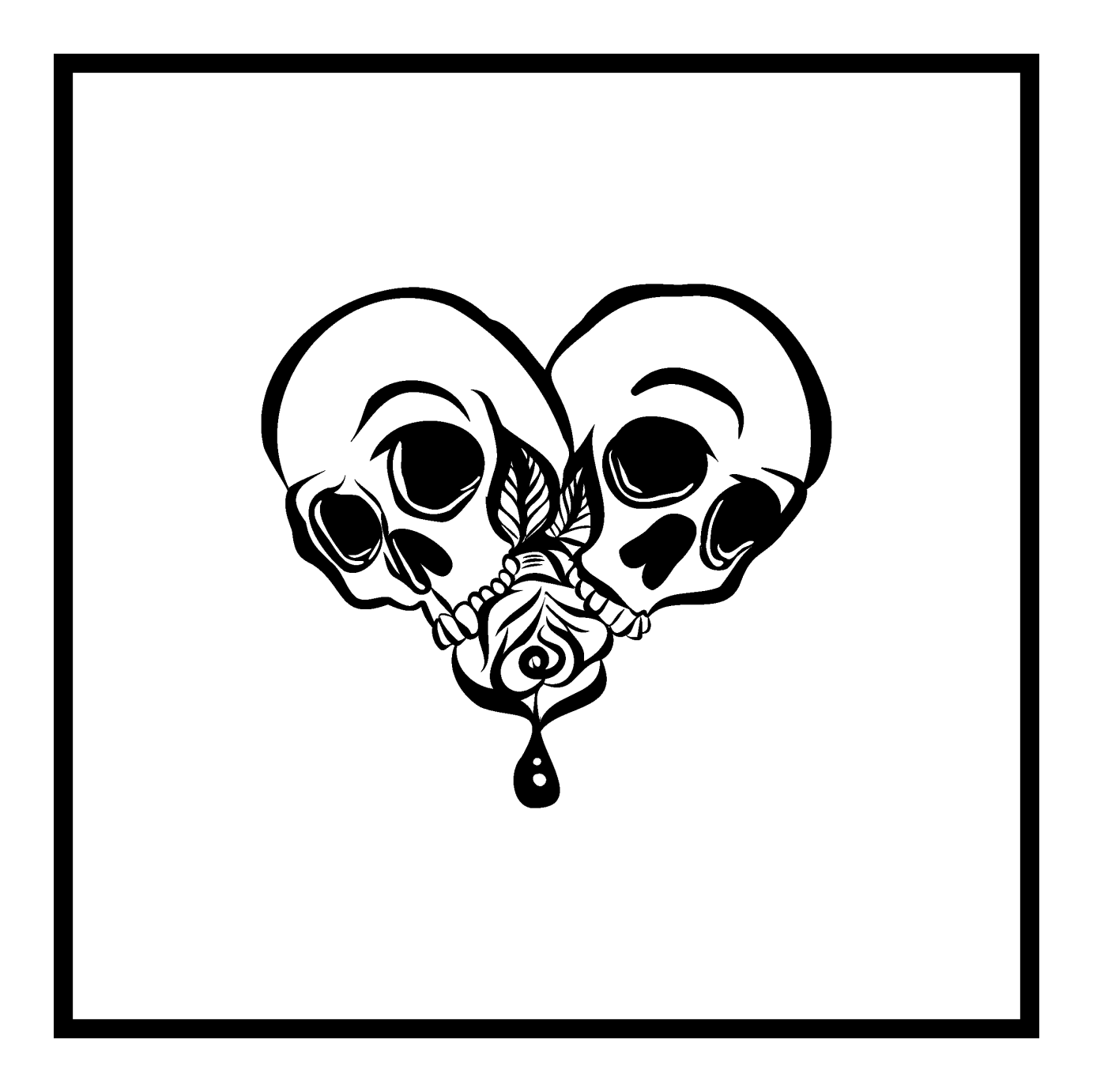
Logo design for music artist d4vd with creative direction from the artist and UMG management. Request for utilization of skull and rose, I then applied the elements to create heart-shaped design with hand-drawn aesthetic.
Commissioned by Universal Music Group.
3 years agoRMG | Break The Drum
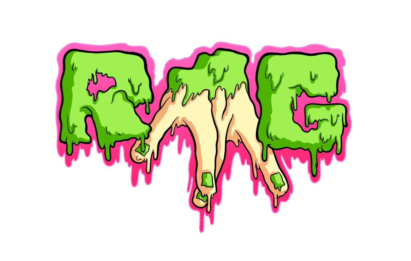
I made these logos for my brother "RMG" and his music project "Break the Drum".
RMG is his personal brand as a DJ. Break the Drum is his new brand, a concept to unite the sounds of Break Beat and Drum and Bass and to promote the DJs from Jerez and Andalusia.
3 years agoReel Long Overdub - Branding
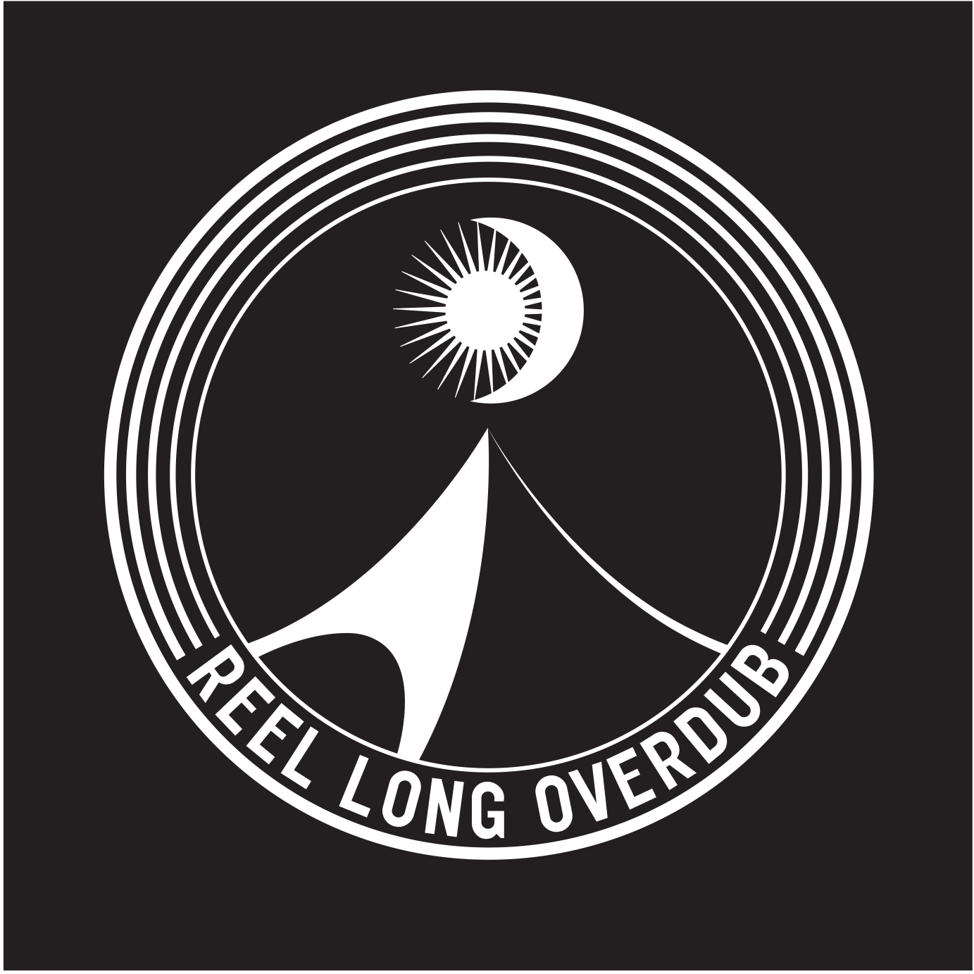
Reel Long Overdub
We were commisioned last year by the super enigmatic London/Leeds based record label and party promoters Reel Long overdub to create a logo and a label template to use for there heavily sought after 7inch records.
When we were working on the logo we took inspiration from label founders Brudenell Groove's infamous castle party teepee tent. This feautures as a motif of the top of the teepee pointing towards a combiantion symbol of the sun and moon, a hint to the type of events that the label puts on in the day and night.
We rounded this off with a radiant cirlce, hinting to the vinyl the label releases and balanced with bold typeface underneath.
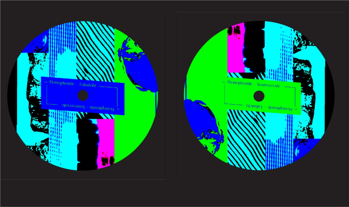
On the vinyl label templates we wanted to create something colorful, eccentric with a design that would be mesmerising whilst spinning on a record player but also legible for djs when finding the track information.
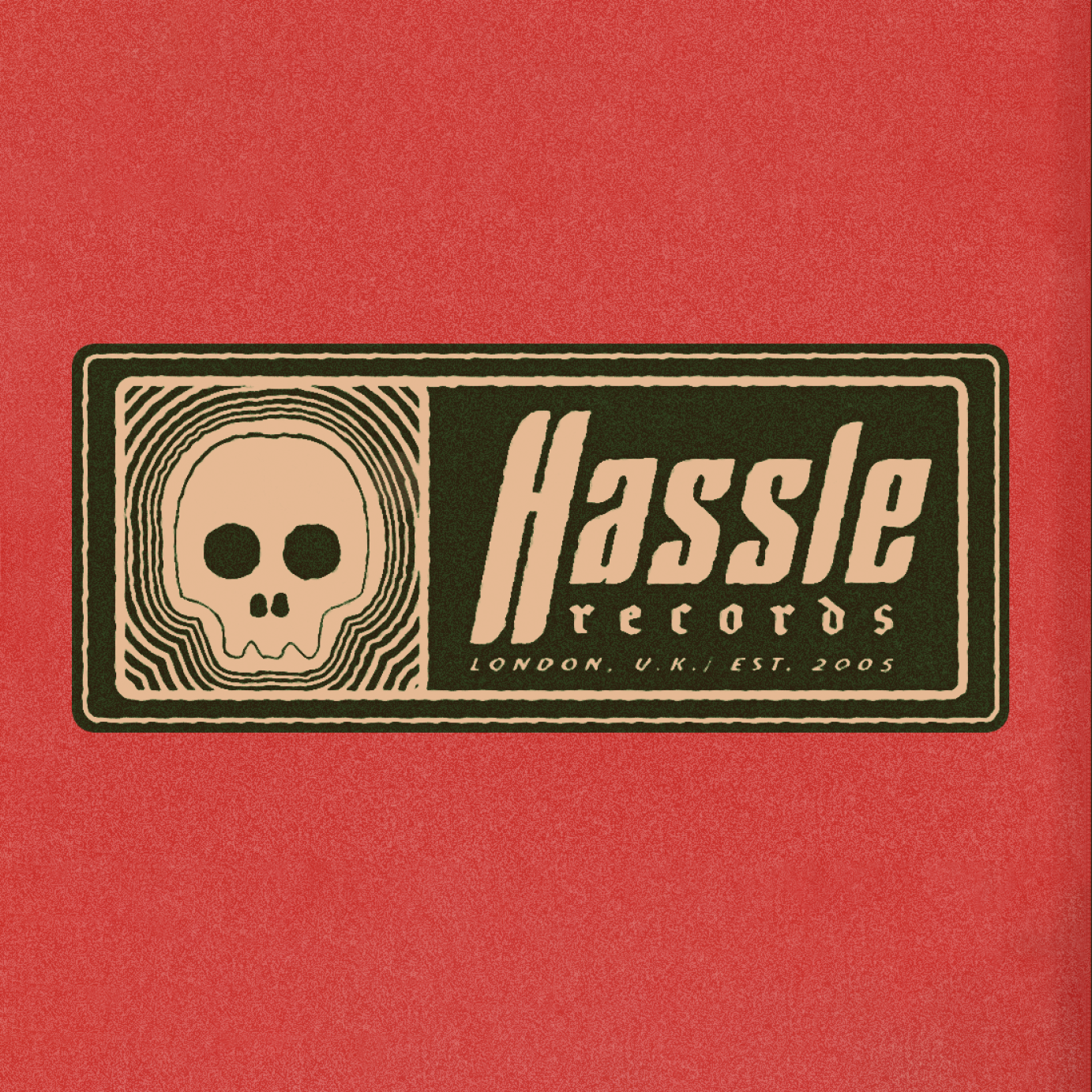
3 years agoHassle Records Logo
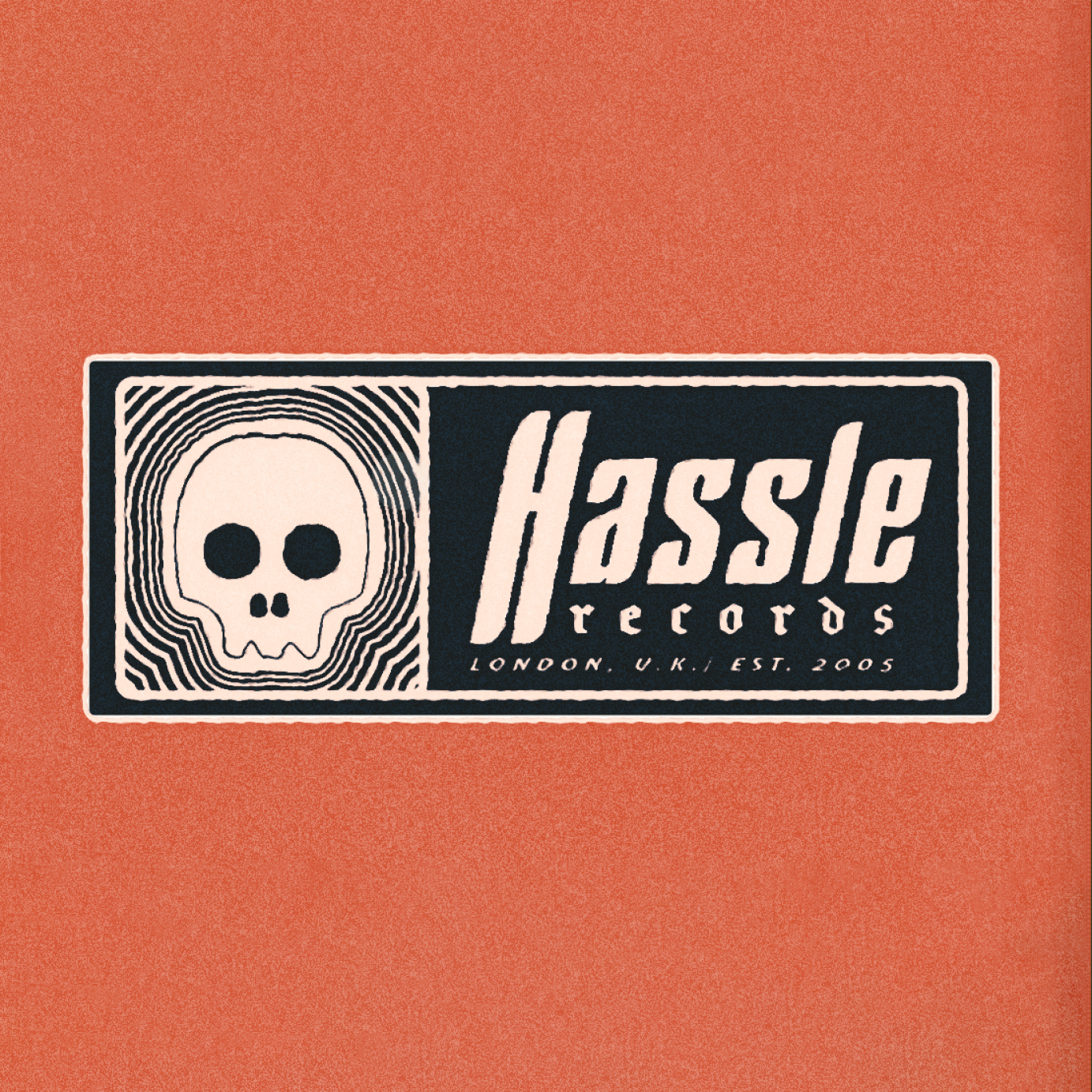
Commissioned to create a vintage style logo for Hassle Records that would better fit in with the cover art of their artist's new album, Ithaca's "they fear us". Was used in a number of other places now too.
Commissioned by Hassle Records.
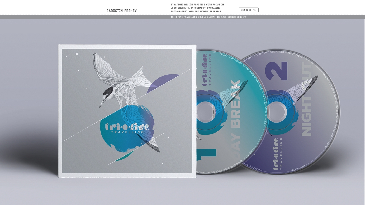
3 years agoTri-O-Five "Travelling" Album Concept and Artwork
Band logo and album concept artwork delivered through album cover, merchandise.
I chose the most traveling creature on our planet - the Arctic Tern to be the main symbol of the album artwork. Its semi-scientific depiction draws attention to the more abstract and mental side of "traveling".
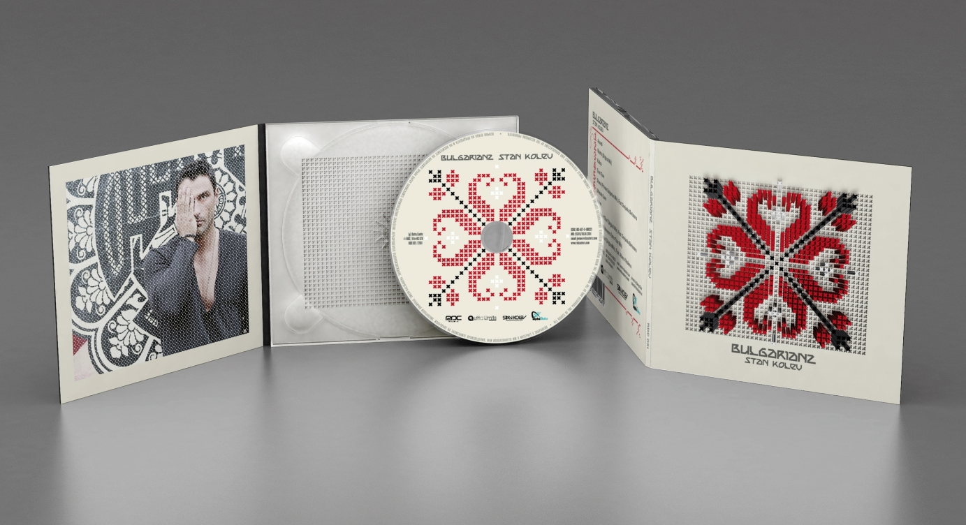
3 years agoStan Kolev "Bulgarianz" Album Concept and Design
Artist logo, album concept delivered through cover, artwork and design. Stan Kolev is a DJ and producer based in Miami (FL) and he blends Bulgarian folklore music with tech-house dance vibes.
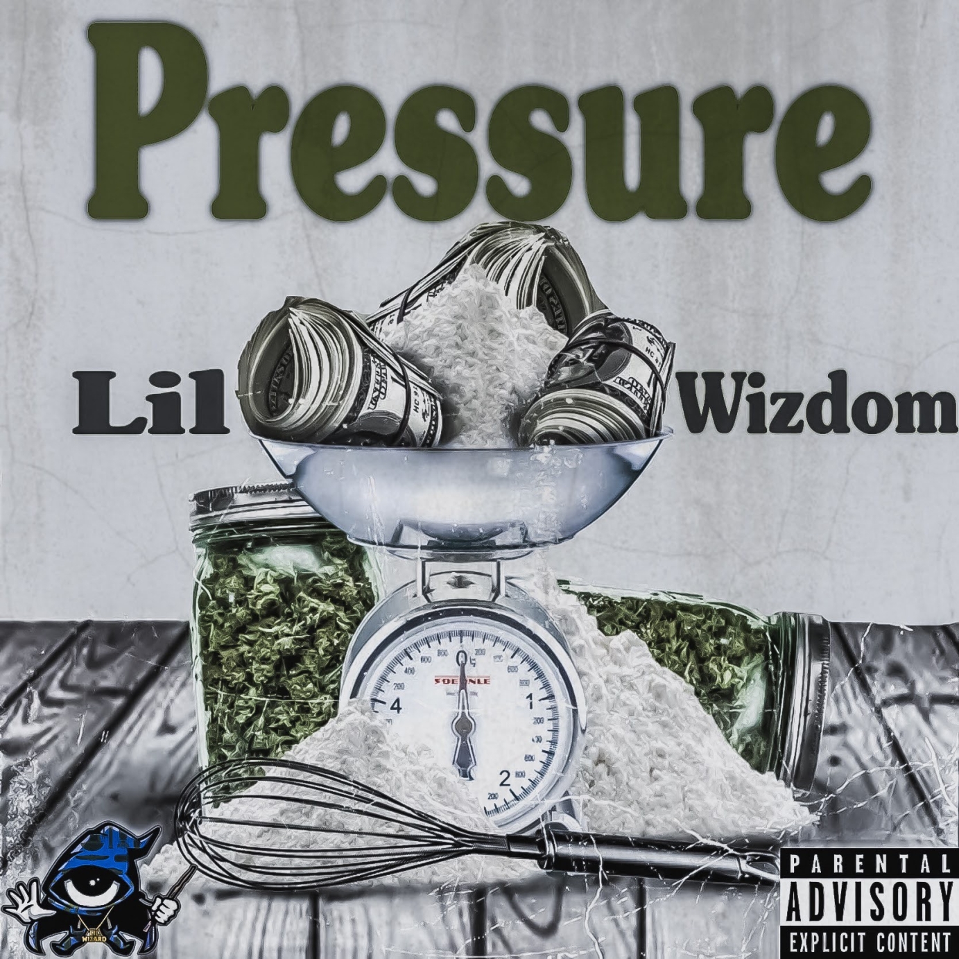
3 years agoLil Wizdom Pressure Album Cover Design
Album cover design for upcoming Chicago artist Lil wizdom song titled Pressure by Last Foreign Queen Graphics
Commissioned by L-MGMT.
3 years agoAlbum cover design for Lil Wizdom song Fake Love
Album cover design for upcoming Chicago artist Lil wizdom song titled Pressure by Last Foreign Queen Graphics
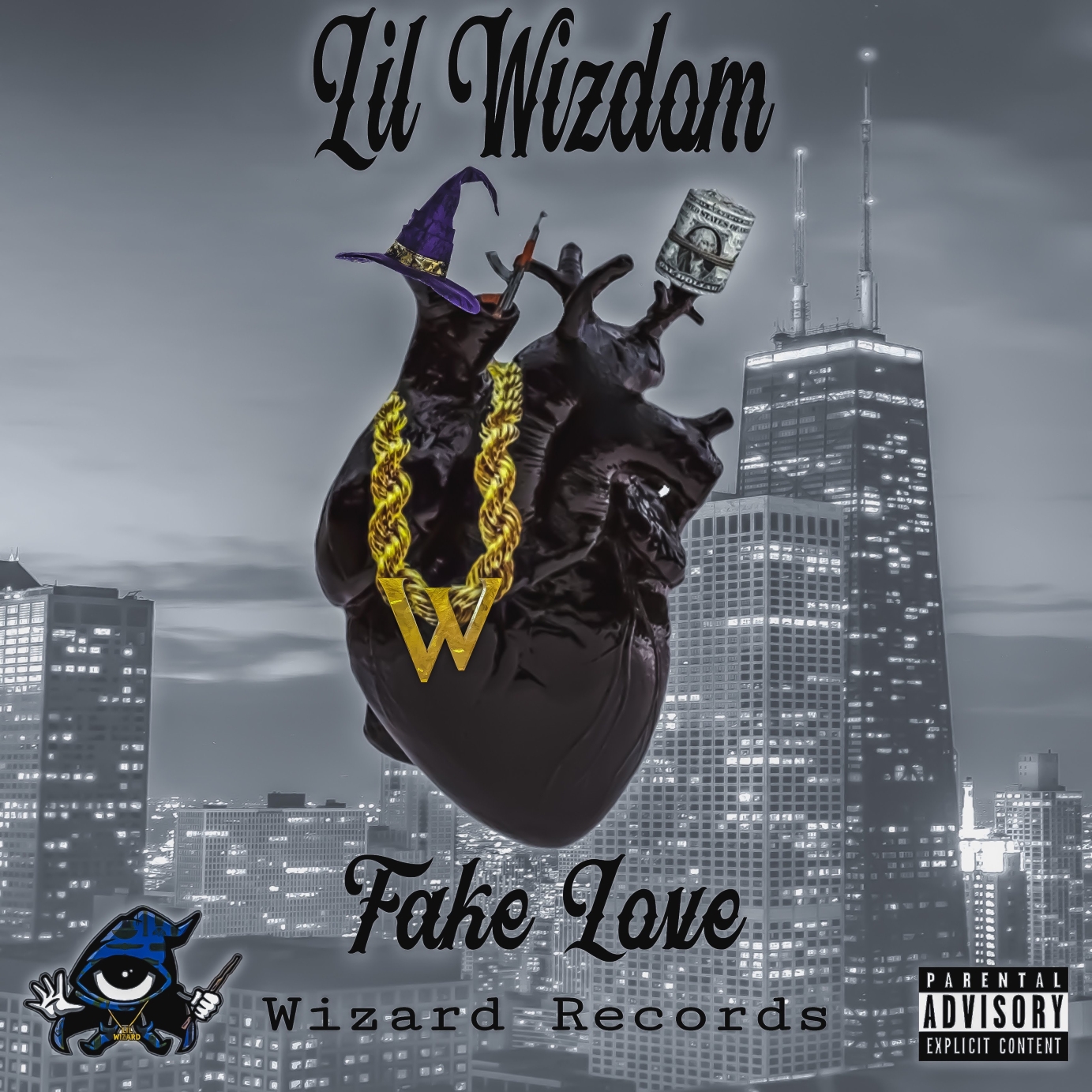
3 years agoLil Wizdom Fake Love Album Cover Design
Album cover design for upcoming Chicago artist Lil Wizdom song titled Fake Love
3 years agoLogo, branding, merch and gig promo for Big Thirsty Girl
Big Thirsty Girl logo (two of several variations), background pattern (static), tee shirt and gig promo.
3 years agoYung Filly Logo
Logo for artist and social media star Yung Filly.
Commissioned by Warner Music.
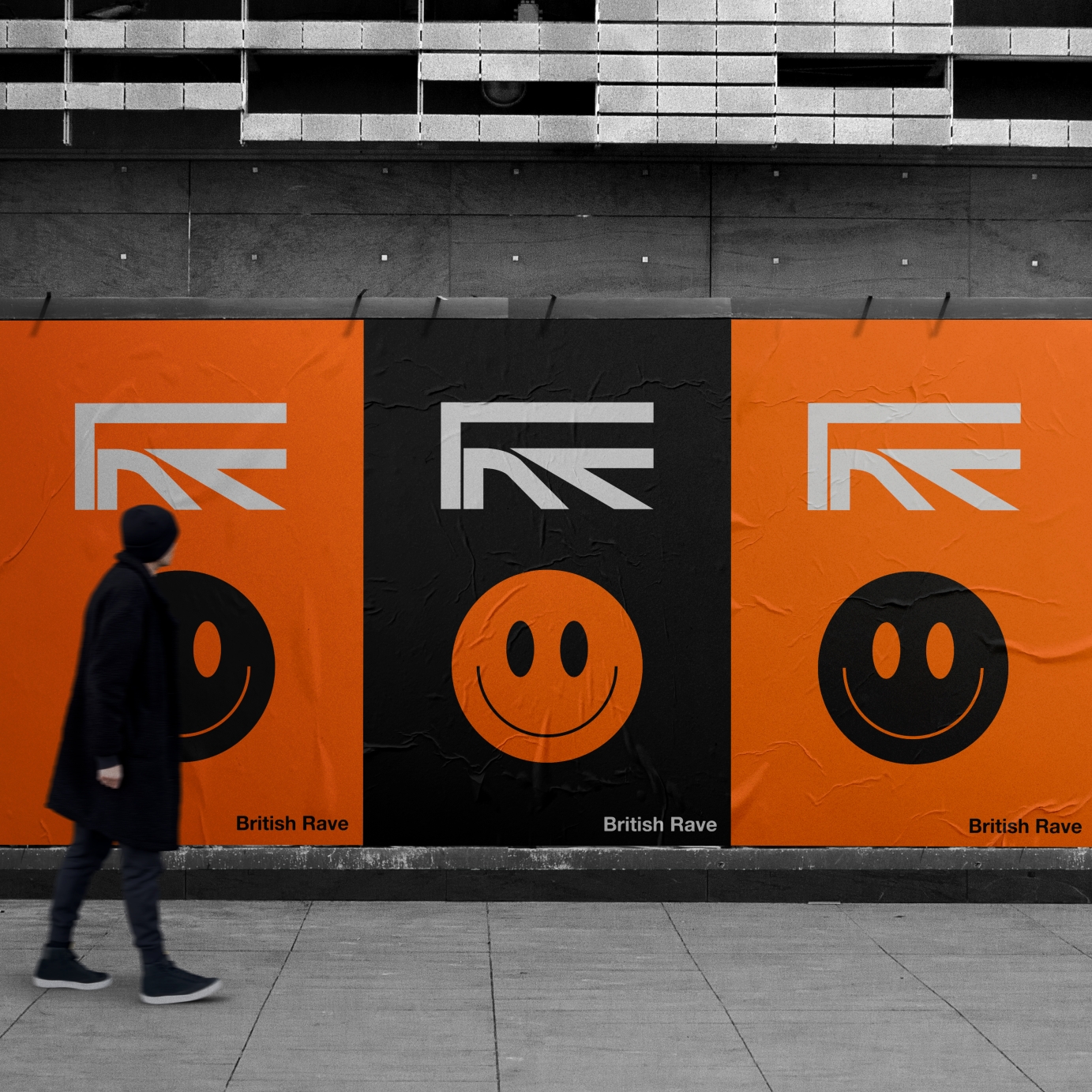
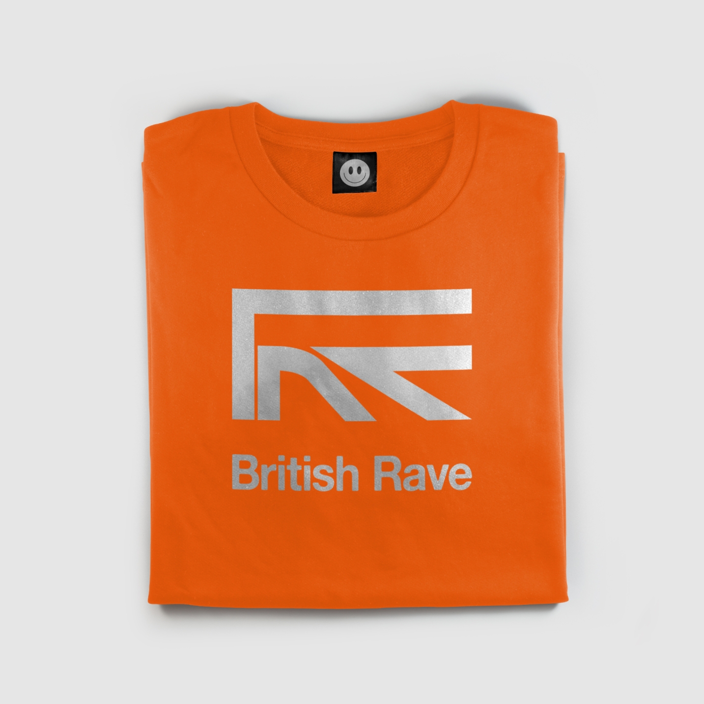
3 years agoBritish Rave™
Brand identity system and concept for British Rave™.
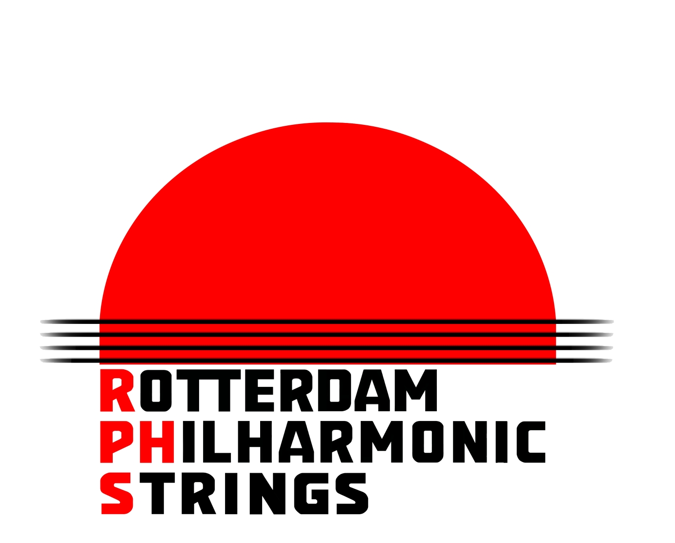
3 years agoArtwork for Rotterdam Philharmonic Orchestra
A group from the Rotterdam Philharmonic string section had permission to set up the "Rotterdam Philharmonic Strings."
They asked me to design a logo inspired on the one from the orchestra. The fonts should be the same.
http://www.rotterdamphilharmo…
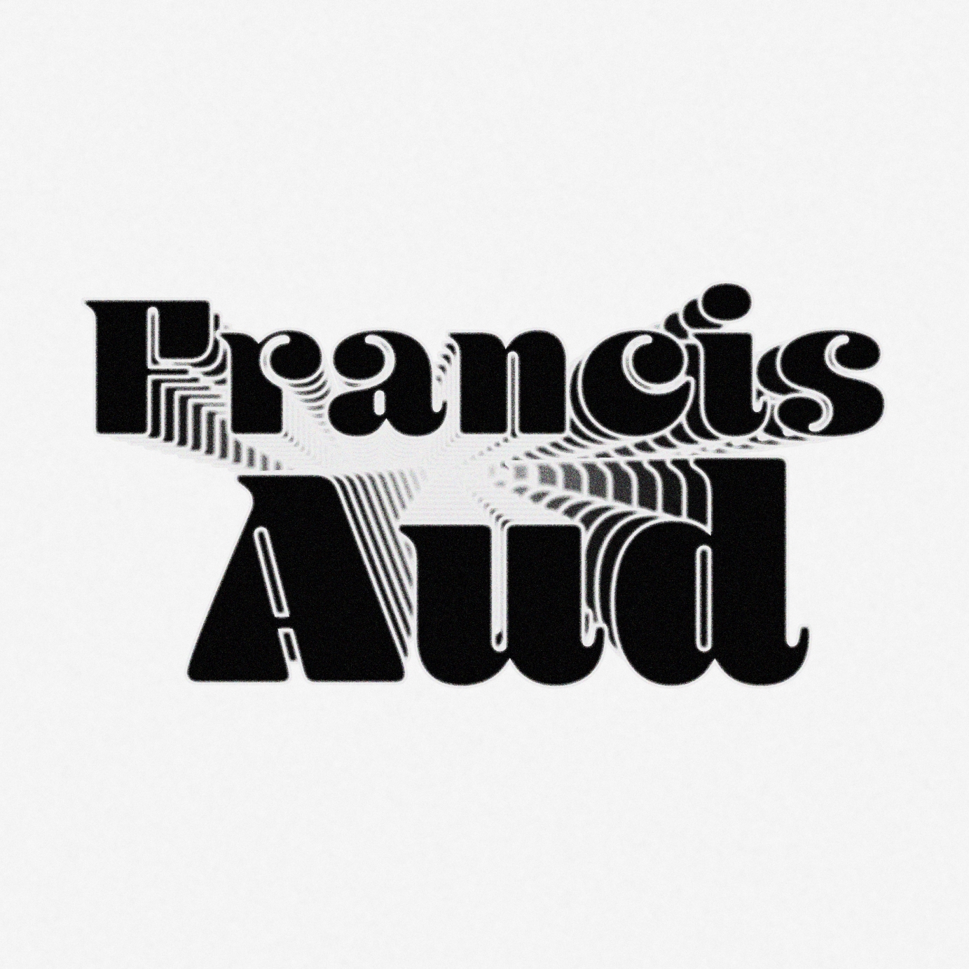
3 years agoLogo for Francis Aud
Francis Aud is an indie-pop artist with funky vibes. For the past 6 months, I've been working on his brand. Starting with the logo, where I found a font that would fit the personality of the brand and genre. I was inspired by the text treatment by old funk albums, posters, and artists. So I incorporated repetition, glow, and blur to remind us of the funky dance floor.
4 years agoLogo - Pleasure Heads
Logo created for indie rock band Pleasure Heads
4 years agoLogo - VIEW92
This logo was created for the VIEW92 design freelance
4 years agoSTEREOHYPE LOGO
I worked with James Hype from 2017 - 2021 and part of that I journey I was part of building STEREOHYPE Records. This includes, the brand, concept, logo and business plan.
4 years ago'Fat Chance' Logo
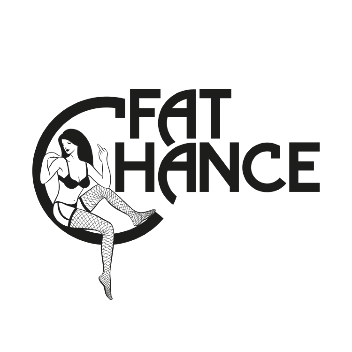
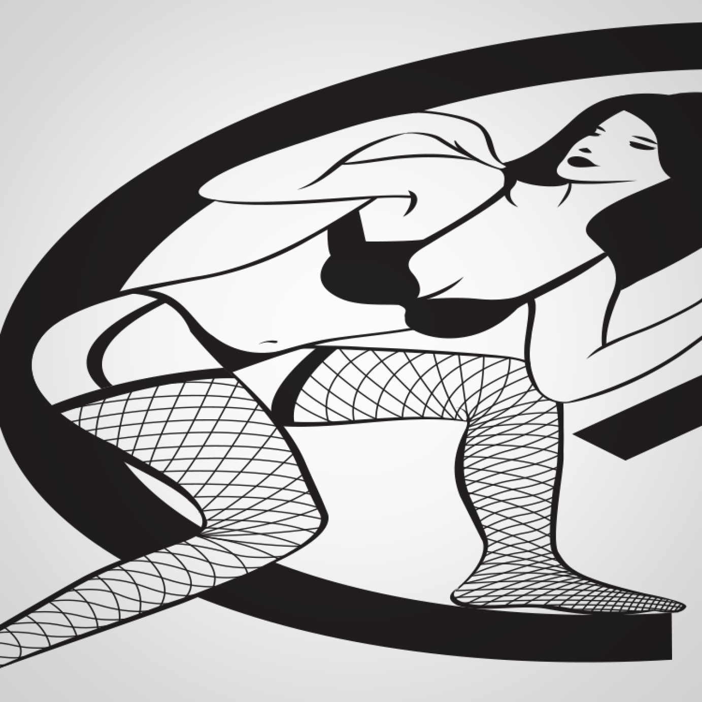
A middle-aged rock and blues band with a self-deprecating sense of humour, the name was a gift, I just had to run with the joke. The logo makes the well-worn connection between rock'n'roll and sex, but subverts the trope through the disinterested pin up atop a heavily 70's Clapton-esque typeface. Taking it one step further, the contact details were scrawled across the card as if handwritten at a gig, despite there being 'fat chance'.
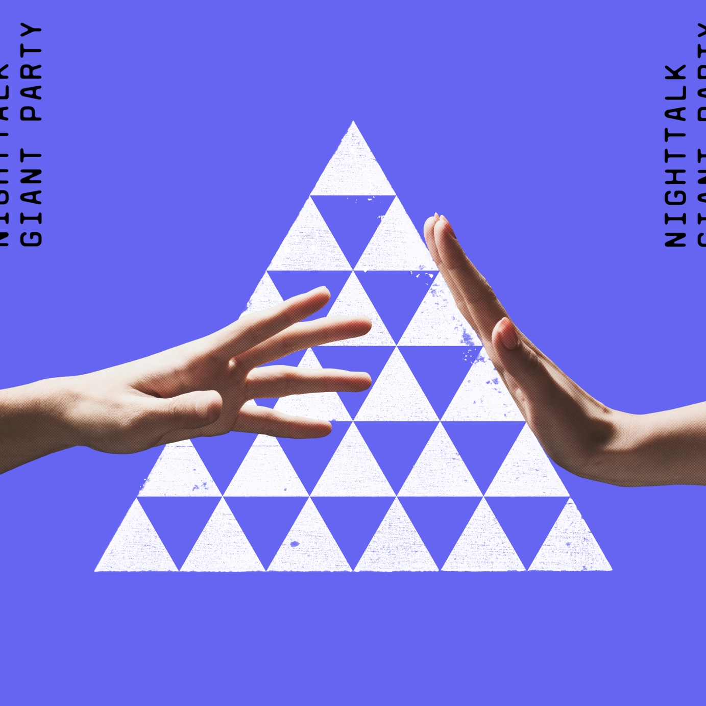
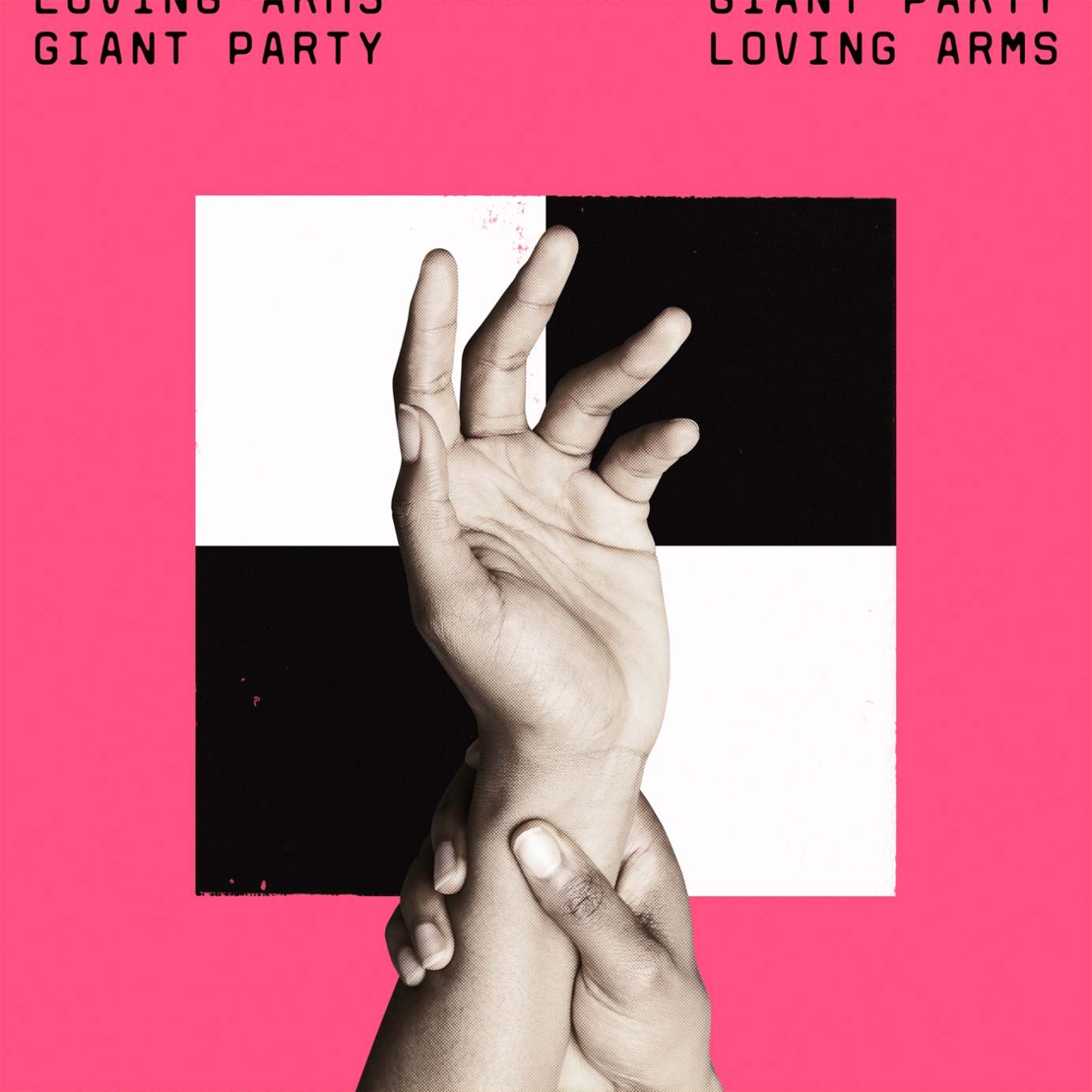
4 years agoGiant Party / Various sleeves
Sleeve designs for new Giant Party singles The Man Who Made Me, Loving Arms and Nighttalk. This is part of an ongoing campaign initiated in 2021 that will continue through 2022.
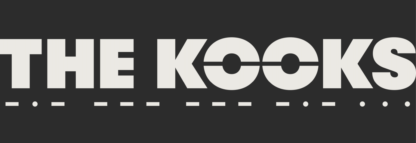
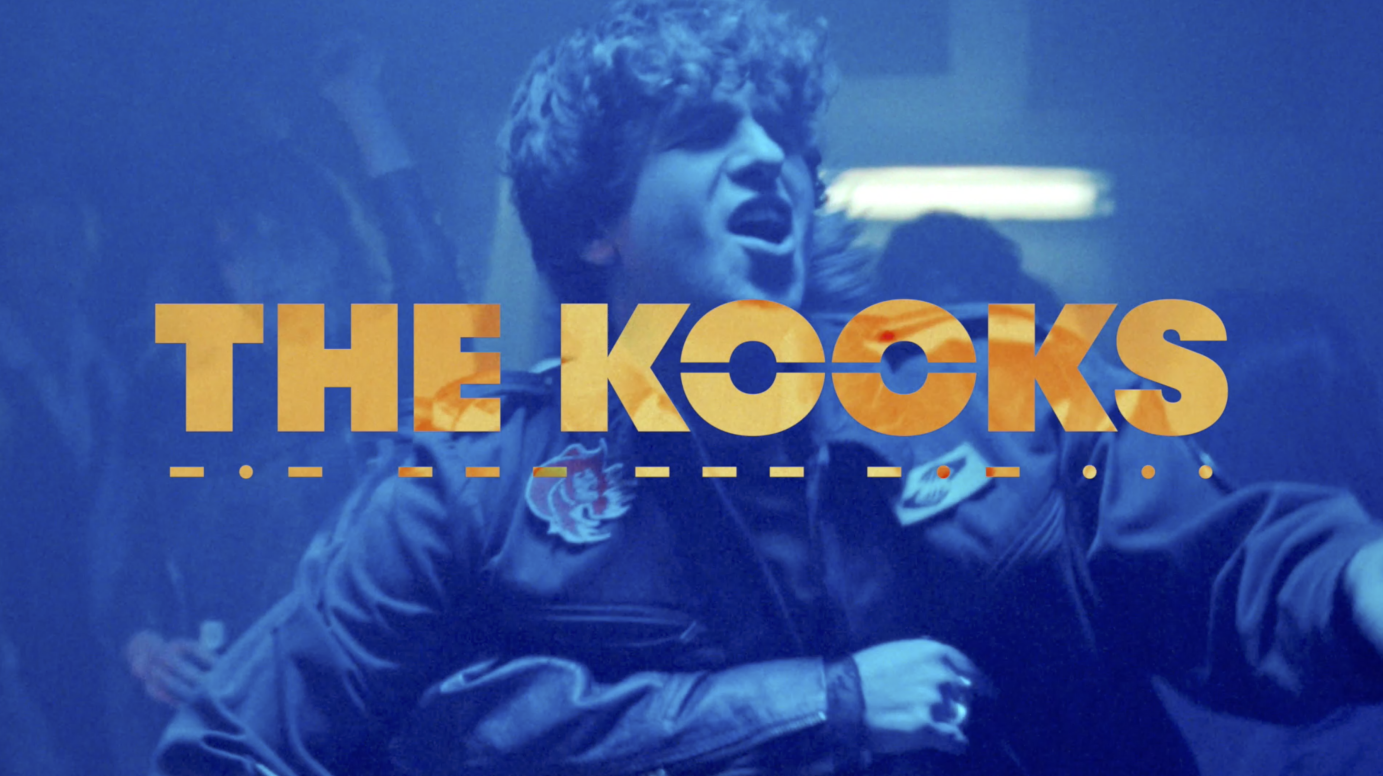
4 years agoThe Kooks - New logo
New logo designed by Ilya Kulikov for The Kooks.
Commissioned by AWAL.
4 years agoDyadik — music label branding and album artwork
Logo, branding, album artwork and packaging design for a small label I run with Martin Boulton (Touched Music).
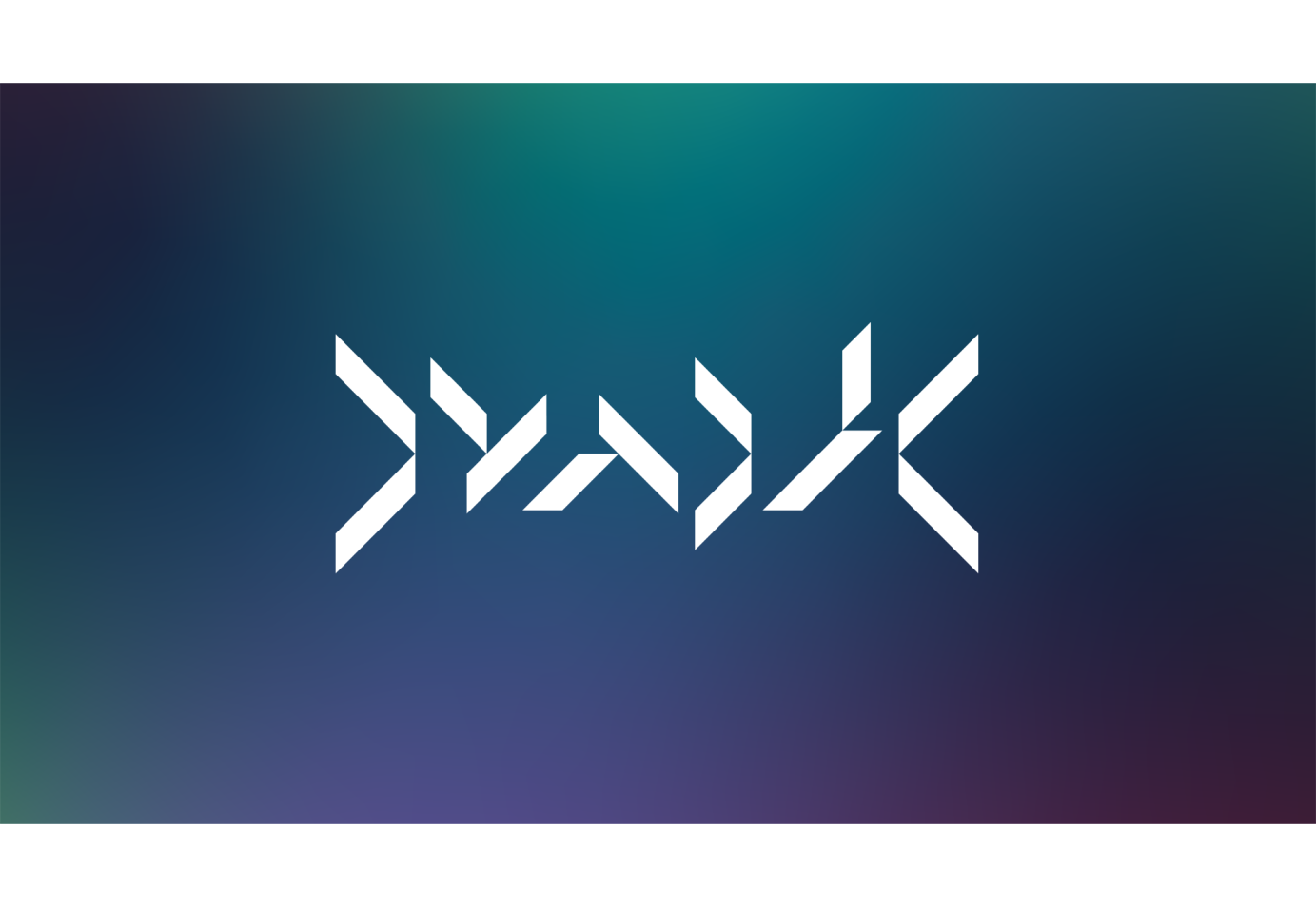
I work with Martin a lot – designing for his various labels, we're both into the same music and decided to start a label together. Whilst brainstorming names I found dyadic (something that consists of two parts or elements) and we went on to use this concept as the starting point for the branding. The wordmark started life as an experiment to construct each letter of Dyadik with just two shapes. It's abstract but keep looking and the name reveals itself (a bit like music needing attention to fully appreciate), there's also a pleasing symmetry of the D and K at each end holding the logo together (and is why the catalogue numbers have > <).
From there I designed an icon (a stylised two in roman numerals), a custom typeface and some geometric repeat patterns, all constructed using just these two shapes. Various weights of the Archia font is used for all other text.
As the label has evolved, the packaging has become a way for me to explore bespoke ideas of how to house physical music in interesting ways within a limited budget. On the latest releases I have spent many hours hand assembling the various elements.
Murya — Northern Lights >1<
Gradients inspired by the colours of the aurora borealis cover the inner and outer sleeve, the gloss laminate gives the colours depth and richness contrasting with the uncoated plain paper obi.HRYM — Organik >2<
CD in a matt laminate 10 panel bespoke card sleeve. For the second release I continued with the custom type (based on the shapes of the logo) and geometric graphics established with the label's first release. The idea of a folding card sleeve was inspired by an image of flowers the band supplied (which also ended up as the blurred background) and is like the petals of a flower opening. The flaps can fold multiple ways, creating many variations on the cover. From there I explored mixing nature with the man-made: the contrast of the blurred flowers with the angular type and hard edges of the flaps as they overlap.Various Artists — Adykt >3<
2CD compilation in a clear jewel case with transparent sticker. The name (Adykt = Addict) came from noticing it was almost part of the label name – dy-adik(t) and thought it was a perfect title for this release. I always want to try and do something a bit different with the packaging for Dyadik and it's fun to come up with solutions within a limited budget. One of the things I love to do with physical media is layer elements to create the design (which I did again on the following release). We went with a white ink transparent sticker rather than screen printing but I think the results look just as good. As with previous releases, the title text is made from the logo shapes, the circles on the CDs represent track length.Heogen – Oxygen Fields >4<
Limited edition, glass mastered CD in clear wallet with double sided insert, printed on pearlescent paper, housed in a translucent anti-static bag with white ink transparent sticker on the front. I wanted to do something quite bright and optimistic, possibly with a holographic feel, as that is how the music feels to me – it would also be a contrast to the first Heogen album art. I spent a long time looking at things we could use for album packaging and pricing up different options within a budget that would work for a small quantity. The various elements were all ordered separately and assembled by hand. We put 100 copies on Bandcamp and they sold out in under 24 hours. I am really happy with the finished product and love how the artwork layers up through the translucent bag and sticker.exm—comp >5<
Continuing the quest for unique packaging with Dyadik release 5… limited edition glass mastered 2CD compilation of selected works by exm, presented in a hand assembled custom A5 gatefold sleeve, printed on recycled 350gsm matt card, with removable gloss sticker holding the case shut.
Seeing as this is a compilation album, I has the idea to make the big artist and title text out of smaller type about each track – literally a design made from the tracks, I wanted to do it in a way that isn't too easily to read. This also carries over to the big track listing on the inside. I hid the credits under the sticker so they only get seen when opening the sleeve. The background is an inverted image of lava by Pawel Czerwinski, the idea of "cold lava" came into my head whilst listening to the music. Everything was delivered to me separately and I hand assembled 200 copies which sold out in about 24 hours.
Commissioned by Dyadik.
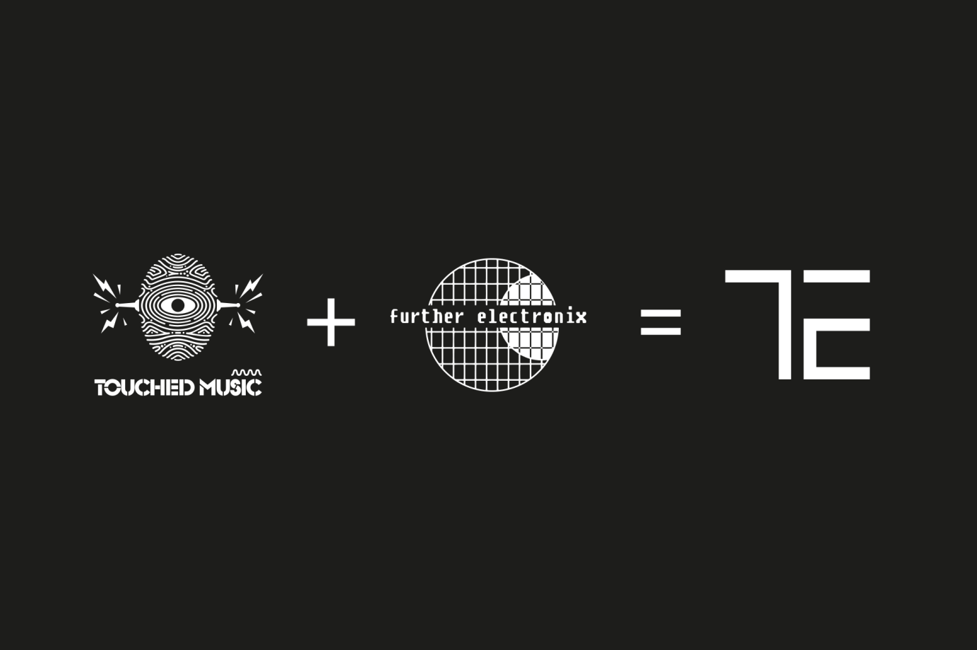
4 years agoTouched Electronix – logo, font and record label artwork
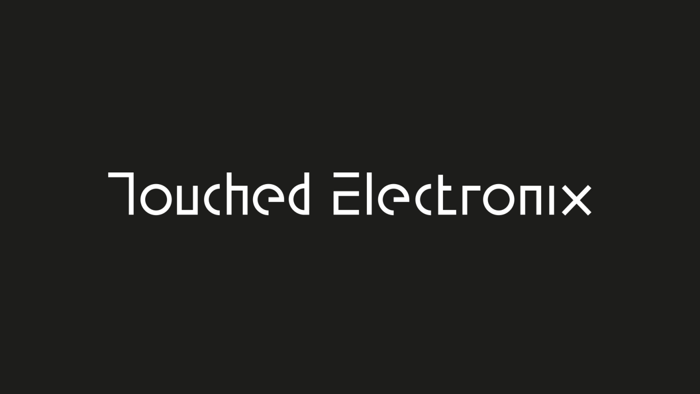
Logo and identity, including custom typeface and record sleeve design for a series of five double vinyl compilations.
The design of the wordmark led to the idea of a complete custom typeface, this was key in developing a distinctive look for the label and went on to form the basis of the record sleeve designs. The strong visual language established with 001 makes the labels releases easily recognisable – either as a small image on a website or across a record shop.
Commissioned by Touched Electronix.
4 years agoSync 24 - Inside The Microbeat
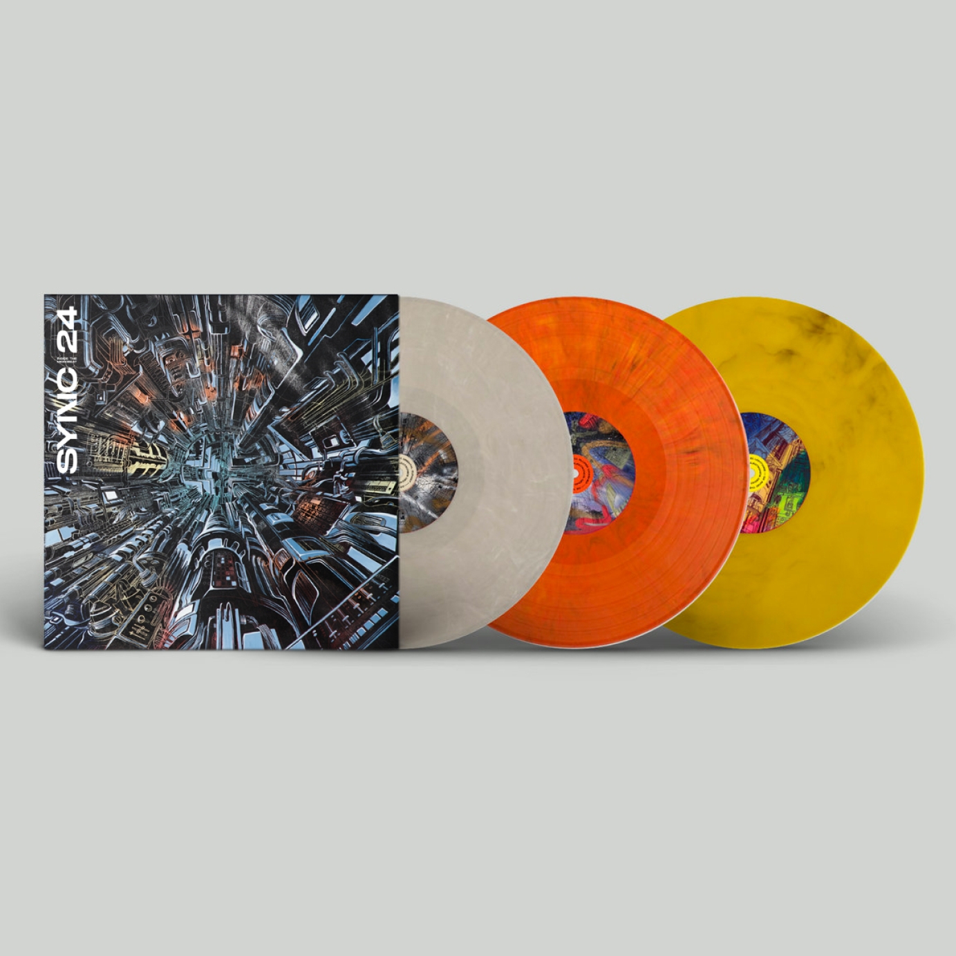
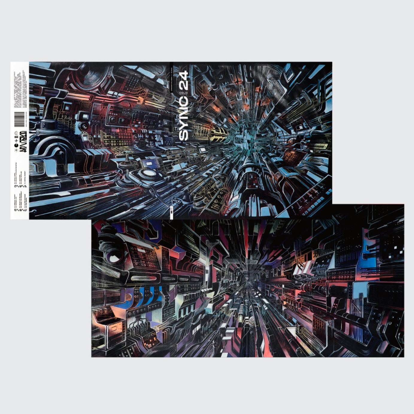
Sync 24 debut album - Inside The Microbeat. A tunnel infinitely disappearing into the distance built of drum machines, samplers and synths. The drawings were silkscreen printed onto hand painted canvas backgrounds in many different variations. Released as a limited edition triple coloured vinyl, each containing a signed square of the original canvas artwork by Will Barras.
Commissioned by Cultivated Electronics.
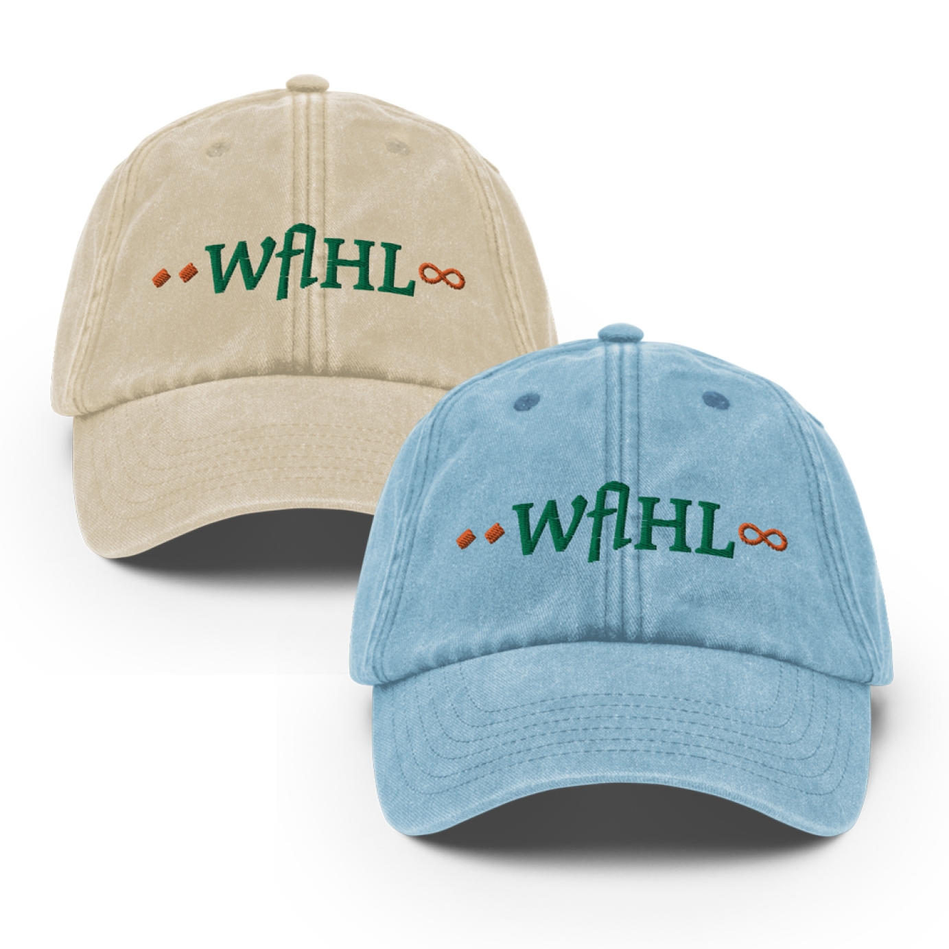
4 years agoLogo rebrand and merch launch for London duo WAHL
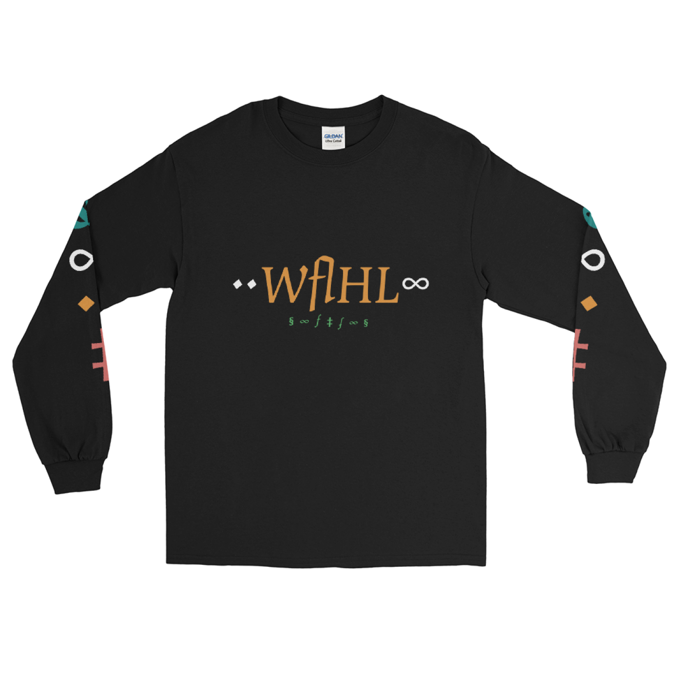
I recreated the logo for London duo WAHL to reflect their new direction. The brief was to create something androgynous and skate-aestehtic inspired, for use online but also to be applied to a new line of merch. I had great fun working with typographic themes to built a new logo based upon characters and the symbolism of "two". We explored different angles that would reflect the duo being more than the sum of their parts, whilst also still representing the two members all the same. This included the use of infinity, ampersands, doubling symbols into pairs and an overall aesthetic of symmetry and balance as if one always reflected the other. I took inspiration from skateboarding street aesthetics and Japanese typographic design, knitting together a new universe of symbols in a colour pallette ready for social media as much as it was for print.
Commissioned by WAHL (AWAL).
4 years agoKing Goozy - Logo
Logo design for KING GOOZY
Commissioned by King Goozy.
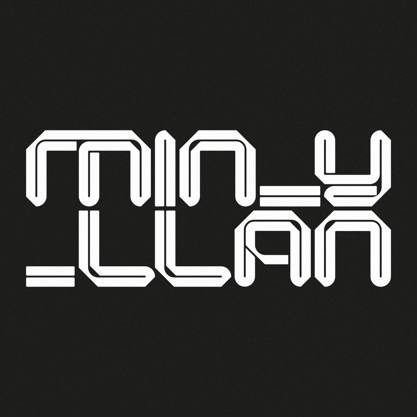
4 years agoMin-Y-Llan logo
Artist logo created for Welsh electronica artist Min-Y-Llan.
Commissioned by Touched Music.
4 years agoThe Scarlet Coast Design + Art Direction
Wordmark design and cover designs for a new band in the Pacific Northwest.
Commissioned by The Scarlet Coast.
4 years agoSatellite 79 Band Logo
Retro style logo for a traditional rock band.
Commissioned by Kevin Botha.
4 years agoFabiana Palladino - Logo
Logo and Typography design for Fabiana Palladino, XL Recordings
Commissioned by XL Recordings.
4 years agoMortivius - Logo Design
We recently worked with our friends in Mortivius with producing their new logo.
4 years agoAmber Mark Logo
Official artist logo for Amber Mark.
Commissioned by EMI at Universal Music Group.
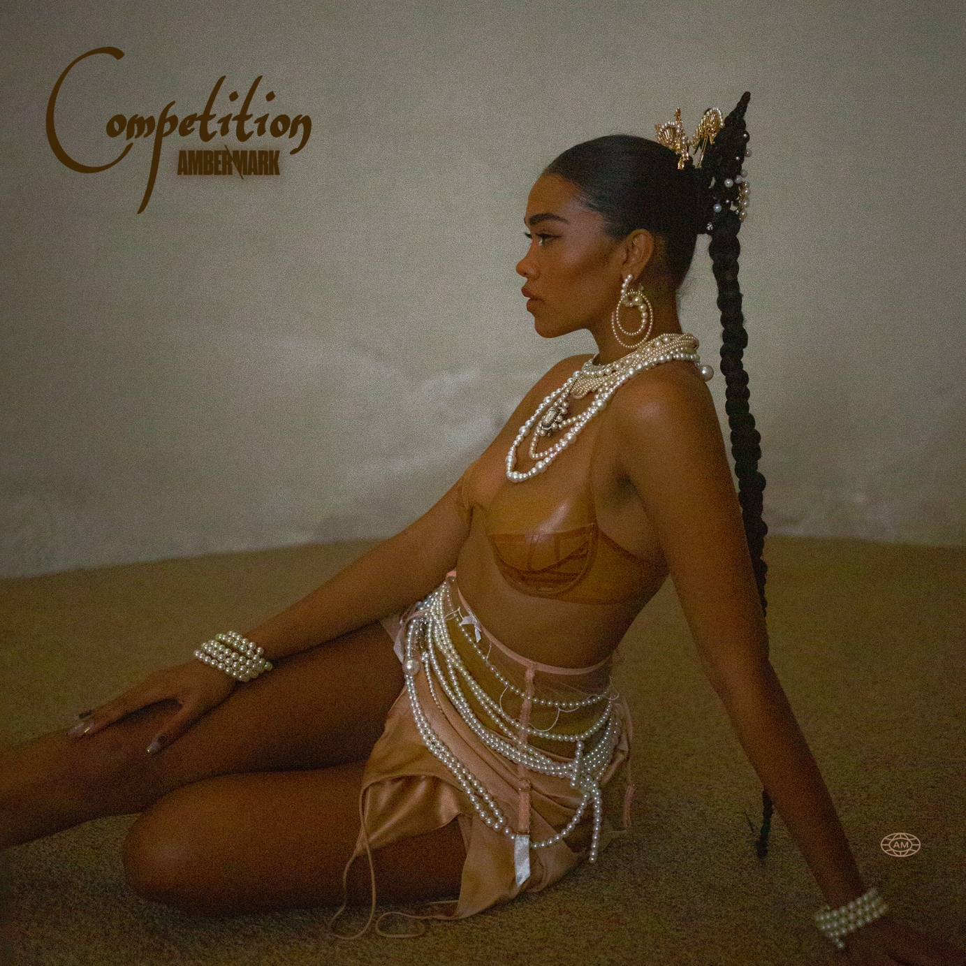
4 years agoAmber Mark - Competition
Single cover for "Competition" by Amber Mark.
Commissioned by EMI at Universal Music Group.
4 years agoASHNIKKO - Logo
Logo design for Ashnikko
Commissioned by Parlophone Records.
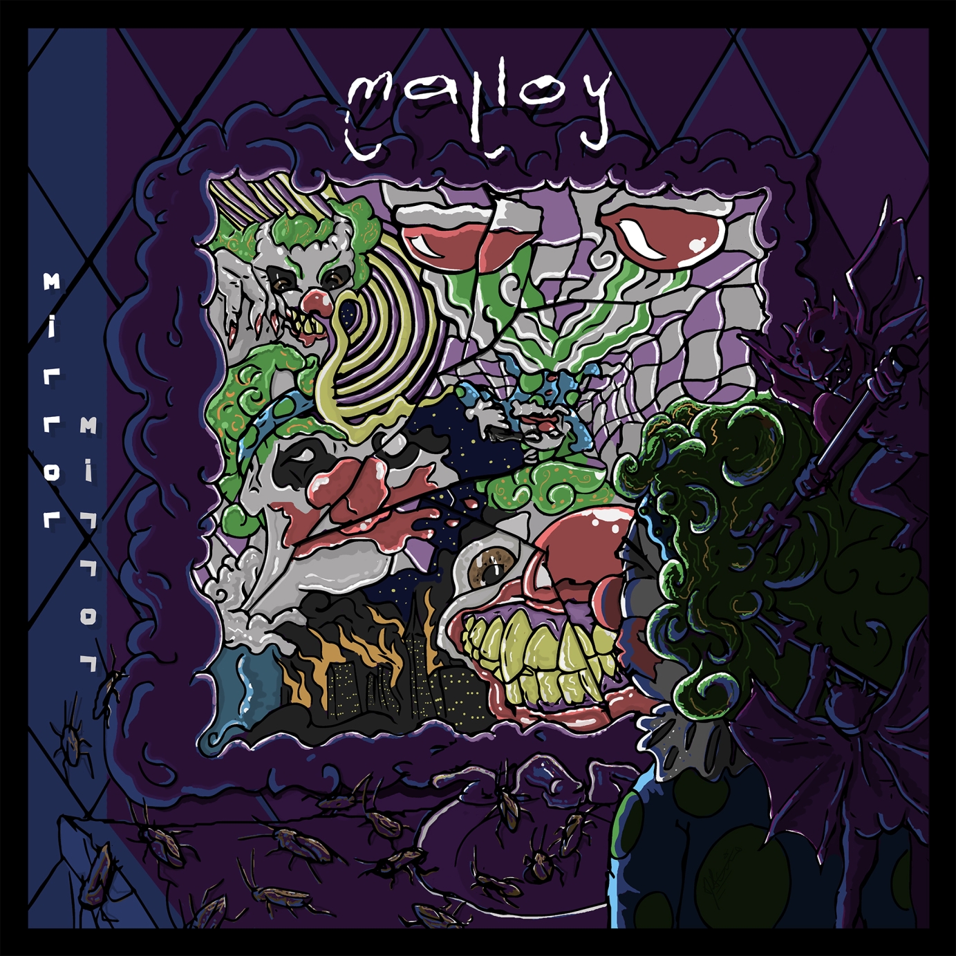
4 years agoMirror Mirror' Album Cover & Logo
I was commissioned by experimental rapper, Malloy, to develop a logo for the artist and create a digitally illustrated album cover for the digital release of his album, 'Mirror Mirror'. After being given a stick figure drawing depicting his idea for the cover, I took the concept and shot for the stars. The influence for this specific project came from the Eminem cartoon as well as my own animation style.
Commissioned by Malloy.
4 years agoALETULLE | Logo & Merch Design
Produced by Skateaway Pictures
Graphic design and animation by Alejandra Lopez Martin
London, 2021
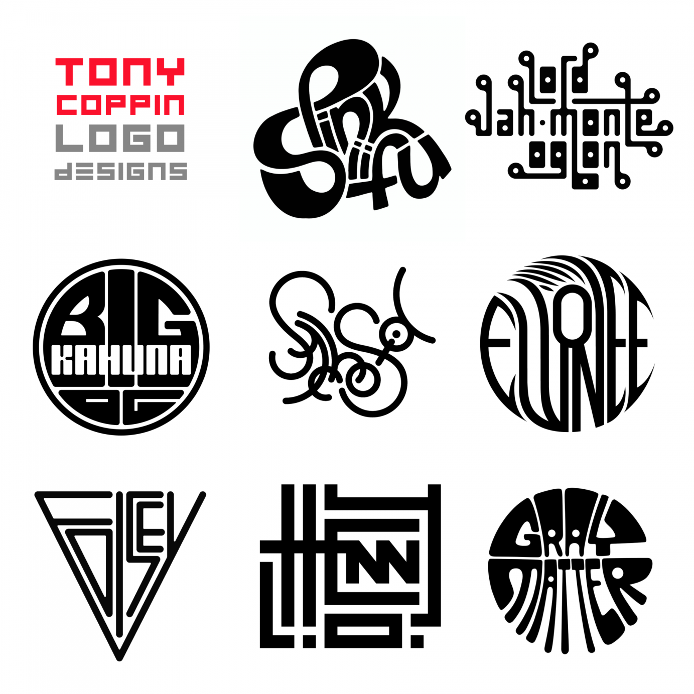
4 years agoLOGO DESIGNS
A series of logotype designs for underground rappers and producers which I developed into 3d rings.
5 years ago
