
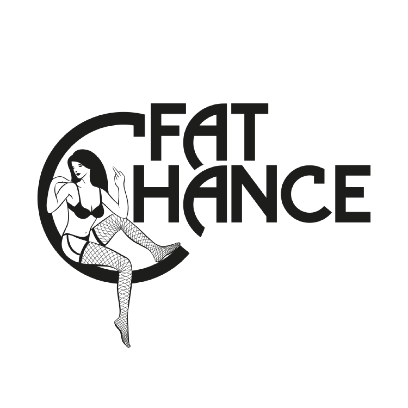
'Fat Chance' Logo
Image
Image
Image
Image
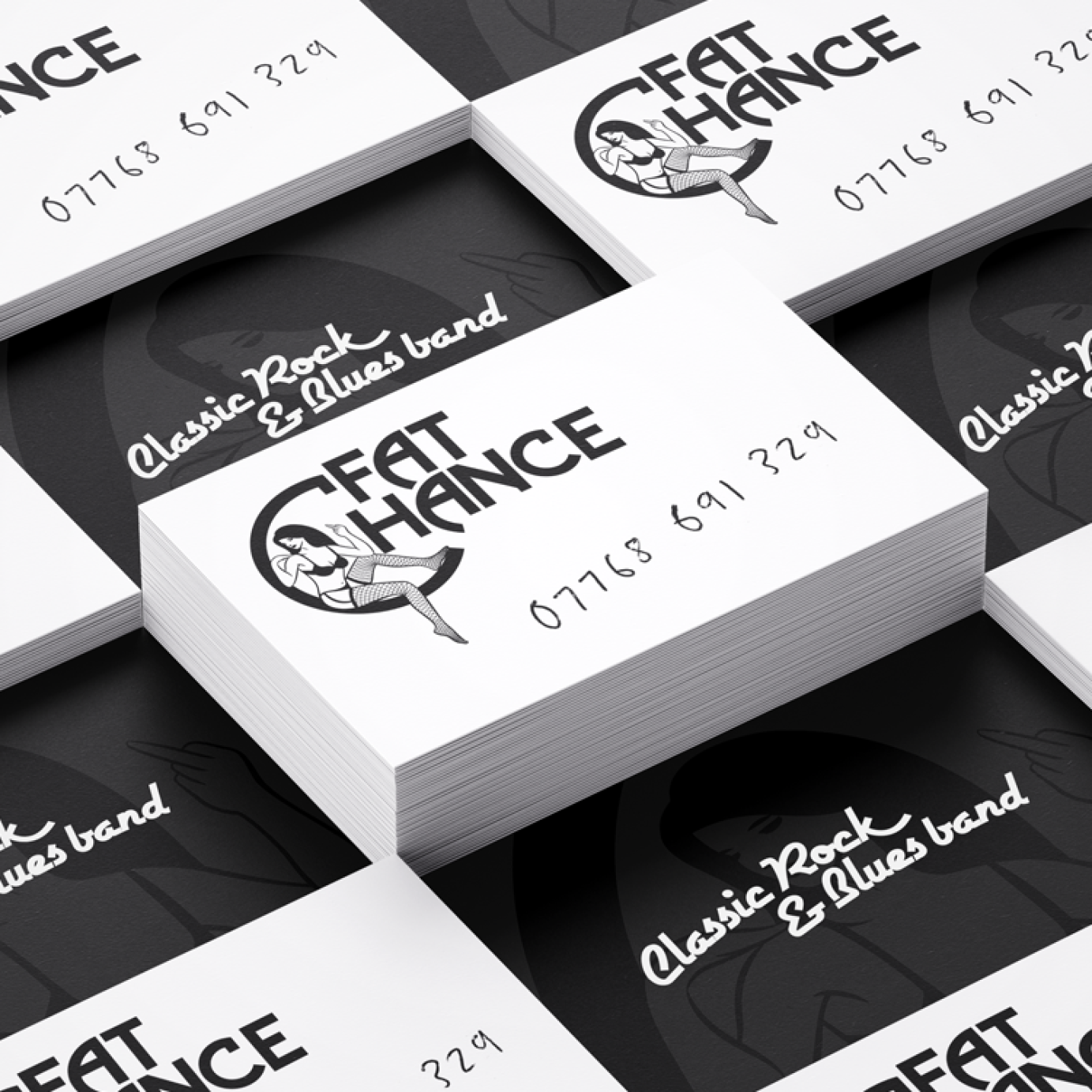
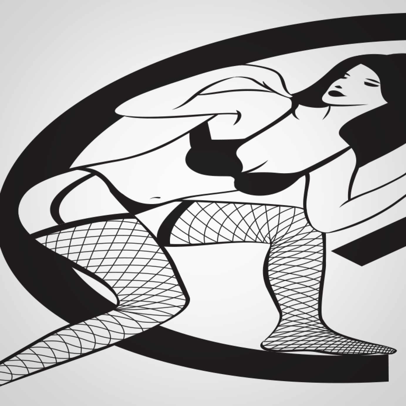
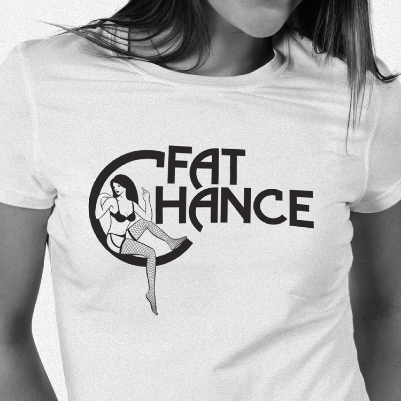
A middle-aged rock and blues band with a self-deprecating sense of humour, the name was a gift, I just had to run with the joke. The logo makes the well-worn connection between rock'n'roll and sex, but subverts the trope through the disinterested pin up atop a heavily 70's Clapton-esque typeface. Taking it one step further, the contact details were scrawled across the card as if handwritten at a gig, despite there being 'fat chance'.