Image
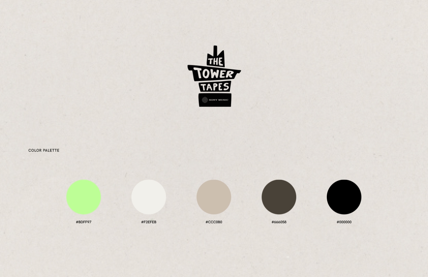
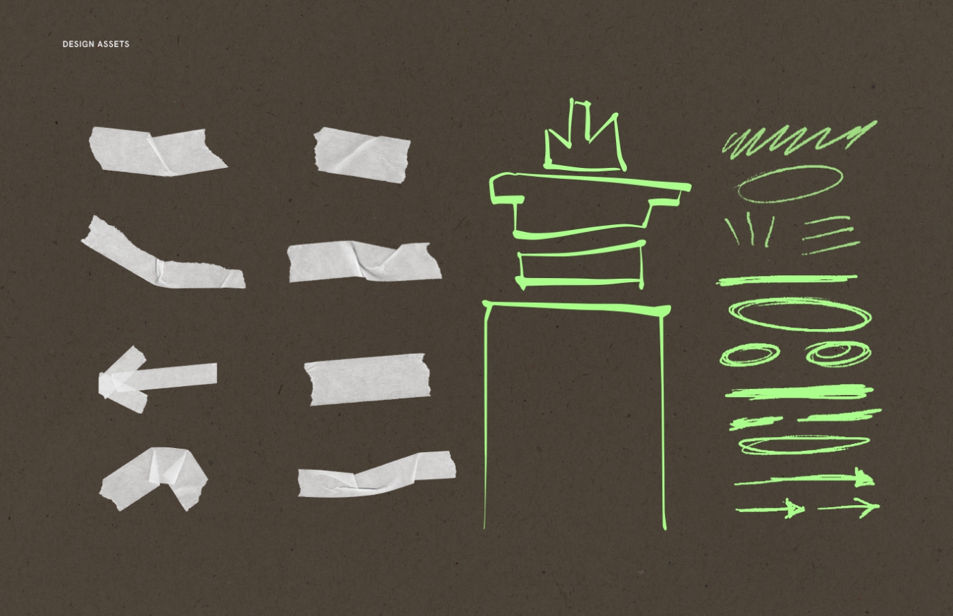
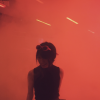
The Tower Tapes is a dynamic live music platform hosted by Sony Music, showcasing the talents of the moment -both nationally and internationally.
I had the pleasure of shaping its visual identity, from creating a photography plan and shooting the artists to designing playful, analogue-inspired visuals. Using handmade elements like handwritten text, scanned tape, and ripped paper, I crafted a cohesive style that extended to social media assets, invites, and merch. While the logo was pre-existing, I ensured the overall design complemented it seamlessly, enhancing the platform’s unique energy.
Commissioned by Sony Music Entertainment.
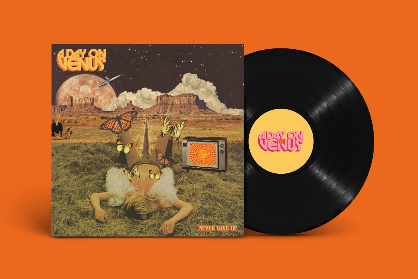
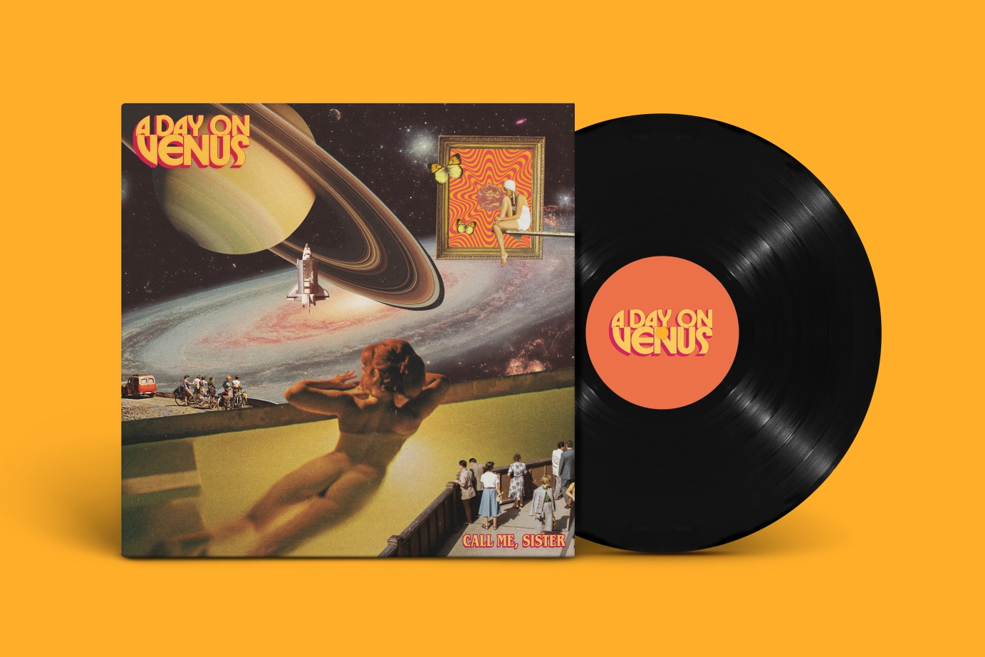
A 70s-inspired brand refresh and cover art designs for british band A Day on Venus.
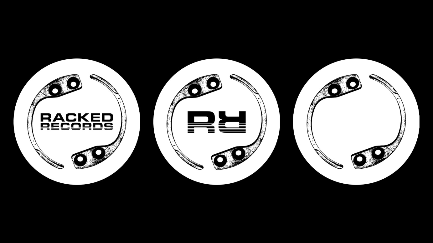

I was asked to help come up with an identity for record label Racked Records. For the logo the brief was to include some sort of security tag that you would usually find on some products/items of clothings in stores. I wanted to create something minimal but also to bear in mind that the logo would be seen on record centre labels, so I wanted it to look cool if it was spinning on a record.
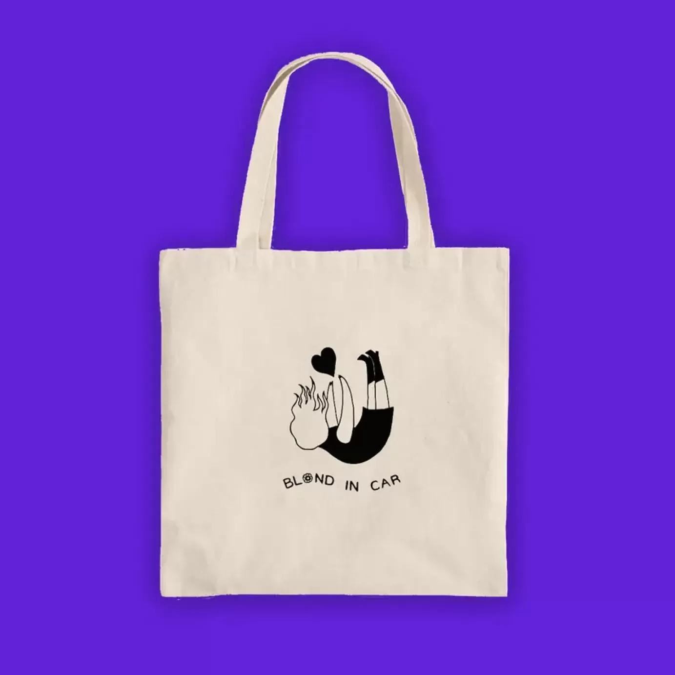
As well as this I also Designed the artwork for the Sweet Chill EP by Samurai Breaks was such an enjoyable project. The brief was to make the sleeve resemble the packaging of a Thai sweet chilli sauce bottle. To achieve this, I styled the top and bottom of the sleeve to mimic the plastic bottle, with the "sauce" visible behind it. The label was intentionally designed with a slightly "stock image" feel to enhance the aesthetic, featuring playful nods to nutritional details you’d find on real packaging—reimagined with a musical twist, including the tracklist and a cheeky note of 160 burns per minute.
Credits:
Sleeve photography: Cicely Grace.
Racked Records logo illustration featured on Sweet Chilli EP: Tavs World.
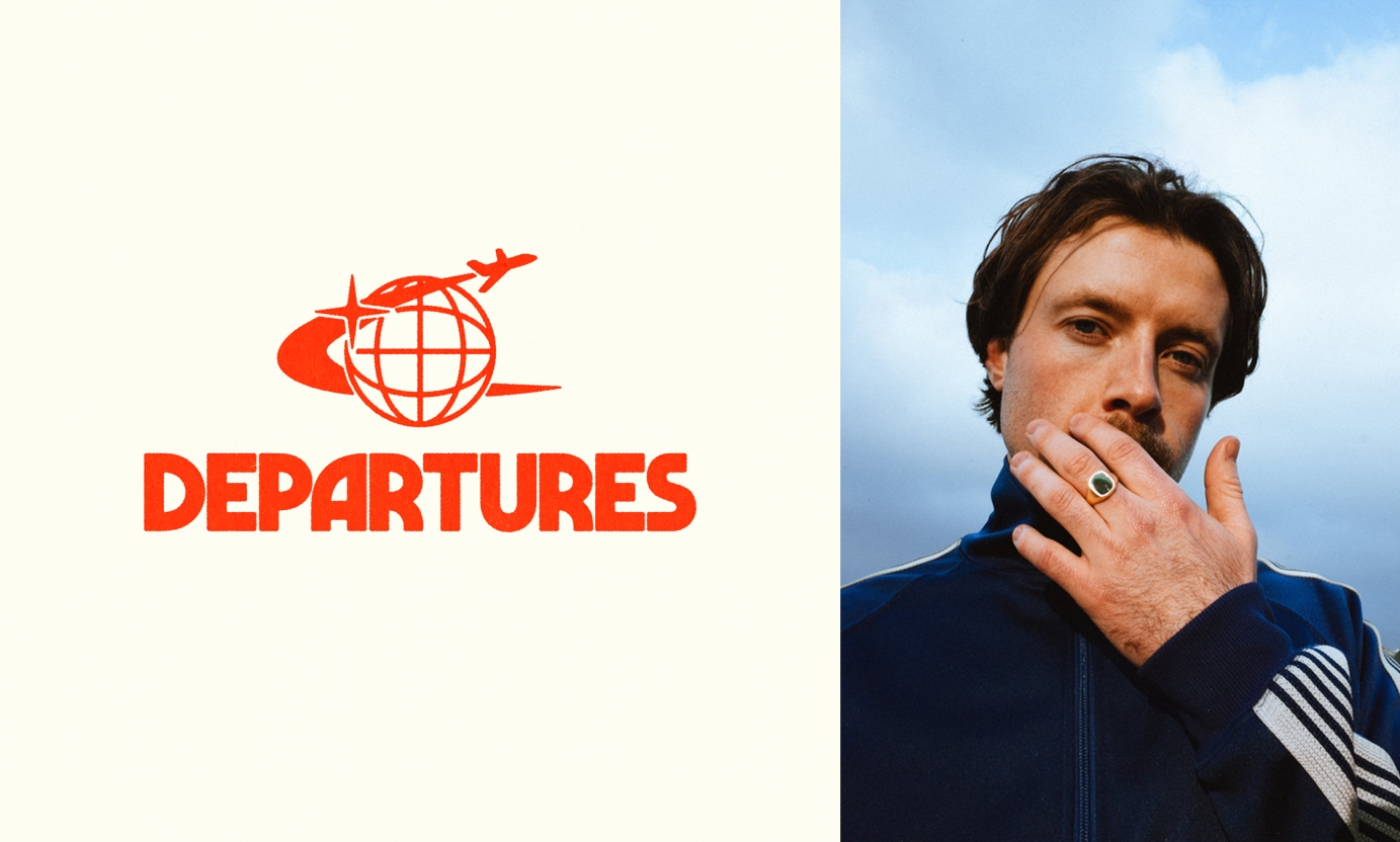

Branding for Charlie Boon's event's company 'Departures'


The 02DATRAP® Sharingan Fitted Caps were designed as a tribute to the legendary Lake Elsinore Storm Caps, which were synonymous with the UK grime scene during the early 2000s. This concept was inspired by the iconic Sharingan sound effect from the Naruto anime franchise, which is used by BACK2DATRAP producer Bally as his producer tag throughout Lancey’s mixtape.
This capsule was created in partnership with Years of Tears, a London based punk brand owned and run by Lancey’s close friend and fashion designer, Slik Syd
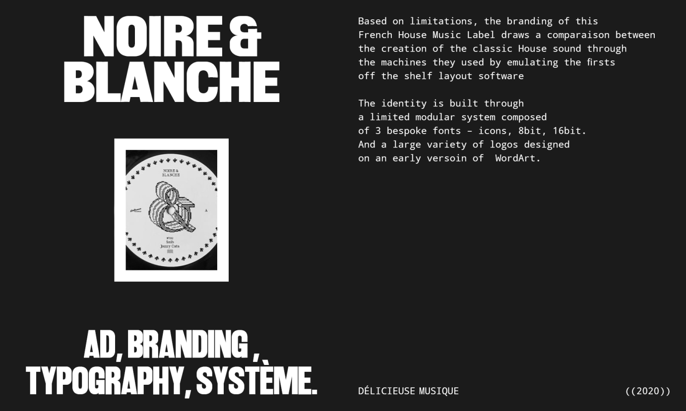
Based on limitations, the branding of this
French House Music Label draws a comparaison between the creation of the classic House sound through
the machines they used by emulating the firsts
off the shelf layout software
The identity is built through
a limited modular system composed
of 3 bespoke fonts – icons, 8bit, 16bit.
And a large variety of logos designed
on an early versoin of WordArt.
Created a logo and merch design for artist Baby Draco


I worked on the brand refresh for West End Records, an American music record label that focuses on Electro, Disco, Garage House, Boogie, and Hip-Hop genres.
I had to simplify and modernise the logo, and develop a fun and modern aesthetic inspired by Keith Haring's illustrations. His illustrations were a big part of Paradise Garage, the iconic club in New York where West End's disco music was prominently played.
/ Logo
/ Branding
/ Illustration
/ Marketing assets (static and animated)
/ Digital Album Art
Commissioned by BMG.
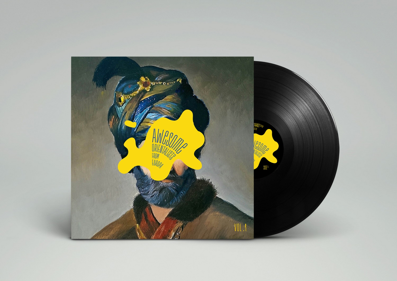
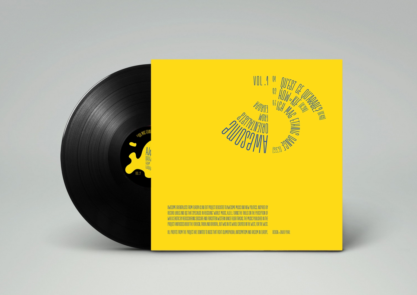
Full branding and graphic design for Awesome Orientalists From Europa 3 part project.