Image
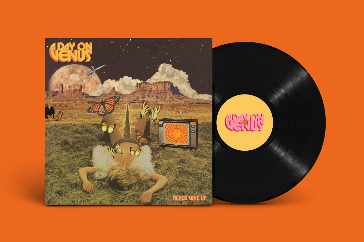
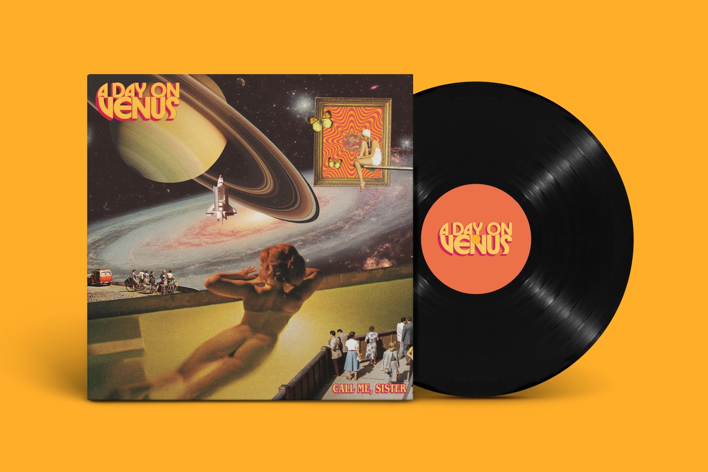
A 70s-inspired brand refresh and cover art designs for british band A Day on Venus.
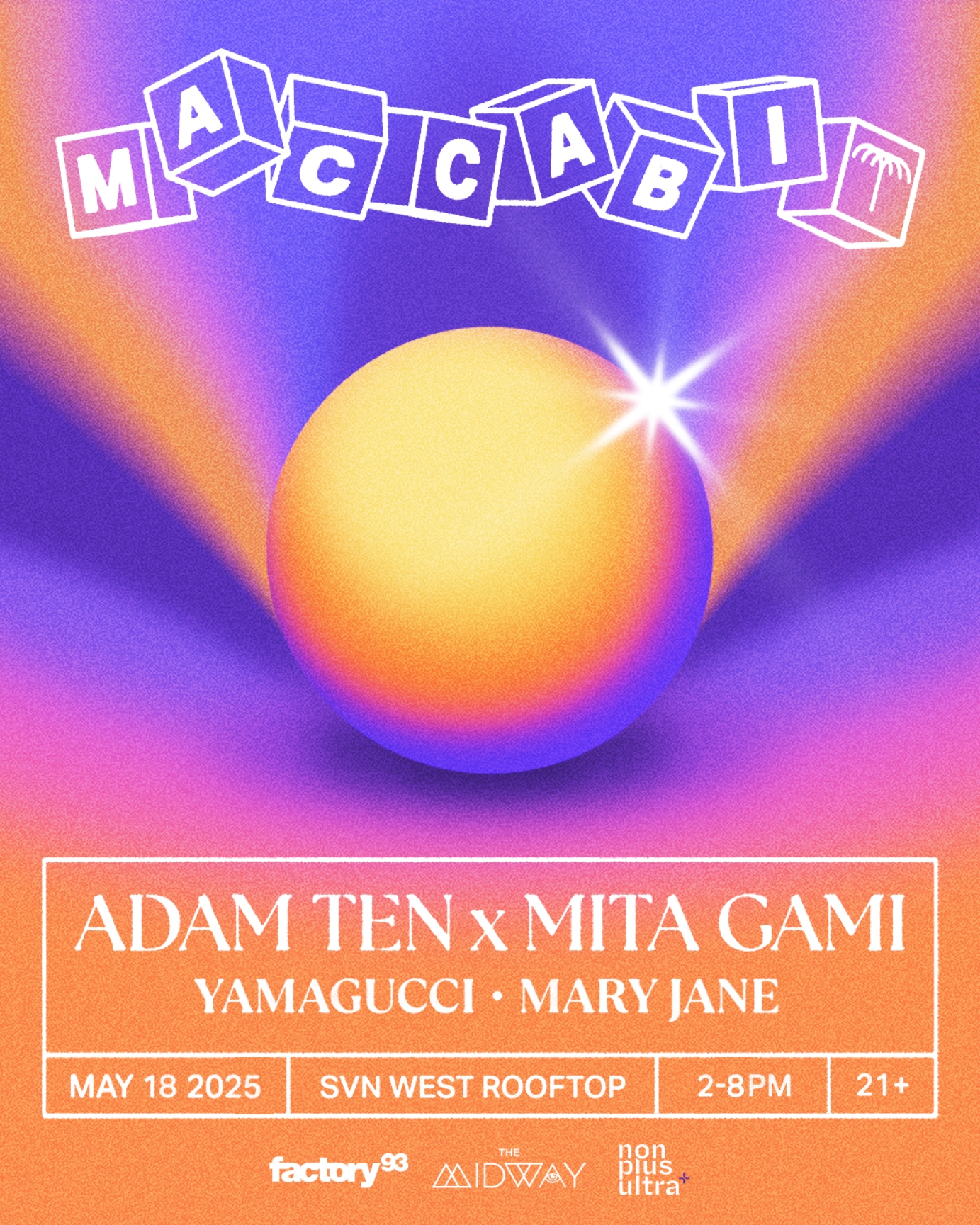
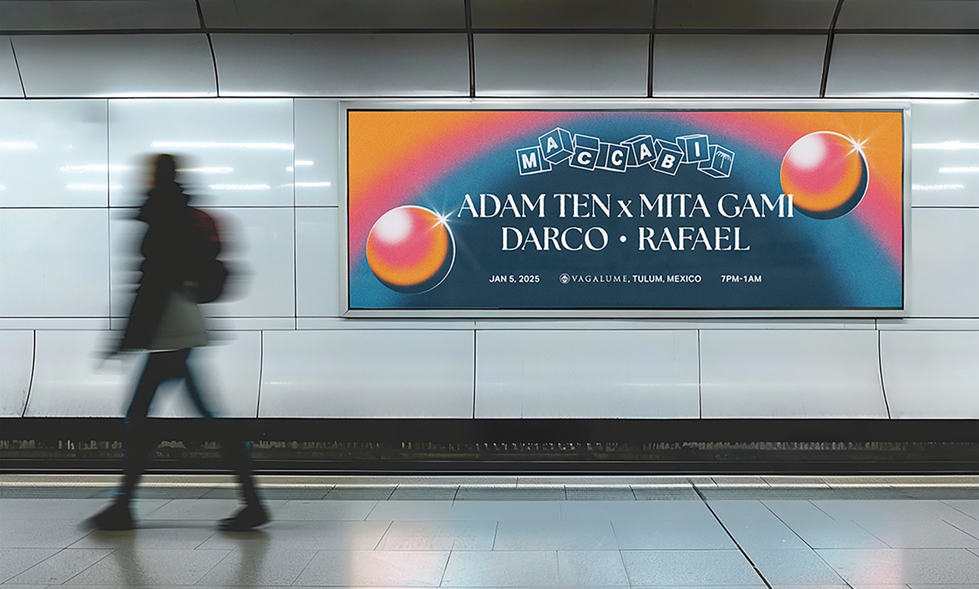
Branding and Creative Direction for Adam Ten x Mita Gami's company 'Maccabi House'
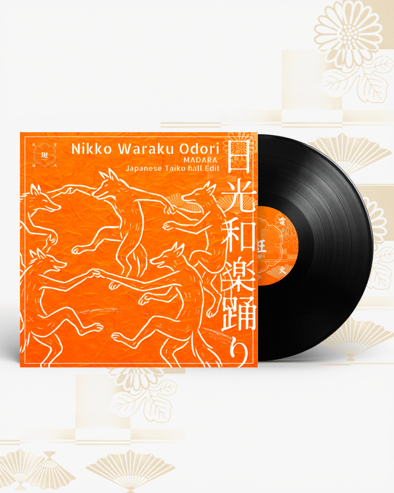
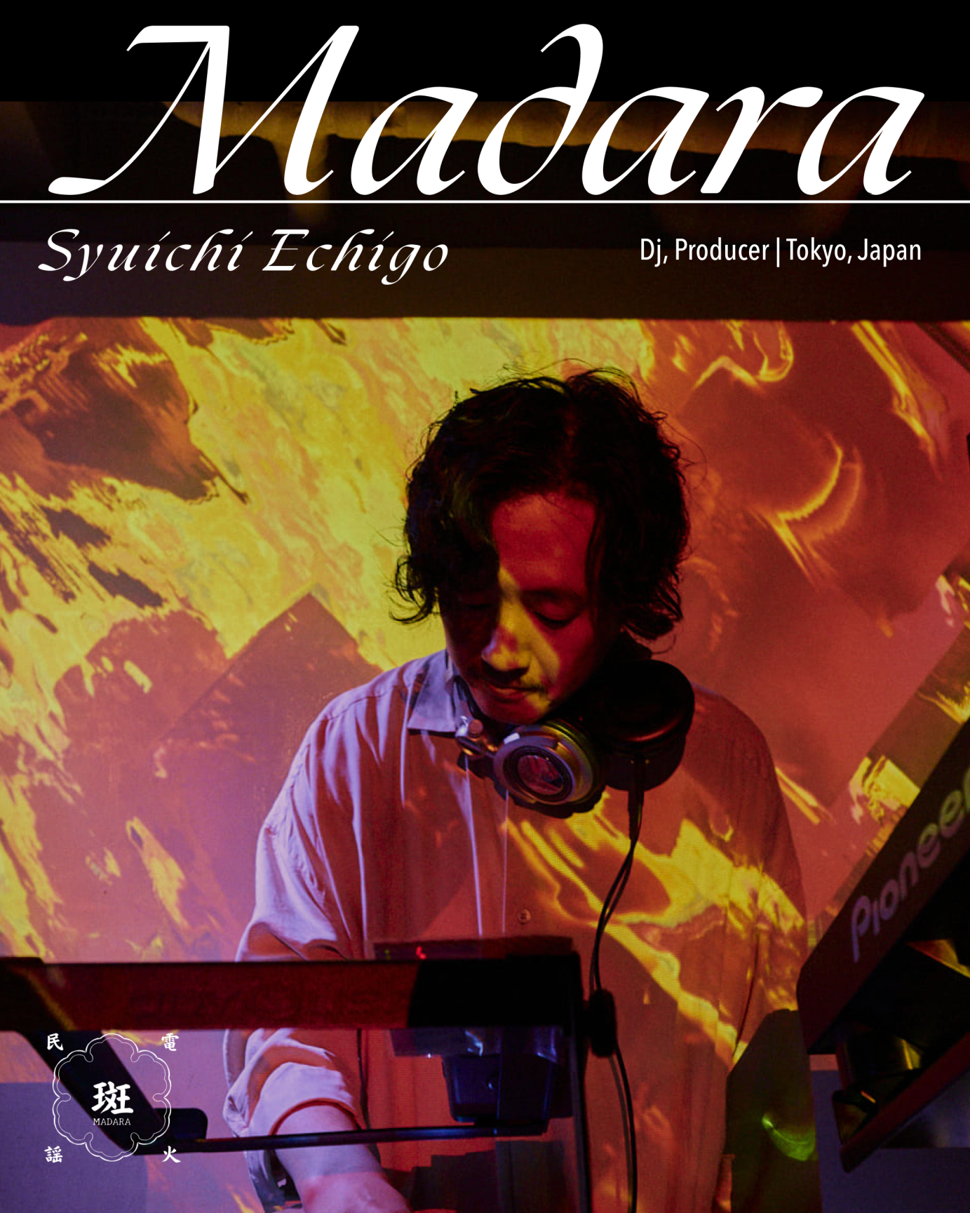
Artist Visuals #01 — Madara @echi55555_djmadara
As part of an ongoing project exploring how visual identity can reflect sonic character, I’m collaborating with independent artists to translate their sound into cover artwork and promotional visuals.
Madara (Syuichi Echigo) is a Tokyo-based DJ and producer originally from Osaka, known for reinterpreting Japanese folk traditions (min'yō) into contemporary dance music. A resident of @whitespacelab , his sets weave together tribal textures, world influences, and underground club aesthetics.
This artwork channels that hybrid energy—ritualistic, rhythmic, and raw—using a process that blends AI image generation with custom composition, color, and typographic treatment.
Visual direction & design: @ntmsth_design
Track ID: 日光和楽踊り Nikko Waraku Odori(MADARA Japanese Taiko hall Edit)/栃木県民謡-FREE DL-
Available on Soundcloud - soundcloud. com / madara-tokyo
I’m currently open for collaborations with artists, producers, event organizers and labels seeking a tailored visual identity.
See the details on my website, find the link on my bio!


LEVI'S® CAME TO COLORSXSTUDIOS WITH ONE REQUEST:
'HELP US BRIDGE THE GAP BETWEEN OUR GLOBAL AUDIENCE AND GROWING BRAND...' OUR SOLUTION WAS TO FILL THAT GAP WITH MUSIC 🎶
LEVI'S - REFLECT YOUR ORGINALITÉ WITH JEWEL USAIN
#ReflectYourOriginalité is a reflection of our shared ideals. To be truly original is to be truly yourself. It means tapping into the personal experiences, values, and creativity that make us distinctive and unique— unapologetically flaunting those qualities to the world.
CURATION, CREATIVE CONTENT DESIGN, DIGITAL ASSET PRODUCTION, RADIO PROGRAMMING, EXPERIENTIAL DESIGN & IRL PRODUCTION, PLATFORM AMPLIFICATION


An ever-evolving art direction
for Gayance's debut album
Carried by a painting of Bahati Simoens,
the identity references the rough aspect
of painters book from the 90's.
With near-illegible lettering
reflecting the idea of hiding or
discovering someone true self.
Commissioned by Rhythm Section International.


The 02DATRAP® Sharingan Fitted Caps were designed as a tribute to the legendary Lake Elsinore Storm Caps, which were synonymous with the UK grime scene during the early 2000s. This concept was inspired by the iconic Sharingan sound effect from the Naruto anime franchise, which is used by BACK2DATRAP producer Bally as his producer tag throughout Lancey’s mixtape.
This capsule was created in partnership with Years of Tears, a London based punk brand owned and run by Lancey’s close friend and fashion designer, Slik Syd


Hip Dozer is a french label
aspiring to represent a scene
often reducted to the term lo-fi.
We achieved this by distancing
the label from the visual stereotypes of the genre, removing typical imagery in favor of a bold,
custom typographic system.
The visual borrows from many eras
rearranging them the way a producer digging through records and reinterpreting samples. The inside
of the record sleeve compares this process
to a form of modern archaeology


Rag'n'Bone Man for Principle Magazine.
CREATIVE DIRECTION
Laurie TB and Max Giorgeschi
PHOTOGRAPHY
Max Giorgeschi
FASHION
Tanja Martin
GROOMING
Sara Bowden
SET DESIGN
Laurie TB
PHOTOGRAPHER’S ASSISTANT
Alex José
FASHION ASSISTANT
Elizabete Pakale
SET ASSISTANT
Isabella Armora
Commissioned by Columbia Records.


FSOLdigital presents Mind Maps 5
Artwork for a CD in an eight panel uncoated card digipak case and screen printed merchandise for part five of the annual Yage mix albums jointly released by Touched Music and FSOLdigital.
Like last year's Mind Maps 4, the background is based on just one satellite image — this time Pinacate National Park in Mexico from USGS on Unsplash. The wonderful natural colours go so well with the music, the yellows and dusky purple emphasising the acid sounds and darkness within the mix.
The angled, modern building on the front cover evokes the mysticism of the Central American pyramids which ties into the satellite imagery location. A bitmap image of a mountain is a recurring theme throughout the artwork and adds texture and interest. The idea of map grid references inspired a graph showing track durations and the way the mix fits together. Squares indicate a Yage remix and circles show FSOL/Yage/Humanoid tracks.
As with merchandise for the previous Mind Maps albums, the designs are not just a graphic from the album artwork. The t-shirt and hoodie were available for a limited time and hand screen printed to order by Exalt T-shirts.