Image
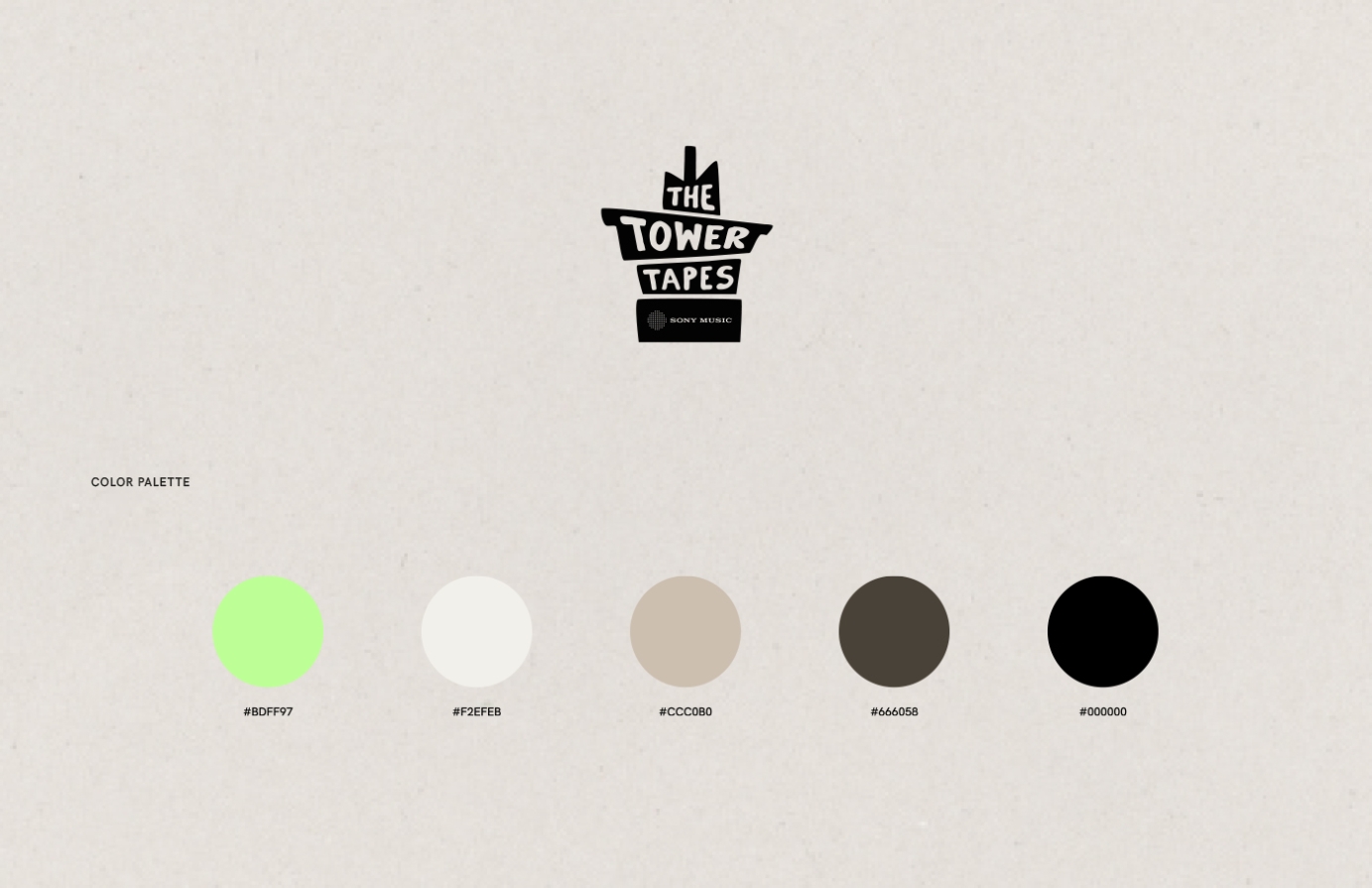
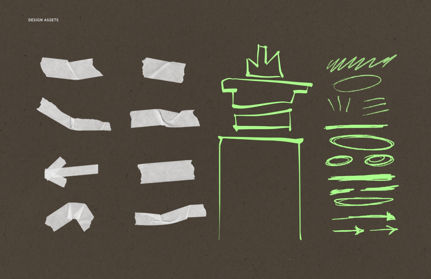
The Tower Tapes is a dynamic live music platform hosted by Sony Music, showcasing the talents of the moment -both nationally and internationally.
I had the pleasure of shaping its visual identity, from creating a photography plan and shooting the artists to designing playful, analogue-inspired visuals. Using handmade elements like handwritten text, scanned tape, and ripped paper, I crafted a cohesive style that extended to social media assets, invites, and merch. While the logo was pre-existing, I ensured the overall design complemented it seamlessly, enhancing the platform’s unique energy.
Commissioned by Sony Music Entertainment.
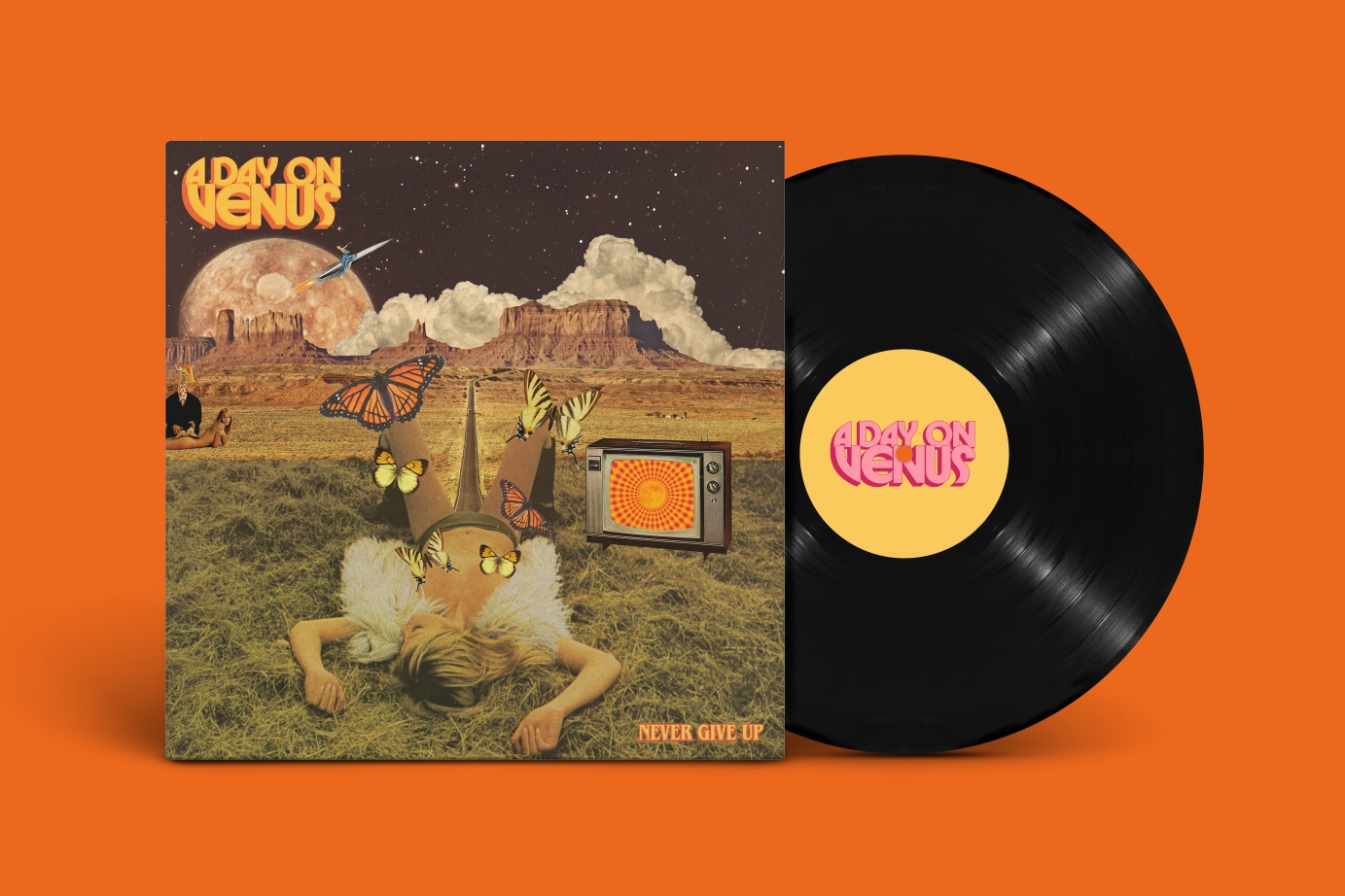
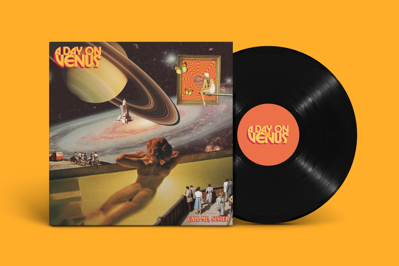
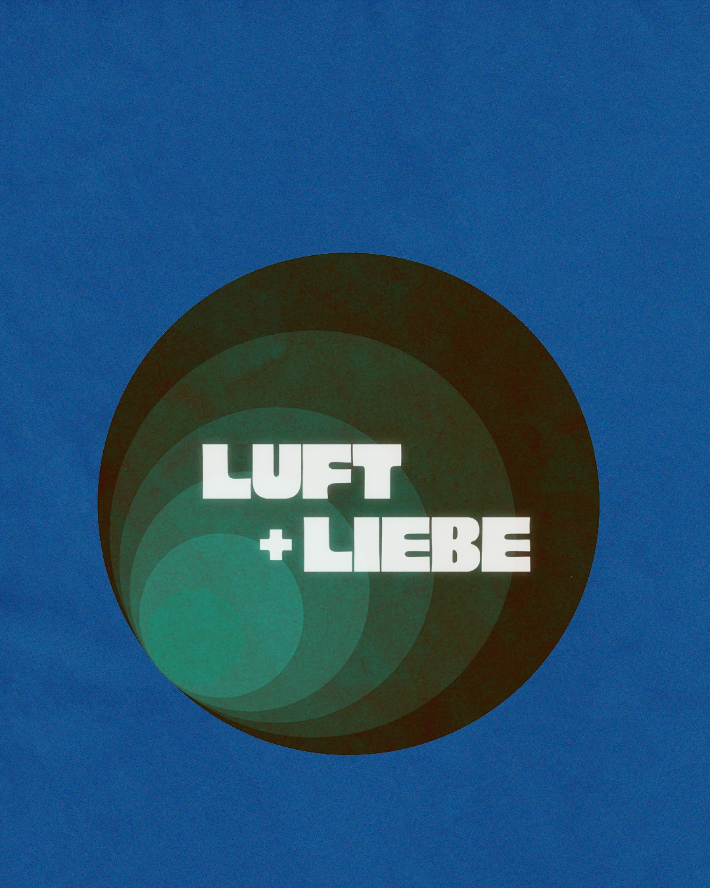
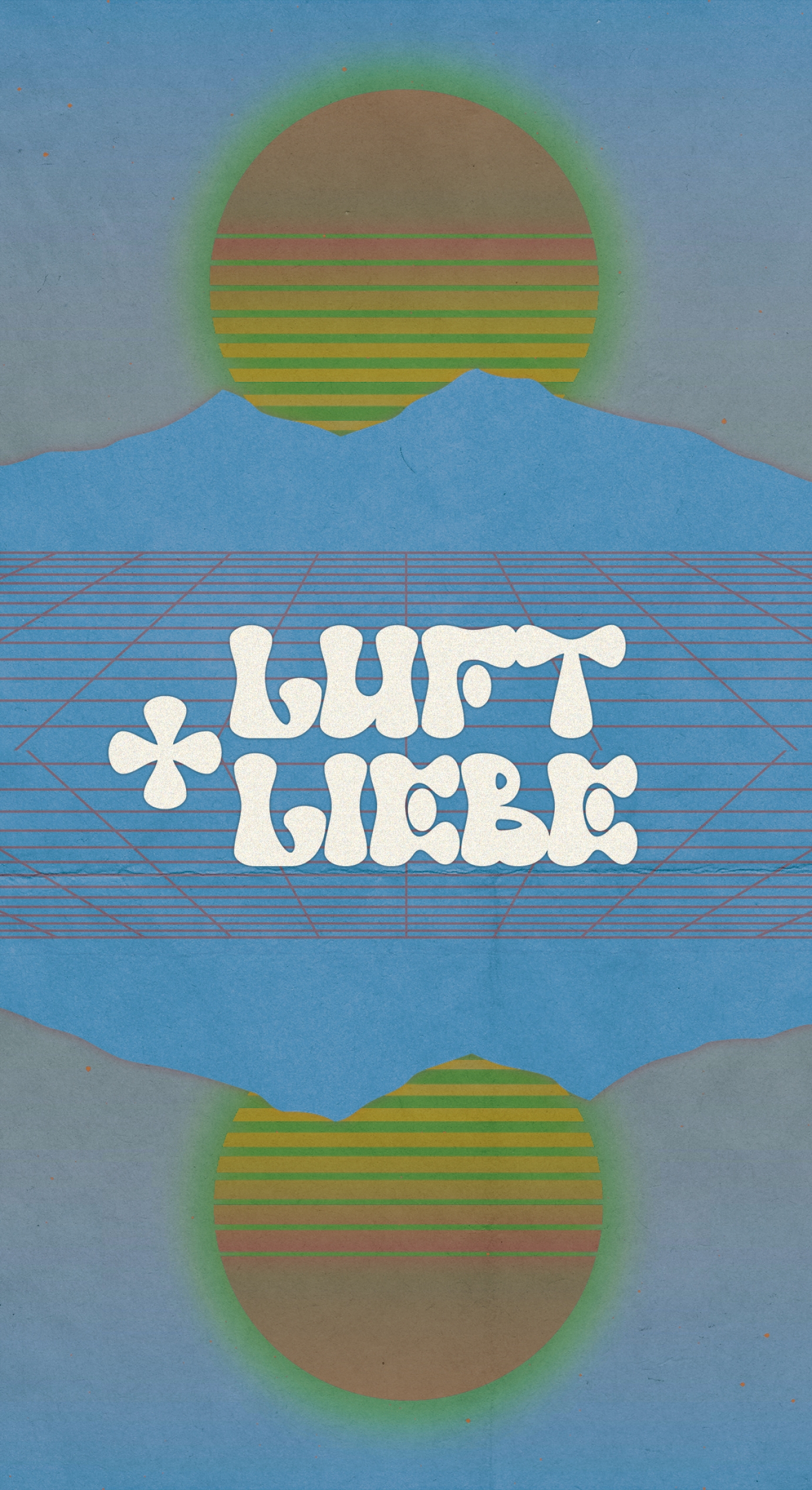
A 70s-inspired brand refresh and cover art designs for british band A Day on Venus.
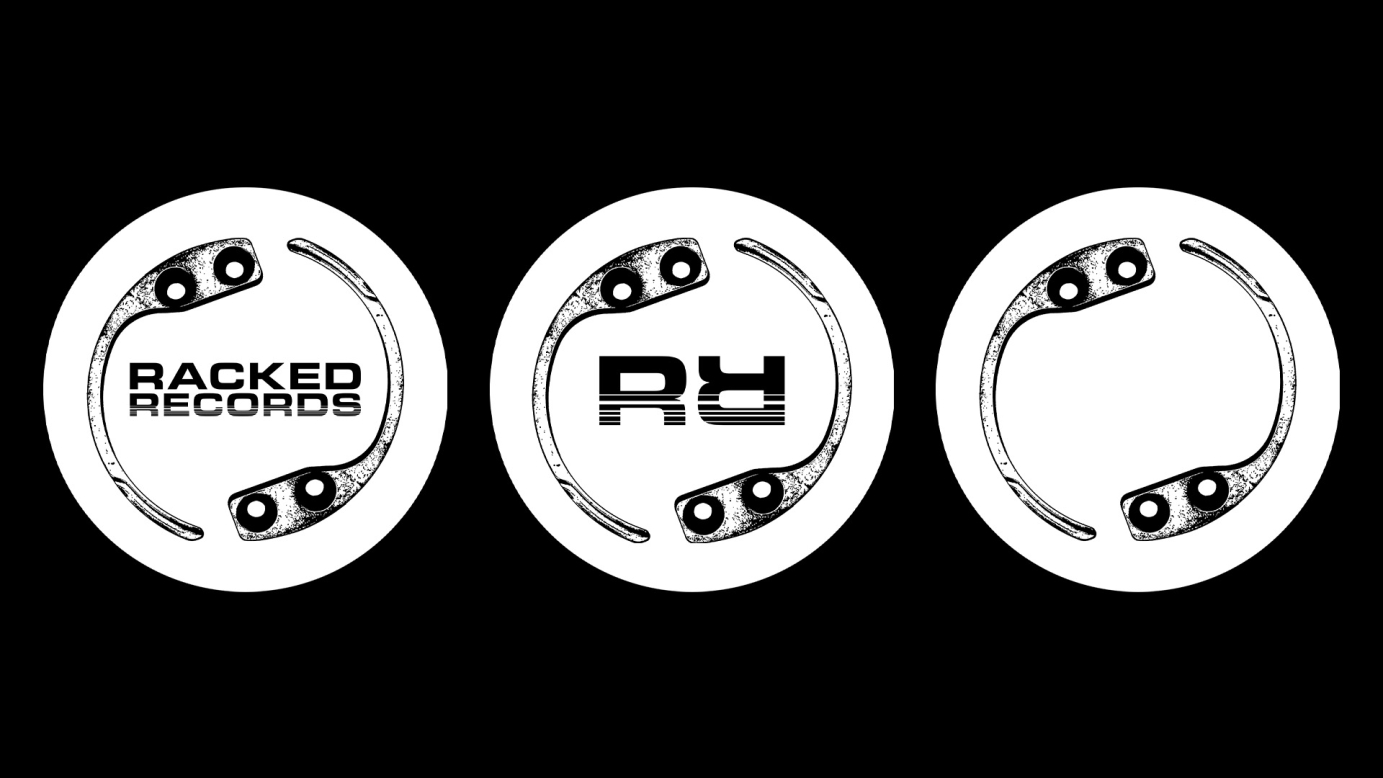

I was asked to help come up with an identity for record label Racked Records. For the logo the brief was to include some sort of security tag that you would usually find on some products/items of clothings in stores. I wanted to create something minimal but also to bear in mind that the logo would be seen on record centre labels, so I wanted it to look cool if it was spinning on a record.
As well as this I also Designed the artwork for the Sweet Chill EP by Samurai Breaks was such an enjoyable project. The brief was to make the sleeve resemble the packaging of a Thai sweet chilli sauce bottle. To achieve this, I styled the top and bottom of the sleeve to mimic the plastic bottle, with the "sauce" visible behind it. The label was intentionally designed with a slightly "stock image" feel to enhance the aesthetic, featuring playful nods to nutritional details you’d find on real packaging—reimagined with a musical twist, including the tracklist and a cheeky note of 160 burns per minute.
Credits:
Sleeve photography: Cicely Grace.
Racked Records logo illustration featured on Sweet Chilli EP: Tavs World.
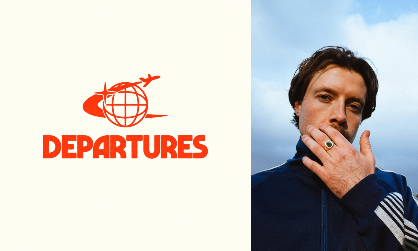

Branding for Charlie Boon's event's company 'Departures'


The 02DATRAP® Sharingan Fitted Caps were designed as a tribute to the legendary Lake Elsinore Storm Caps, which were synonymous with the UK grime scene during the early 2000s. This concept was inspired by the iconic Sharingan sound effect from the Naruto anime franchise, which is used by BACK2DATRAP producer Bally as his producer tag throughout Lancey’s mixtape.
This capsule was created in partnership with Years of Tears, a London based punk brand owned and run by Lancey’s close friend and fashion designer, Slik Syd
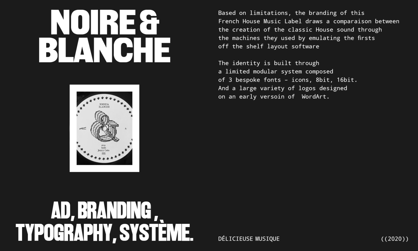
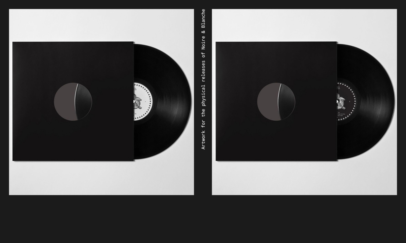
Based on limitations, the branding of this
French House Music Label draws a comparaison between the creation of the classic House sound through
the machines they used by emulating the firsts
off the shelf layout software
The identity is built through
a limited modular system composed
of 3 bespoke fonts – icons, 8bit, 16bit.
And a large variety of logos designed
on an early versoin of WordArt.
Created a logo and merch design for artist Baby Draco


I worked on the brand refresh for West End Records, an American music record label that focuses on Electro, Disco, Garage House, Boogie, and Hip-Hop genres.
I had to simplify and modernise the logo, and develop a fun and modern aesthetic inspired by Keith Haring's illustrations. His illustrations were a big part of Paradise Garage, the iconic club in New York where West End's disco music was prominently played.
/ Logo
/ Branding
/ Illustration
/ Marketing assets (static and animated)
/ Digital Album Art
Commissioned by BMG.
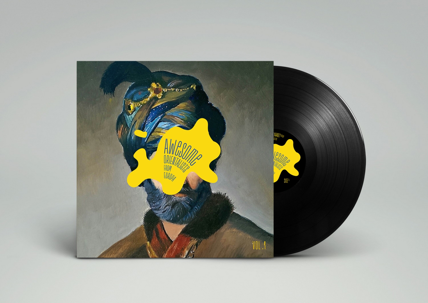
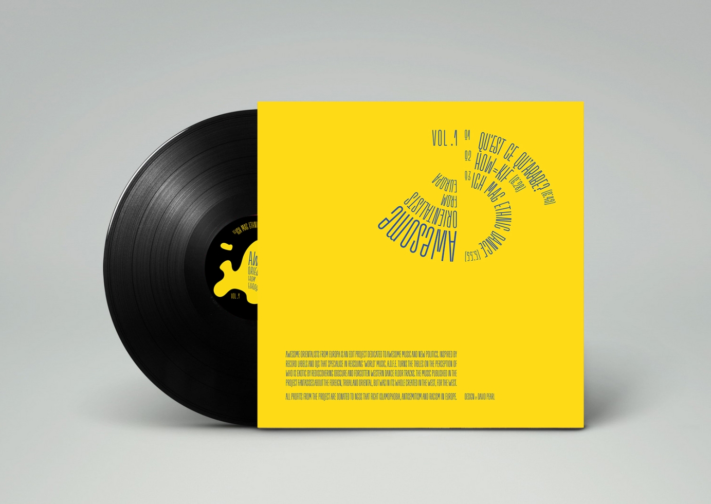
Full branding and graphic design for Awesome Orientalists From Europa 3 part project.

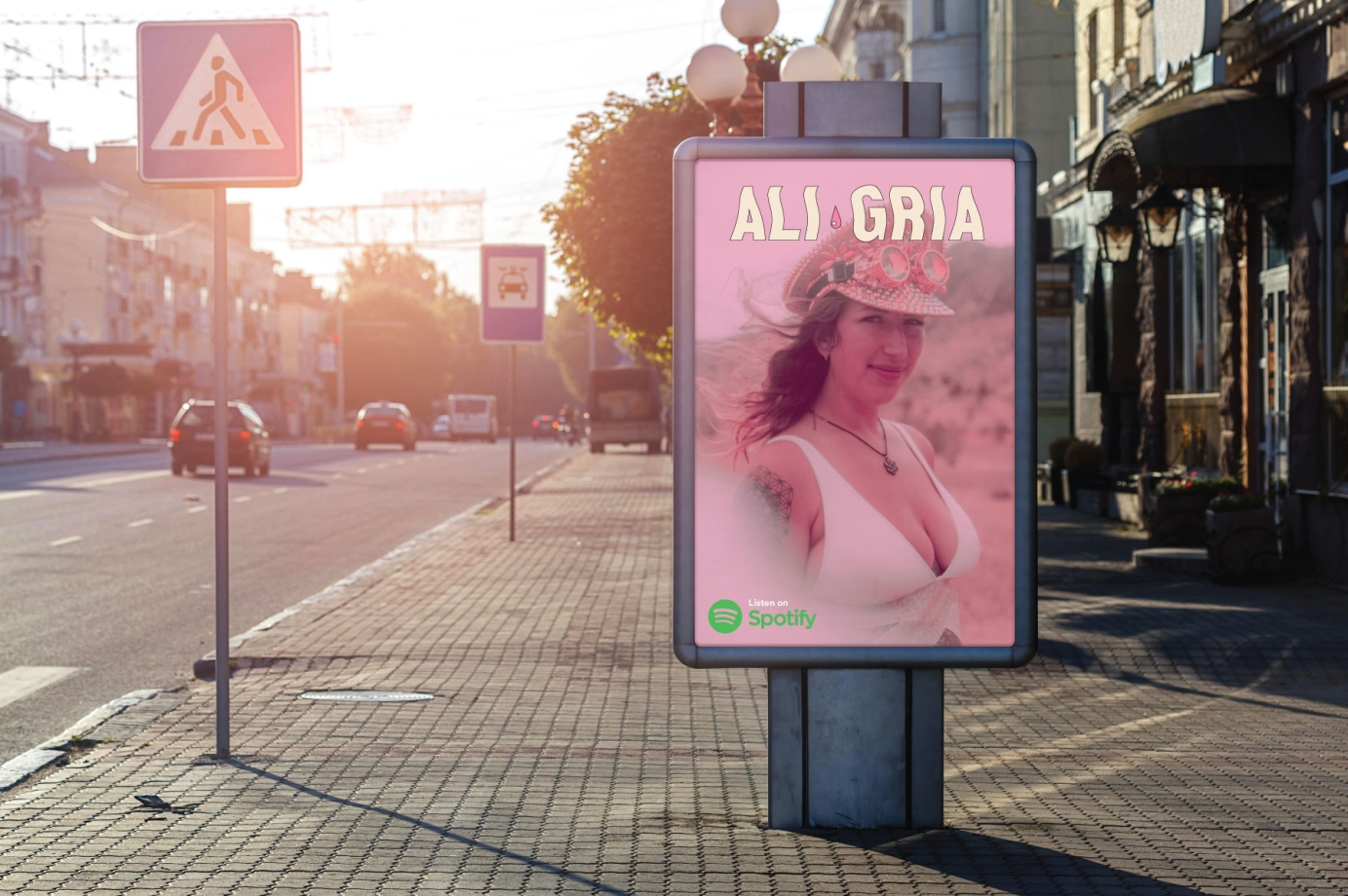
DJ & producer on a mission to connect, inspire, and uplift.
Ali Gria's brand journey is a harmonious blend of inspiration, inclusiveness, and innovation.
Her music resonates with the therapeutic power of dance and the unity it fosters within her diverse community of listeners.
Through this project, we transformed Ali Gria's brand to reflect her commitment to authenticity, sustainability, and mental health advocacy. Together, we created a vibrant brand that speaks to the heart, connecting individuals with a shared passion for music, dance, and personal growth.
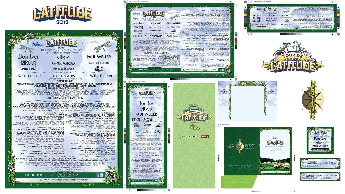
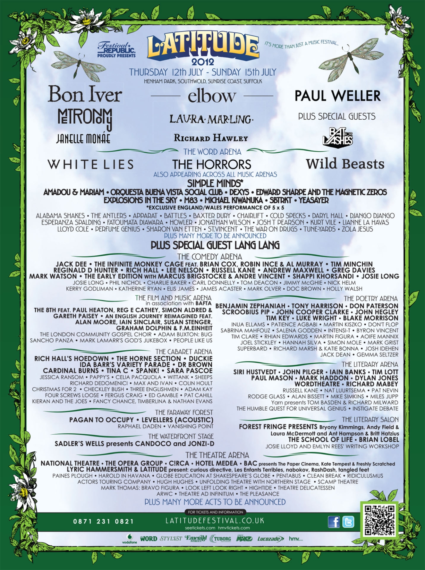
Concept artwork for Latitude Festival. Print ads (30+) for various newspapers and magazines (Guardian, Independent, TimeOut, NME, etc.). Longitude and Tour de Latitude sub logo designs. Press packs, web ads, HPTOs, OOH, DOOH.
Commissioned by Festival Republic.
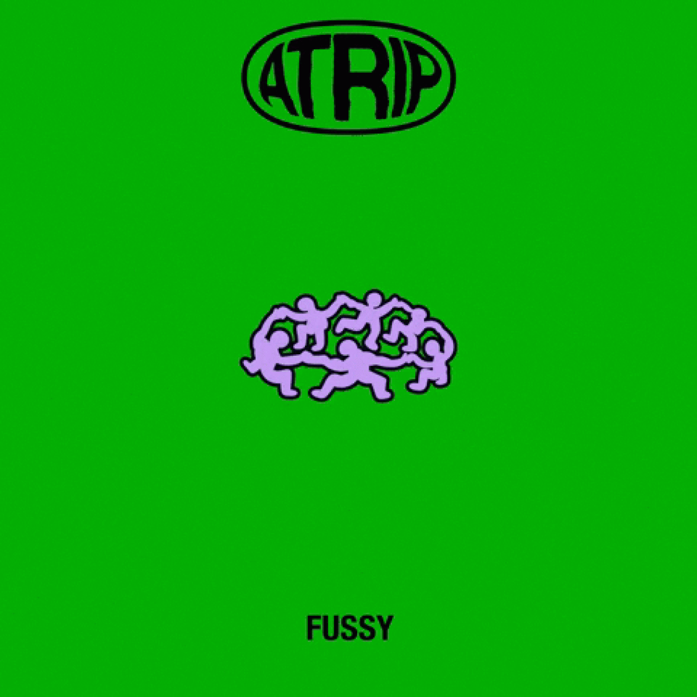
ATRIP branding including logo, logotype and mixtape release packshots
Commissioned by AWAL.
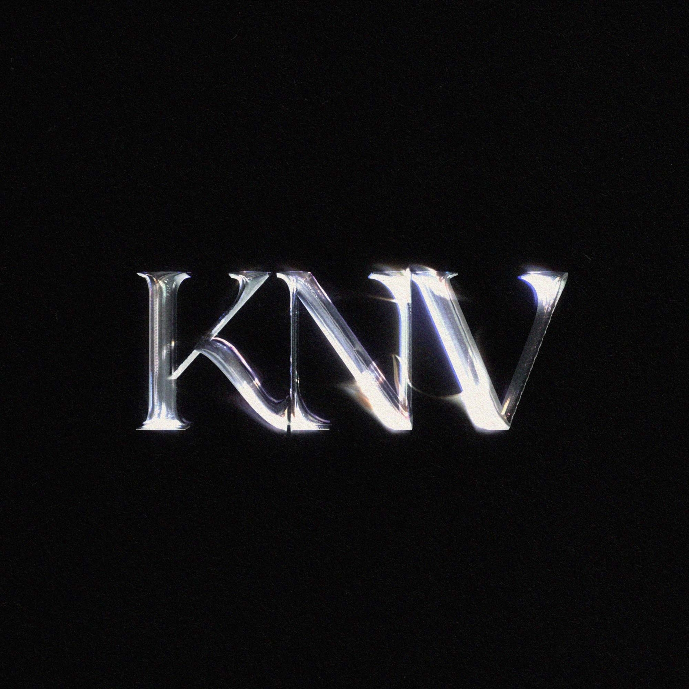
Artist logo for KNV
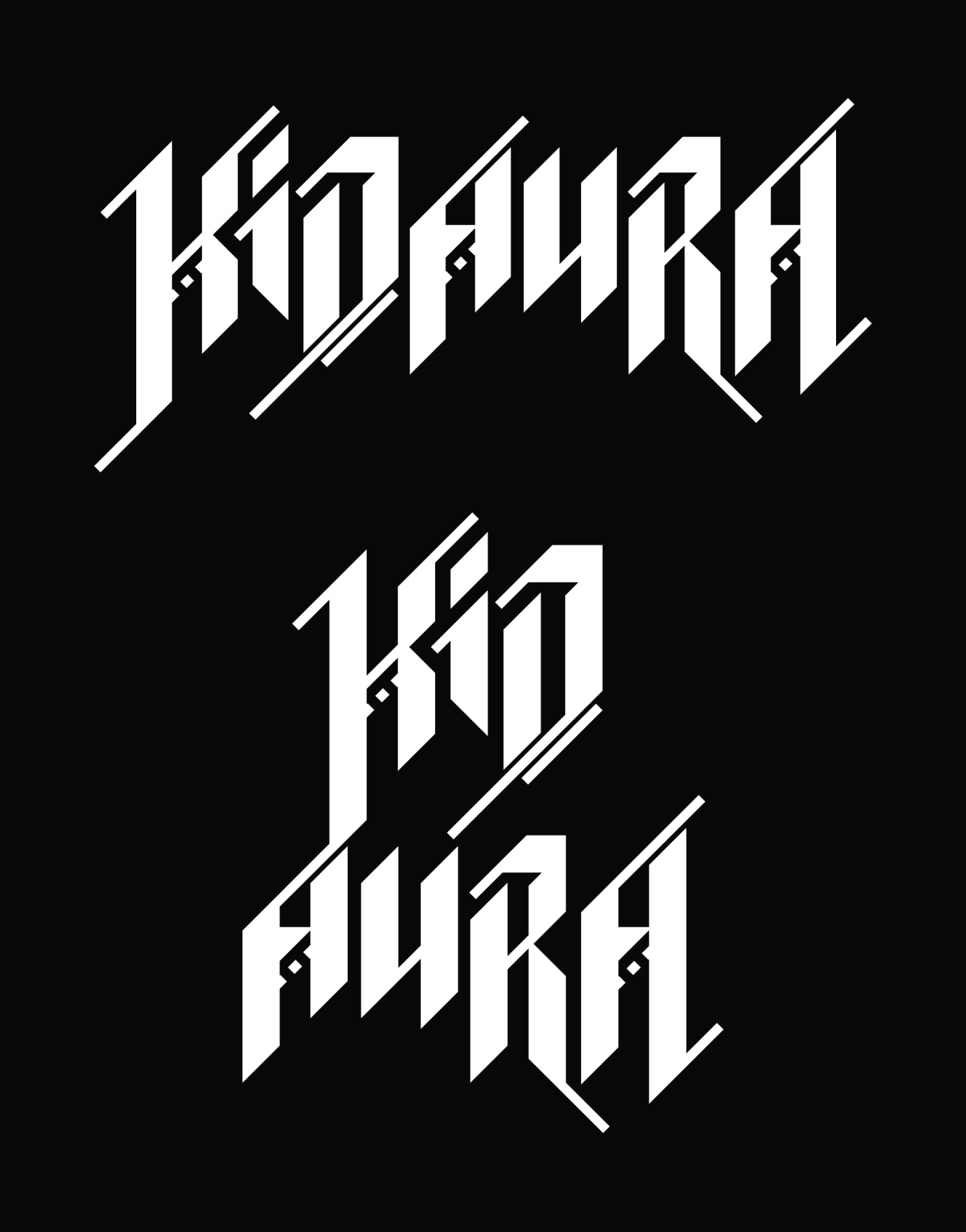
Commissioned by SSK Records to lead the creative direction for their latest signing Kidaura. Creating a logo, social assets, lyric video, single covers, website - and more yet to come!
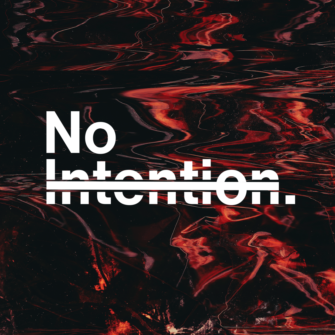
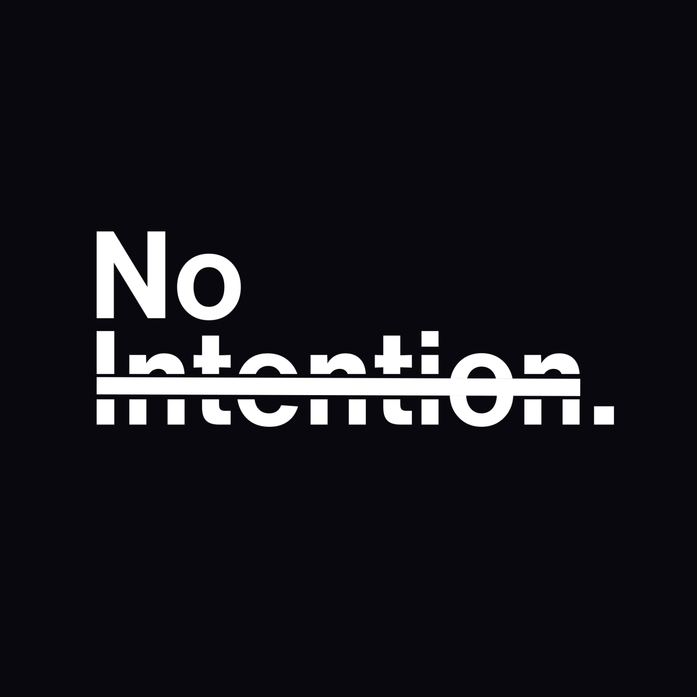
Logo design and artwork for house producer No Intention
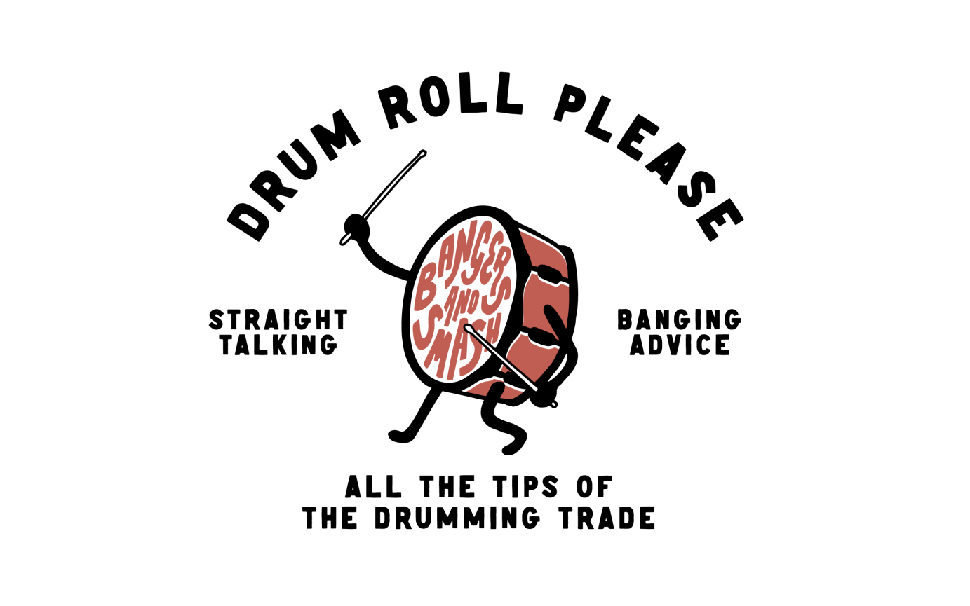
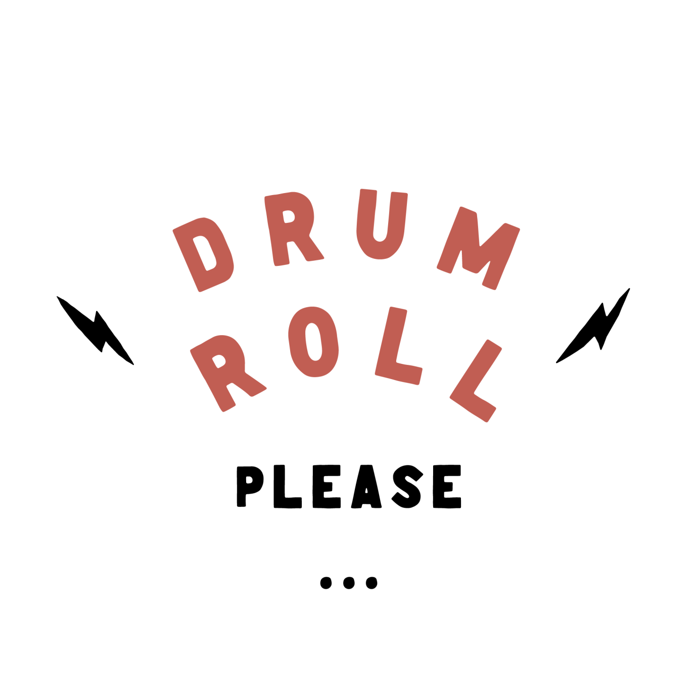
Identity for a drumming masterclass
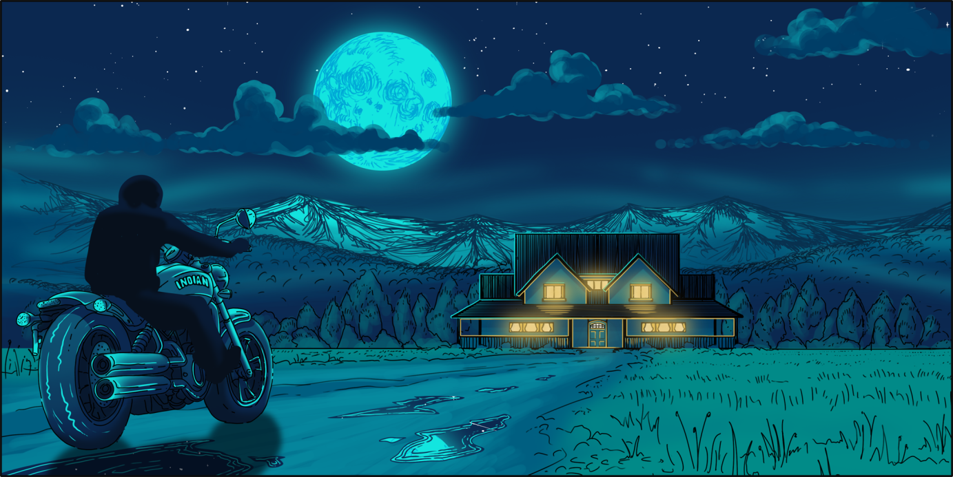
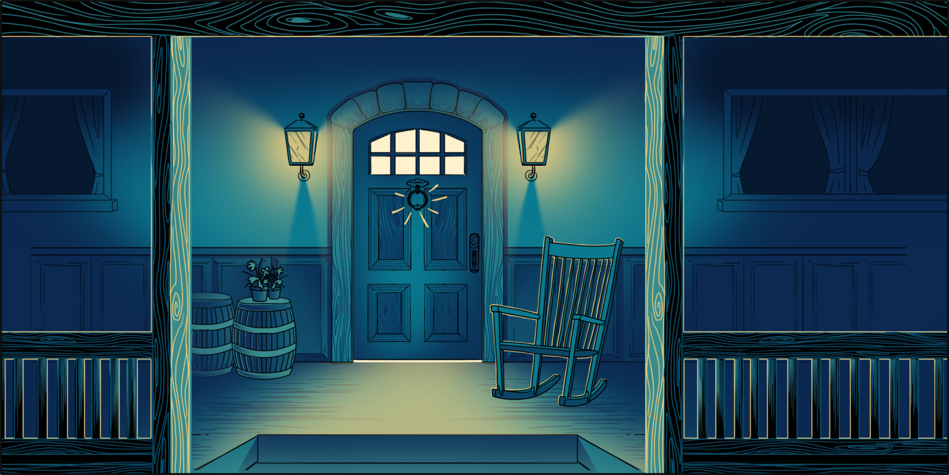
Website Link - Interactive website artwork commissioned by Modern English Digital for Luke Combs. Scattered around the remote cabin are many discoverable artefacts that fans can discover.
Commissioned by Sony Music .
Client : Hoover Records Japan
A Japanese Visual-Kei band going to release their brand new album soon, therefore they want to change their image and logo to the most strong identification one for their next adventure.
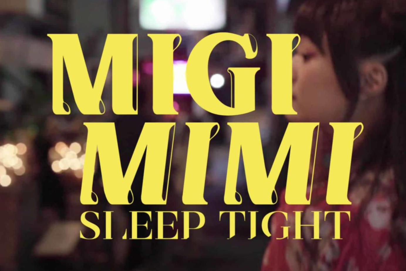
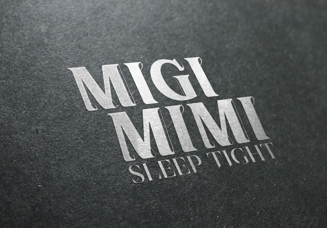
Client : Space Shower Music
Japanese Music Band Migimimi Sleep Tight since year 2016 has joined Japan’s largest Indie Music Group “Space Shower Music”. Throughout the years they are daring to experiment with different styles of music. In 2020, we were invited to create a new logo based on their more mature yet still playful development. From the nature of their music, we used chunky wording design with dynamic figures, creating an identifiable and modern logo.
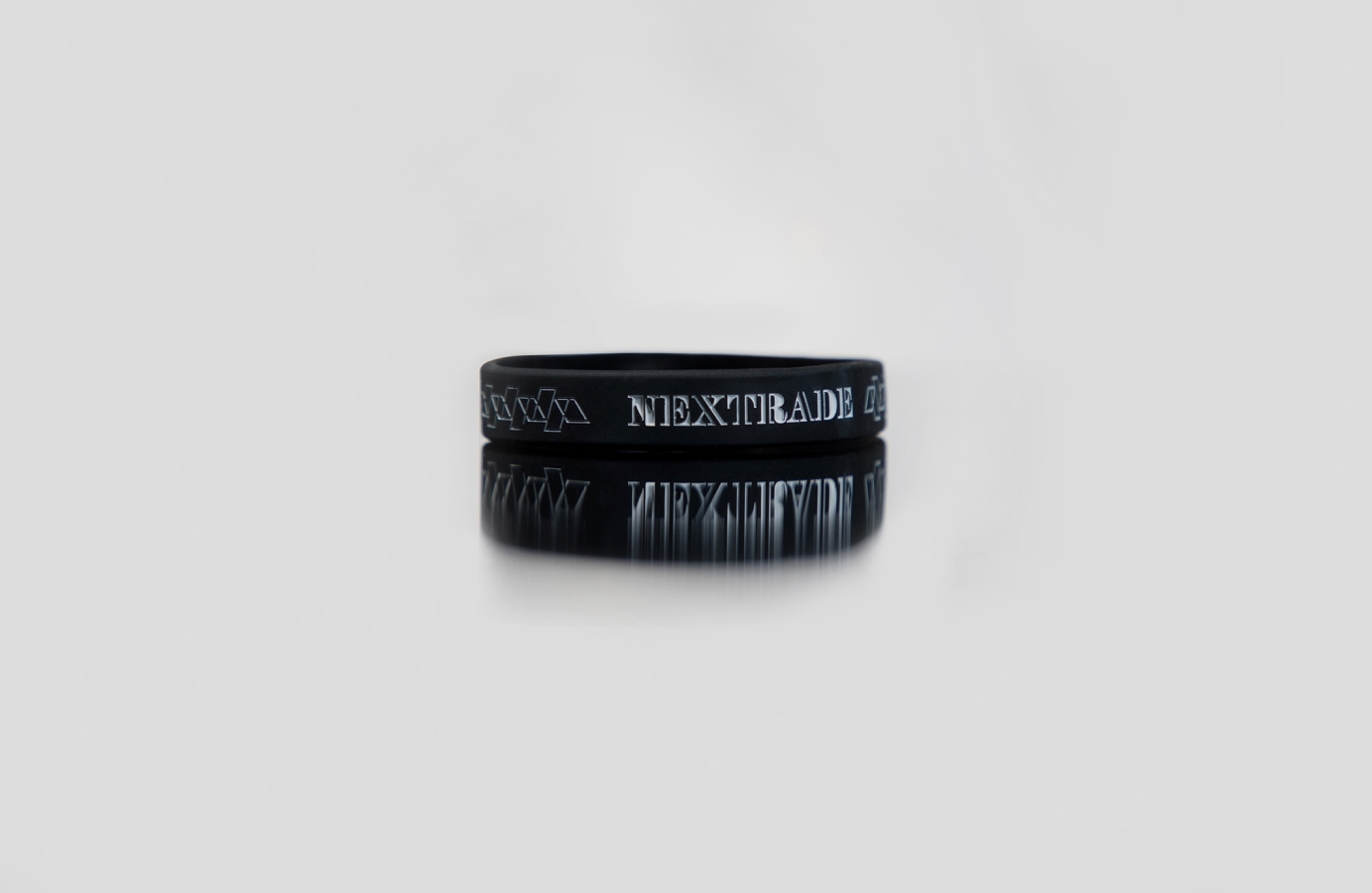
Client : LNP Records
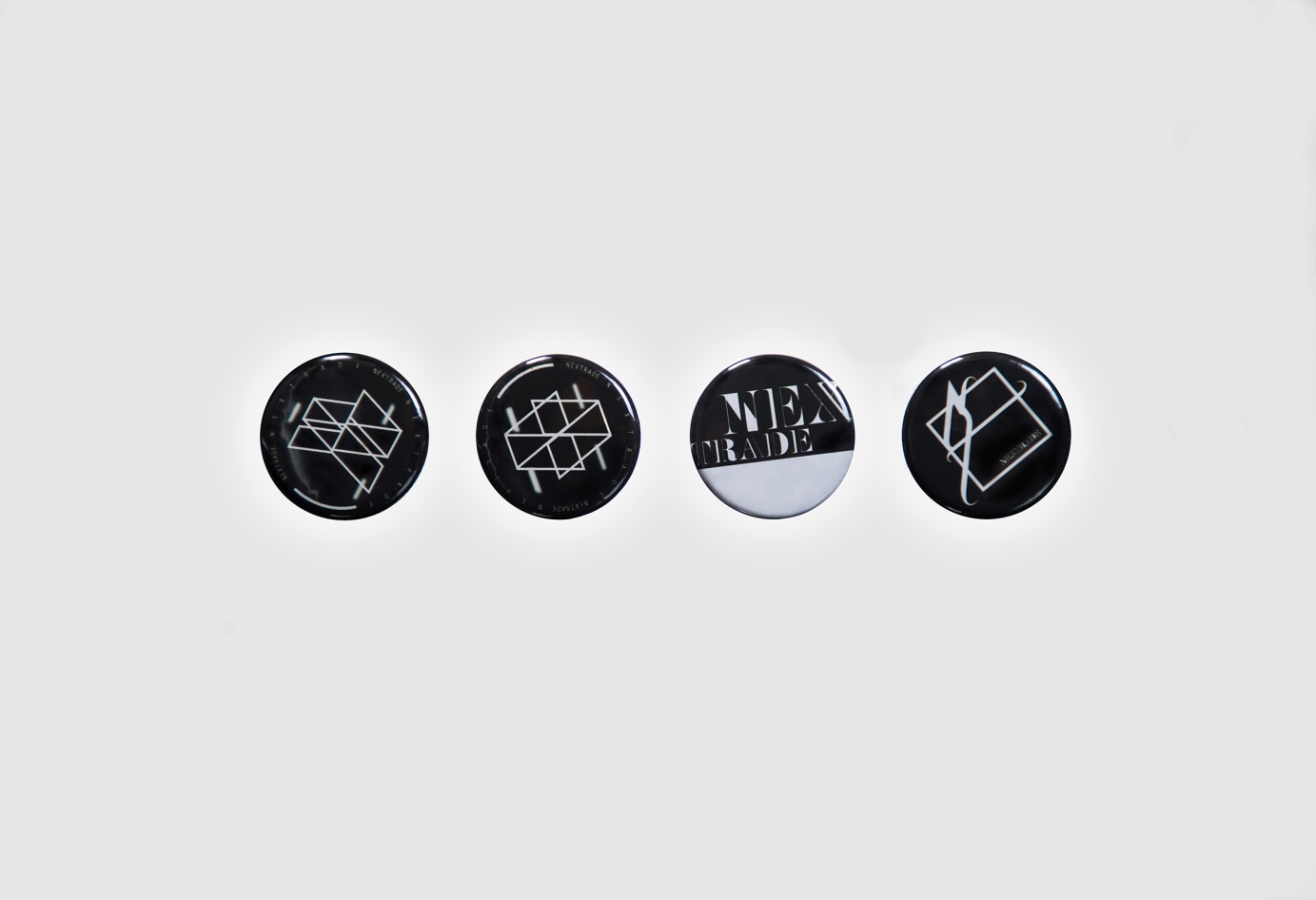
Nextrade is an Indie Rock band from Tokyo, their music influenced from explosive visual rock. We were tasked with the job to design a series of merchandise for their concert. We wanted the include Japan’s J-Rock cultural elements to their products with thoughtful designed manner, with the intent of continued use even after the concert.

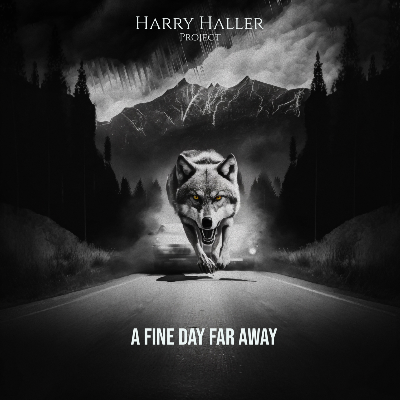
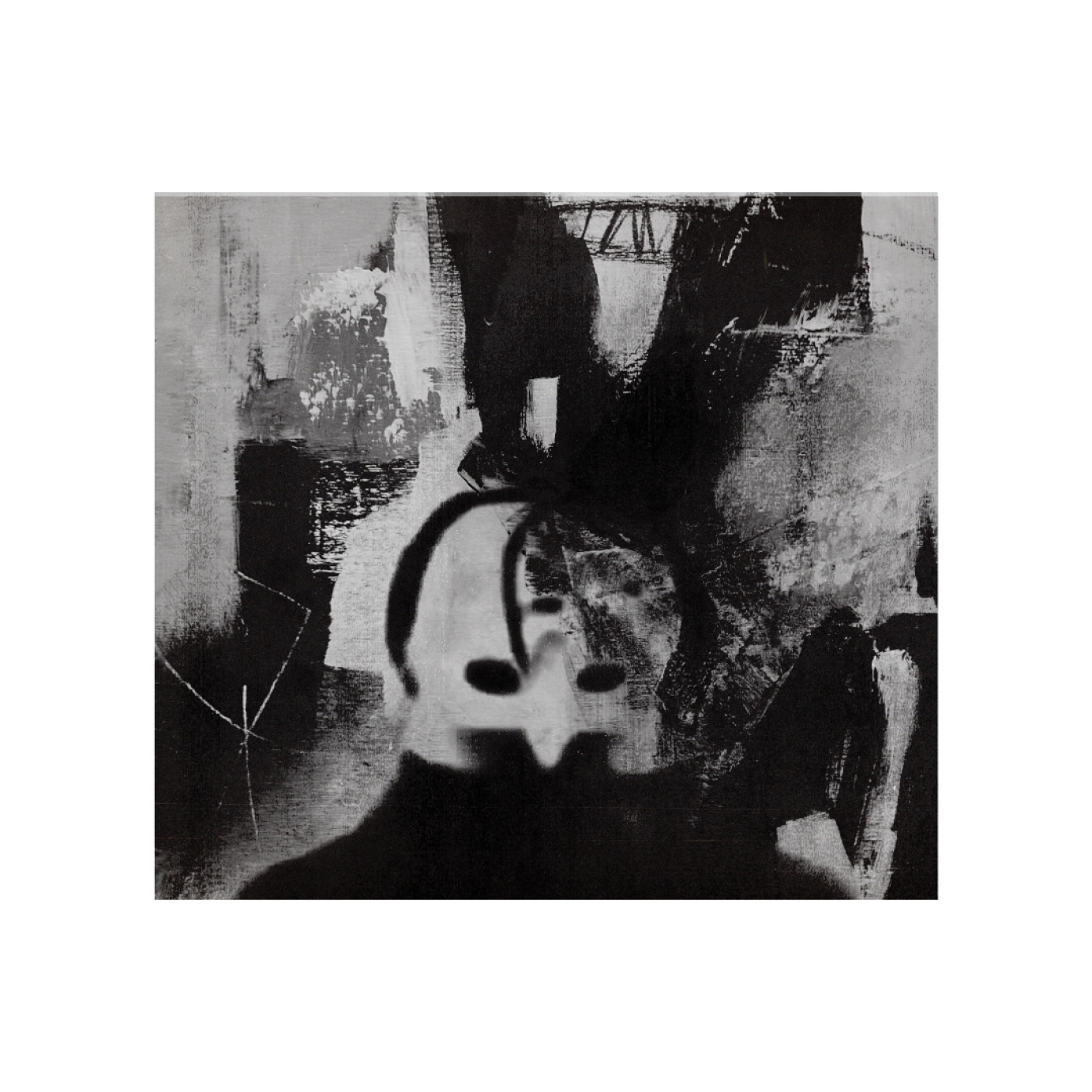
Artwork created for single, a Fine day far away.
The aim was to keep the wolf theme and set the vibe something dark and unsettling that re-presents the constant inner fight.
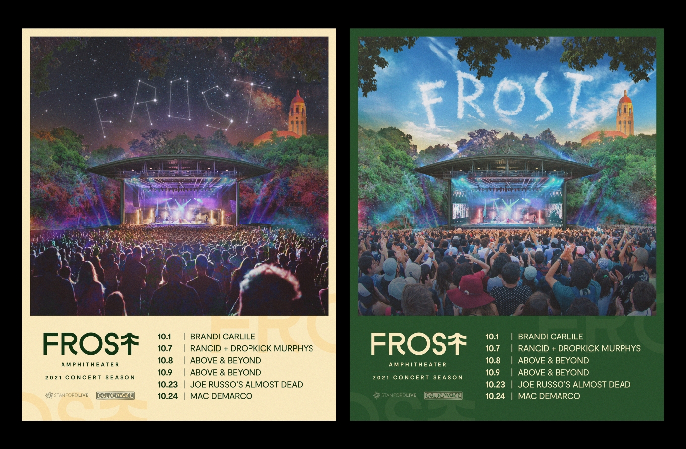
Poster design and branding for 'Frost Amphitheater' 2021 Summer concerts.
A motion reel of animated illustration and client projects featuring 2D motion work, branding and illustration.
CC Track: Ketsa "Just for Fun" via the Free Music Archive https://freemusicarchive.org
Work featured (in order of appearance): The Heroic Collective (The Bite Podcast), Minority Trip Report, Explainer Video (B2B video), Mission Club (Introduction Video for Conferences and Website), 36 Days of Type Project Design Challenge, Ronley Teper's Big Black Clouds Music Video, Christmas Eyes (Personal Project), How a Pineapple Grows (Tribute Video), Puppet Island Vanity Plate/Motion Branding
All work under is under the copyright of their respective clients/owners.
Personal projects (c) Carolyn Tripp 2023
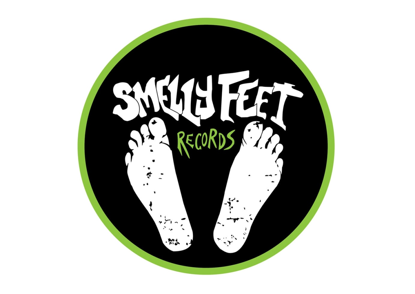
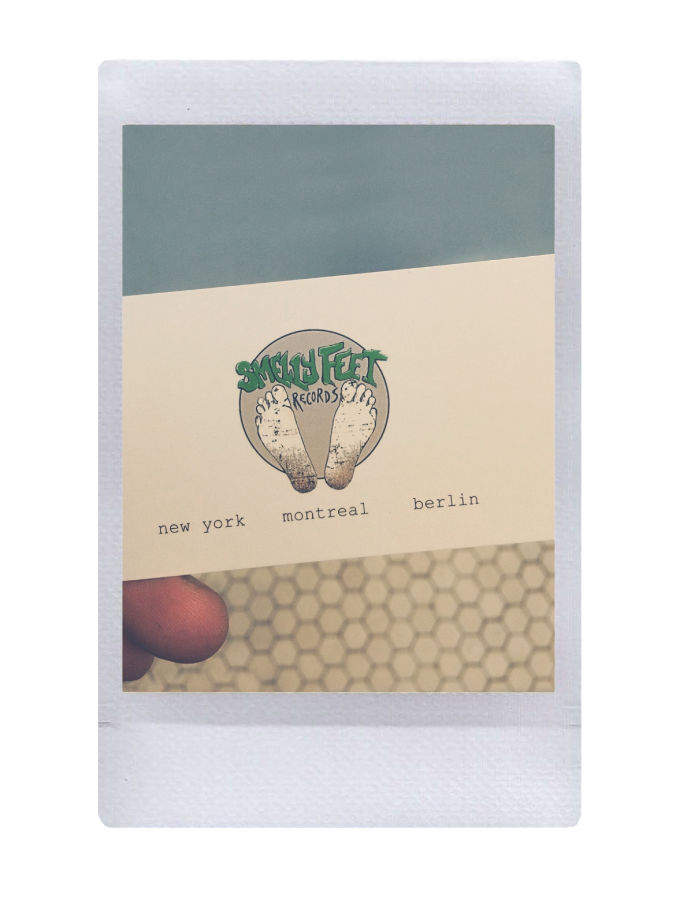
Smelly Feet Records - Berlin/NYC/Montreal
2016-2018
Created logo design, apparel design, stickers, and video/mix templates *change out the text/color for uploading different mixes to Youtube, soundcloud, etc.)
https://www.smellyfeetrecords…
https://soundcloud.com/smelly…
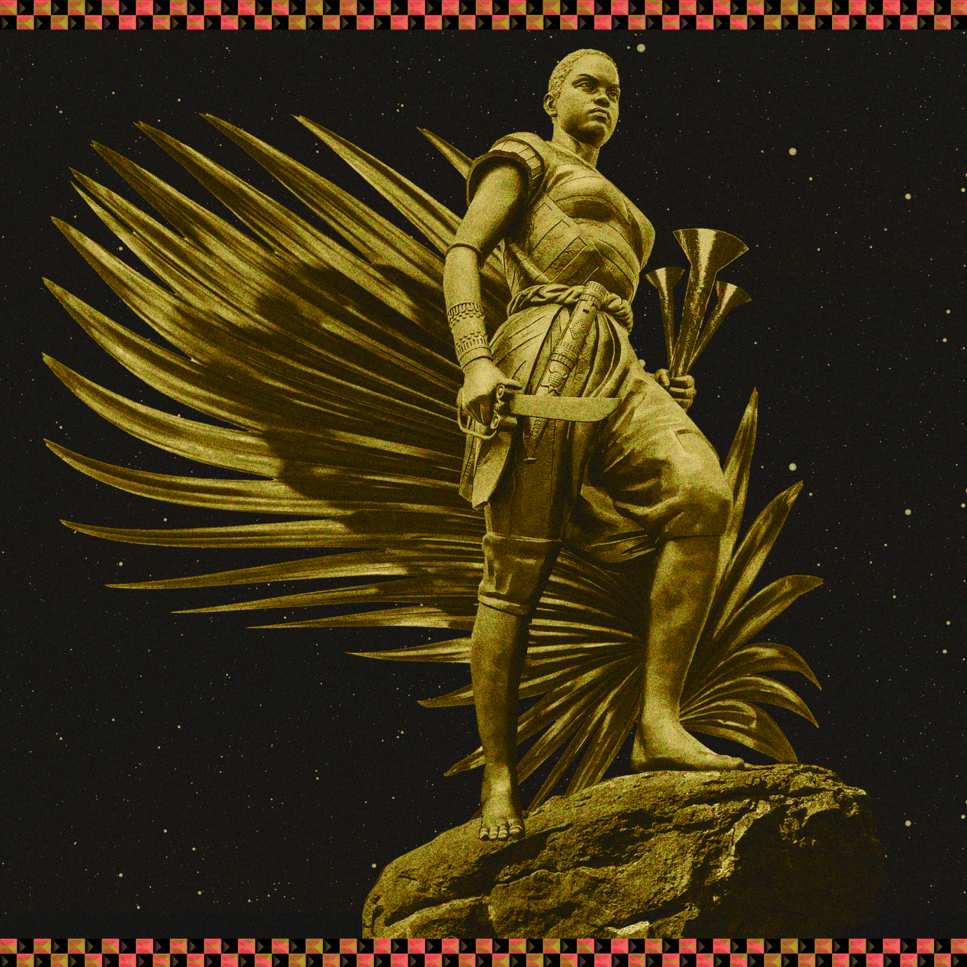
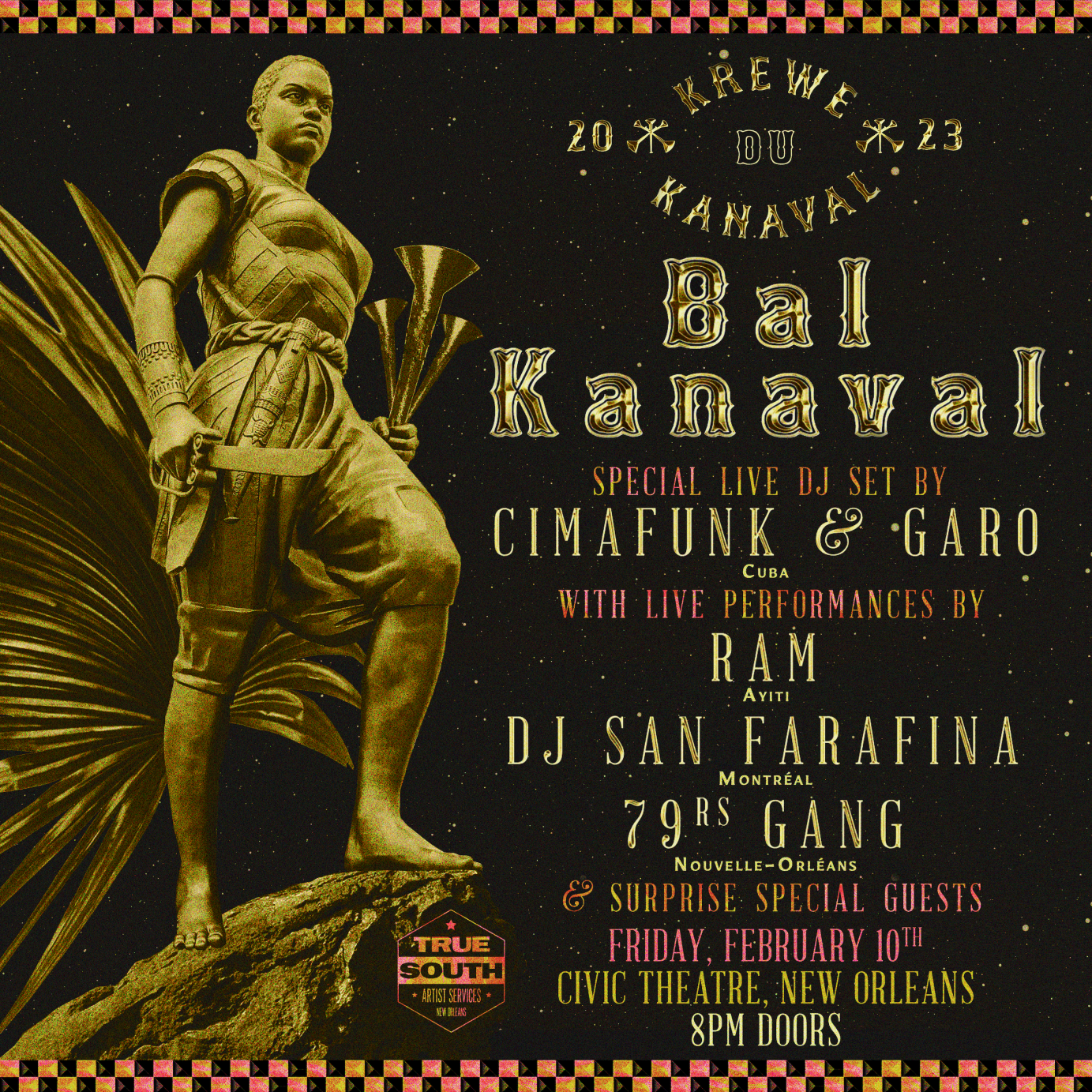
All branding and design for Krewe Du Kanaval, a New Orleans Mardi Gras krewe for Haiti founded by Arcade Fire and Preservation Hall Jazz Band
In the air tonight 🖤✨🎉
REACTION Visuals Album Cover ®
For @geekmusic.co.uk @paramountplus @halotheseries 🏆🌎🌍🌏✨🎉
Thanks for feel ✨✨✨
Ever 🖤✨🏆🎉
#REACTION #VISUALS #REACTIONVisuals #ALBUMCOVER #ALBUM #COVER #ART #GEEKMUSIC #GEEK #MUSIC#HALO #HALOSERIE #INNOVATION #WORK #WORLD 🎉
Commissioned by Hollywood Records.
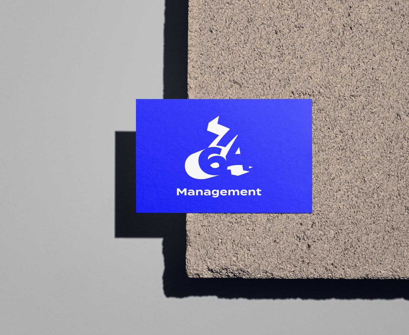
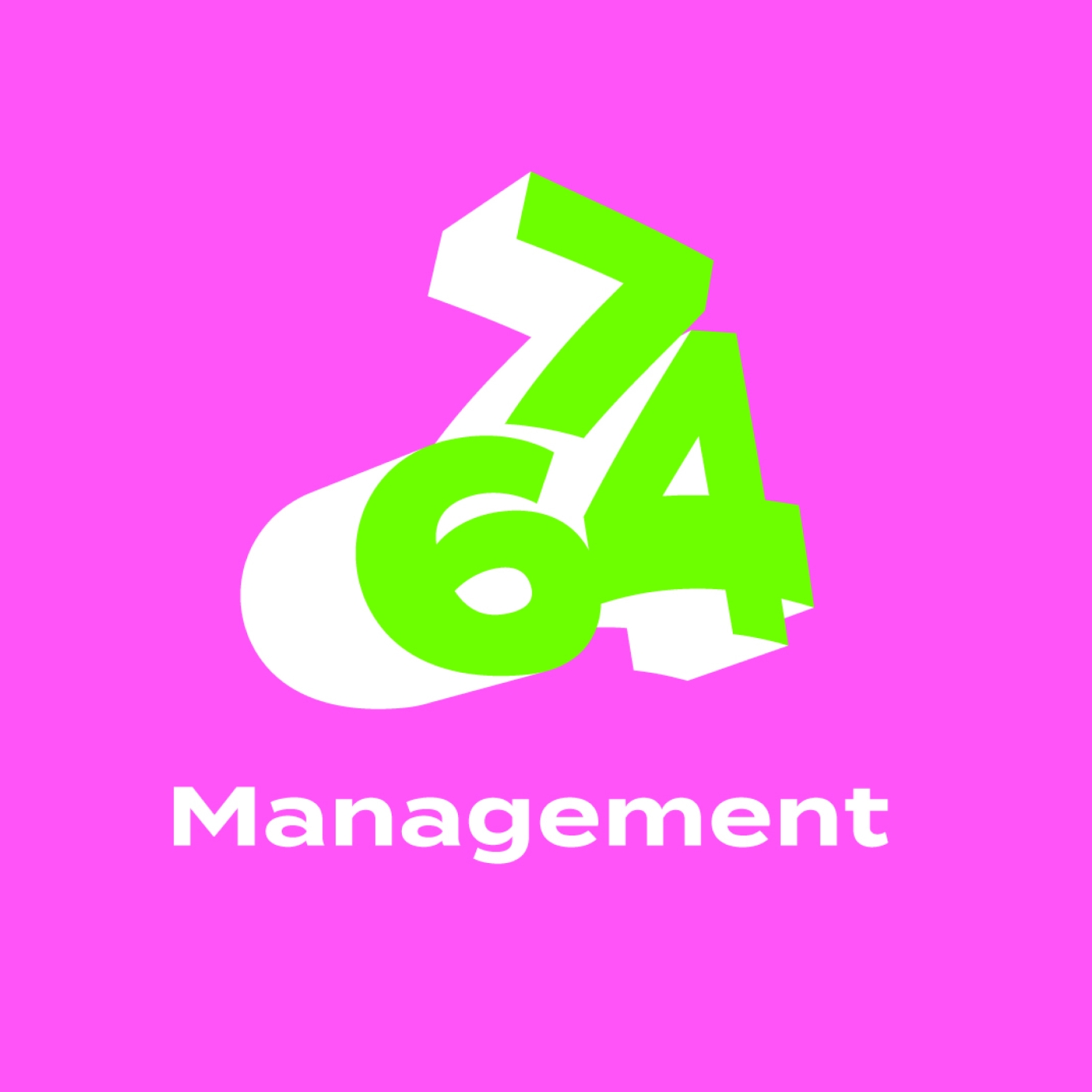
Complete logo branding and development for new music Management company 764.
Responding to the brief of an energetic, colorful and exciting direction reflecting the exciting acts and artist under 764, we created a neon color focused 3D esque logo hinting at new talent and opportunities coming from all directions. Balanced with a clean modern font and composition, this logo was designed to be versatile and future proof.

Project Description:
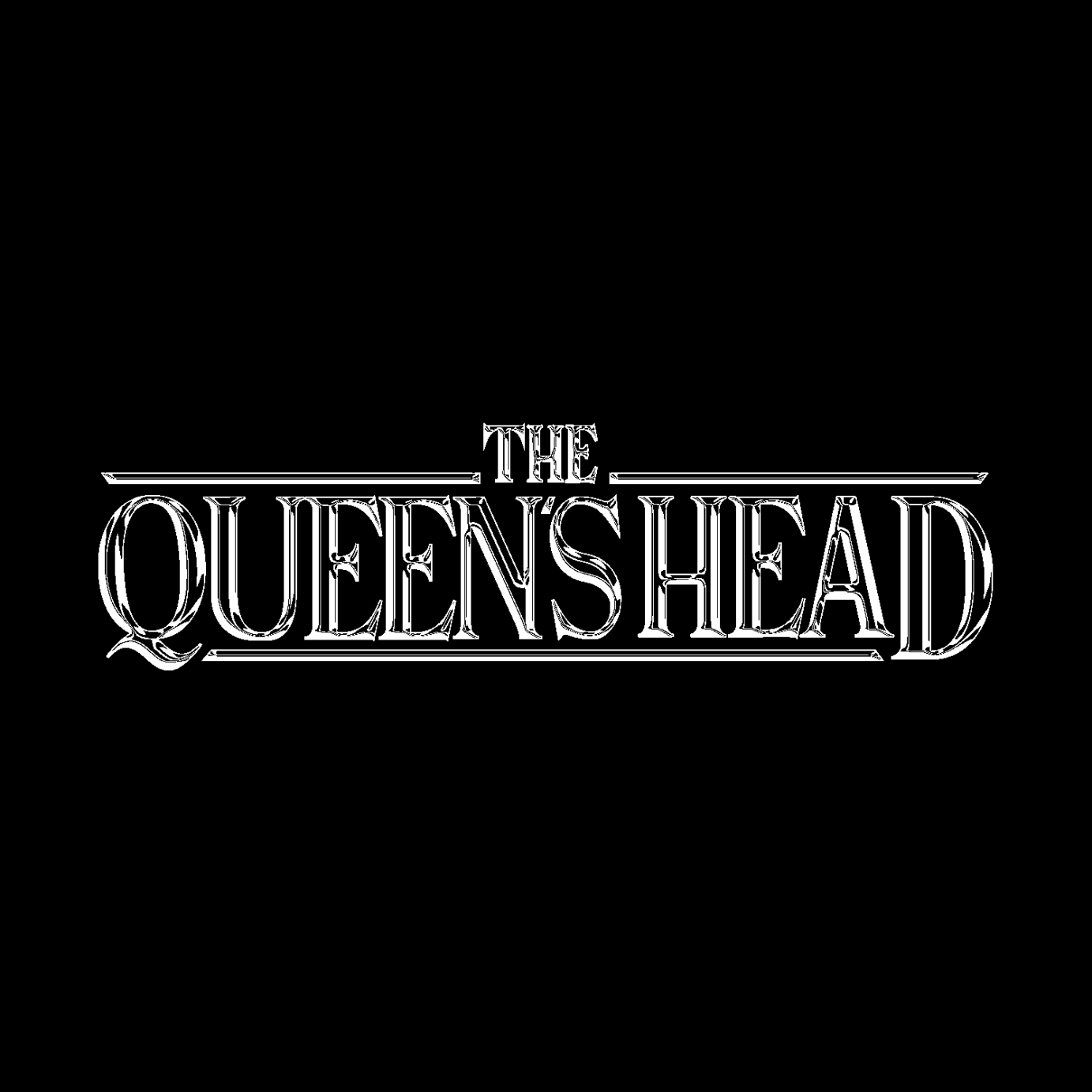
Branding and digital artwork project for UK Dance / Punk band The Queen's Head.
Alternative design aesthetics themed around 80s Sci-fi Horror.
CONTENT:
- Logo Design (+ Mock Ups) 1500 1500 px
- Album Art (+ Mock Ups) 3000 3000 px
- Visualisers 1080 1920 px
- Official Music Video 1920 1080 px
👑
Band Bio:
" The Queen's Head are a five piece from South London making alternative pop about modern anxieties
...
Blending elements of post-punk, noise-rock, disco and modern dance music, wrapped in a familiar verse-chorus pop structure, the resulting sound is simultaneously enchanting and terrifying. "
Client Testimony:
" Working with Jamie on my project was an absolute pleasure. I couldn’t have asked for a more flexible and responsive collaborator...
The work we produced exceeded expectations, mainly due to his attention to detail, talent and ability to combine his artistic vision with the brief we set. Couldn’t recommend highly enough. "
💘
---
Full Case Study (On Behance):
https://www.behance.net/galle…
---
✉️
Commissions:
Email - [email protected]

Washington DC based hardcore band, Destroy Capital.

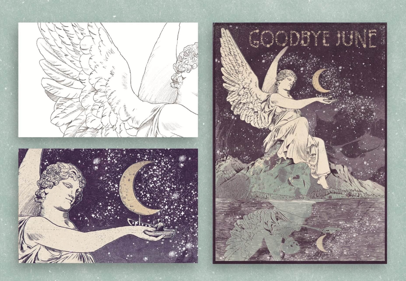

This illustration honours Goodbye June, an amazing rock band from Nashville, Tennessee.
Cousins Landon Milbourn, Brandon Qualkenbush and Tyler Baker formed the band after the death of Tyler Baker's brother. This tragic event in June led to the name of the band today.
This print deals with this difficult memory with the illustration of an angel.
Having a death in the reflection symbolises that life can change in a flash, evoking the car accident.
The inspiration is also from the album's name 'See Where The Night Goes'.
We can see a journey in the sky portrayed with a sailor fishing stars, living an adventure helped by the angel.
There is a subtle mention of grief in the reflection of the man in the boat. It is of two brothers, one with the arm over the other, instead of what should be the sailor by himself. This is to show the love that remains. The crescent moon instead of the sail represents rebirths and new beginnings.
It was important to include nature in the print, because inspiration comes from being in nature, and is responsible for us being alive, also a link to Nashville’s beautiful nearby lakes.
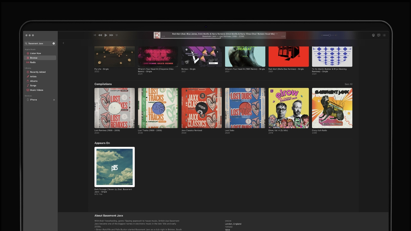
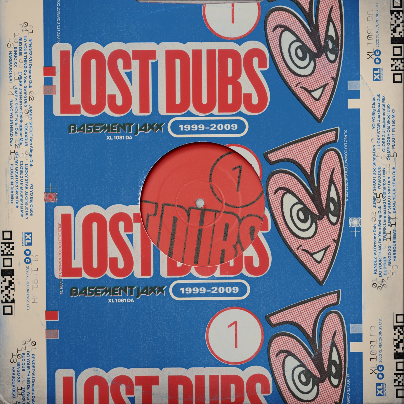
The design of a series of four, digital-only pack shots and accompanying digital promotion for multi-award winning electronic music duo, Basement Jaxx. The collection of tracks comprises of unreleased, remixed and lost tracks between 1999 and 2009. To imitate a physical release, the artwork features analogue textural treatments that have been constructed and digitally coloured and composited.
Art direction and design: Michael Speed.
Commissioned by XL Recordings.
This on of the product from the site I’ve made this sizzling short reel
Commissioned by DistroKid.
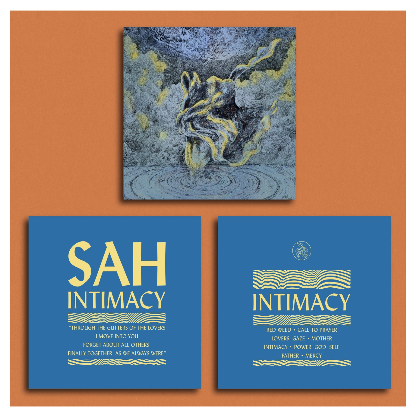
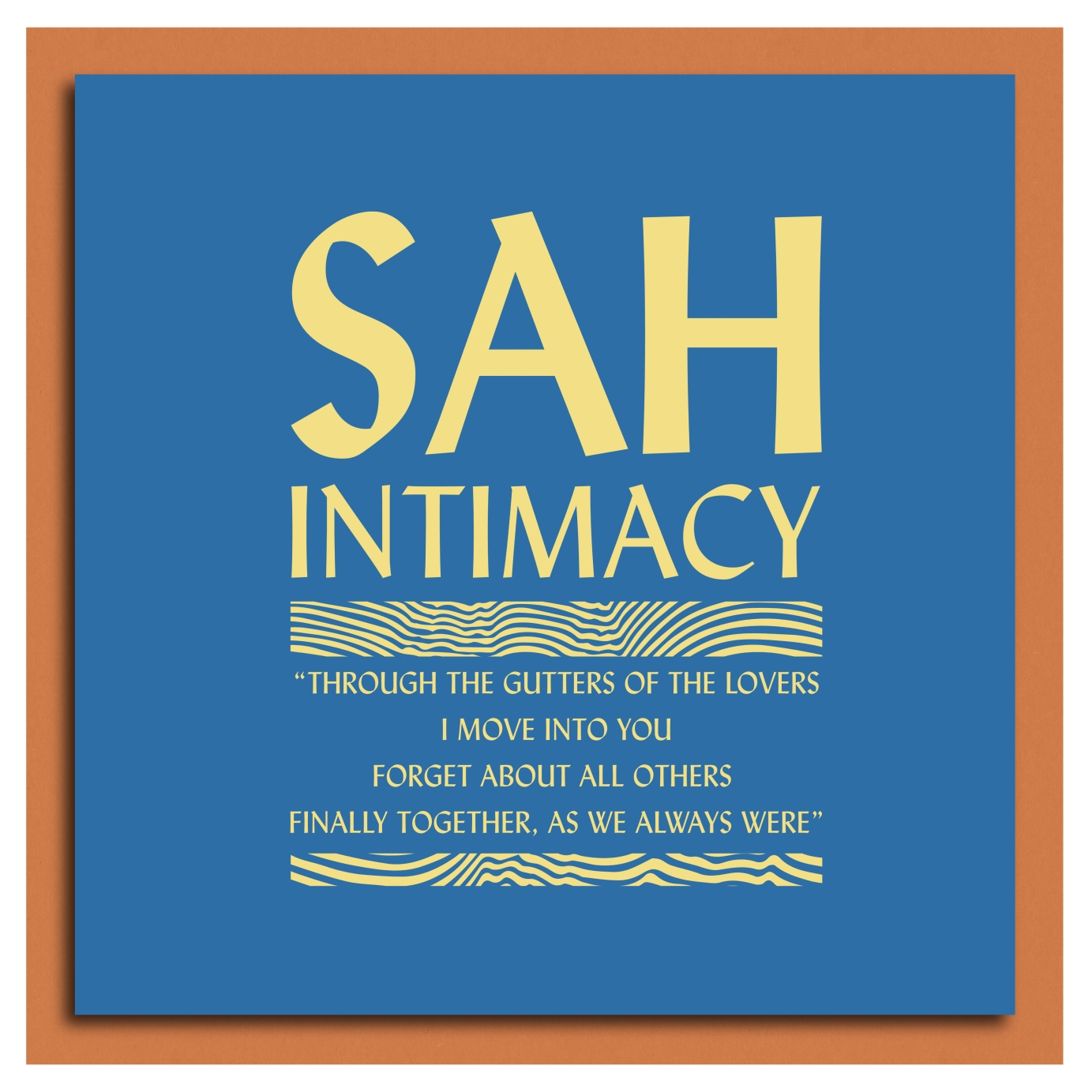
We were approached by experimental ambient producers SAH to work on the layour for there double sleeve debut album.
We wanted to put the front cover as a focus, but use a powerful typeface and color pallette that represented the deeply atmospheric and nuanced themes of rhe album.
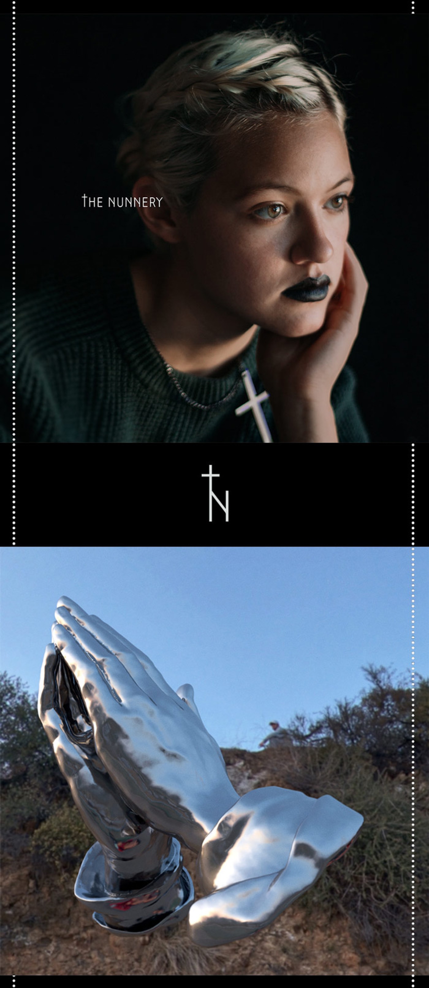
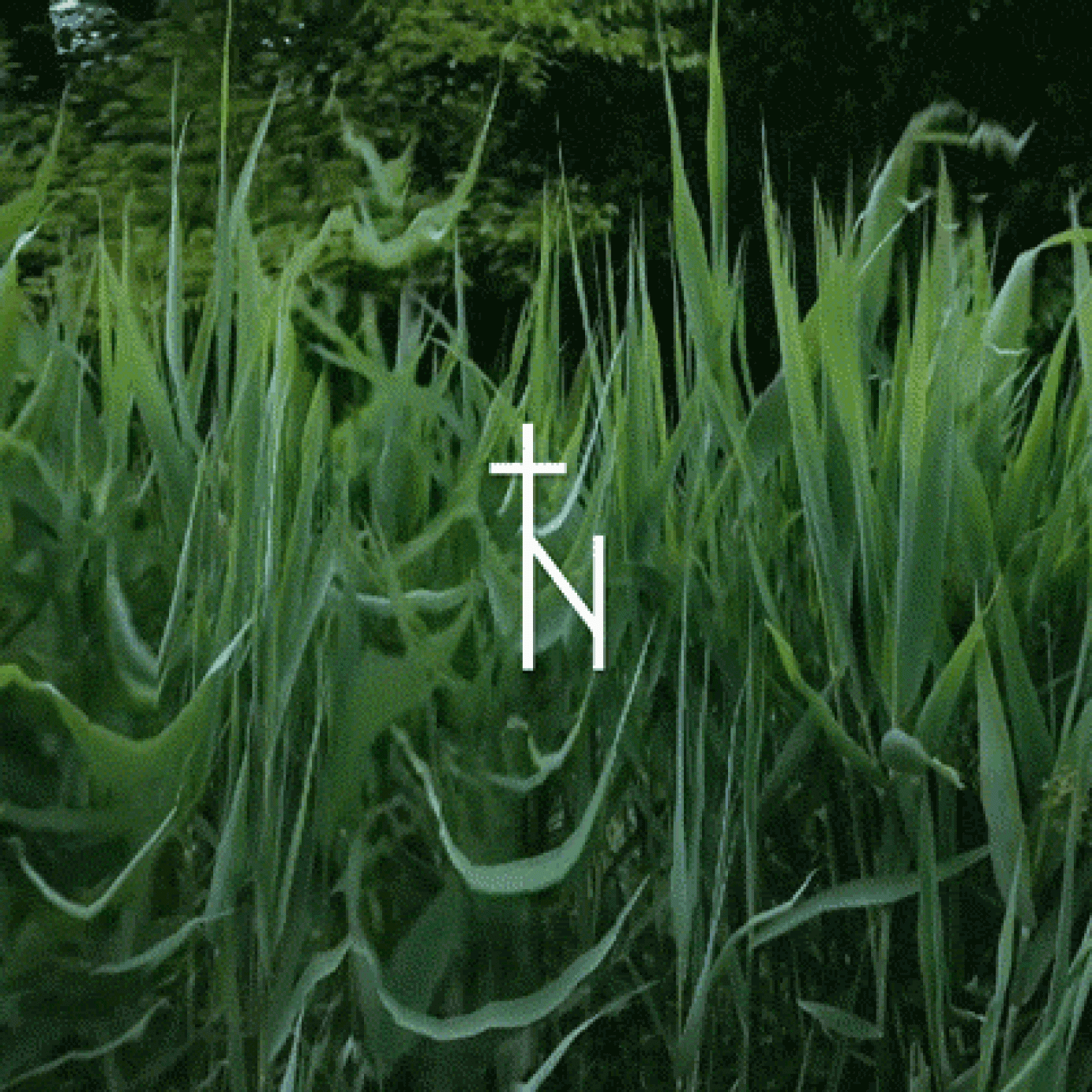
Identity, photography, website, and multimedia for a solo musician that uses vocal looping to construct meditative songs. The identity explores religious iconography, centered compositions, negative space, and The Nunnery’s presence.
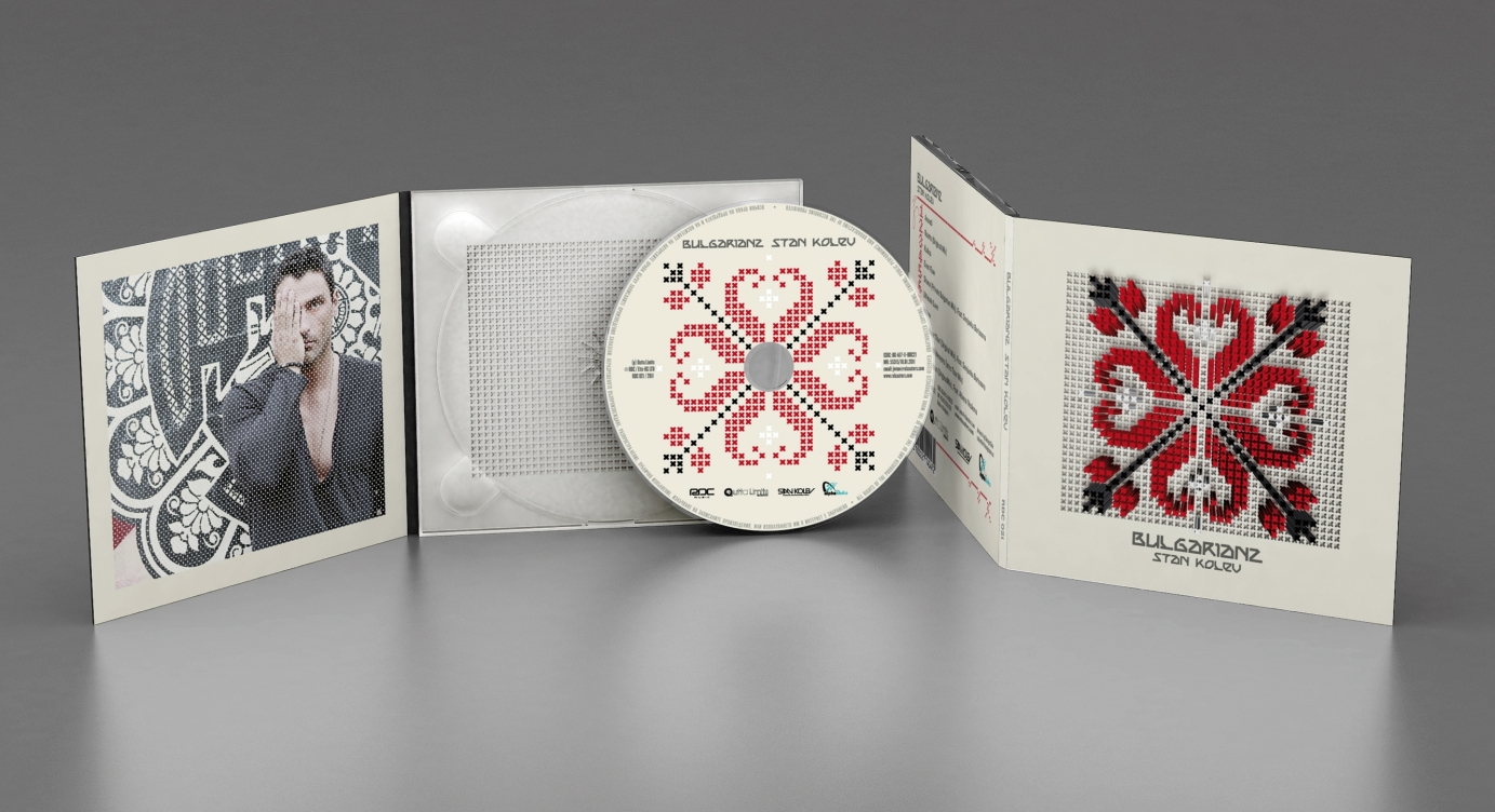
Artist logo, album concept delivered through cover, artwork and design. Stan Kolev is a DJ and producer based in Miami (FL) and he blends Bulgarian folklore music with tech-house dance vibes.
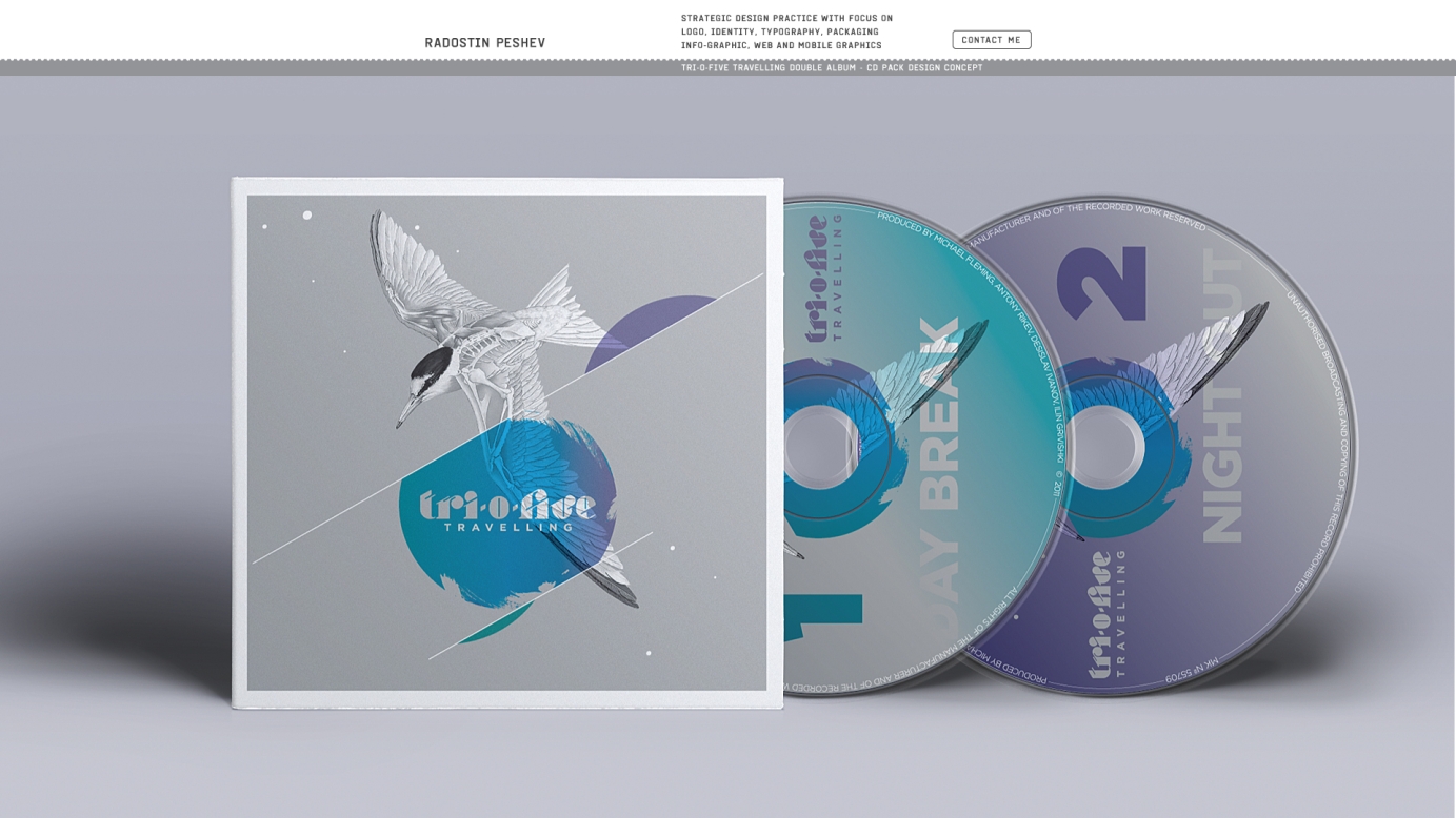
Band logo and album concept artwork delivered through album cover, merchandise.
I chose the most traveling creature on our planet - the Arctic Tern to be the main symbol of the album artwork. Its semi-scientific depiction draws attention to the more abstract and mental side of "traveling".