Image
🎨 Art Direction for @radioephemere
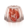
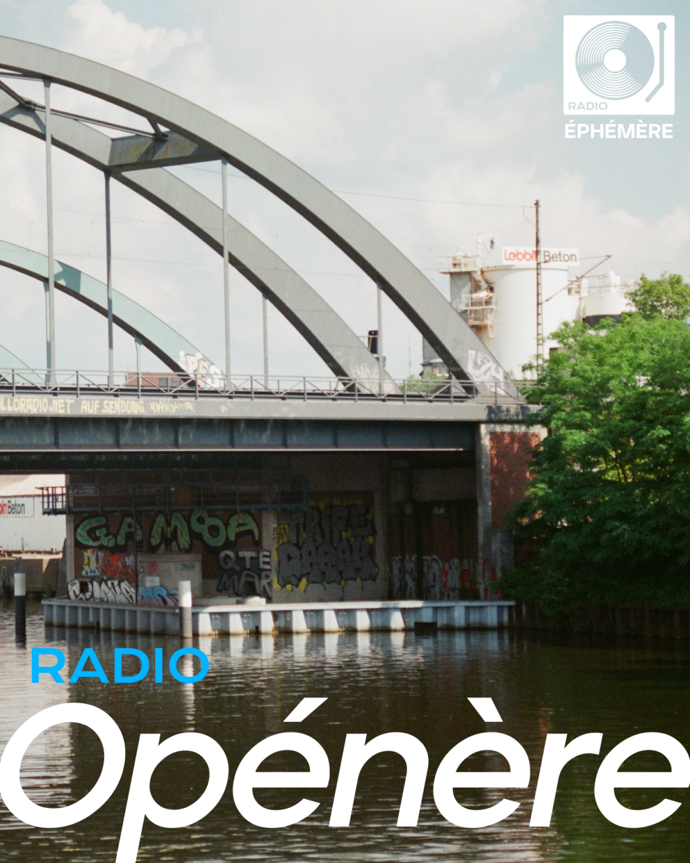
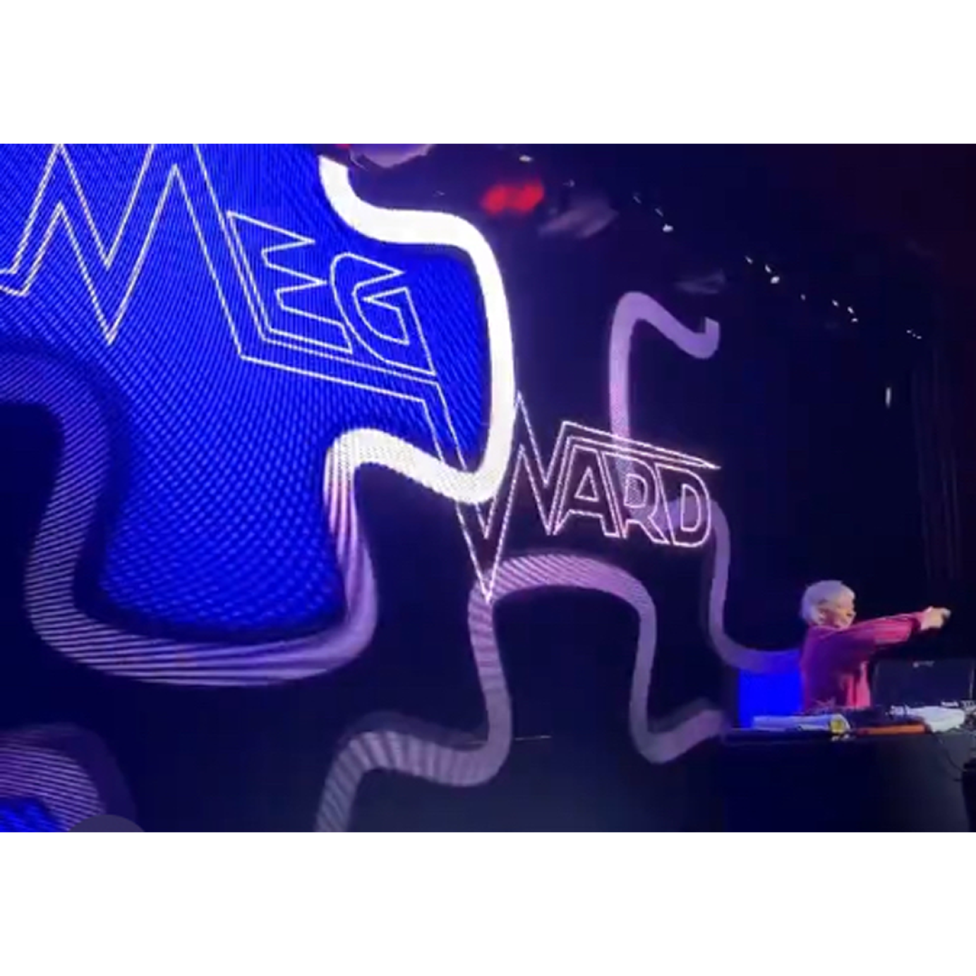
Radio Éphémère is a Hamburg based Dj collective.
For this project, I contributed to shaping and refining the collective's evolving visual identity:
— Logo Renewal: Updated the logo to better reflect the group’s energy and evolving ethos.
— Event Key Visuals: Designed striking imagery to capture the tone and atmosphere of each event.
— Instagram Art Direction: Built a cohesive and compelling page presence to elevate their social media identity.
— Cover Template for Radio Series: Created a flexible visual system for their recurring SoundCloud radio show.
I’m currently open for collaborations with artists, producers, and labels seeking a tailored visual identity.
See the details on my website, find the link on my bio!
Created a logo and merch design for artist Baby Draco

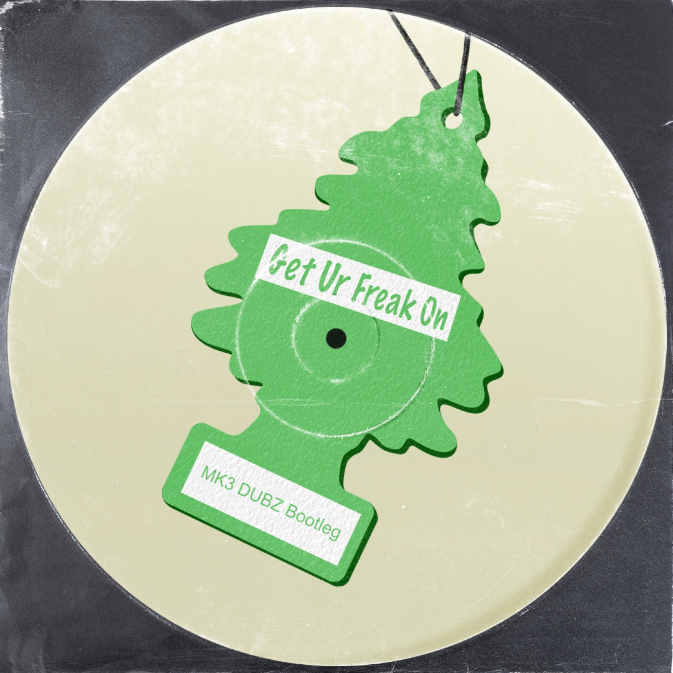
The artist sought a logo that exuded the same feel as a Golf GTI car badge. We decided to create a 3D logo, providing the flexibility to animate it for social media posts, set footage, and more.
The design was inspired by the iconic 'Little Trees' car freshener to complement the car badge aesthetic.
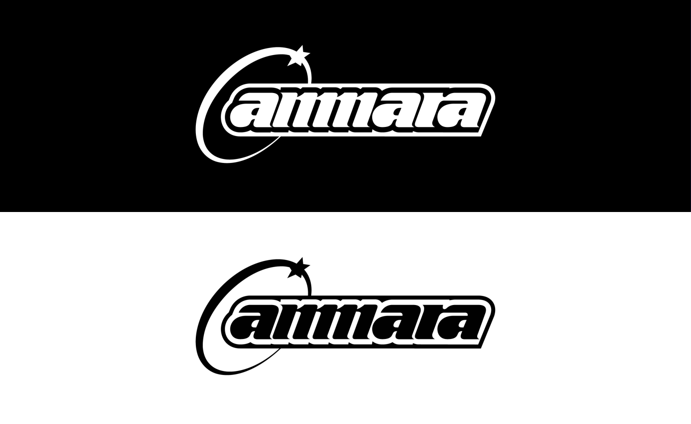
Static and animated logo for London-based DJ and producer Amarra.
Commissioned by Triple Threat Management.
Design Brief: 10138
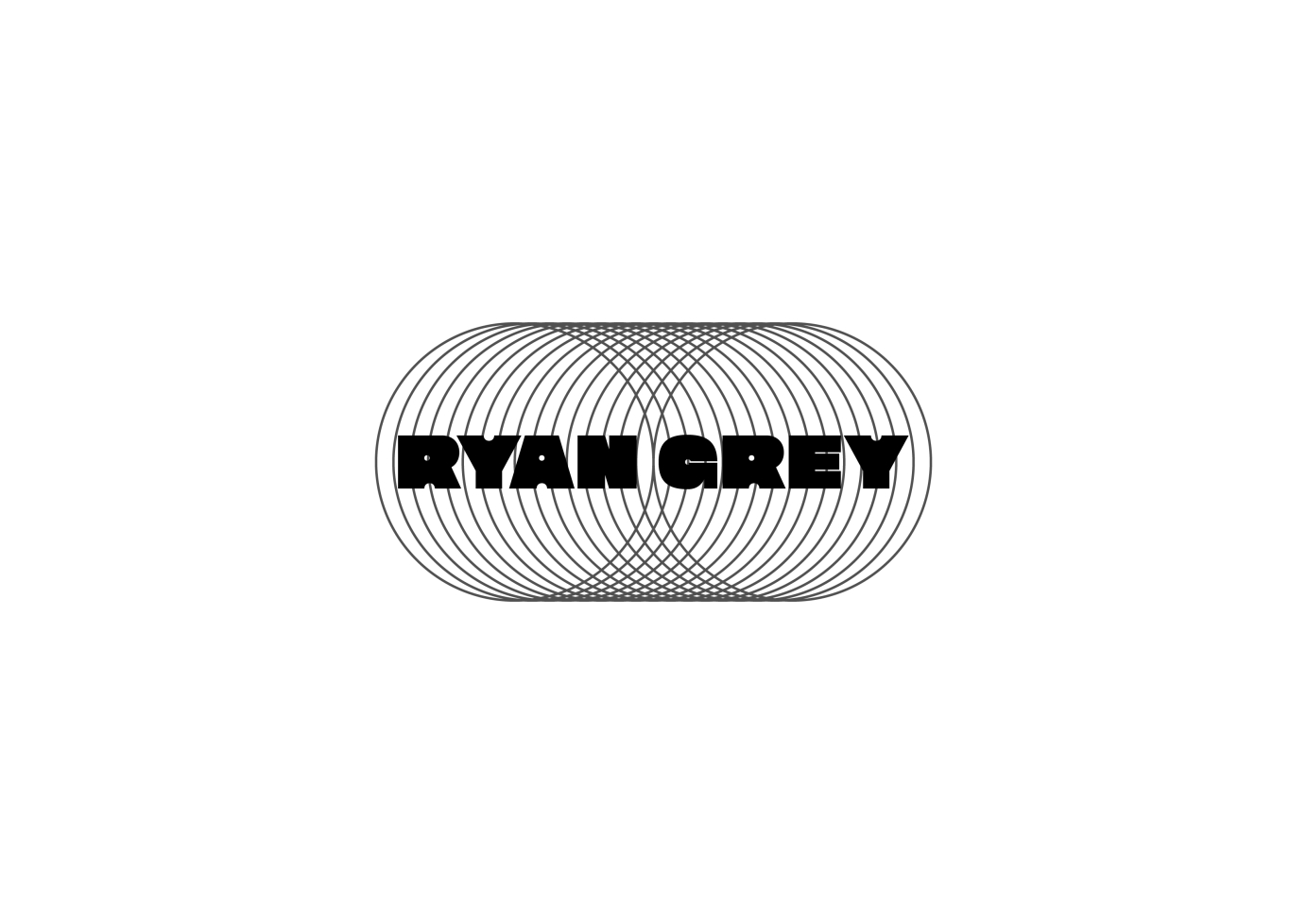
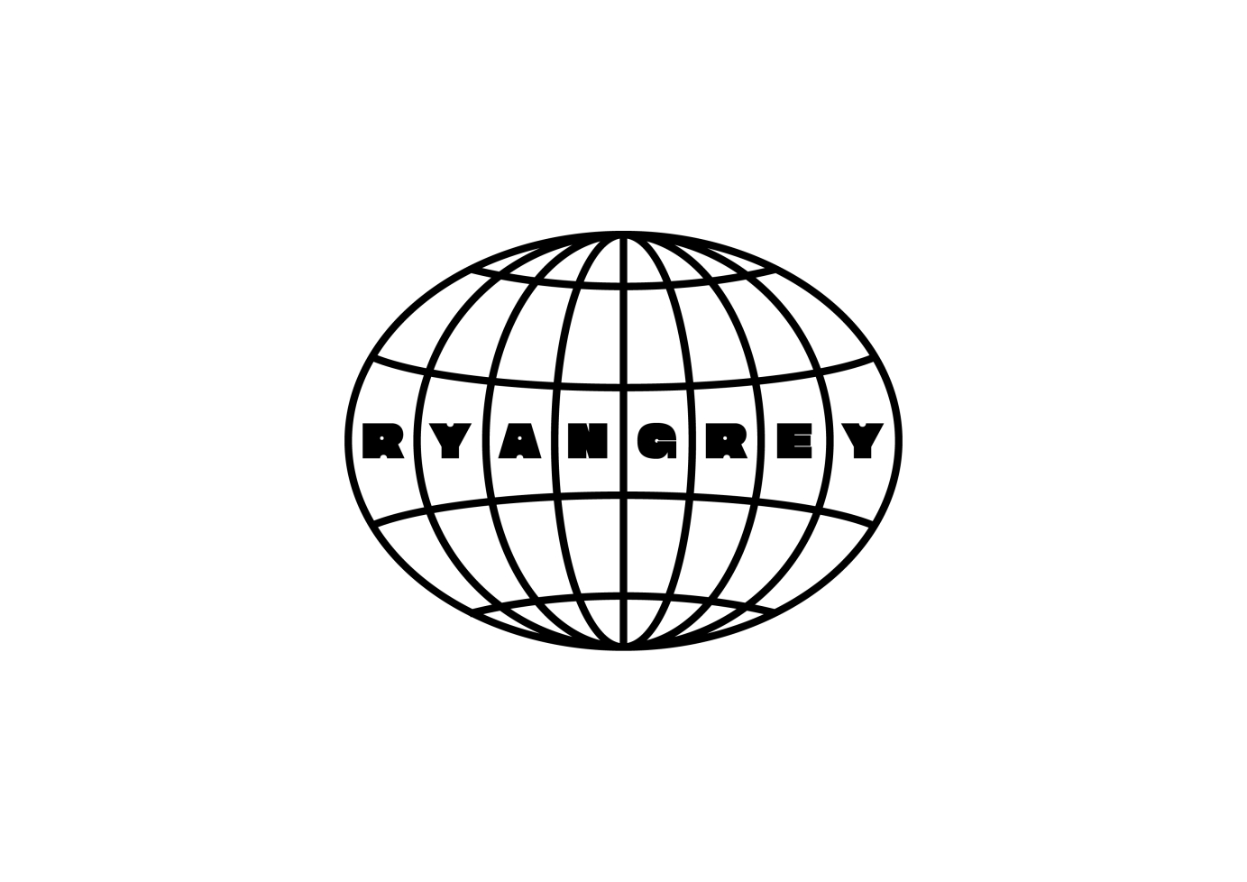
I was asked to design 3 logo variations for Toronto based producer Ryan Grey to be used across a variety of media / formats. Simple geometric forms paired with a Sans Serif typeface was the basis for the logos to give it a 90s vibe.
Commissioned by Agenda Management.
to Animate logo in and Escher type style
Commissioned by Warner Chappell Production Music.
Overview
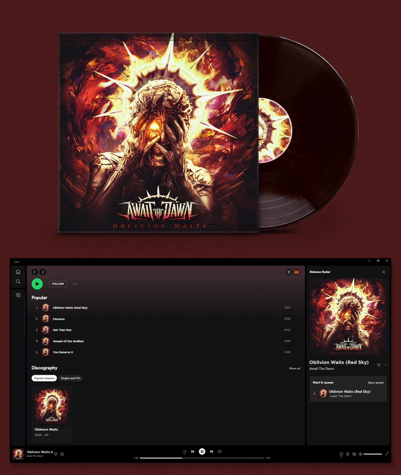
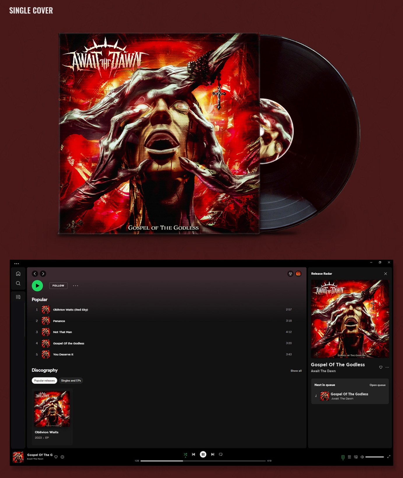
Await the Dawn is a metal band from Albuquerque, New Mexico. They approached me to create a logo for their band, a single cover, the EP cover for their first release, and a visualizer for Spotify. I guided the band through their first effort to brand themselves and led the creative direction for the band’s first artworks.
Await the Dawn released Oblivion Waits on Halloween of 2023.
Approach:
At the time the band approached me they were still very early in the process of creating music as a group. We tapped into the various elements of the members character, interests, and backgrounds to distinguish a starting direction for the band’s aesthetic and word mark.
Logo
Creating something that was distinct and legible, yet still aggressive were some of the main takeaways from my first meetings with the band. I designed their mark to have strong movement, and aggressive shapes without cluttering up the letters too much. Creating a strong symmetrical look helped the mark identify itself clearly with the rock/metal genres but more on the side of rock rather than extreme metal with the clean letters. Finally, roughing up the type gave it an even more aggressive look, and the iron sun at the top helped connect their mark with the sentiment of their name.
Gospel of the Godless (Single)
As their first piece of artwork we used the single cover as a playground to explore ideas. The song was written about the weaponization of religion so it has a lot of dark themes. I wanted to create strong imagery for the cover that would reflect those themes and illuminate them in a cool way. The final artwork depicts a fearful young human being slowly corrupted and overpowered by demonic, withered hands of religious creatures inside of a tortured fever dream-like reality.
Oblivion Waits (EP Cover)
After finding a good rhythm with the single cover, we embarked on the EP cover. The band had a few songs written at the time but not the complete EP. From what the band did have I was able to interpret a lot of themes of mental toil and struggle. Members of the band shared their individual stories and writings for the music to help illuminate the final direction for the art. The Oblivion Waits cover reflects those stories with a tortured character who wears a blinding crown of light battling a maelstrom of demons. This graphic captures the aggressive, tumultuous, and hopeful energy of the group I feel and creates a compelling visual motif for listeners to enjoy.
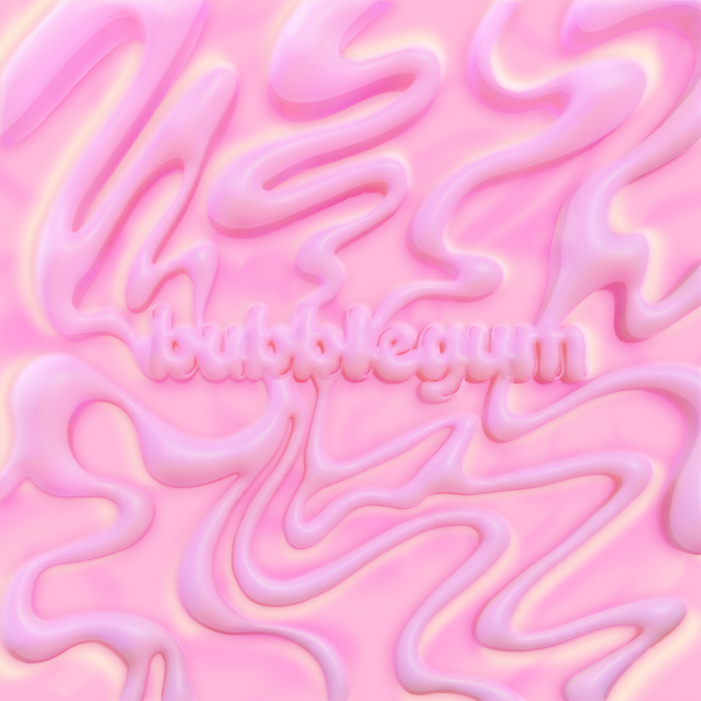
Single artwork for Lu's BUBBLEGUM

Logotype and Icon for UK producer Enzo. Drawing influence from digital and analogue audio recording equipment, as well as graffiti and street art to create the unique 'E' stamp.
Commissioned by E.47 Agency.
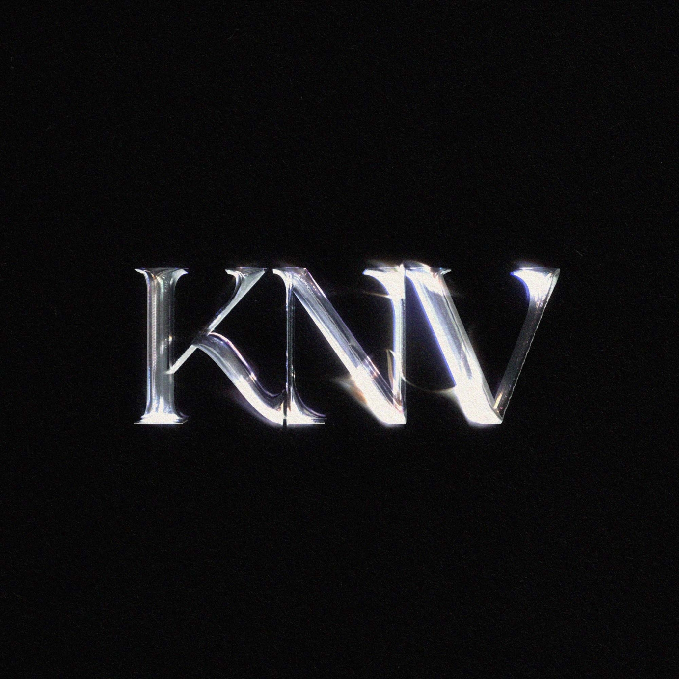
Artist logo for KNV
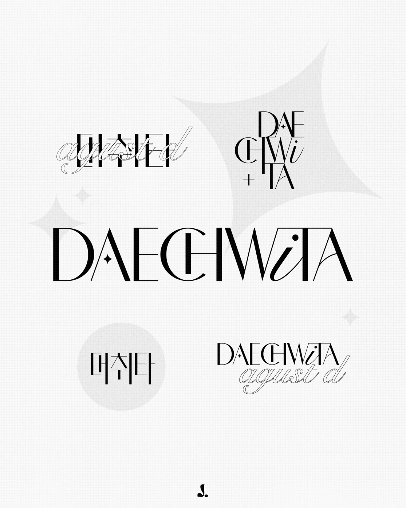
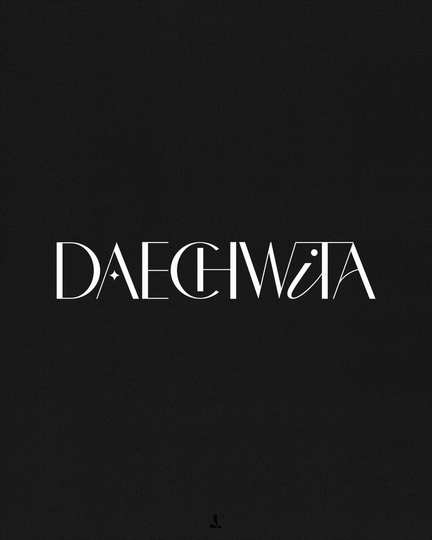
A branding study for 'Daechwita' by Agust D.
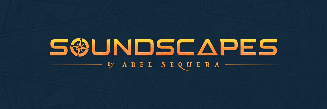
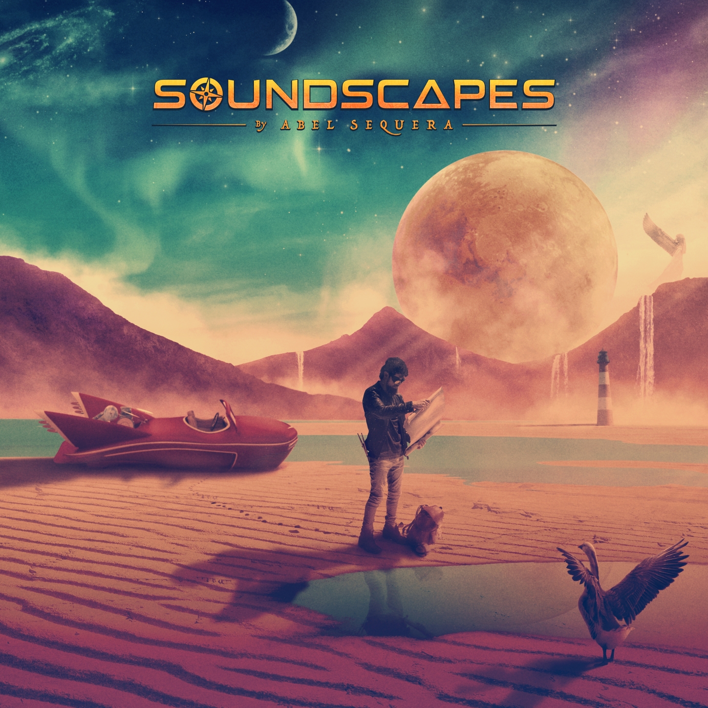
Abel Sequera is one of the most talented drummers and composers coming out of the rock and metal scene in Spain. Alongside guitar player, producer and composer Carles Salse (and with the help of dozens of musicians from across the globe) they created Soundscapes, a conceptual progressive metal album that tells the story of the great spiritual and philosophical journey of a being roaming the unknown in search of new horizons.
I was brought on board of this ambitious and meticulous album to capture the story and translate it into images. The album includes a 44-page booklet featuring a series of double-page illustrations conceived specifically for each particular song. Making the most out of the panoramic format, the images are conceived like frames from a movie.
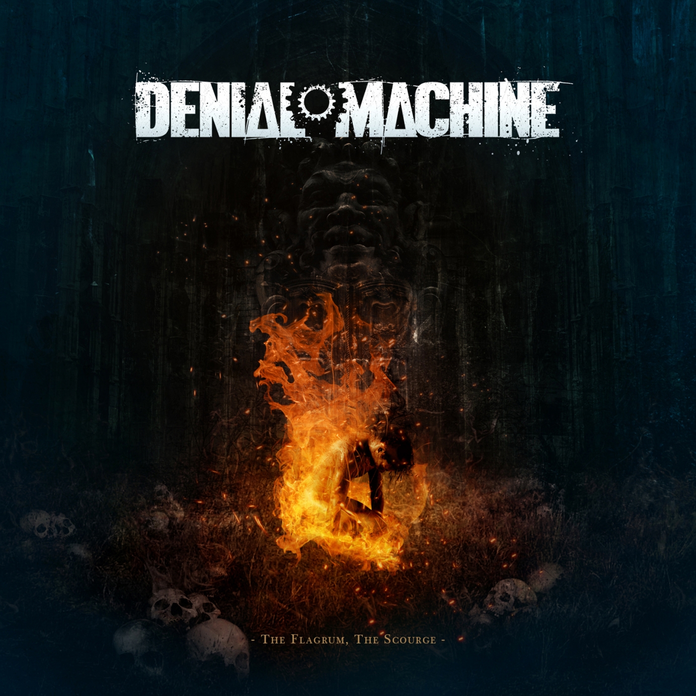
Logo and cover art design for my long-time collaborators Denial Machine, an American metal band who have entrusted me with the cover art for all their releases.
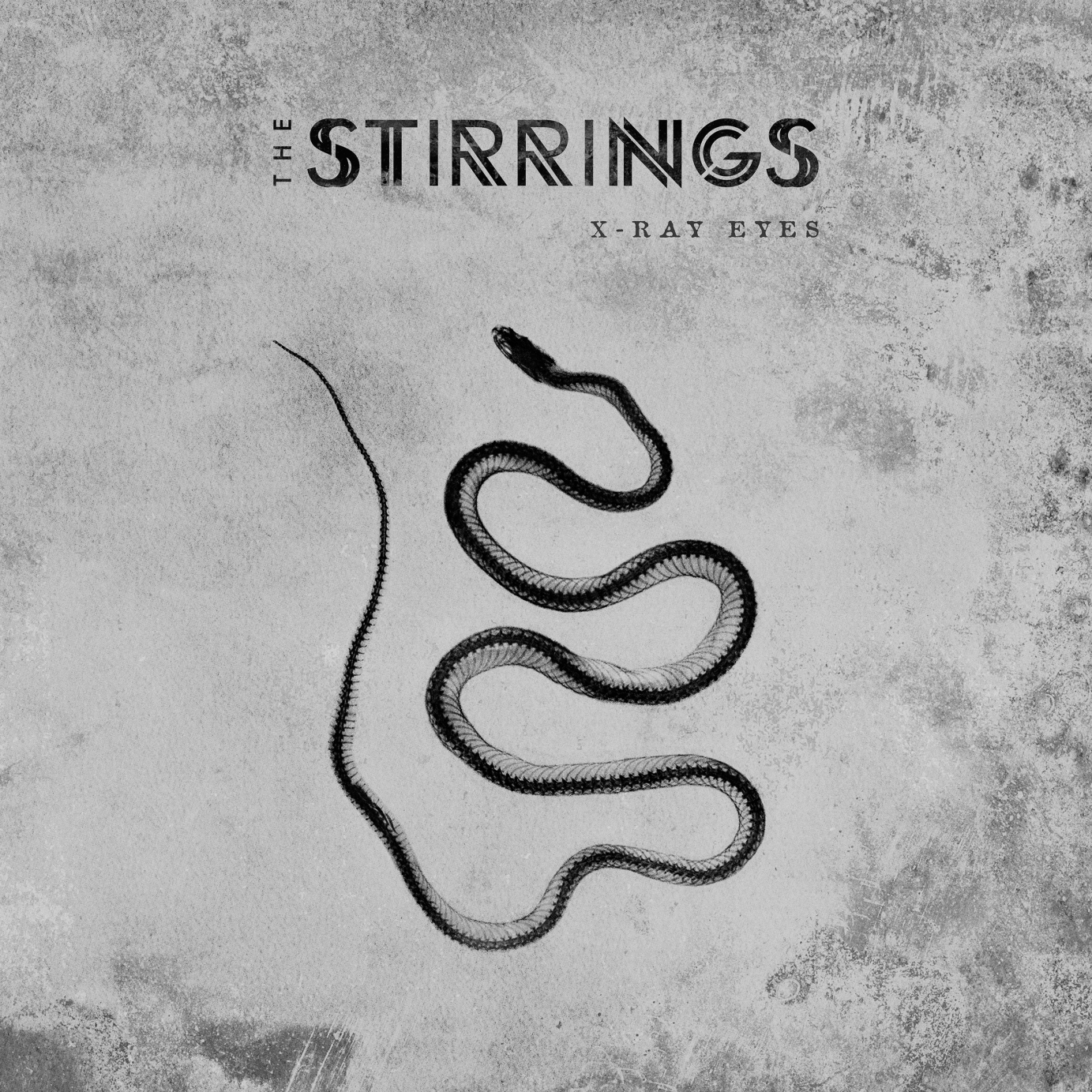
Art direction, cover art, logo design, album layout, photo retouching and merchandise design for the debut album of The Stirrings, an experimental rock band from Madrid.

Album artwork and Logo design for fuzz riddled rock'n roll outfit Brother, Bite The Buffalo.
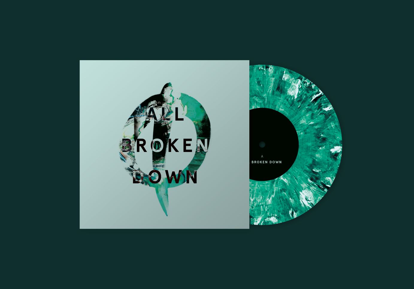
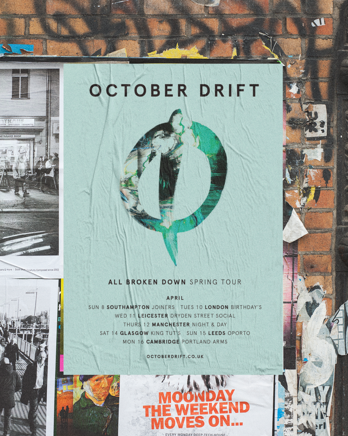
Artwork and posters for single releases for Sugar coated power-rockers, October Drift.
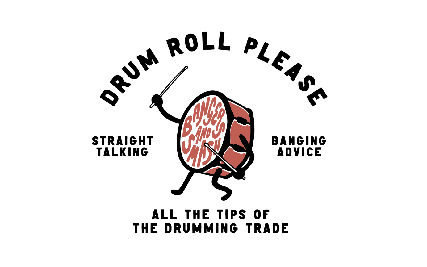
Identity for a drumming masterclass


Psychedelic type logo for Young Martyrs.
Client : LNP Records
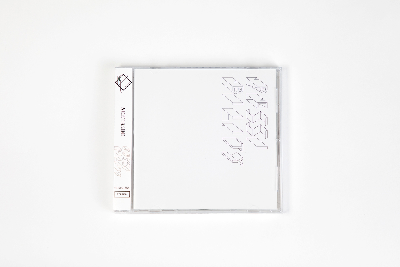
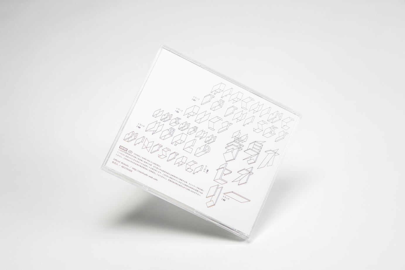
Album packaging design for the Tokyo Indie band Nextrade on their latest album [Possibilities]. On the theme of “possibilities”, we explored design elements of organic polygonal graphic to represent their musical resilience and temperament.
Client : Hoover Records Japan
A Japanese Visual-Kei band going to release their brand new album soon, therefore they want to change their image and logo to the most strong identification one for their next adventure.
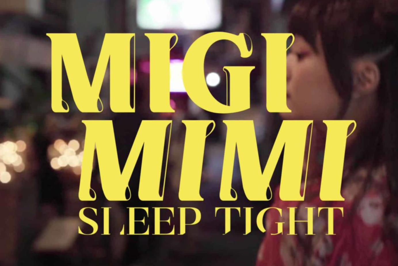
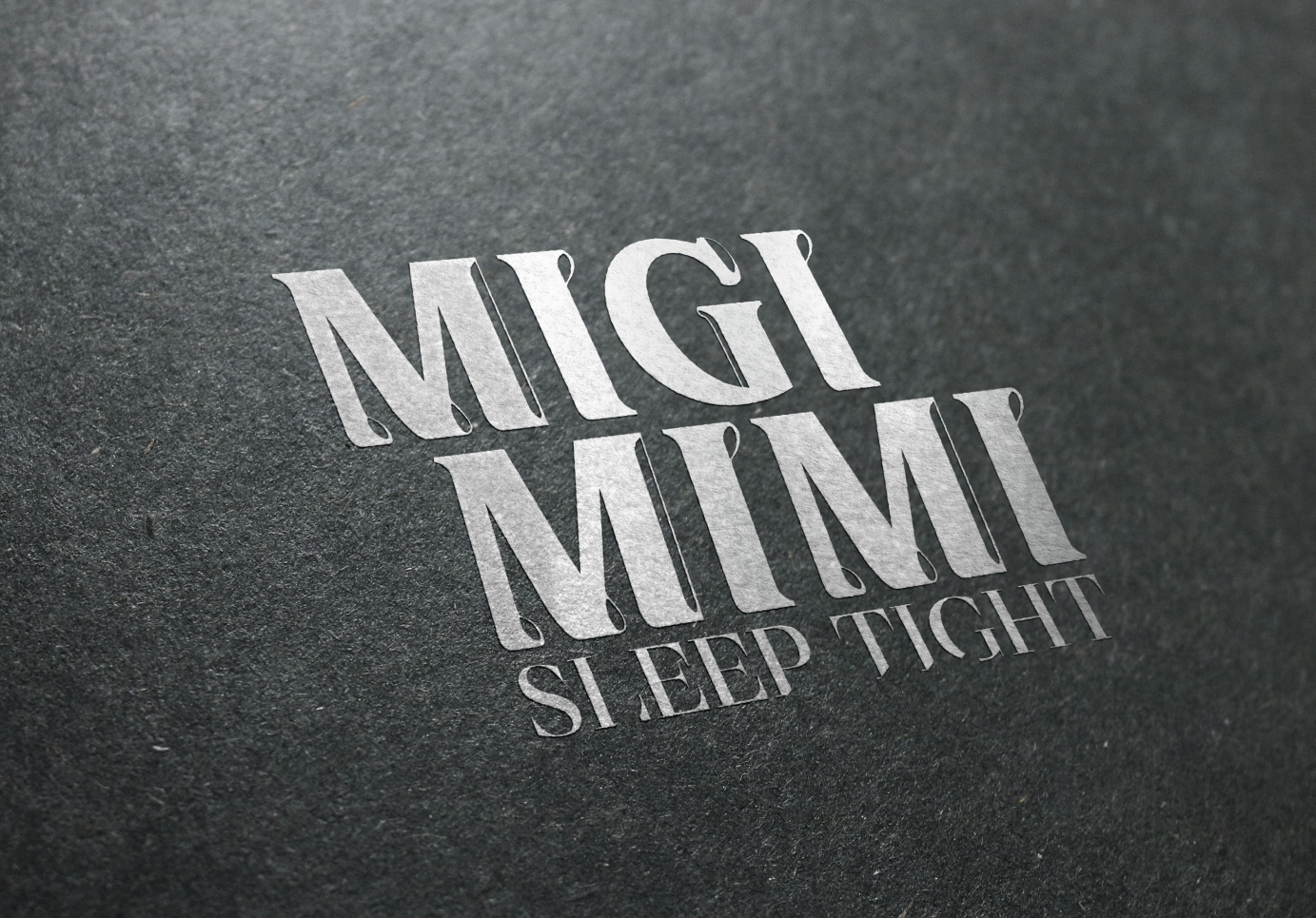
Client : Space Shower Music
Japanese Music Band Migimimi Sleep Tight since year 2016 has joined Japan’s largest Indie Music Group “Space Shower Music”. Throughout the years they are daring to experiment with different styles of music. In 2020, we were invited to create a new logo based on their more mature yet still playful development. From the nature of their music, we used chunky wording design with dynamic figures, creating an identifiable and modern logo.

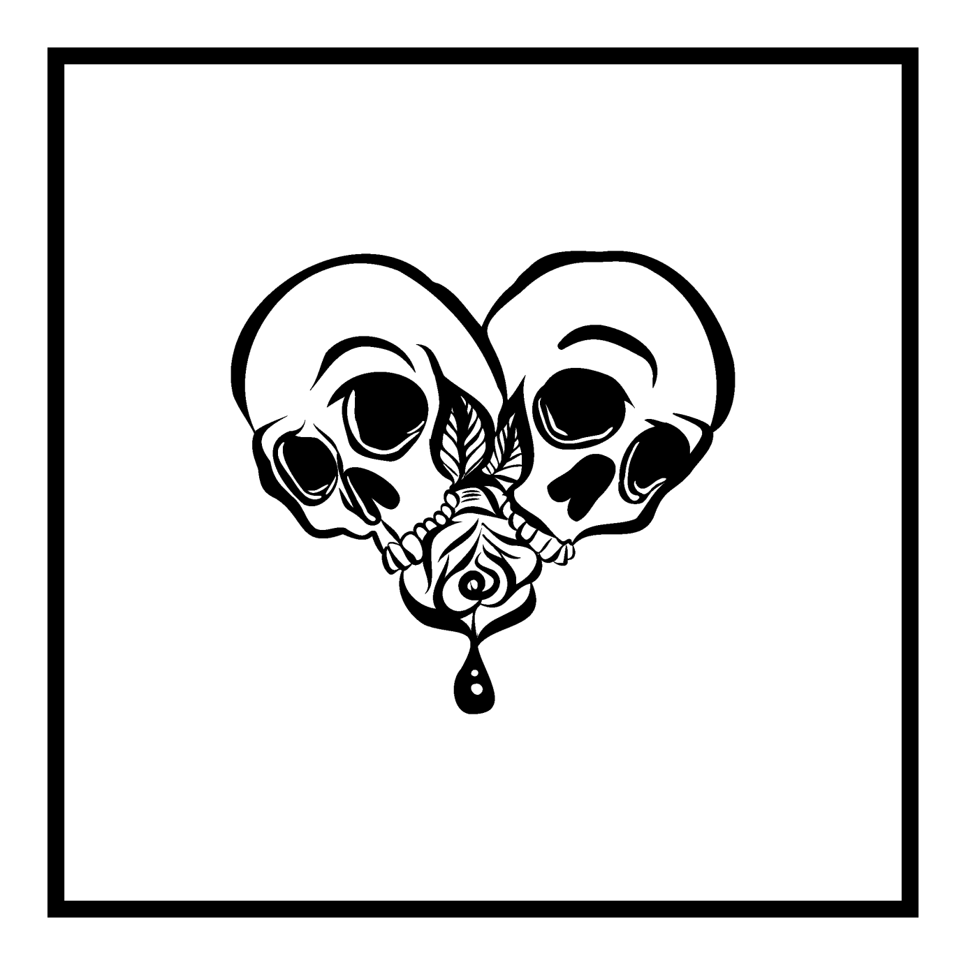
Logo design for music artist d4vd with creative direction from the artist and UMG management. Request for utilization of skull and rose, I then applied the elements to create heart-shaped design with hand-drawn aesthetic.
Commissioned by Universal Music Group.
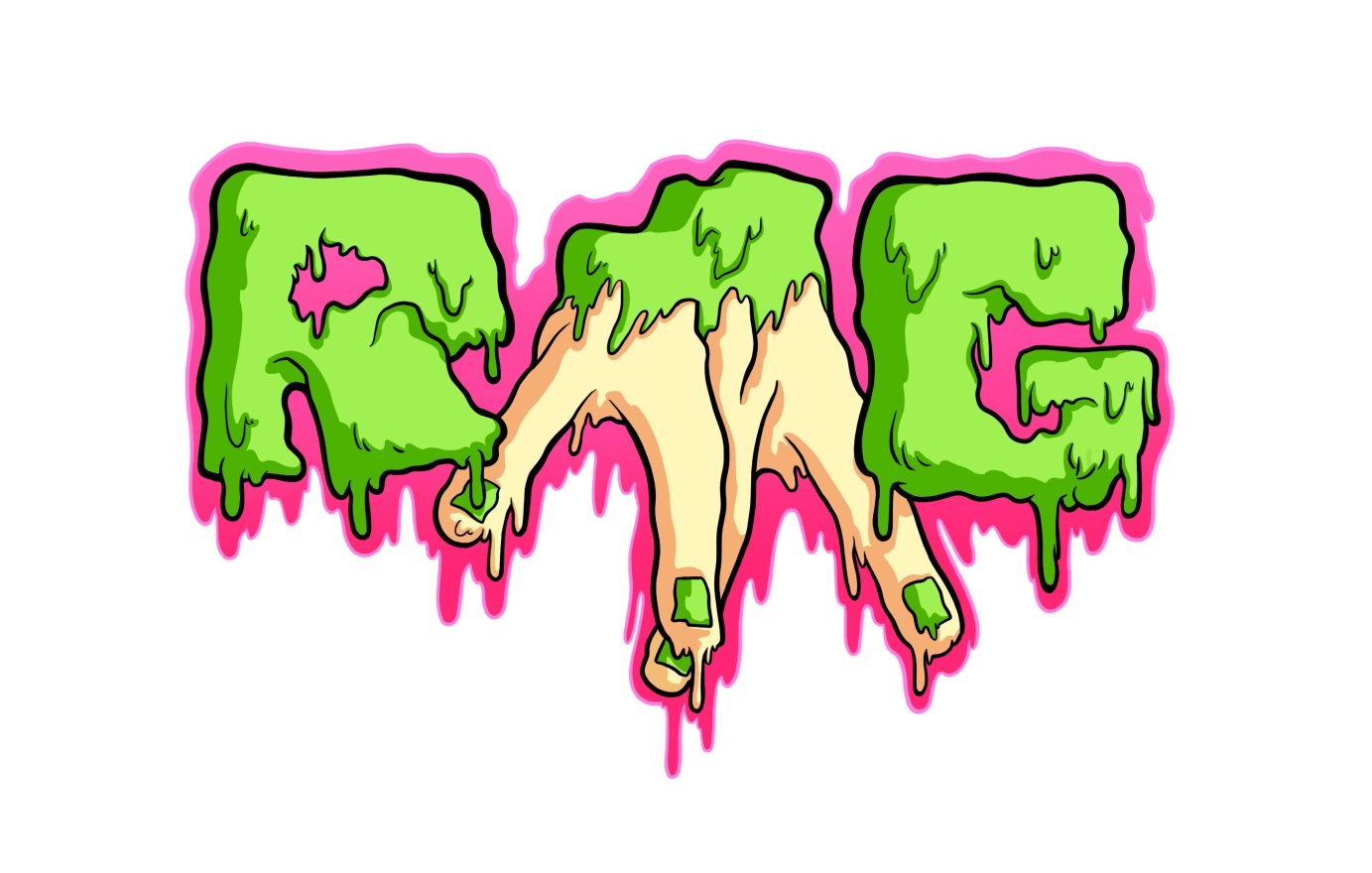

I made these logos for my brother "RMG" and his music project "Break the Drum".
RMG is his personal brand as a DJ. Break the Drum is his new brand, a concept to unite the sounds of Break Beat and Drum and Bass and to promote the DJs from Jerez and Andalusia.

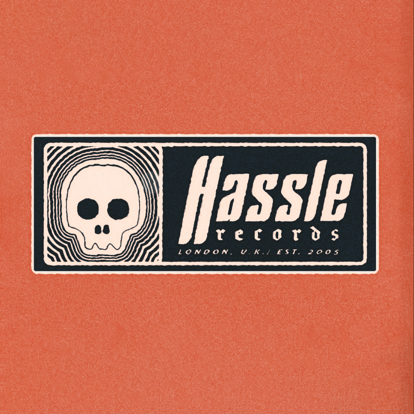
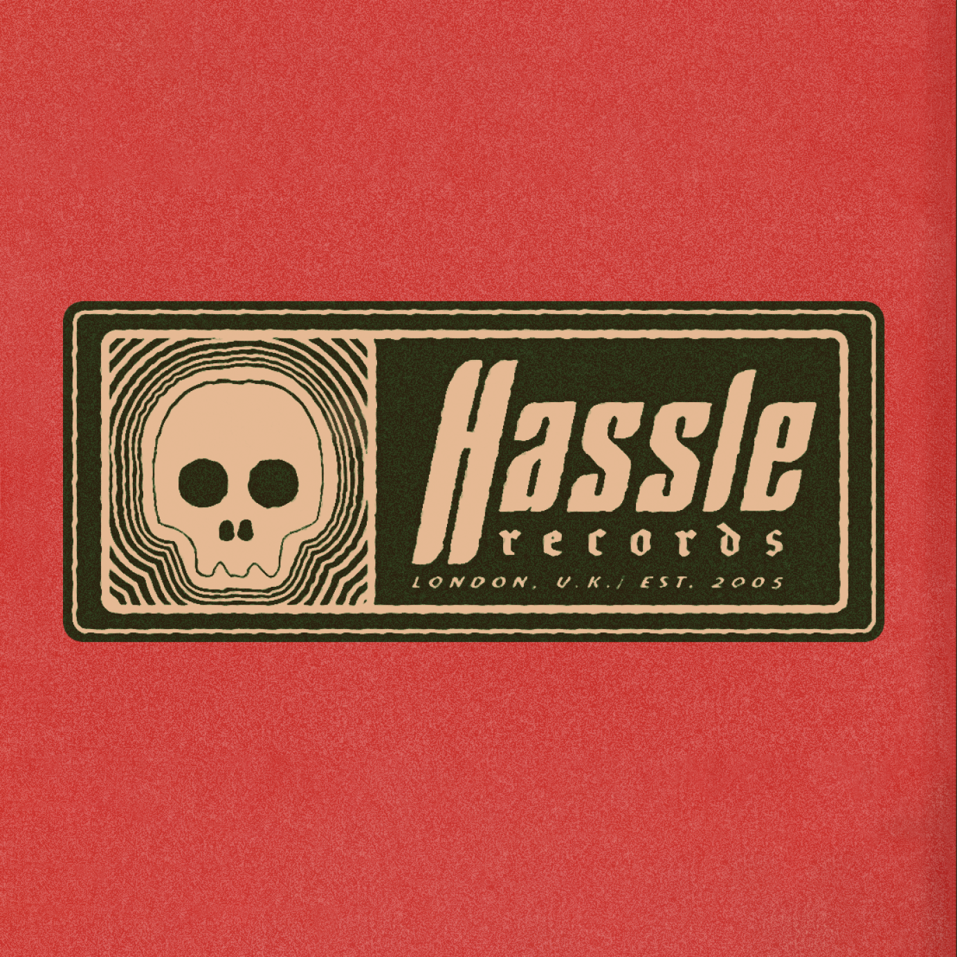
Commissioned to create a vintage style logo for Hassle Records that would better fit in with the cover art of their artist's new album, Ithaca's "they fear us". Was used in a number of other places now too.
Commissioned by Hassle Records.