Spotlight focuses on Creative Commission members with stories to tell. Next up, we hear from designer Cam Heyes - a trusted go-to creator of visual content for some of the biggest artists in the world. Over to you, Cam...
My name is Cam Heyes and I’m a multi-disciplined designer specialising solely in visual content for the music industry. I started StudioX three years ago out of a lifelong interest in music, marketing and design. It has gone from strength to strength ever since.
Career beginnings weren’t plain sailing for me at all, some would describe me as an underdog - and I’m happy with that.
When I left school I really struggled to get into graphic design professionally. I didn’t achieve the grades needed for the graphic design A Levels so, instead, was enrolled on a lower-ranked mediocre art course whilst I re-took certain subjects. I didn’t hate it but I didn’t enjoy it either - life drawings and the history of fine art just wasn’t for me.
After a long dull year of college, I finally got the grades for the course and was hit with another blow that the course was full. I had to look for another college but by that time I was 19 and just wanted to work and earn money.
In 2013, after a few years of job-hopping and freelancing, I landed my first in-house design job working in marketing for a family-run card craft business. I was over the moon. All those nights learning the software and keeping up with trends had paid off. My car was falling to bits, money was tight but I was happy nonetheless.
It was at this firm I first experimented with motion graphics, adding basic lower thirds to card-making tutorials and moving a logo from side to side - it was very minimal animation but back then, I felt like Dreamworks Pictures! I learned a hell of a lot about marketing and design from my colleagues during the three years with the company.
I set myself a personal goal that one day I would work in music marketing. That being said, I had a lot to learn about the music industry and how it operates. Before I felt confident enough to do that, I needed design agency experience and after several unsuccessful interviews and I gave up trying - you can’t pay people to see the potential that I frustratingly knew I had.
'Fast forward five years, I can say with so much pride that I’m now a trusted go-to creator of visual content for some of the biggest artists in the world'
I spent the next two years relentlessly perfecting my graft and reaching out to other music creatives, labels, management and even artists directly to try and win them over, in hindsight - I was a bit of pest. I wonder how many blocked lists I’m on? Hmmm. One artist I reached out to finally said “yes, send your details over to my manager” and that was the start of a solid working relationship with them which ultimately opened the door to bags of industry experience.
Fast forward five years, I can say with so much pride that I’m now a trusted go-to creator of visual content for some of the biggest artists in the world. I work with for labels and management companies daily including Universal Music Group’s UK and US division, Ministry of Sound, Capitol Records UK, Sony Music, Tap Music, Eleven Management, Virgin Music UK - just to name a few.
I love nothing more than being sent a track that needs bringing to life visually.
For most projects I work on it’s a team effort with marketing and digital industry professionals who all collaborate with direction and feedback. I have several group chats on the go for different clients all of which are less than conservative and that’s what brings the fun. Through banter and GIFs is how I communicate with clients to soften the awkward initial introduction and that’s often the recipe for hitting the mark visually when working on a project.
From inception to completion - for the most part, it’s a blast. Not to mention how satisfying it is to see the content revealed on social media and how the fans react. Especially the artists with a bigger following.
FAVOURITE CAMPAIGN
The campaign I’ve recently enjoyed the most, without shadow of a doubt, is Dua Lipa’s Future Nostalgia. And not because I work with her management company of a lot of projects for their other artists. That album’s whole campaign has been a trailblazer for both visual and sound, the music videos, the lyric videos. It does exactly what it set out to do.
From the heavy text effects of the early 2000s in its artwork to the 90s vibes of its overall sound. Future Nostalgia has taken elements of music that have been long gone and brought them back all while remaining current and somewhat ‘futuristic’. To the younger generation its production is new and exciting but for us 90s kids it awakens a nostalgia that has been locked away in a mental time capsule for years.
I’m also going to throw a curve ball here as it was actually the year before but Liam Gallagher’s Why Me? Why Not. Everything about that campaign had me glued. From the rustic poster branding and the timeless artwork, big and tall typefaces, the iconic Gallagher vibe and minimal press appearances in true rock and roll star fashion. I think there’s still a lot of mystery around Liam Gallagher and we look for it in the content he puts out. One of my favourite cover arts to date.
I always love when an artist reinvents themselves with every album release, Lady Gaga is renowned for this which leads me on to creatives whose work I admire. First is Andrea Gelardin, a creative director who’s work with Lady Gaga’s Joanne era, her epic tour visuals and the Super Bowl half time show blew my mind. I had the pleasure of working with Andrea last year on a project for Riz Ahmed - a true creative. I couldn’t list any more people that inspire me and my work without giving a shout out to the incredible Ezra Cohen, I think it’s safe to say most creatives who work in the visual arts are familiar with his work. He’s a filmmaker whose assets and motion graphics are fresh, trendsetting and unique.
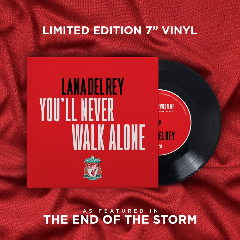
The project I’m most proud of from 2020 is Lana Del Rey’s cover of You’ll Never Walk Alone from the Liverpool FC Documentary The End Of The Storm OST. Although the artwork is super simple as requested from management, it was my first project for a physical CD/Vinyl and for such an established artist too is amazing.
I recently started collecting LPs so this job was welcomed with more excitement than usual. When the copy arrived in post I couldn’t wait to give it a spin and inspect the artwork - Lana also signed it which was an added surprise!
