CC speaks to photographer Laura Lewis and designer Dan Tombs about the creative process behind Gold Panda's latest release
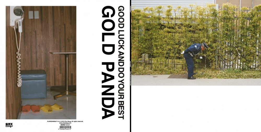
The art for Gold Panda's latest album Good Luck and Do Your Best was designed by Dan Tombs and photographed by Laura Lewis. It is featured in this month’s Album Cover of the Month poll - a unique award voted for exclusively by our creative community. We spoke to the duo behind the cover to find out how the creative process developed and to take a step into the creative world of Gold Panda.
How did you come to be working with Gold Panda initially? How involved was he in the artwork?
LAURA: Derwin (aka Gold Panda) was completely involved in the artwork from the off, it was his idea, so he's very much part of it. He had a vision and I guess it was my job to try and help him realise it via photography.
Gareth Dobson at Wichita introduced Derwin and I in early 2014. Derwin had a copy of my book, People. Places. Things. which was a collection of photographs I'd taken throughout the world on my travels. He had some plans for a project which would eventually become his third album. He explained a little about his ideas and asked if I wanted to go with him to Japan to photograph some travels, and people, and places, and things.
The photography we did there became the cover artwork for his album Good Luck and Do Your Best, single artwork for In My Car and Time Eater plus a photography book and elements of Derwin's and Dan's visuals for the live show. During our trips to Japan I shot on 35mm film, medium format film, digital, throw away cameras, filmed on my Go Pro and iPhone... essentially I captured as much as I humanly could over the course of two weeks.
DAN: I’ve known Derwin for 7 or 8 years and have previously worked on various Gold Panda videos and sleeves for his Notown label. I also designed his live visuals in 2012 and have been developing them ever since.
As Derwin was finishing this record he was spending a lot of time in Norwich (where I live) working with our mutual friend Luke Abbott who mixed and produced the record. After they had finished a days work I was often meeting them both for a drink and naturally talking about the record. Derwin knew he wanted to use Laura’s photos for the cover image and then set me the challenge of coming up with an idea for the rest of the sleeve. We looked at a few old Jazz records Derwin has in his collection and examined the typography, some of which was done by hand and had minute differences in the character placement and kerning. We thought this gave it a very honest quality and taking those records as inspiration I placed each letter of text individually (digitally) creating deliberate aberrations as I went, I carried this approach through all liner notes too which was quite a task in the end.
Have you both worked together before?
DAN: Yes, we worked on the cover image for Culture of Volume by East India Youth (XL Recordings) again I had a long standing relationship with Will (from East India Youth) and we were chatting on tour about the possibility of using early Amiga computer technology to emulate some of the work Warhol made late in his career. The basis of which would be a photograph of Will, although the image was going to be heavily processed I felt it important that the source photograph should be as good as possible. Hence calling upon Laura, she worked really well with Will and captured a great relaxed image of him that was already full of character so after the processing in the computer it didn’t look too cold or synthetic.
LAURA: I was really chuffed to be part of the process, and seeing my photographs with Dan's glitchy Amiga wizardry on them everywhere round town on posters was really cool! It was great to work with Dan again on the Gold Panda project, and I'm really proud of the result. High fives all round!
The framing of the cover is unusual, which we love; can you explain why this is?
LAURA: When Derwin and I sat down to try and decide the cover image, we played around a lot with framings with a few images. It was Derwin's idea to frame the cover photograph in that way - the landscape photograph at the top of the square, with white space underneath. I loved it as soon as we tried it. Derwin has a really great eye for detail and design, and I think he sees things in a very unique and beautiful way. I wouldn't have ever thought to frame a photograph like that but it's a strong and effective result, he really has a great eye.
It was Gold Panda's idea to frame the cover photograph in that way... [he] has a really great eye for detail and design, and I think he sees things in a very unique and beautiful way
DAN: Full credit to Laura and Derwin on that one, I tried to add text to it but they wisely stood their ground.
Where was the cover shot?
LAURA: The cover image is a photograph I took in Kyoto during our travels. I took it on my Canon AE1 on 35mm film. I really fell in love with Japan and was wowed by the country - its people, their hard-working demeanour and the ever-present concept of doing one's best. The cover shot is of a security guard bending over to pick out a piece of rubbish from a well-kept row of plants. For me, the image encapsulates the notion of hard work, diligence and commitment I found present in so many of the people we met there. Derwin named the album after a Kyoto taxi driver's parting gesture to us was 'good luck and do your best', and people doing their best and trying hard is a real underlying theme in a lot of the photography we produced. Due to the amount of time we spent in Japan there are probably way too many tales to list here. But you can get a good sense of some of it in the video I made for Pink & Green which is made up of footage I shot along the way
Gold Panda named the album after a Kyoto taxi driver's parting gesture to us was 'good luck and do your best'... [this] is a real underlying theme in a lot of the photography we produced
How did the conceptual creative process develop into the final design for Good Luck and Do Your Best?
LAURA: Derwin and I had hundreds of images to choose from, so we sat down with a cup of tea one day, listened to the album, and started cutting out loads of images we liked from the contact sheets. For this project, and in general, I've always liked printing contact sheets and cutting things out, placing things together, scribbling notes on things, doing things in a tactile way instead of editing digitally - it just somehow feels more real and authentic. I love the printing process and having images in your hand is very different to scanning over things on a screen. We chose about sixteen favourites, decided on the cover image, then handed it all over to Dan to do his thing.
DAN: The composition on the rear sleeve was perhaps the trickiest to get right and went through quite a lot of variations, trying to balance the necessary amount of text with a large image and give everything space. The breakthrough was actually a chance conversation with Luke (producer) over a coffee one morning when he described the LP as a Punk record, that was a key for me to table to unlock the layout and make sense of it all, simply rotating the main text by ninety degrees to the image. Always a relief when you get the breakthrough moment.
I've always liked printing contact sheets and cutting things out... doing things in a tactile way instead of editing digitally - it just somehow feels more real and authentic
To dive a little deeper into the artwork, can you explain the direction for the inner sleeve too?
DAN: The imagery created for the inner sleeve was inspired by the MPC samplers that Derwin uses to make the majority of his music. They have a four by four grid of buttons to trigger samples and I wanted to reference the sixteen squares in the artwork. I was able to source some small glass cubes stack them into a grid and have great success projecting different images through the glass and rephotographing the reflected image. I used various pieces of video I’d synthesised from analogue hardware and then Laura’s cover photo. Derwin had kept the receipt from his first MPC purchase and this through the cubes is the imagery for the vinyl and CD labels. I produced an awful lot of images and Derwin was the one who spotted an image i’d overlooked and its now the main image on the inside sleeve. We spent a day with print outs of the layout making changes and going through a folder full of images, there really isn’t any better way than being in the same room with all the images.
LAURA: I think Dan really nailed the inner sleeve and cover / rear cover design. The huge letters on the rear cover, travelling down the side of the Tokyo love hotel room photograph, make for really striking design. I like the way the inner sleeve is all blues and blacks and deep colours - it clashes and contrasts really nicely against the white spaces of the cover and rear sleeve.
Gold Panda had kept the receipt from his first MPC purchase and this through the cubes is the imagery for the vinyl and CD labels
Have you got a copy of the vinyl? If so, what was it like to hold your work in your hands?
DAN: Yes! Always the best feeling to finally see the finished article, mixed with nervousness in case there was anything you mistyped or forgot to finish, but thankfully all turned out well. I often work in video so having a definitive psychical product of your design work is always an exciting moment and one I cherish.
LAURA: Yes I do, it was great to hold it in my hands! It's currently sat on the mantel piece in the living room in pride of place. It was really flattering and fulfilling to have one my photographs used to punctuate such a beautiful album. Being privy to the album-making process was such a privilege, and I'm sure my vinyl copy will probably get framed at some stage. I think I will always look back on this project extremely fondly.
Which fellow creatives inspire you individually?
LAURA: I've always been inspired by photographers like Martin Parr, Henry Cartier-Bresson, Saul Leiter, Andreas Gursky - the beauty in the ordinary is the thing that keeps me wanting to do more. I have lots of really talented friends working in the arts - musicians, photographers, editors, poets, illustrators, animators, designers, writers - keeping abreast of all their work and chatting shop to them continues to inspire me to work hard and keep trying new things. I'm lucky to be surrounded by such talented and creative people.
DAN: I’m always humbled by the work of Alex Peverett he’s an incredibly talented image maker as well as a musician and his passion for new ideas free thinking and forever researching his field is astonishing. He’s also been really generous with his time and knowledge to help me out on several projects and i’m seriously grateful. Trevor Jackson has always been inspirational too, his design work is incredibly well conceived and delivered and often has a little playfulness too. I can’t not mention Peter Saville, and Vaughan Oliver, two seminal designers that really got me thinking that record covers were made by people, and that was a job. In moving image, Dario Argento’s films have made a deep impression on me lately as well as revisiting a lot of John Carpenters work and finally Sabrina Ratté constantly wows me with her work in video synthesis, she’s really pushing that area of work.
What are your creative aspirations for the future; which music artists would you like to work with?
DAN: I’ve been fortunate to meet Stephen and Gillian Morris through my work with Factory Floor and The Charlatans and it would be a real rush to be able to collaborate with them on some video work for New Order, I never tire of enjoying their music and they are a fascinating band that has achieved so much. I think that would be a creative high point for me if that ever happened.
LAURA: There are too many to mention! I have so people I look up to and find fascinating, and those are the people I'd love to photograph. Aretha Franklin, Joni Mitchell and Barack Obama haven't called me yet but I figure it's only a matter of time, right?! I've been lucky enough to work with some amazing music artists during my career so far and I'd love to do more projects that involve shooting on film, travel and music artists. The Gold Panda project involved all those elements and I enjoyed every second of it - I wish I could do it all over again! I'd like to start working more in the charity sector, doing photography projects, portraiture, reportage etc for NGOs and charities. And I'd love to shoot portraits for news supplements and newspaper articles about interesting people. In short, I find people fascinating. Finding out what makes them tick is part of the photography process, and that's the thing I love about it. Oh and I'd love to photograph the Queen. Hopefully she's reading this.
Tell us a little more about your backgrounds
LAURA: I've always taken photographs. Ever since I can remember there were cameras in the house and photo albums and prints lying around the place. I grew up in Norfolk and did my degree at Norwich School of Art and Design. I also studied in Lisbon and London. I've been fortunate enough to take portraits of some musical greats like Rod Stewart, Chase & Status, David Rodigan, Dame Shirley Bassey, Mary Anne Hobbs, Gilles Peterson, and Kasabian. Plus stood on stage with the likes of Nile Rogers and The Strokes shooting their shows. Last year I got to photograph Taylor Swift in front of 65,000 screaming fans. That was quite an experience. I've shot backstage at London Fashion Week for several seasons and a couple of years ago my portrait of David Rodigan was accepted into the National Portrait Gallery collection. I opened my first studio in 2014. Some of my favourite projects have included working with Outward Housing, a charity which supports vulnerable people in London and runs activity breaks for people with learning disabilities. Last year I also spent a few months photographing at a Haringey lunch club for the elderly which was a very fulfilling and inspiring project. Is that enough plugging? I hope so!
DAN: Well Laura and I also share a common education, we were both graduates of Norwich School of Art and Design and studied at the same time! I graduated with a degree in fine art, and I think that has set my perspective on design and video work.
I’ve created sleeves for East India Youth, Nathan Fake and Hannes Rasmus, as well as the logo and design work for Gold Panda's Notown label. What keeps me busy most of the time though is working on music videos and live visuals. I have been working with Jon Hopkins for many years and have toured with him extensively in support of his album Immunity, running live visuals and also a small lighting package. That's been an amazing experience and taken me to some far flung places. I’ve also been working with Blanck Mass which is the solo project of Benjamin John Power from Fuck Buttons and we have collaborated to create a live show that is a sensory assault using analogue video synthesis, distorted x-rays of human bones and even endoscopy, proper David Cronenberg territory. Other collaborations have been with East India Youth, Factory Floor, Perc, Luke Abbott and wonderfully The Charlatans on their 2015 UK tours which was on the back of making several videos for Tim Burgess solo records.
And, finally, what's next for you both?
DAN: I’m off on tour with Gold Panda, creating live visuals for him, utilising some of Laura’s photography and a whole kaleidoscope of other material too. Its a very rich and colourful show and i’m really looking forward to being able to tour it across Europe, USA and back to Japan!
I’m also in the middle of producing a music video for Gold Panda, based on another recent trip to Japan in search of vintage samplers, and celebrates the second hand and junk shops of Tokyo.
Beyond working with GP i’m involved in a research project with the radio astronomers at Jodrell Bank attempting to visualise the sounds of the universe which will be performed at The Blue Dot Festival in July, on the same bill as Brian Eno and The Clangers! In addition i’m also working on my own audio visual release I hope to get finished later on this year and might even start a DIY VHS label…
LAURA: Derwin and I are working on a book, also titled 'Good Luck and Do Your Best' which will feature more of the photography from this project. Otherwise generally my plan is to keep taking pictures, one day at a time. Hopefully I'll continue to have good luck, and, of course, I'll keep doing my best.
