Greg Rose directs content and communications at Virgin, leading Richard Branson and the Virgin brand’s global digital strategy. Greg is also a fiction writer and former music journalist, sport writer and news reporter. A native of the UK, Greg is based in Brooklyn.
Our recent chat with Greg discusses his favourite campaigns and talks about the overlaps between visual creativity and music.
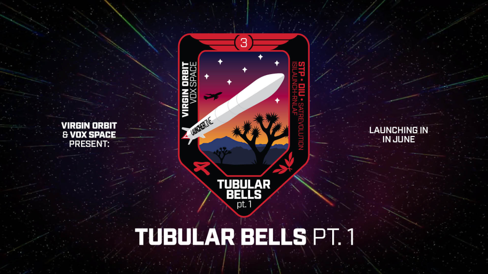
I’m currently working on some exciting plans with Virgin Music and Virgin Orbit, our satellite launch company. Virgin Orbit’s next spaceflight is tipping its hat to the origins of the Virgin brand with the name Tubular Bells. The classic Mike Oldfield record was the first album released by Virgin Records. I joined Virgin to work on a music show over a decade ago, and while my work has gone in a lot of stimulating directions, I’m always pleased when it comes back to music.
I'M LOVING
Creatively at the moment, I’m loving Matt Berninger's Serpentine Prison.
I like when an artist has a cohesive vision for a record and the look and feel matches the sound and mood. Michael Carson's painting for the album cover, with its forked-tongued snake shadowing Matt’s loafer, sets a tone the album aligns with from its title to Booker T. Jones’ production. This is a thoughtful explanation of the process.
FAVOURITE VIDEO
My all-time favourite music video is Kanye West Runaway.
I had the bizarre pleasure of attending the premiere of Kanye West's Runaway. To date it, world heavyweight champion David Haye was getting his iPhone4 sealed into a plastic bag by a BAFTA employee as we went in, and pop stars still had physical launches for extended videos with screenplays by Hype Williams. It was gloriously silly, surreally overblown and surprisingly stunning. Afterwards Kanye did a never-ending Q&A mostly about the extraordinary number of purple hues in the video and glowered at anyone who tried to leave. I still love the song - the piano oddly centred on the 2nd and 4th notes, the tritone at the end – and the video has been buried in my head ever since.
BEST ARTWORK
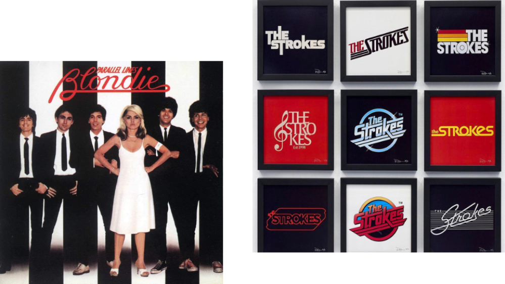
I’ve always loved the album art for Blondie Parallel Lines.
I grew up playing my parents’ vinyl copy and had the sleeve on the wall at university. The design is so simple and striking. I love how chipper the rest of the band appear compared to how cool and confrontational Debbie Harry looks – apparently they all hated it. This cover probably had an influence on the amount of nights I spent in indie clubs wearing skinny ties and dirty Converse. I also enjoy an Easter Egg: in the liner notes, the lyrics to a song called Parallel Lines are included, but it isn’t actually on the album.
RECENT CAMPAIGN
The most recent campaign I’ve enjoyed working on has been Literati and Patti Smith.
We started a book club this year with a brilliant start-up called Literati. We choose a book each month to read and discuss in their app, and Richard interviews the author about their work. We recently had Patti Smith, who was somehow even more delightful and fascinating than I’d expected. Her memoir, Just Kids, is a masterpiece; its lines are always somewhere in the back of my mind when I’m wandering around the East Village.
BRAND COLLAB
The most recent brand collab that caught my eye was Tag Team and Geico.
During the long lockdown months, I have watched an inordinate amount of sport on TV, from the early days of pretending to care about the Bundesliga to attempting to get into American football and even baseball. The constant accompaniment to the coverage is this deceptively smart tie up between Tag Team and Geico. Play anyone in America the start of the song and they will be able to reel off “French vanilla, rocky road, chocolate, peanut butter - cookie dough!” The story behind it is quite sweet too.
VIDEO OF THE YEAR
For me the most creative and original music video of the past year is Haim Gasoline Live.
It may seem counterintuitive to pick a live video out for creativity and originality. But having spent the past 15 months watched endless lifeless livestreams and itching for the feeling of a live show, I love how Haim made this performance in a car park feel fresh and exciting. The camerawork is so breezy, The Forum at sunset makes a great backdrop, they nail the vocals and I’m a sucker for a piano replacing a guitar on a live version.
LOGO LOVE
I wish I’d designed the artist logo for The Strokes.
There was a fun exhibition on the Bowery based around Lizzy Goodman’s Meet Me In The Bathroom book and it included a bunch of alternative Strokes logos. They all looked fantastic, but the original glimmering chrome design still stood out. The Strokes have never played a bum note when it comes to branding and design – right up to their robotic baseball battle in Roman Coppola’s recent video for The Adults Are Talking.
GO FOLLOW
The one artist you should follow on Instagram is Alice Rawsthorn.
Alice Rawsthorn is a design writer who has immaculate taste and vast range. Whether it's a story about Carlo Mollino only making furniture on Sundays, Dazzle design theory, or the history behind Penguin classic music scores, you learn something you didn’t know you wanted to every time you visit her page. Her book Hello World: Where Design Meets Life is well worth a read too.
ICONIC
I almost went for this genius Simon & Garfunkel nod to The Sound Of Silence because it makes me laugh every time I see it.
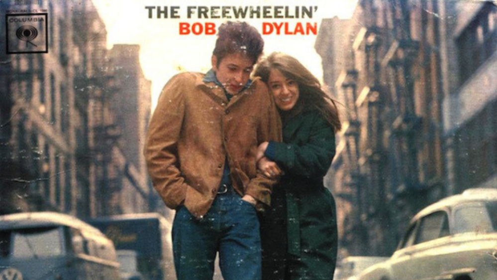
But the most iconic music photograph is another folk album, The Freewheelin’ Bob Dylan cover, gets my vote. It's a defining image of youth, of joy and carefree love, on a record full of heartbreak and humour, war and wonder. Dylan and Suze Rotolo look freezing but happy. The record was my gateway to a lifetime of endlessly enjoyable Dylan obsession.
