Erthling
For By Taylor Dawn Design Studio
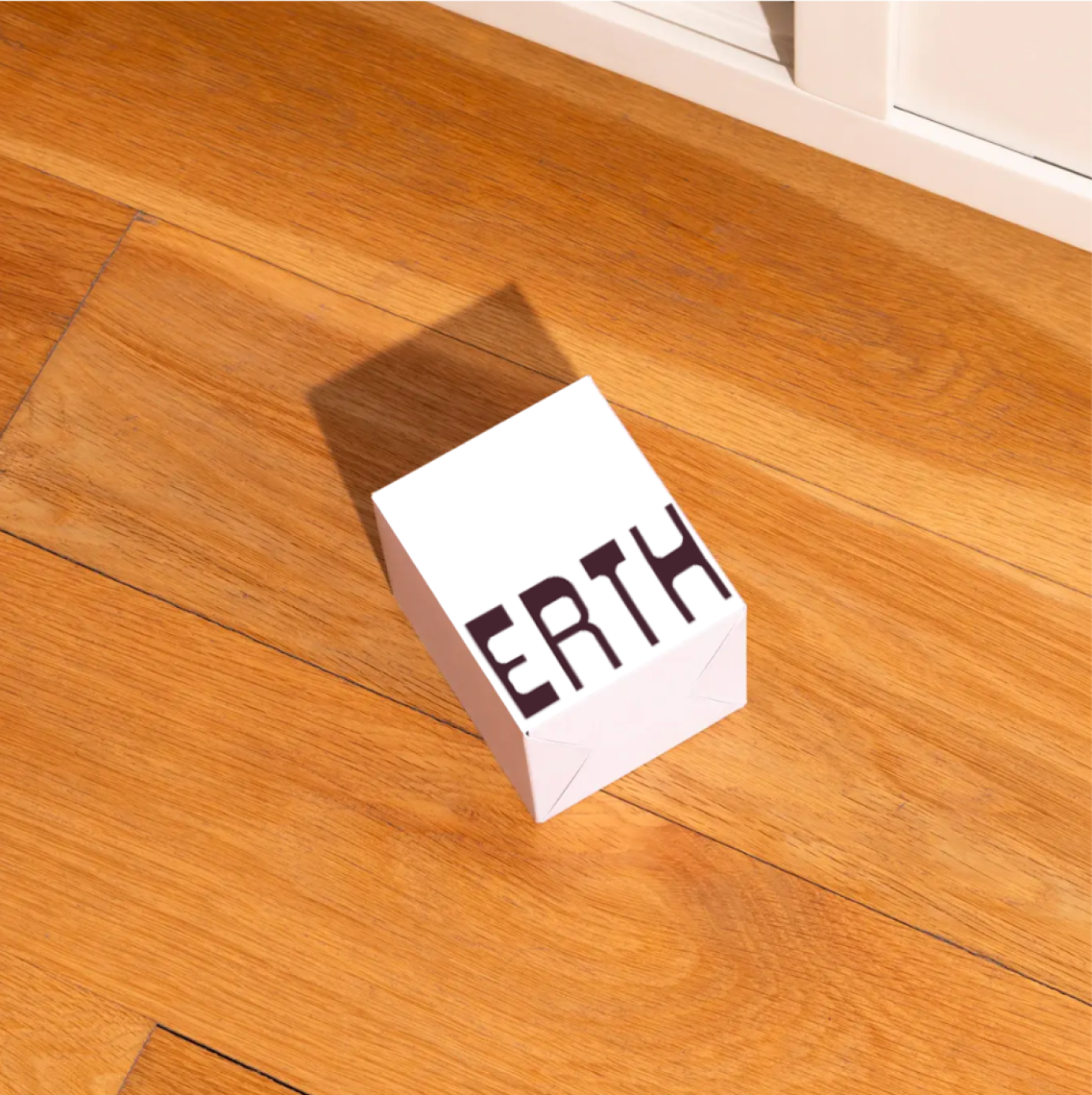
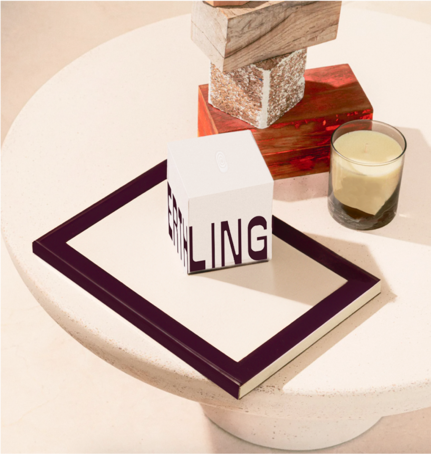
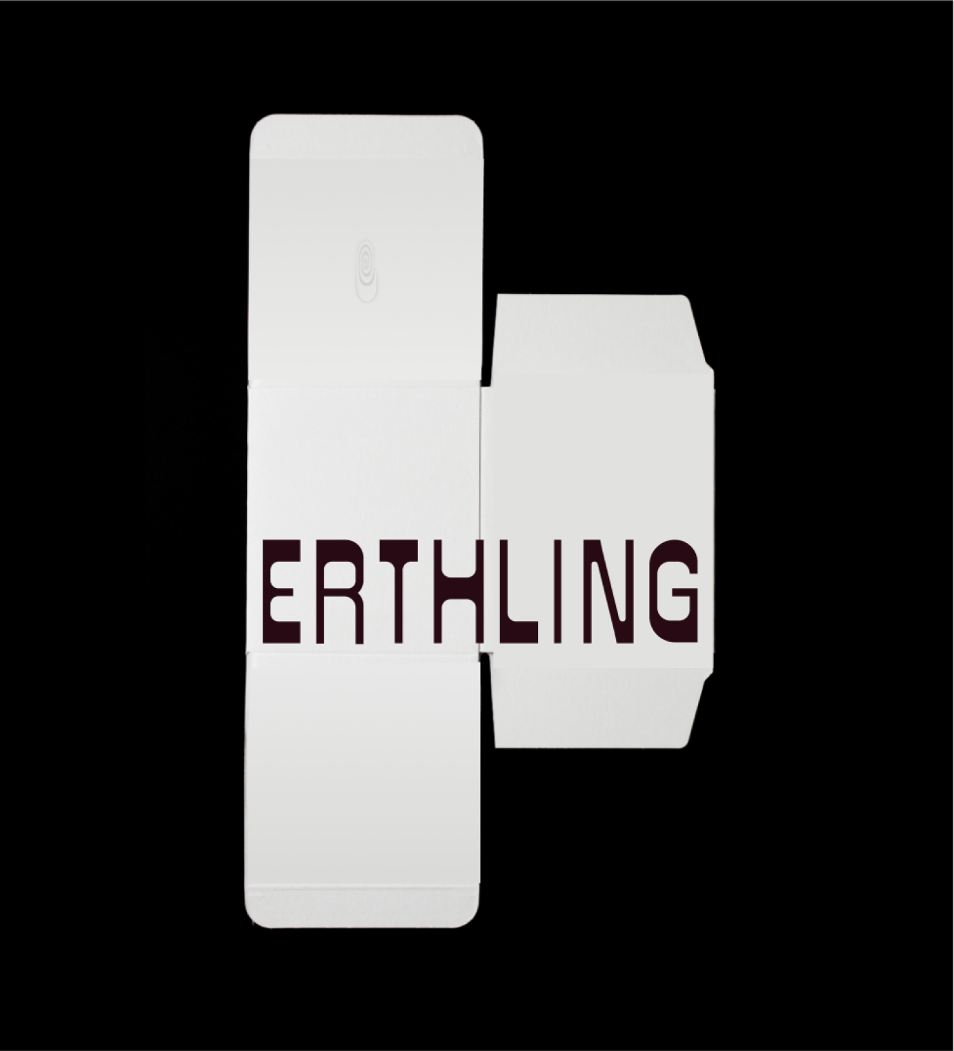
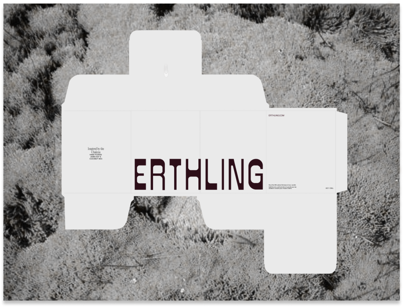
Branding & packaging // Branding and packaging design for an upcoming wellness and beauty brand Erthling, producing chakra inspired natural candles for the high-end European market. Highly visual designed with experimental layouts and expressive colours.
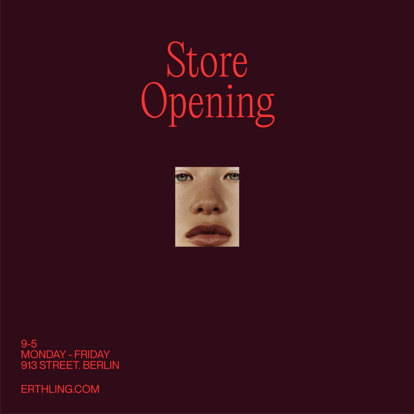
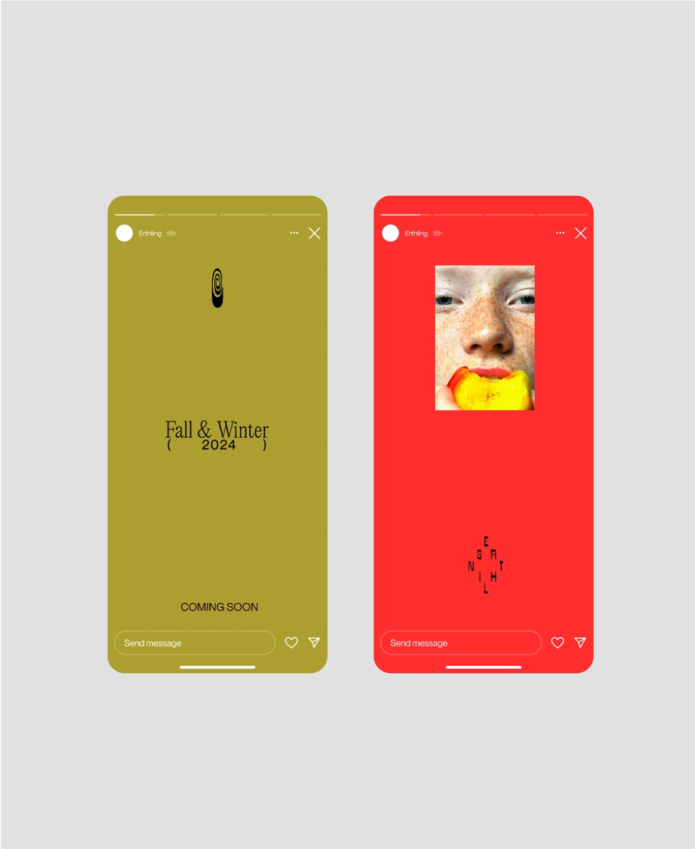
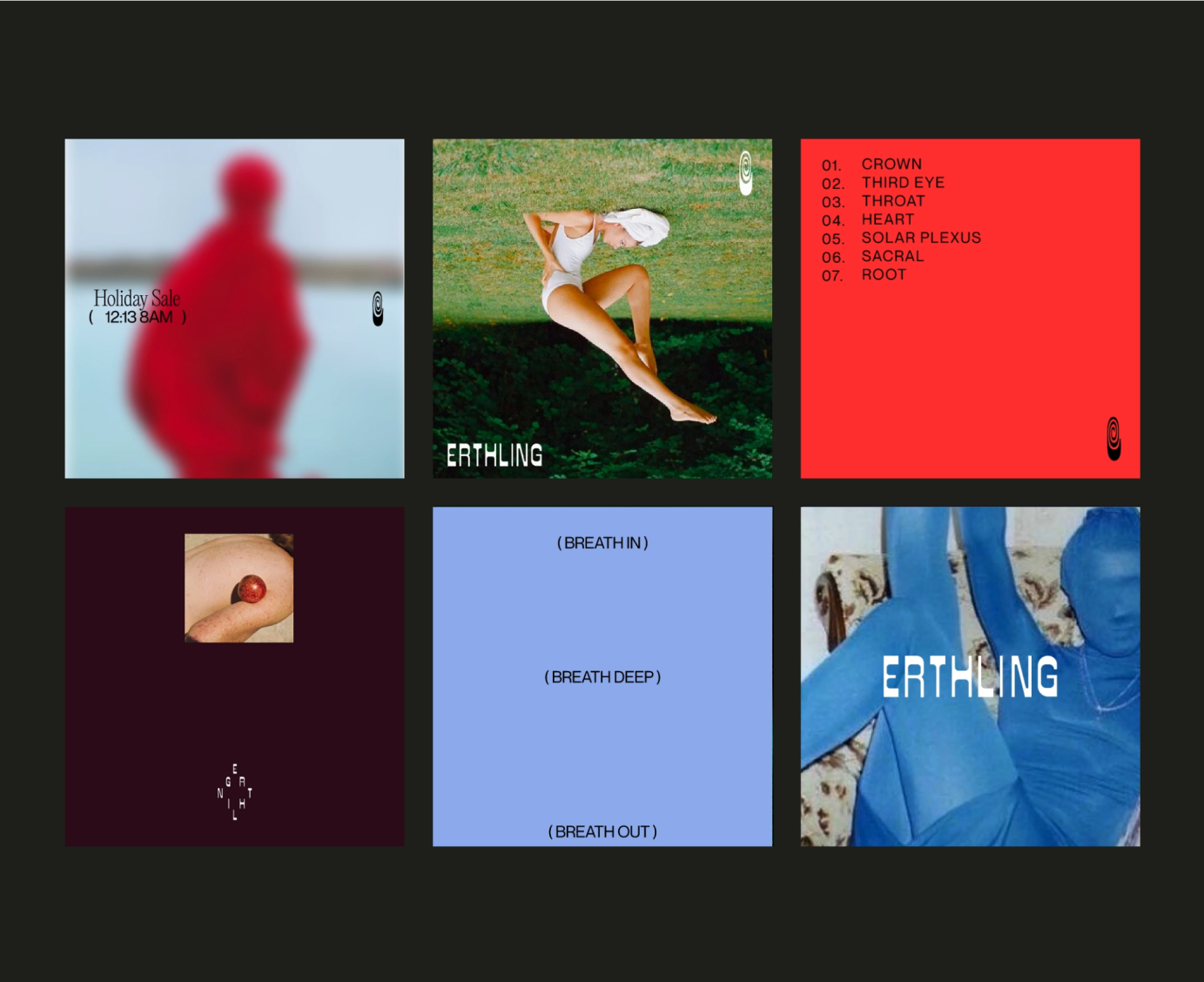
Erthling’s branding brings in a holistic and creative approach to the candle market. The photography visuals push the boundaries of nature vs human. It’s bold expressive colours expresses the brands wants to stand out and be unique, personable, creative. Putting design as a top priority, the visuals throughout social media, packaging and print material expresses the brands values of being curious, artful, grounded and timeless.
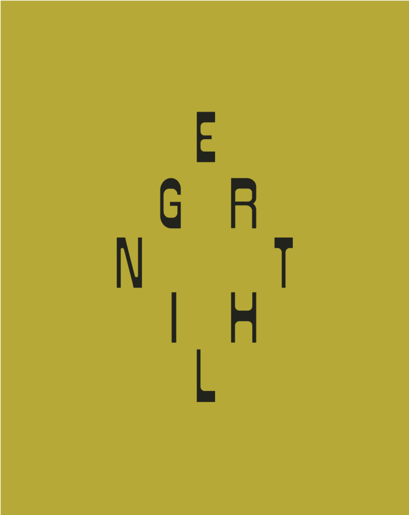
The logo mark is a representation of being conscious of spirituality, being curious, grounded. The custom logo typeface designed by Taylor Peters is an extension of that idea of being expressive and artful. The brand wanted to be representative of the idea that life is not black and white and people can embrace colour in their lives. Considering the high-end market in the candle business, a lot of brands lean in to the minimal, monotone aesthetic, so by stepping away from that Erthling creates a unique look while still having a luxury designer feel, but a natural and carefully crafted one.

