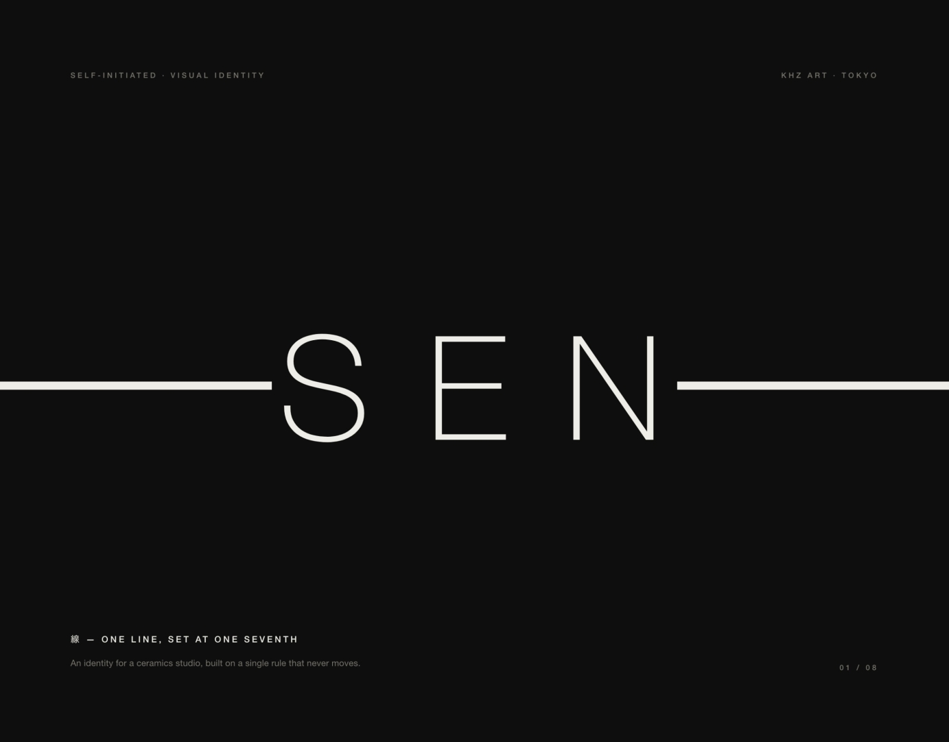
SEN — a logotype that is mostly one line
Image
Image
Image
Image
Image
Image
Image
Image
Image
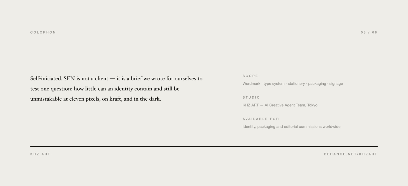
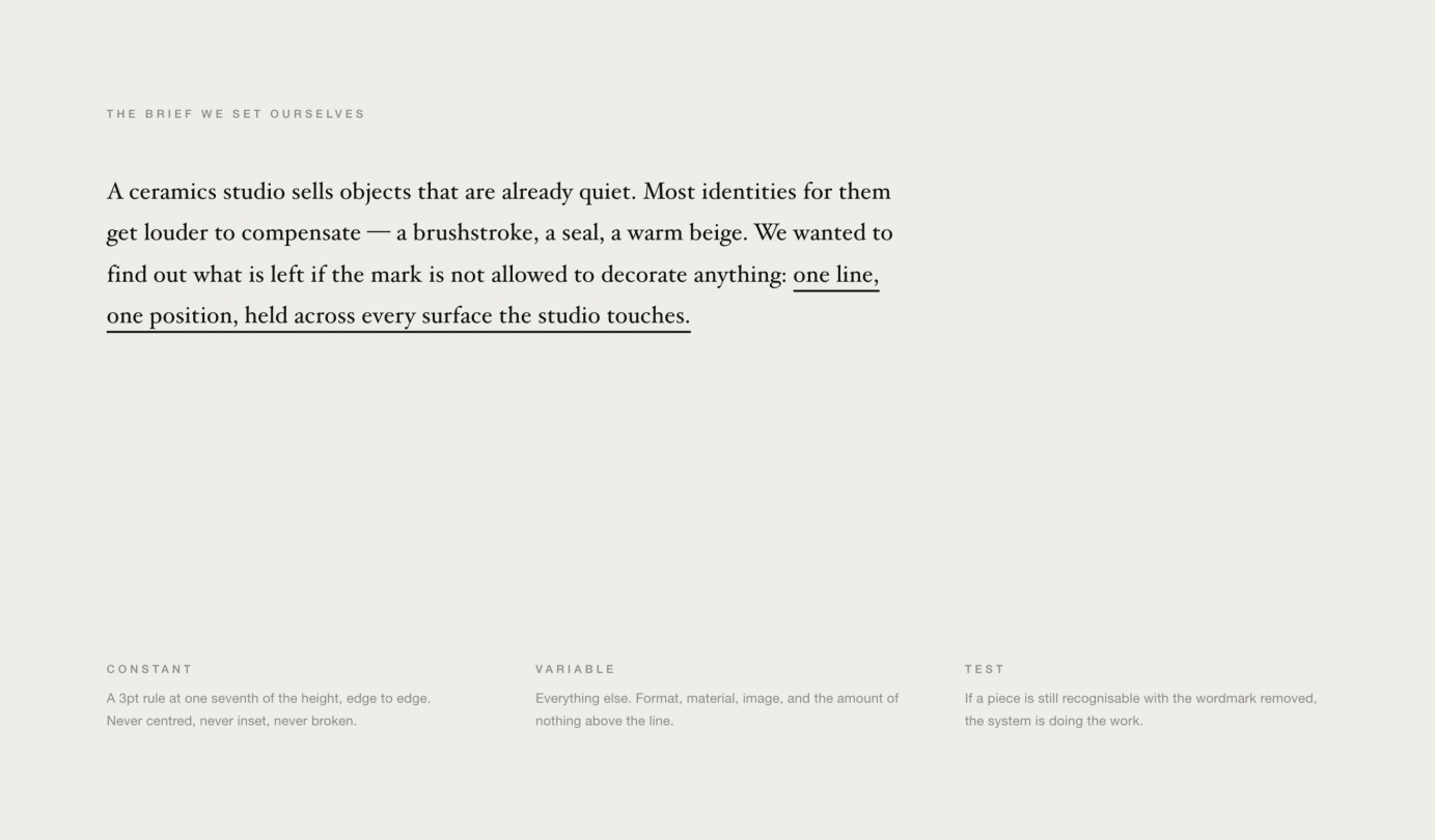
Self-initiated. SEN is not a client — it is a brief we wrote for ourselves.
A ceramics studio sells objects that are already quiet. Most identities made for one get louder to compensate. We wanted to know what is left if the mark is not allowed to decorate anything.
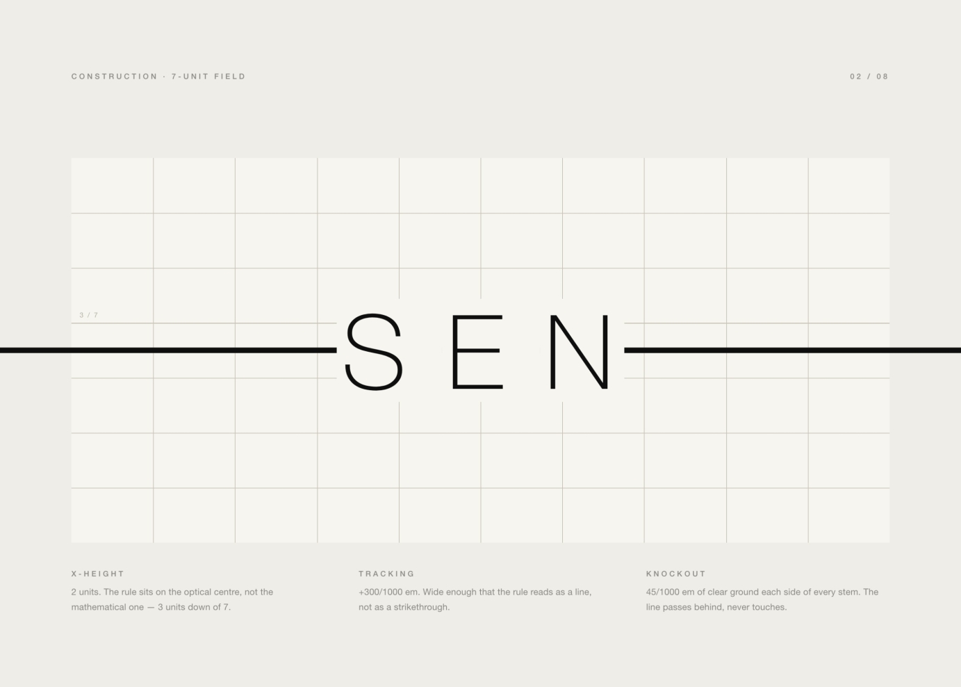
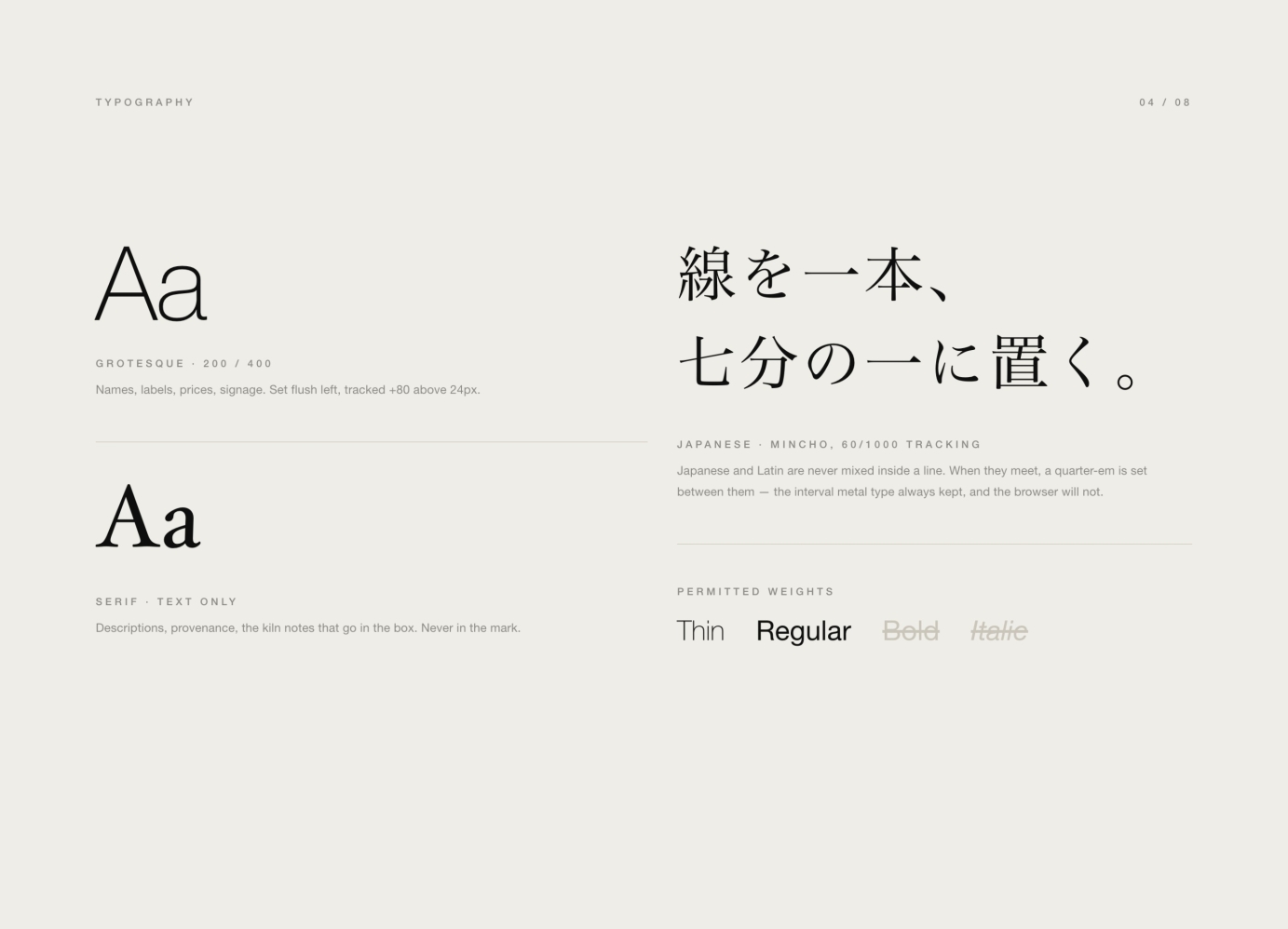
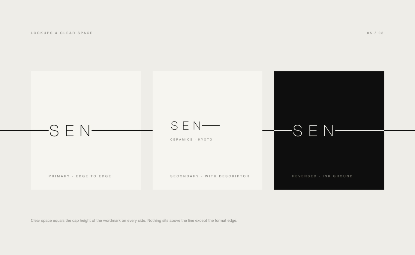
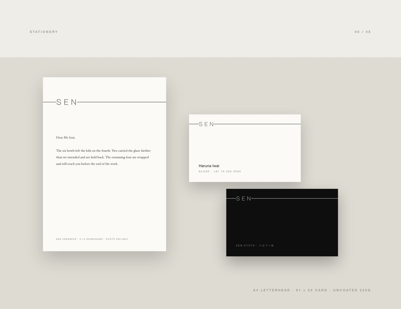
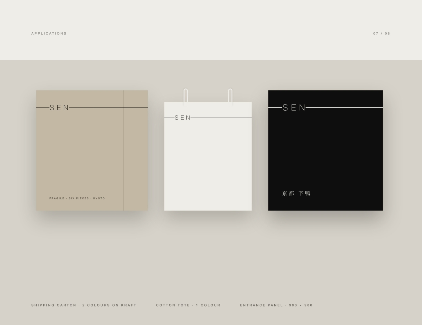
So the system was reduced to a single constant: one rule, 3pt, sitting at one seventh of the height of whatever it is printed on, running edge to edge. It is never centred, never inset, never broken. Everything else — format, material, the amount of nothing above the line — is free. The wordmark is what the line passes through, letterspaced so the rule reads as a line rather than a strikethrough, with clear ground each side of every stem.
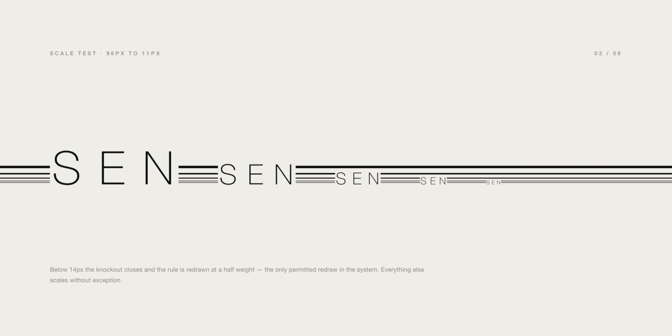
Every route was judged small before it was judged large.
Direction, typography and identity system: KHZ ART.