Branding for photographer
Image
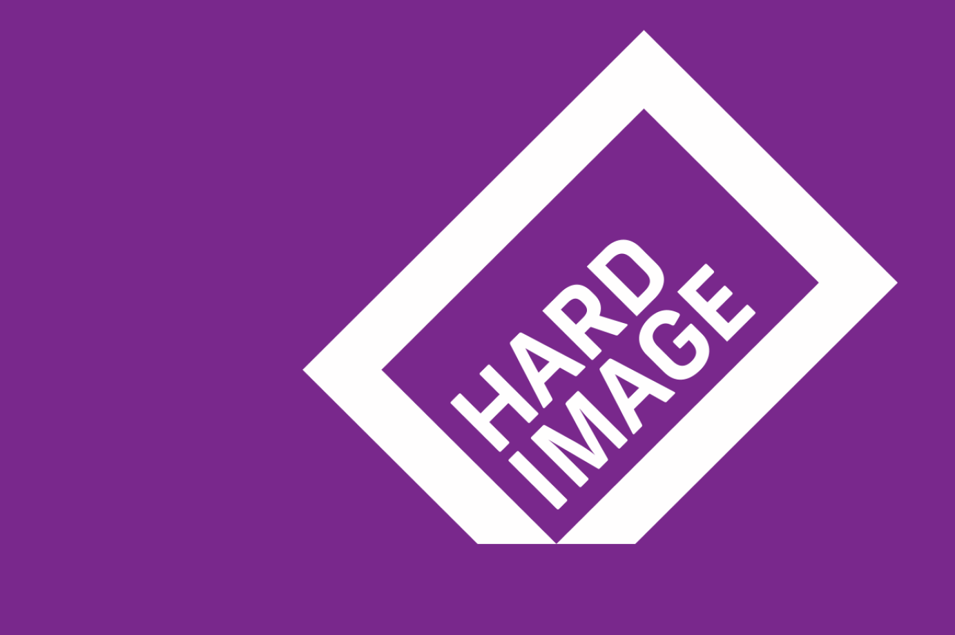
Our research showed photographers across the globe are most likely to use black and white in their corporate identities. Locally not much is different, so we encouraged the team at Hardimage to use bold colour as a strong distinguishing attribute of their new identity. A plethora of camera icons also drove us to search for a different, less pictorial trademark.
Hardimage were only too happy to go along with all of our recommendations, which included a logotype enveloped in a picture frame. The frame has one corner cropped and is tilted to produce the illusion of a hard corner cutting through surface on which it lies.
Creative Direction: Frank Stillitano
Design: Jeremy Boyd