BRONZA Coffee
👾 BRONZA by @briefcorp 👾
Bronza is a coffee brand known for its top-quality beans from the best coffee regions.
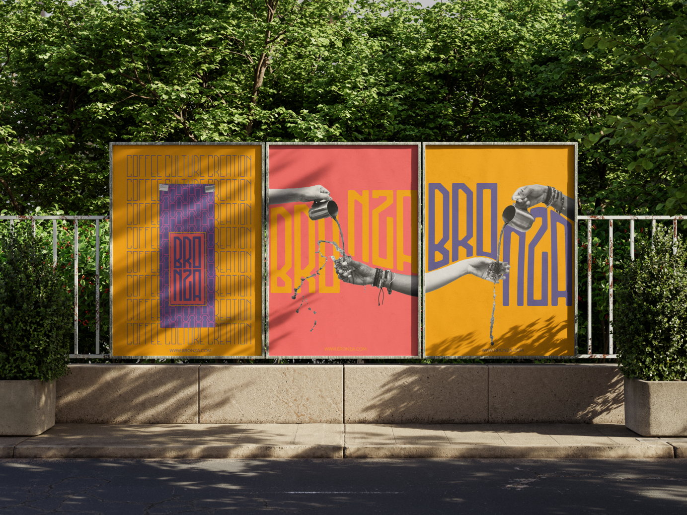
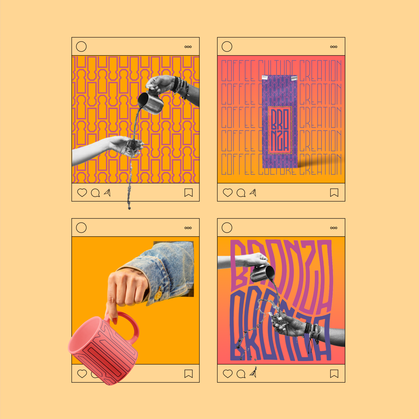
For this brief, I decided to move away from the sober and muted feel of most premium coffee brands and embrace the energy and culture associated with coffee. I was heavily inspired by Moroccan visual imagery due to its usage of colours, geometry and the rich tradition of coffee that the region carries.
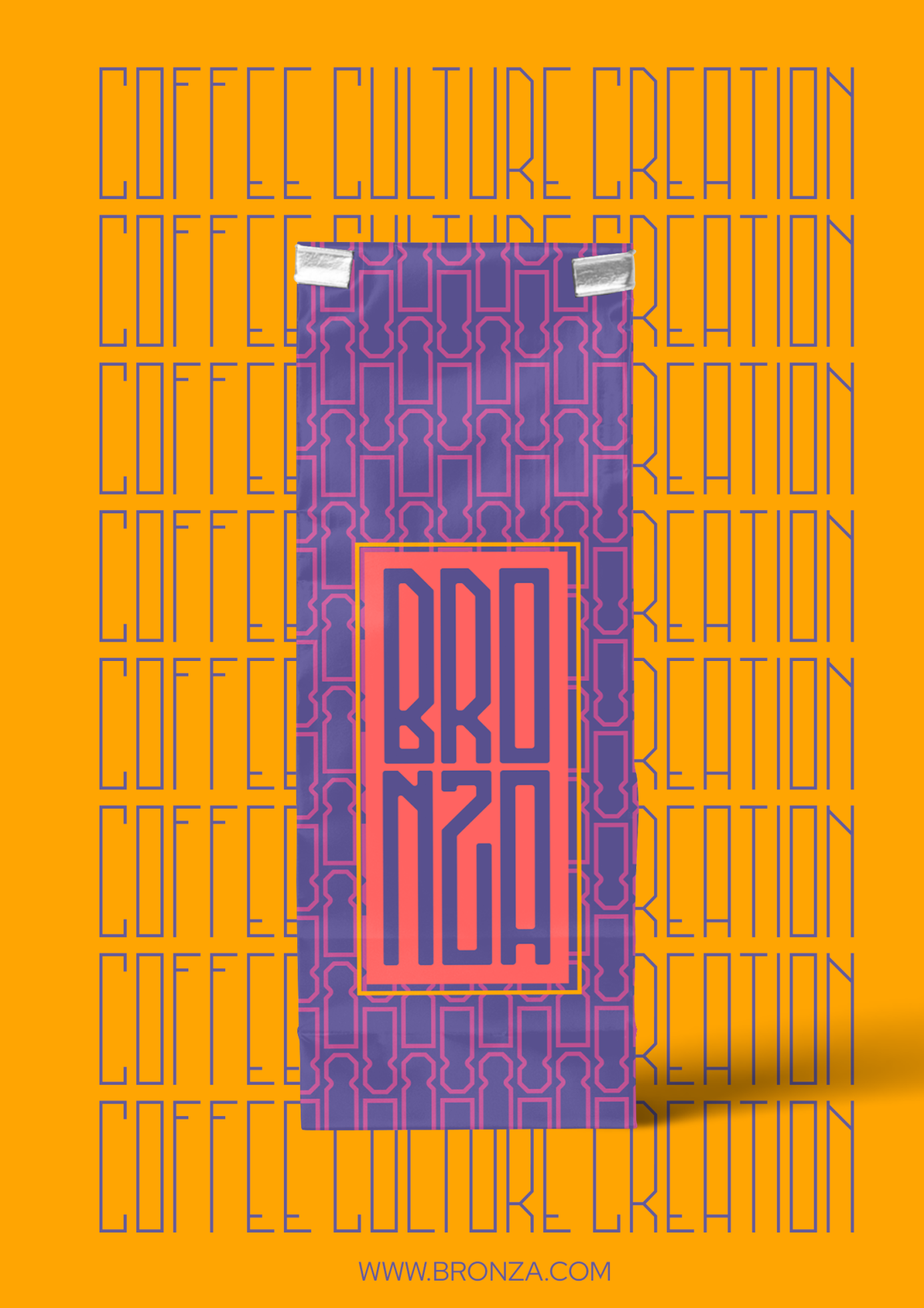
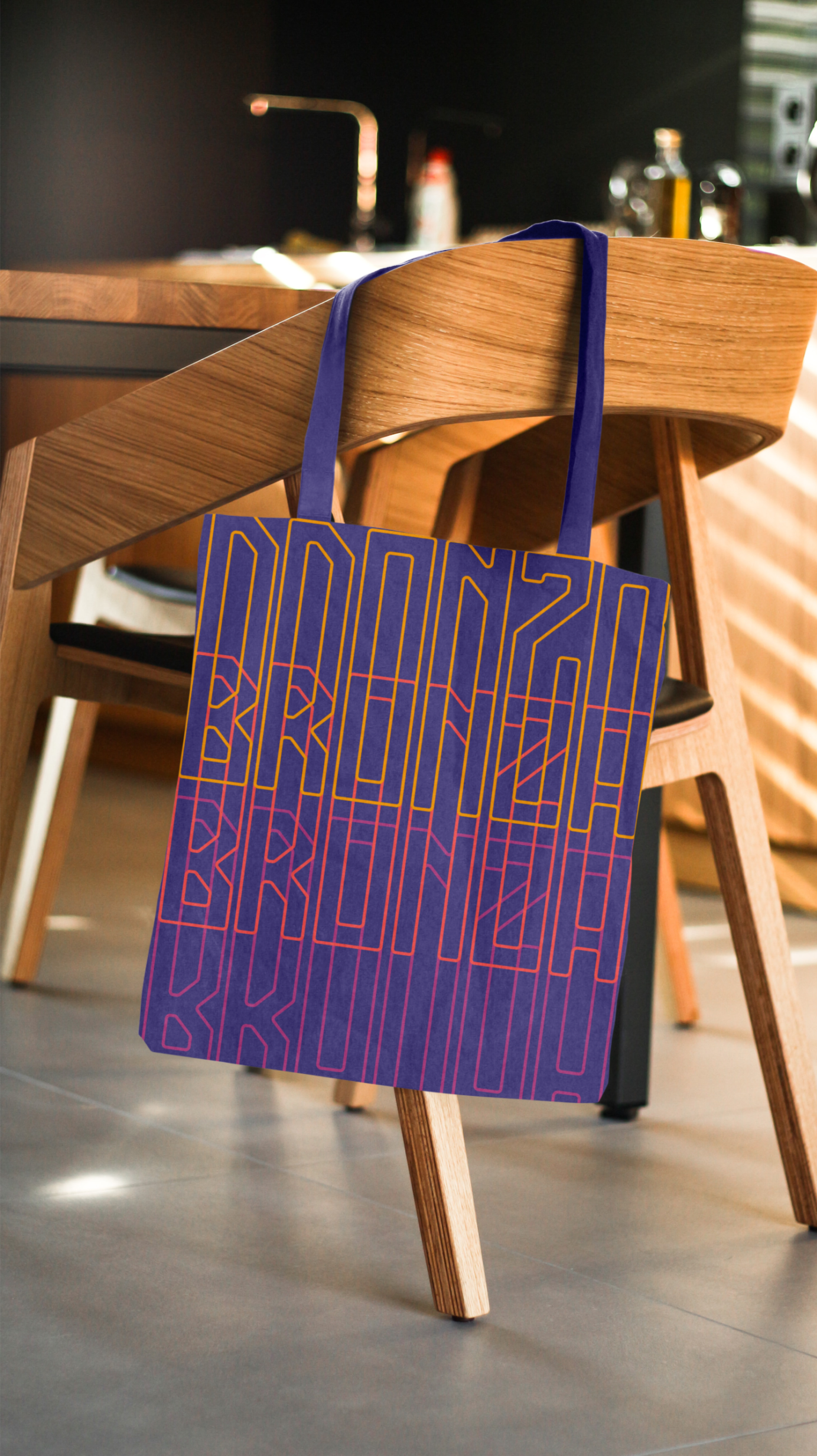
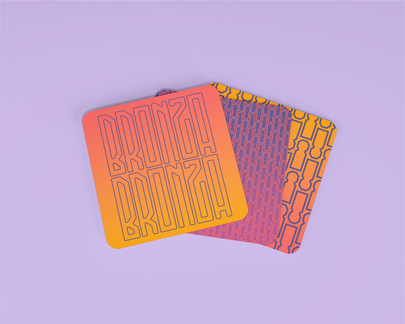
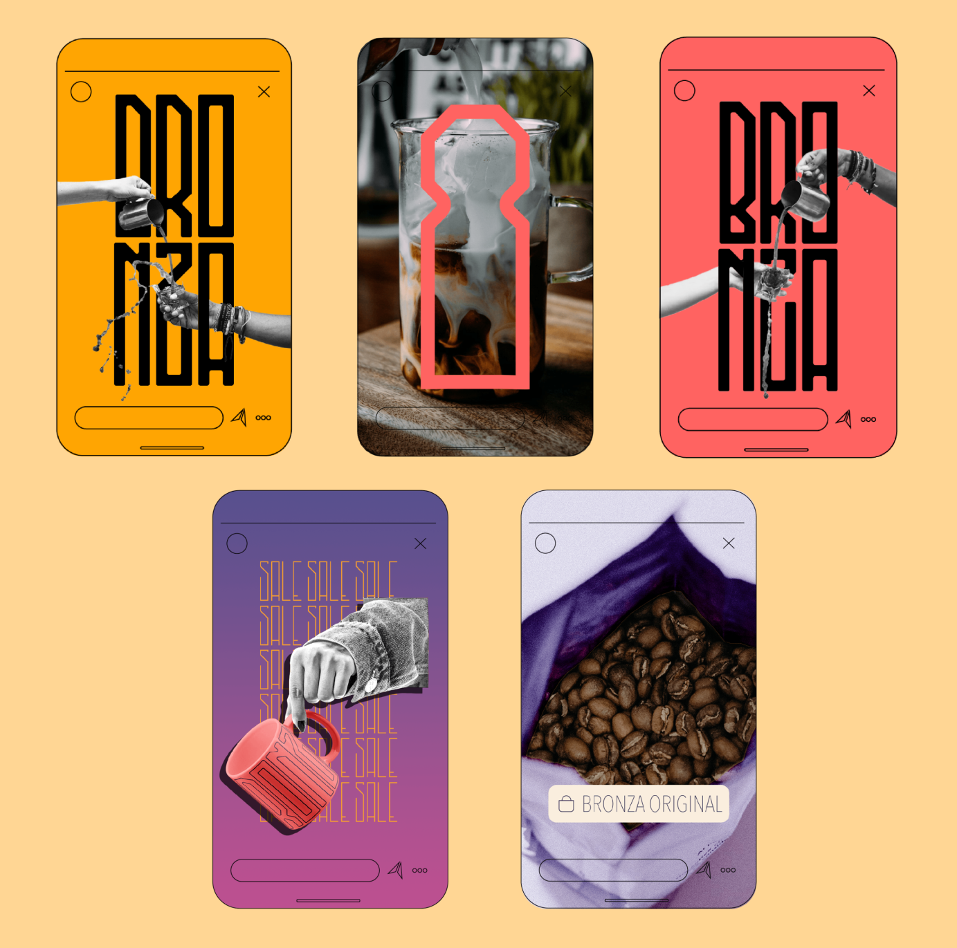
The chosen colour palette for Bronza borrows the vibrant and balanced palette evident in Moroccan design aesthetics. The icon pays homage to the horseshoe arch that is a fundamental feature in Moroccan and wider Islamic architecture. This has been created by heavily manipulating the “B” from Bronza’s typeface.
I designed the chosen typeface as I knew it would complement the more elongated pouch packaging that I envisioned for the brand from the start (which would also serve as a reference to the elongated shape of the horseshoe arch). The typeface is further reminiscent of Art Deco, which is known for its “streamlined” and geometric decorative properties, which I felt would nicely complement the vibrancy of the brand.
CREDITS
Urban posters mockup by Mockups Design via Unblast
Coffee pouch mockup by Mr. Mockup
Hand holding mug mockup by Mr. Mockup via Unblast
Top view of mug mockup by Mockupbee via Resource Boy
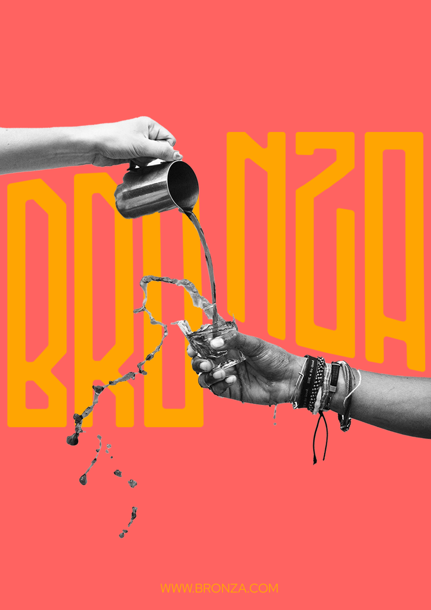
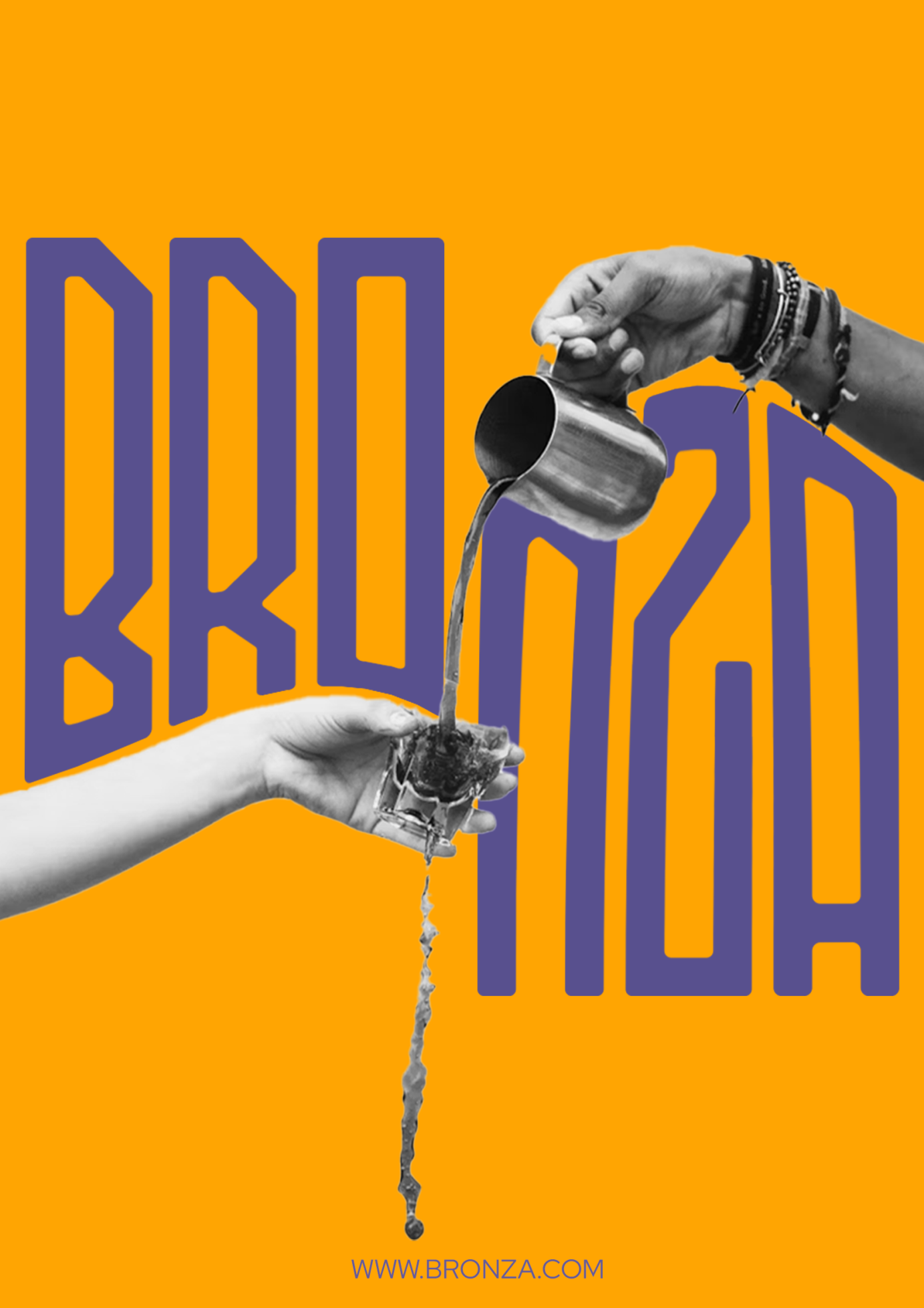
Hands pouring coffee photos by Tyler Nix via Unsplash
Canvas bag mockup by Mr. Mockup
Coasters mockup by Mockup Free via Unblast
Open coffee bag photo by Nadia Valko via Unsplash
Iced coffee photo by Amr Taha via Unsplash