
GOODIES Perfume

🌸 GOODIES by @brand.brief and @goodiesbeauty 🌸
A perfume brand sparked from the embers of Y2K and pays homage to the senses of smell, taste and touch, I present for your viewing pleasure - GOODIES.
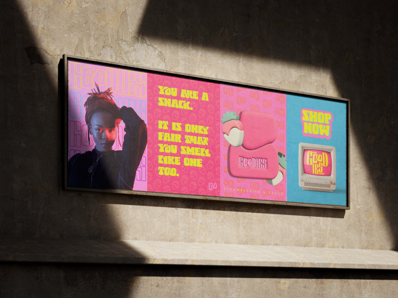
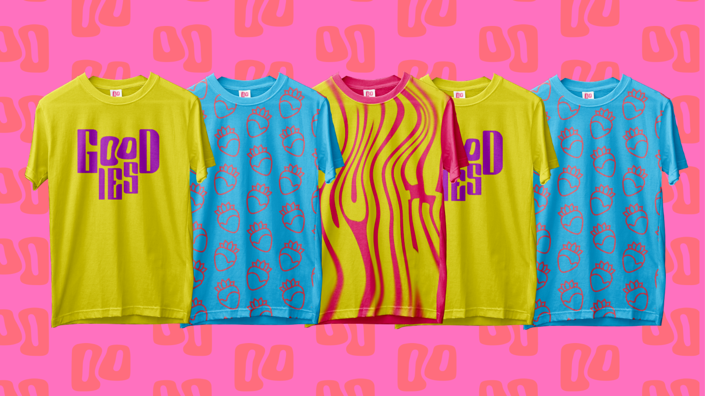
Using the details and mood board provided by the client as a base, I based the visual identity for this brand on the Y2K design aesthetic. This would make room for hints of nostalgia (as requested by the client), particularly for the target audience of women between the ages of 20-40. The period-typical design style would allow me to incorporate bold colours and a chunky typeface to create a kitsch and playful style that is mature yet full of personality.
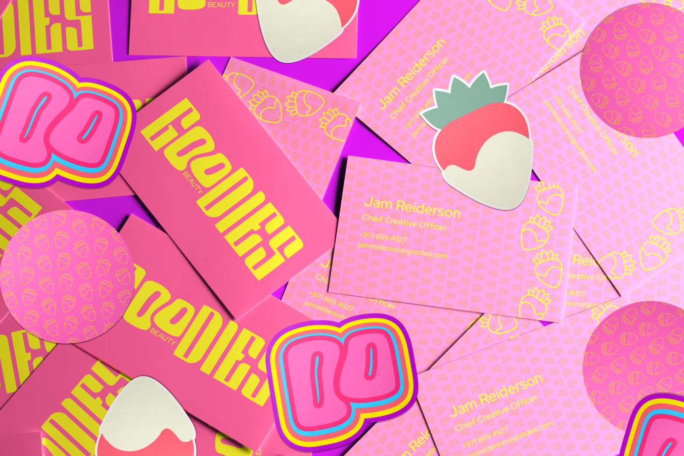
The soft and chunky serif typeface of Arlot is reminiscent of Y2K typefaces and conveys maturity, while the ‘OO’ has been borrowed from the dynamic and playful Fat Kat. This is reminiscent of two baked goods such as cookies, doughnuts or cinnamon rolls being squished together. This serves as GOODIES’s icon and goes on to create the shape for the distinctive perfume bottle. The combination of two fonts further harks to the marriage of taste and smell in GOODIES’s brand identity.
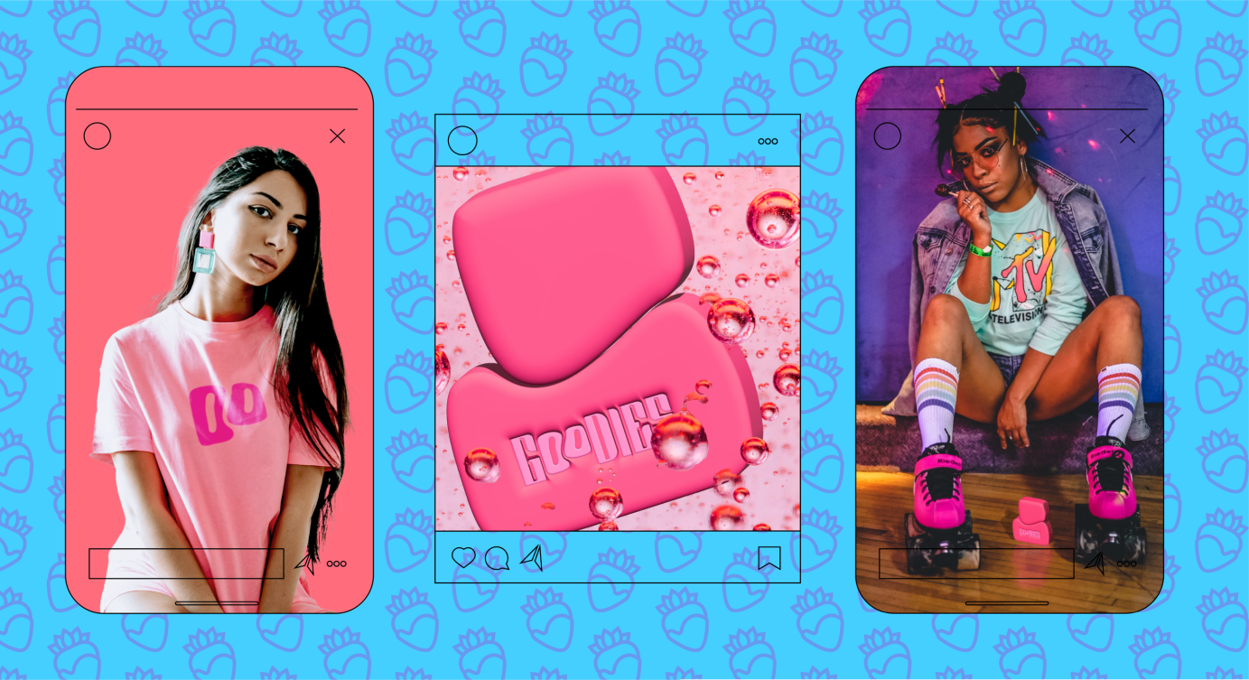
The colour palette is bold, kitsch and predominantly pink to connote the target female audience, and as an homage to the film Mean Girls, a nostalgic work of art that is the zeitgeist of the early 2000s where the colour pink serves an important purpose. 3D elements have been used extensively throughout this project as a callback to the frequent usage of this element during the Y2K period.
The bespoke bottle design has been crafted through the ‘OO’ shape within the logo. I wanted the design of the bottle to be very distinctive and easily identifiable within a highly competitive market. The 3D wordmark upon the bottle not only harks back to the usage of 3D design elements during the Y2K period, but would also be useful for those with visual impairments.
GOODIES combines the senses of taste and smell. The satisfying shape and creatively embossed letters also make for an enjoyable tactile experience. Combined with the attractive visual identity and packaging, Goodies can combine the senses of taste, smell, sight and touch to give the user a sensory experience that they cannot get anywhere else.
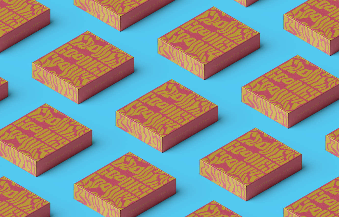
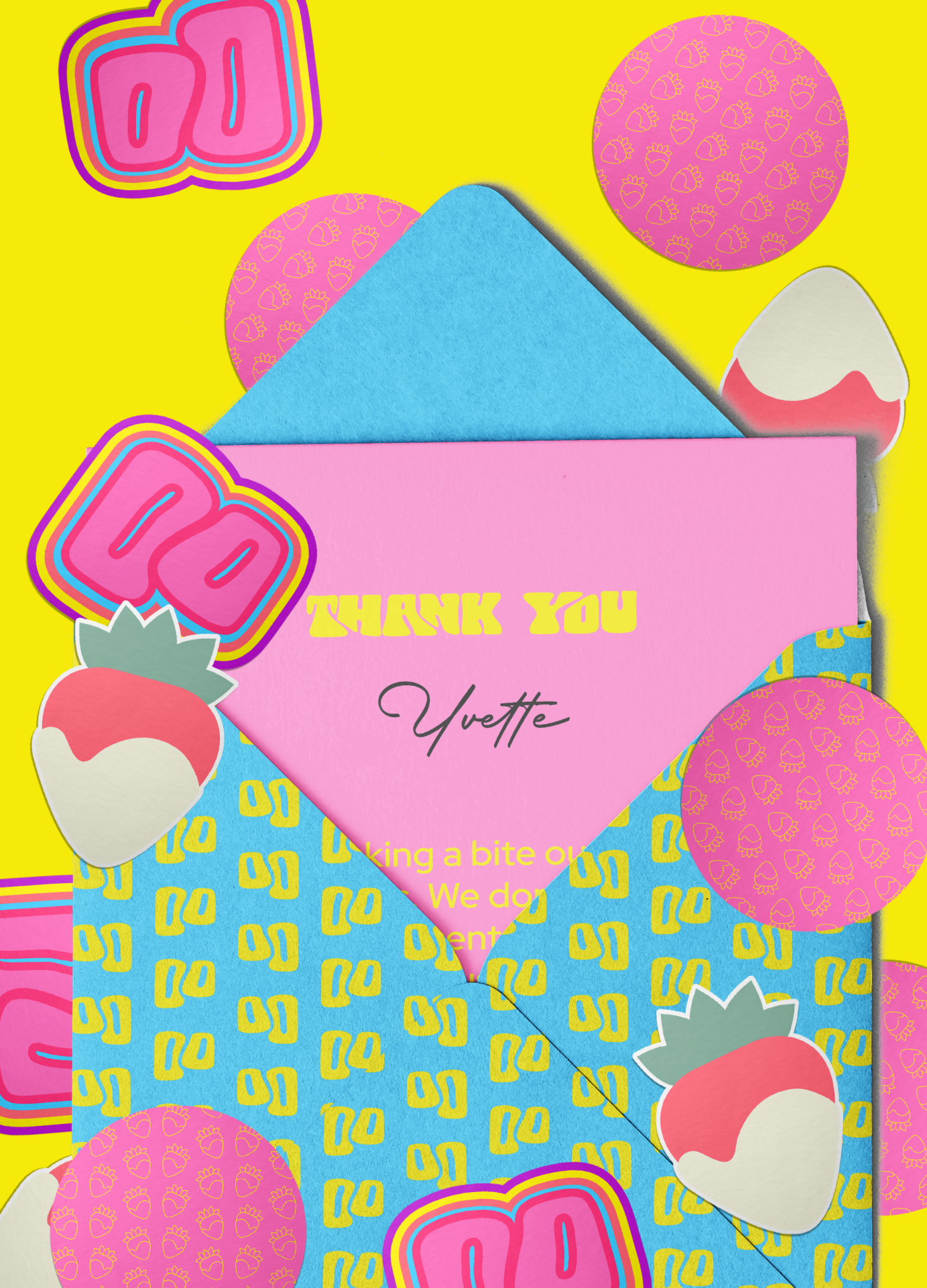
I chose a flap-box packaging as it is a well-sealed and attractive form of packaging that is reminiscent of cookie packaging. The perfume bottle would be securely nestled inside. This can be created using materials like cardboard, paper and fabric. The stylised logo mark appears to drip and spill over the box the way glazing would drip over baked goods. The scent is printed on the side of the box and a corresponding illustration pattern appears in the background.
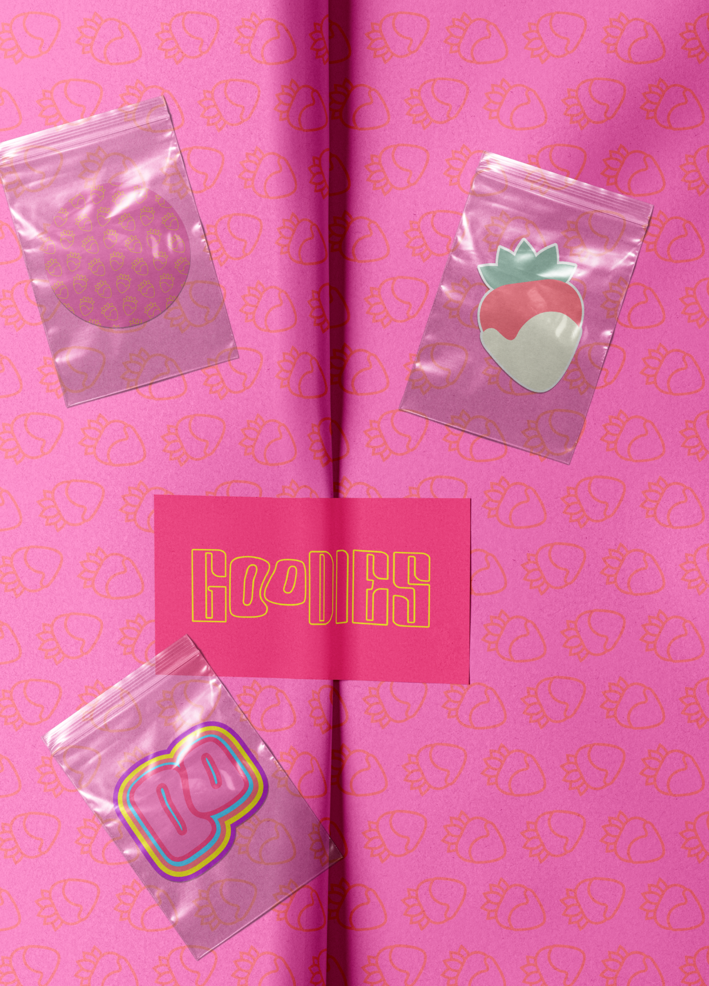
For GOODIES’s first scent, Strawberries and Cream, I created illustrations of a whole strawberry dipped in whipped cream. I drew a simple illustration using just the stroke and coloured-in one that could be turned into brand merch like stickers.
CREDITS
Top of box mockup by Anthony Boyd Graphics via Resource Boy
Box grid mockup by Anthony Boyd Graphics via Unblast
Stickers mockup by Mocku via Unblast
Business cards mockup by Unblast
T-shirt mockup by Mr. Mockup via Resource Boy
Wrapping paper with sticker mockup by PixPine via Resource Boy
Posters mockup by Mockups-Design via Unblast
Old TV mockup by Fruited Design via Behance
Model with hand on head photo by Markus Stephen Griffiths via Unsplash
Scented candles mockup by Mockup Free via Resource Boy
Envelop mockup by Unblast
Bubbles photo by Pawel Czerwinski via Unsplash
Model holding lollipop photo by Chris Benson via Unsplash
Model wearing pink top photo credit unknown
Boxes grid mockup by Anthony Boyd Graphics via Unblast
Stickers mockup by Mocku via Unblast