Record label branding and artwork – Magnonic Signals
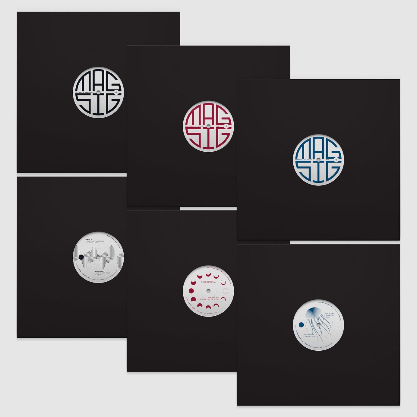
Branding and design of single colour centre labels for a record label putting out quality techno. I have done the artwork for five releases so far.
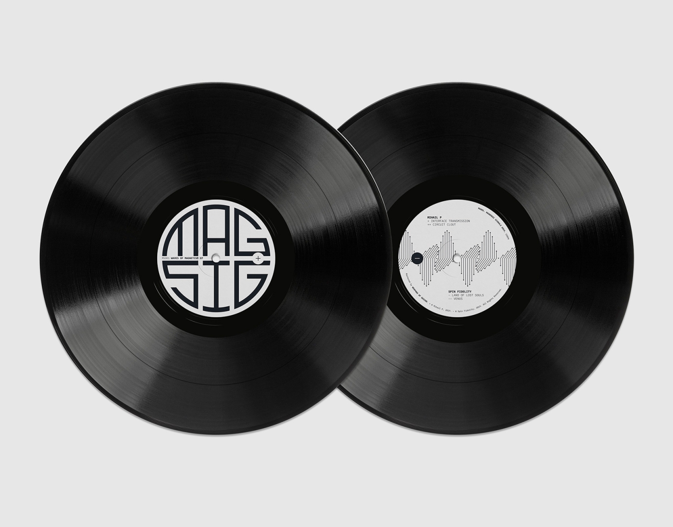
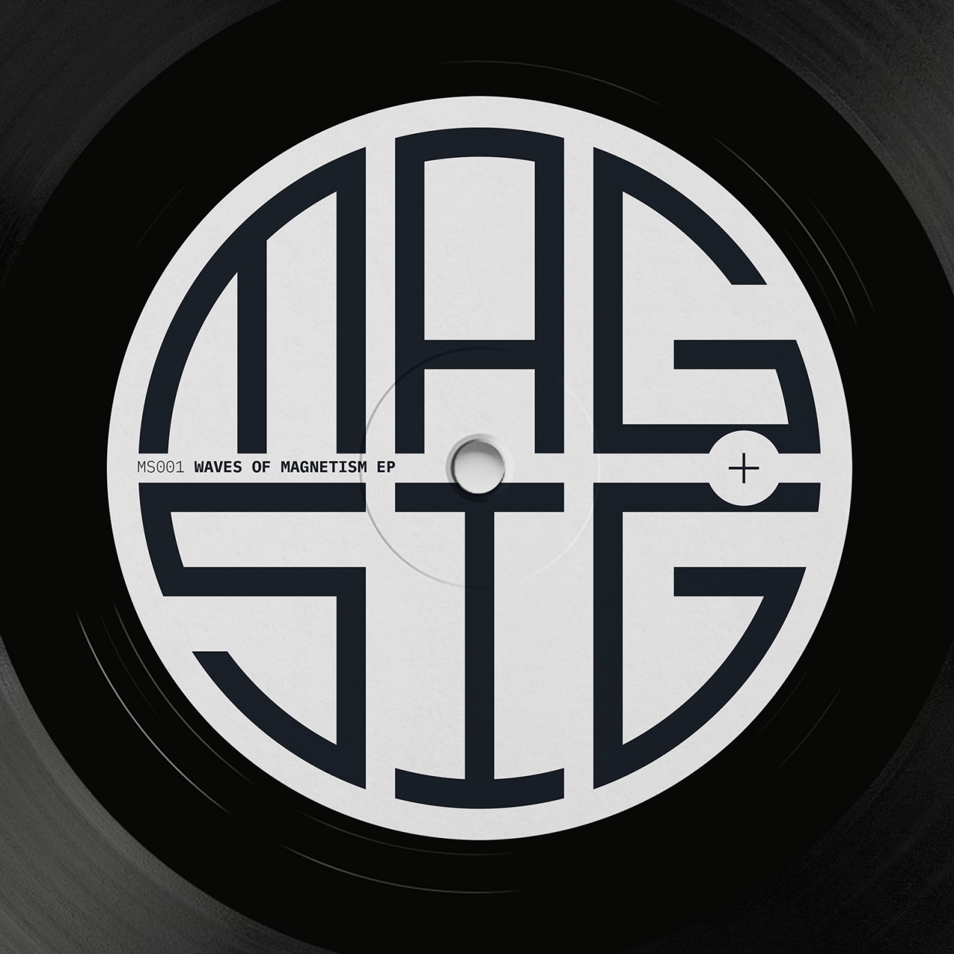
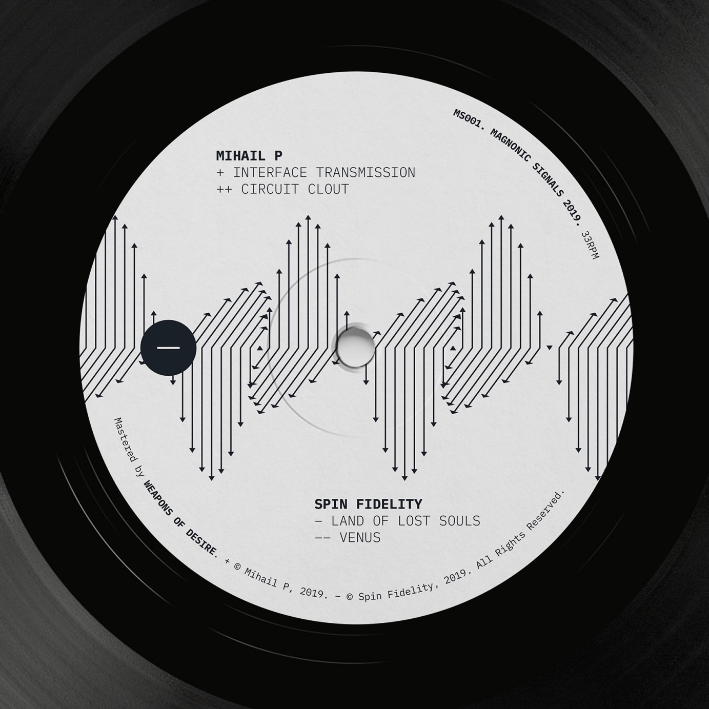
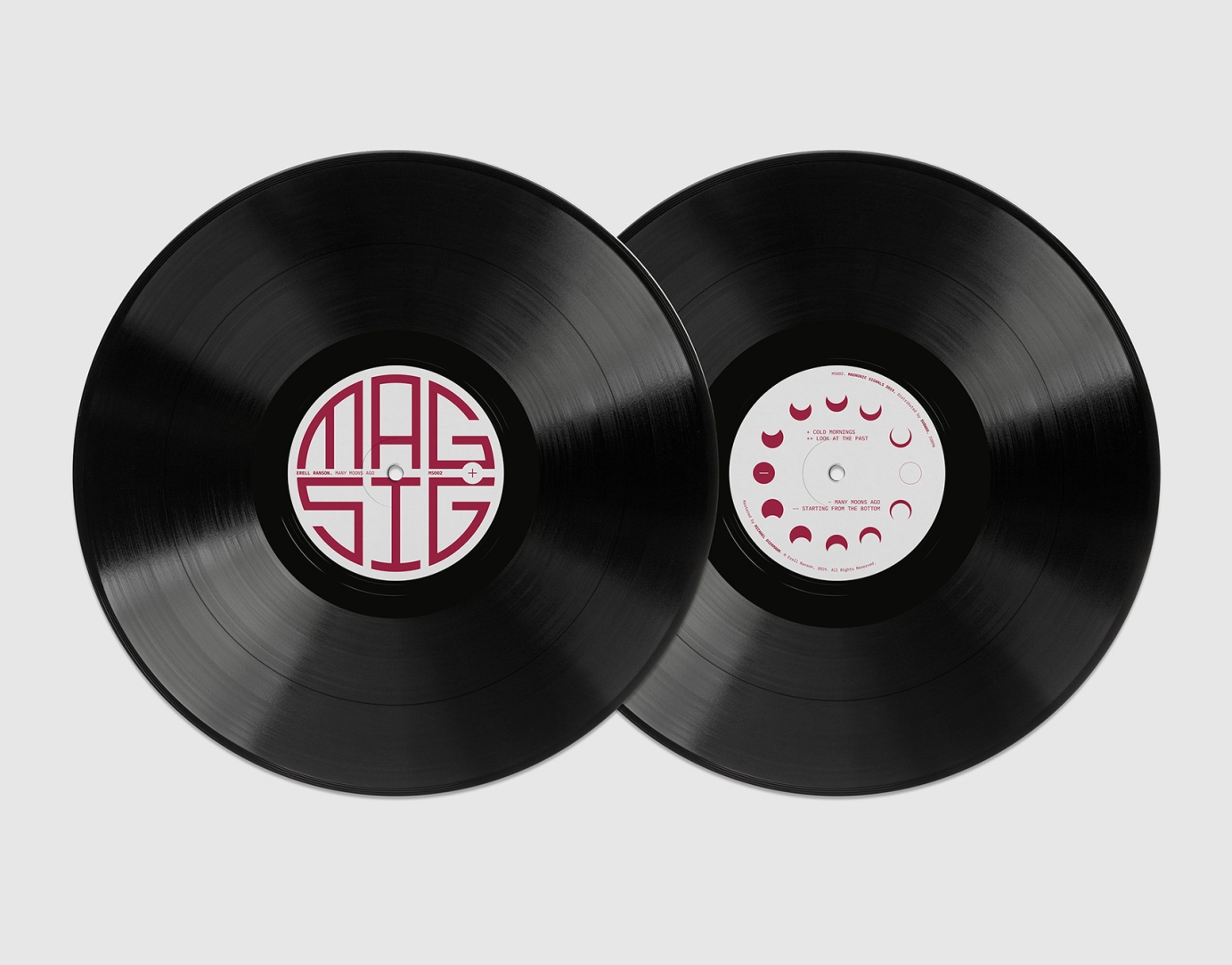
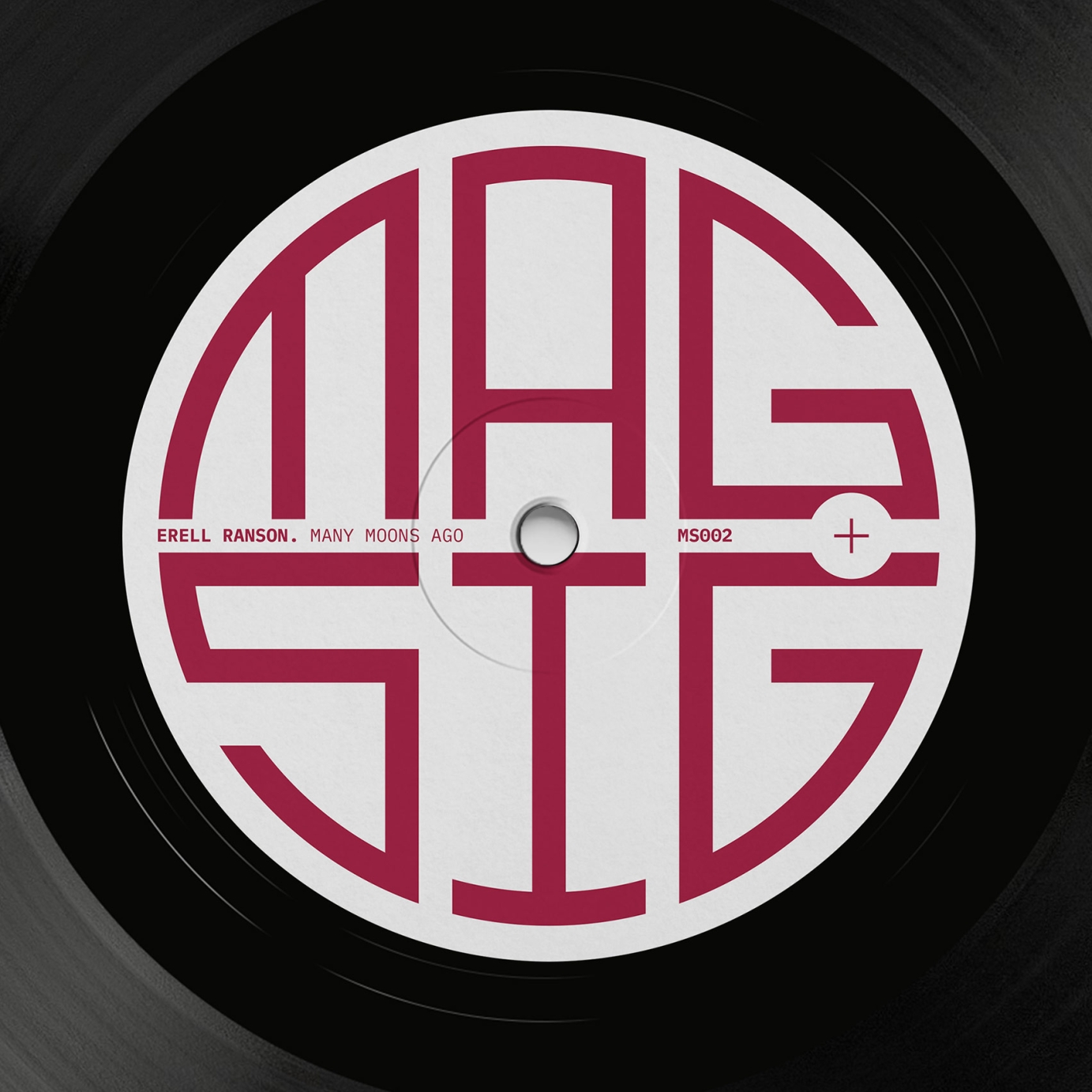
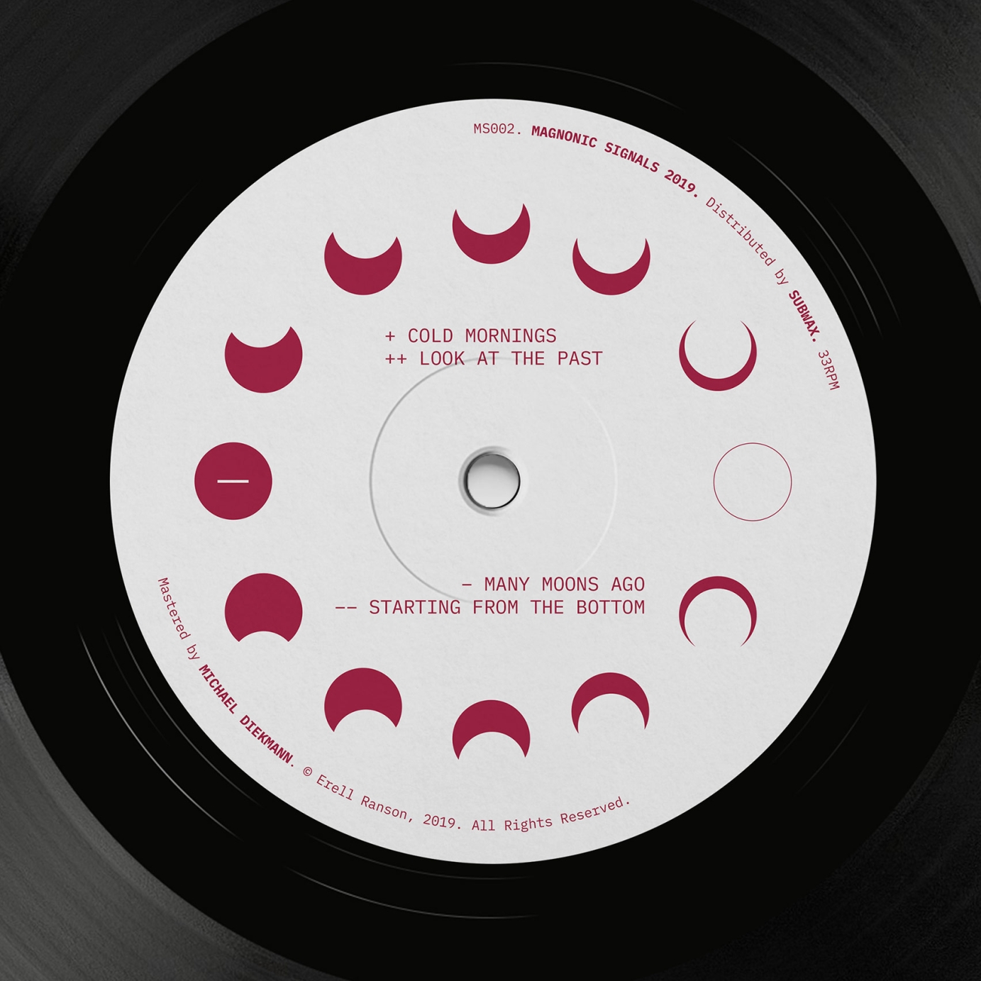
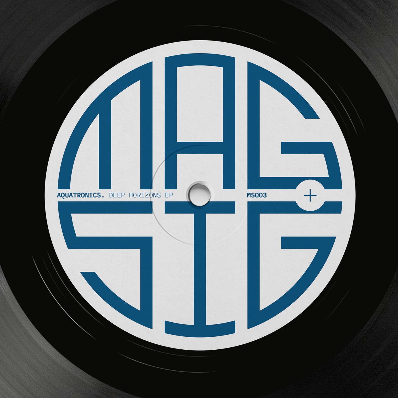
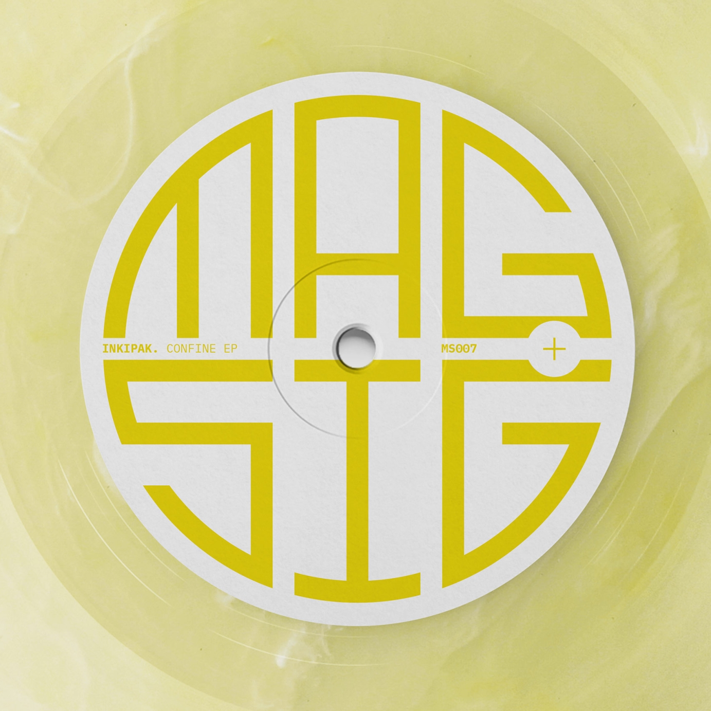
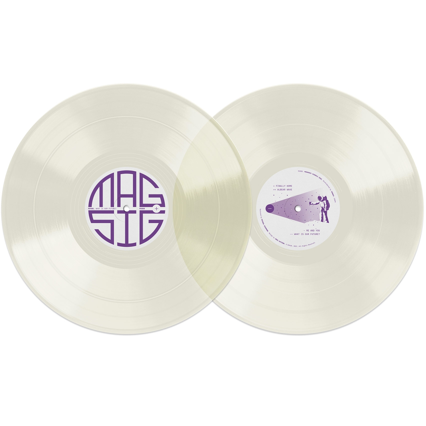
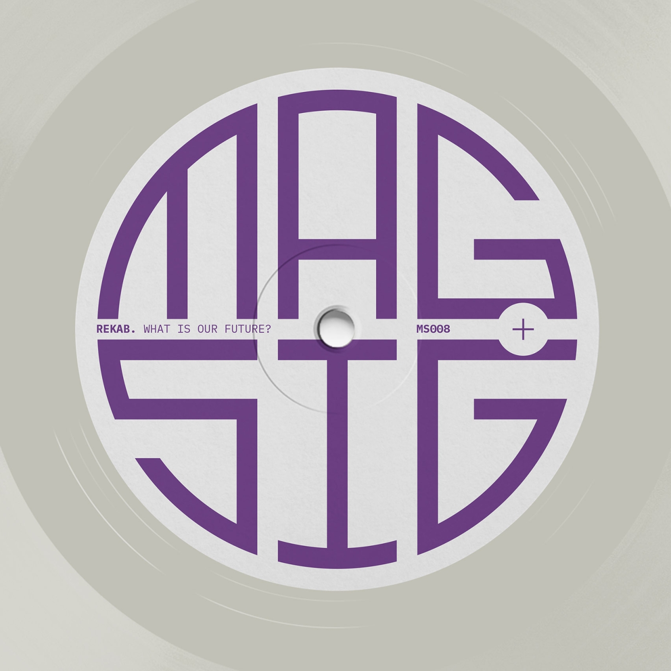
According to Wikipedia "magnonics is an emerging field of modern magnetism". The label already had a solid idea for their logo and my job was to create a simple and adaptable look with the objective of making Magnonic Signals artwork distinctive as an online thumbnail or from across a record shop. It felt like a natural choice to have the circular "MAG SIG" logo big on the front and use the flip to express the concepts behind each release. To tie into the magnetism theme the sides are labelled +/– instead of A/B.
MS001: Mihail P and Spin Fidelity — Waves of Magnetism EP A representation of electromagnetic waves on the B side.
MS002: Erell Ranson — Many Moons Ago The phases of the moon around the label.
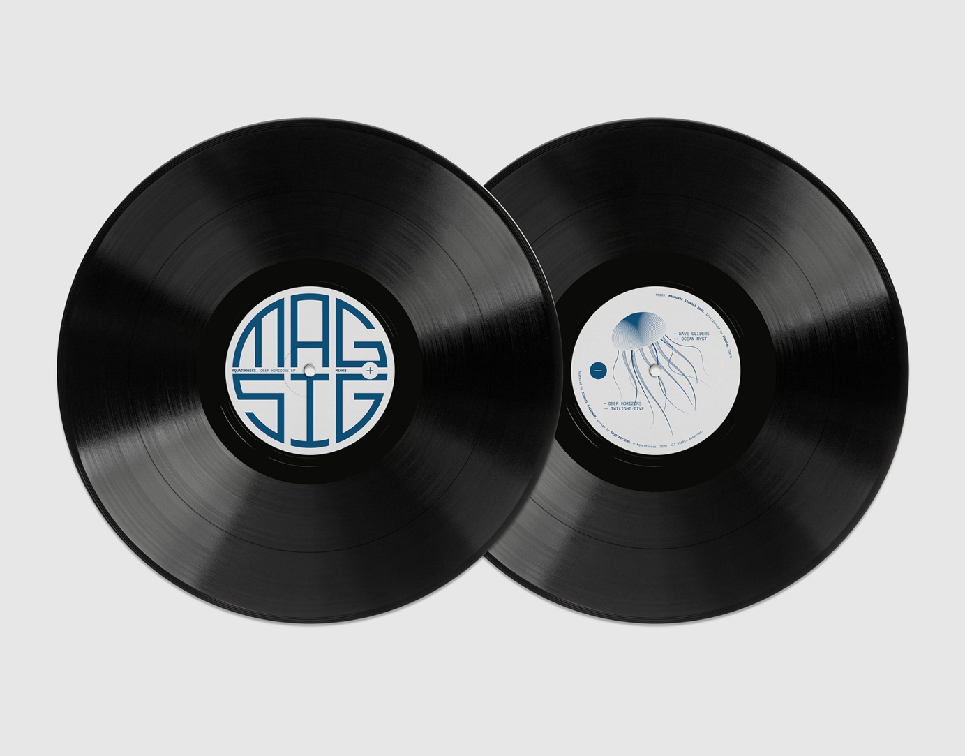
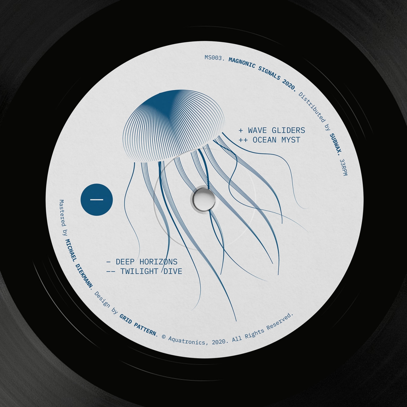
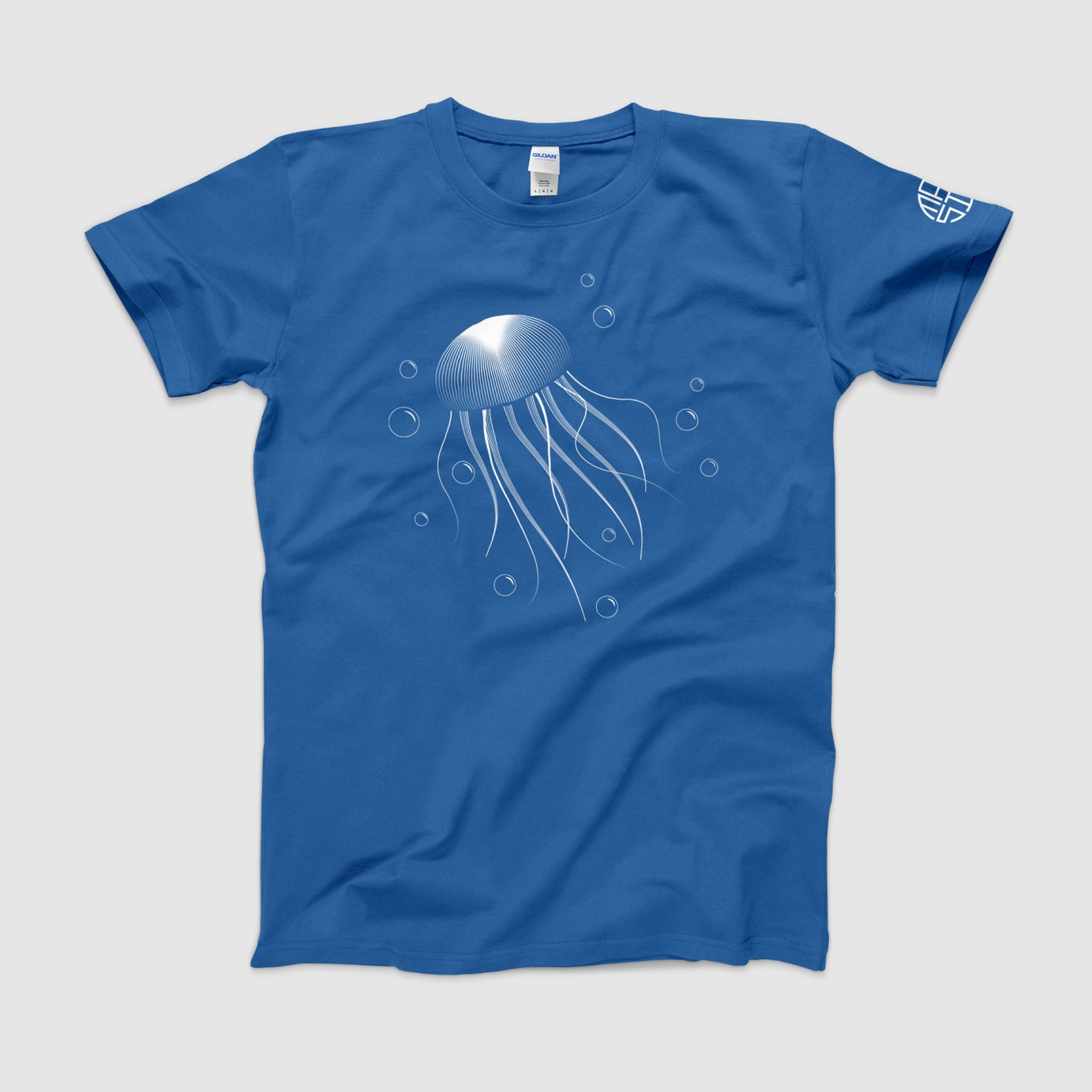
MS003: Aquatronics — Deep Horizons EP A jellyfish for the aquatic themes of Deep Horizons. The jellyfish was also used on a hand screen print t-shirt.
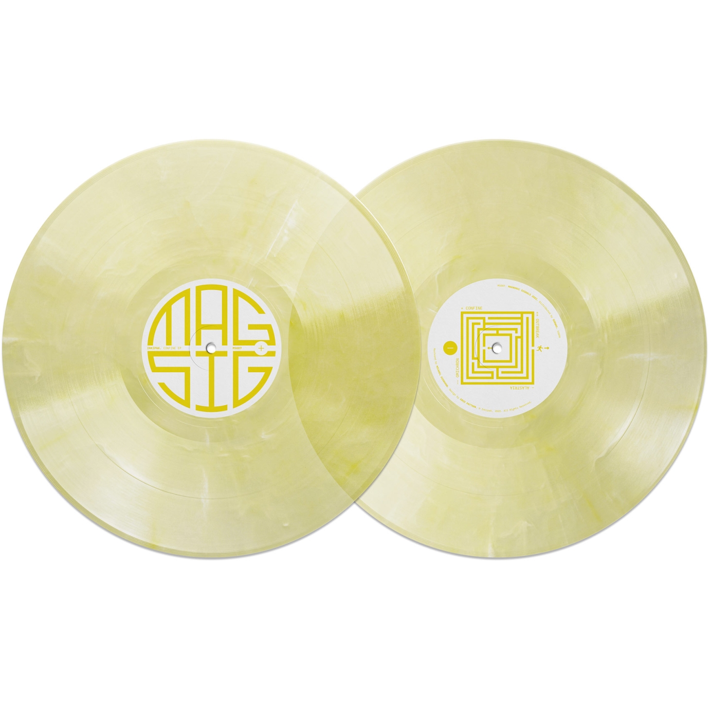
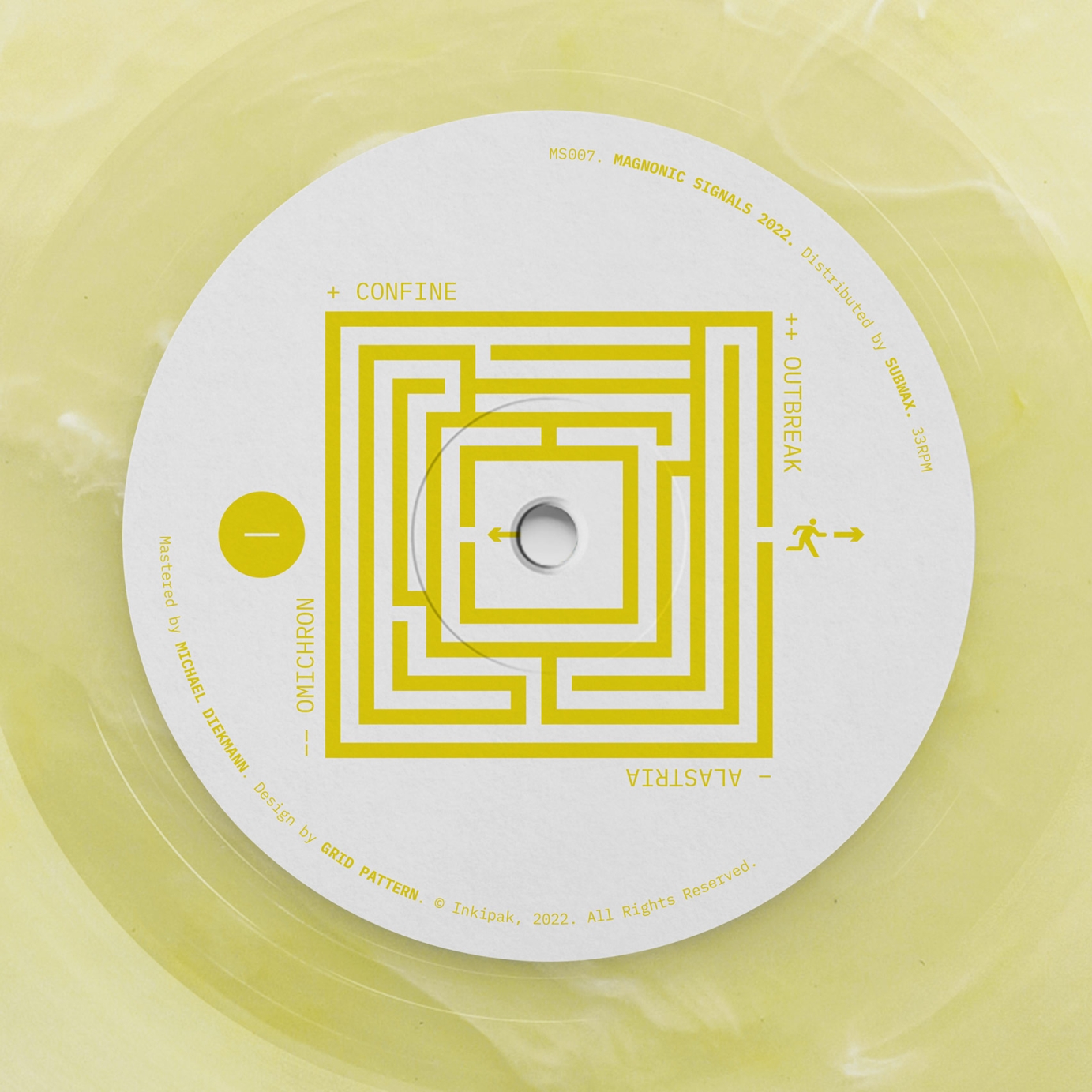
MS007: Inkipak — Confine EP A maze with no escape to represent the EP title.
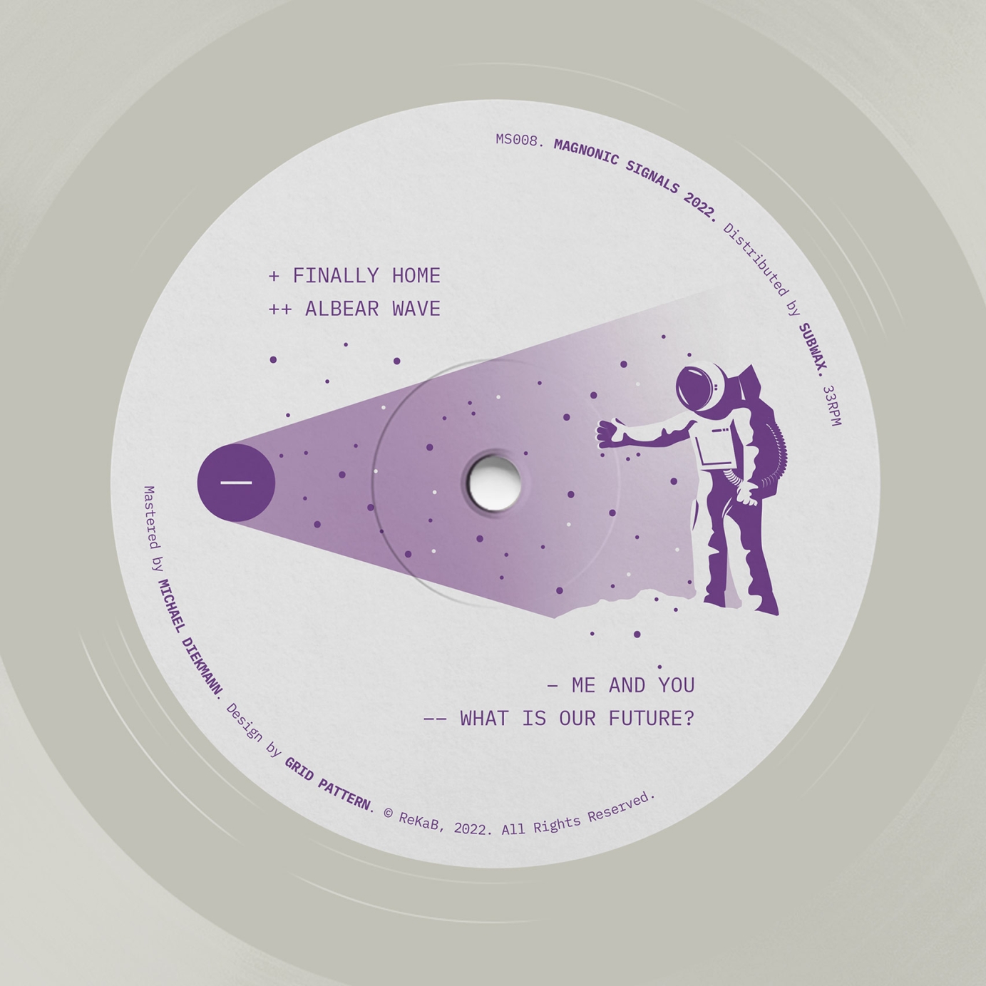
MS008: ReKaB — What Is Our Future? Reaching into the unknown, what is our future?

