Artwork for 3LP, 2CD compilation album
THE END — various artists
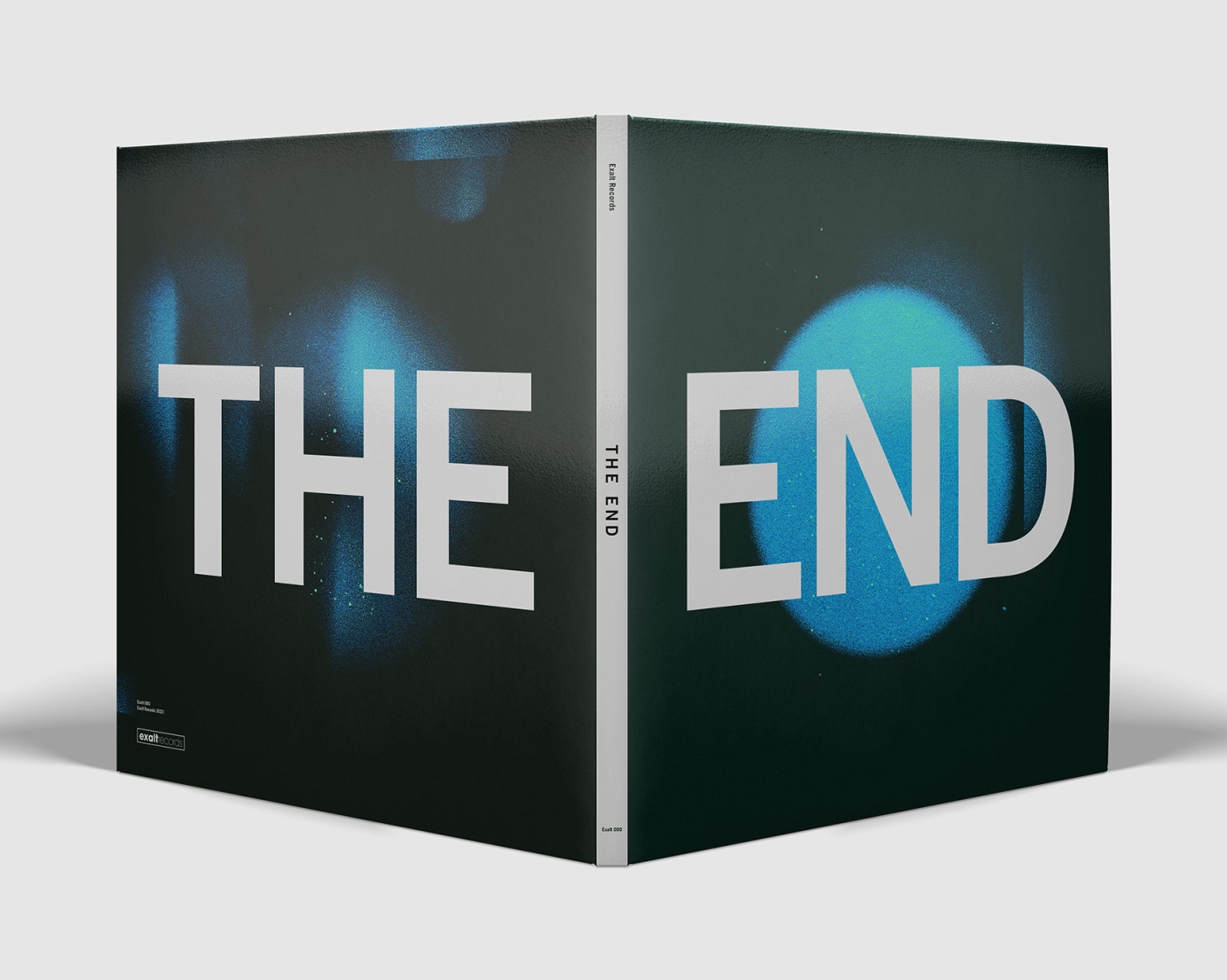
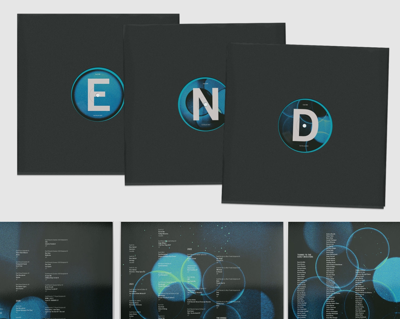
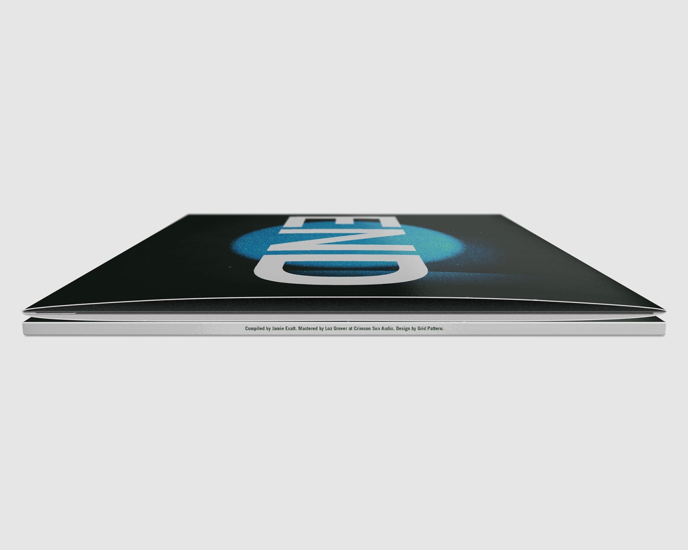
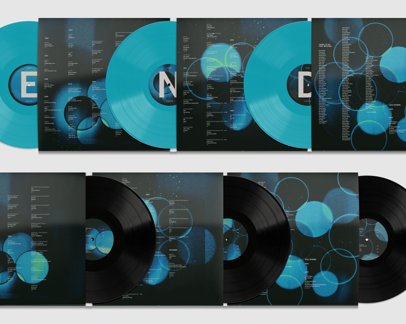
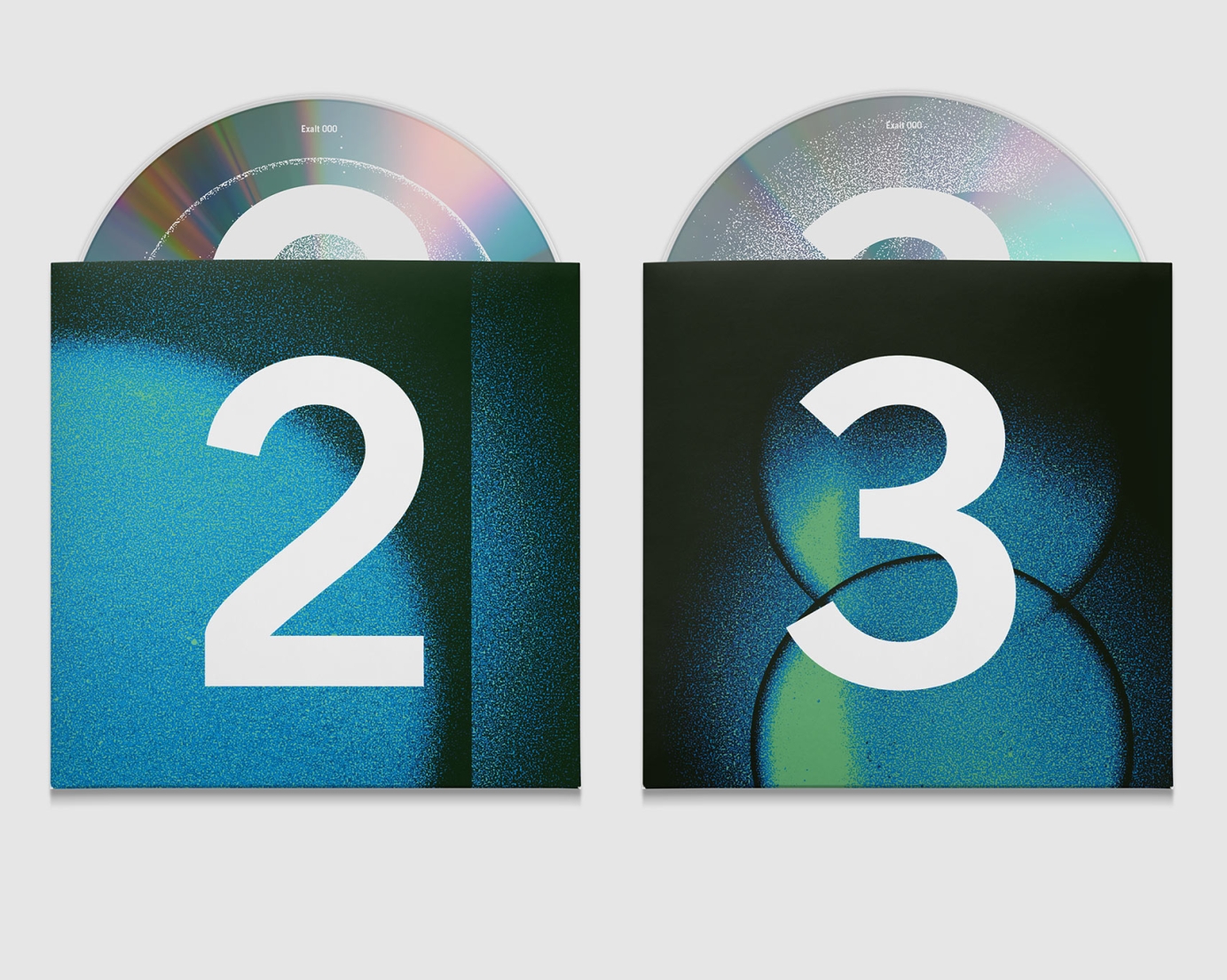
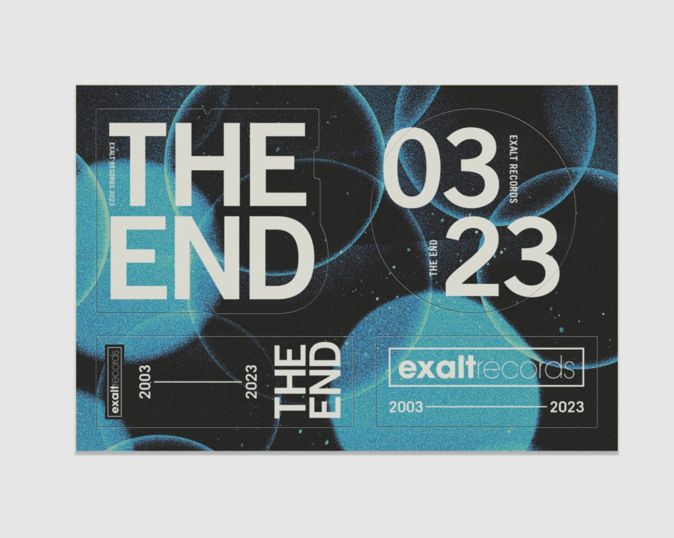
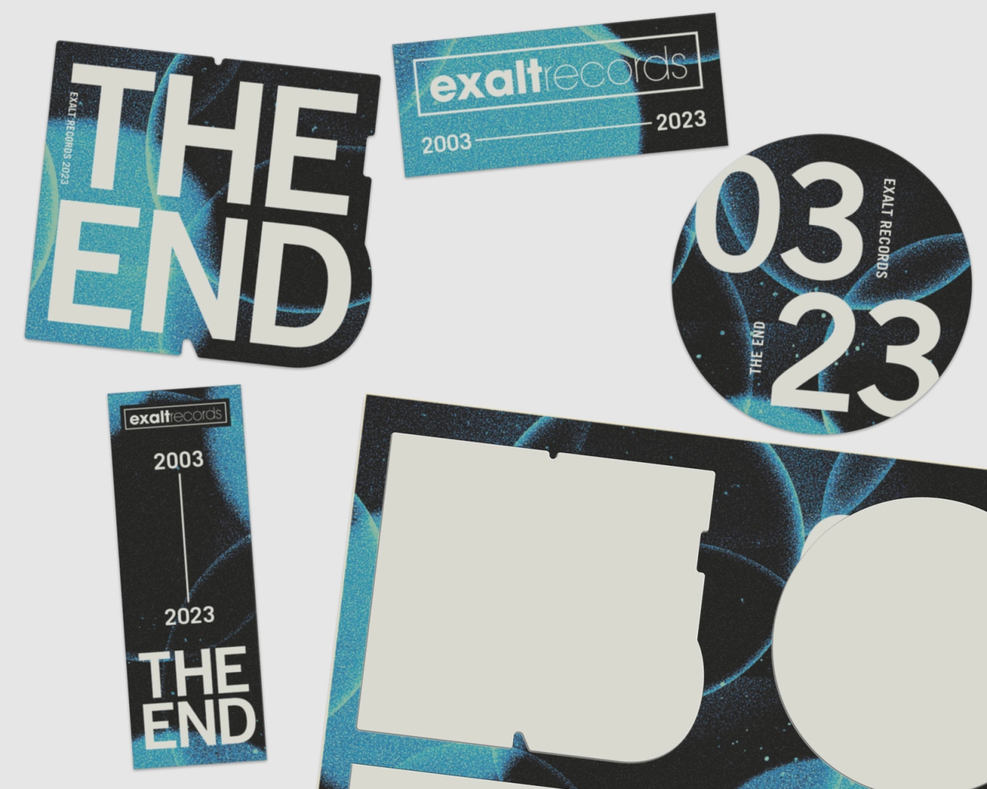
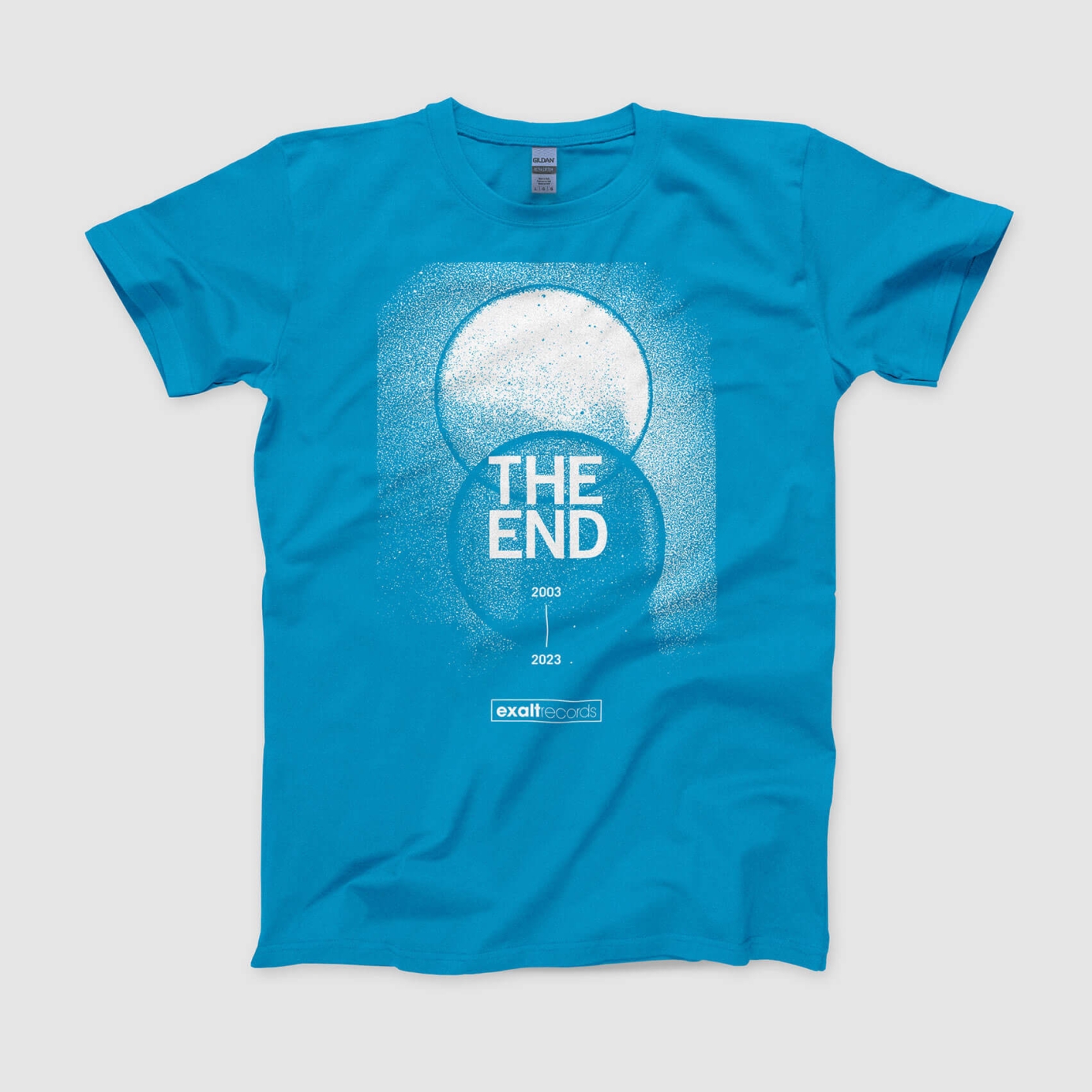
Artwork for the ambitious final release from Exalt Records… a triple vinyl compilation in six panel gatefold sleeve, double CD in custom six panel oversize digisleeve with spot silver foil slipcase, four single colour inserts for a set of highly limited dubplates, a sticker sheet and a screen-printed t-shirt.
Exalt Records started in 2003 with the intention of only doing 23 releases, with catalogue numbers counting down to end on 000. From inception the label was based around the concept of "23" — in numerology, the number signifies new beginnings, revolution and transformation. The brief was to keep the design simple and uncluttered with large, bold typography, similar to this KLF cover.
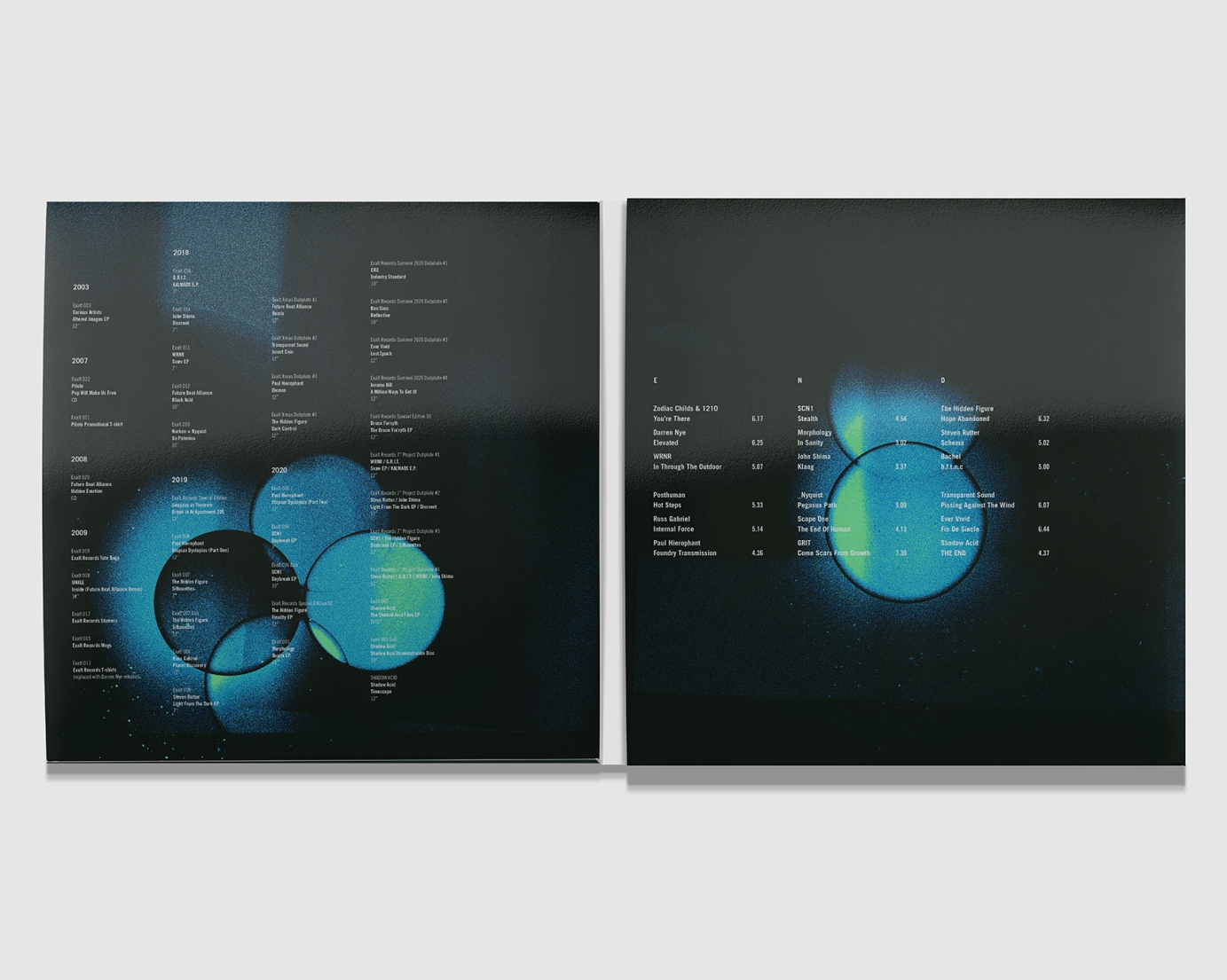
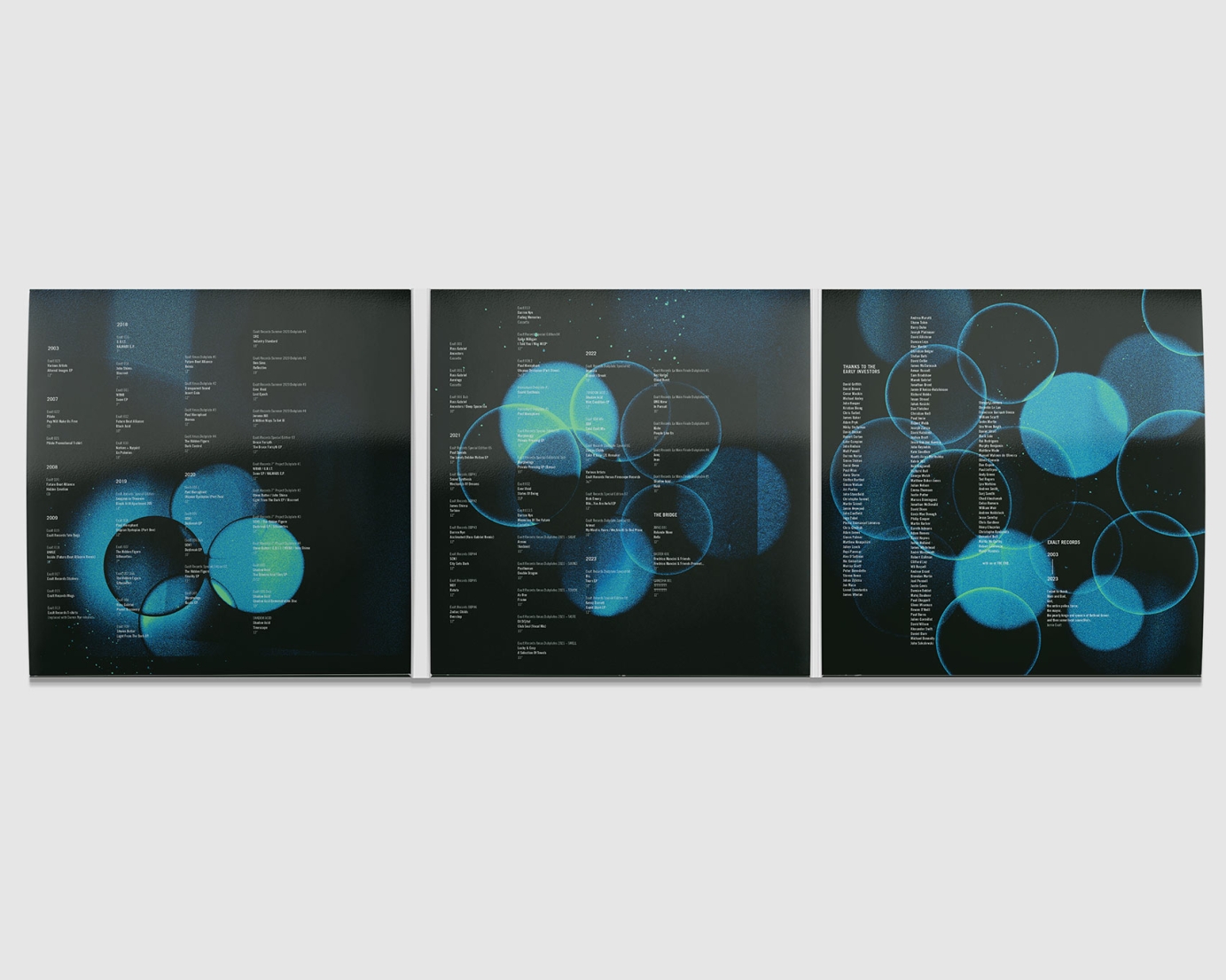
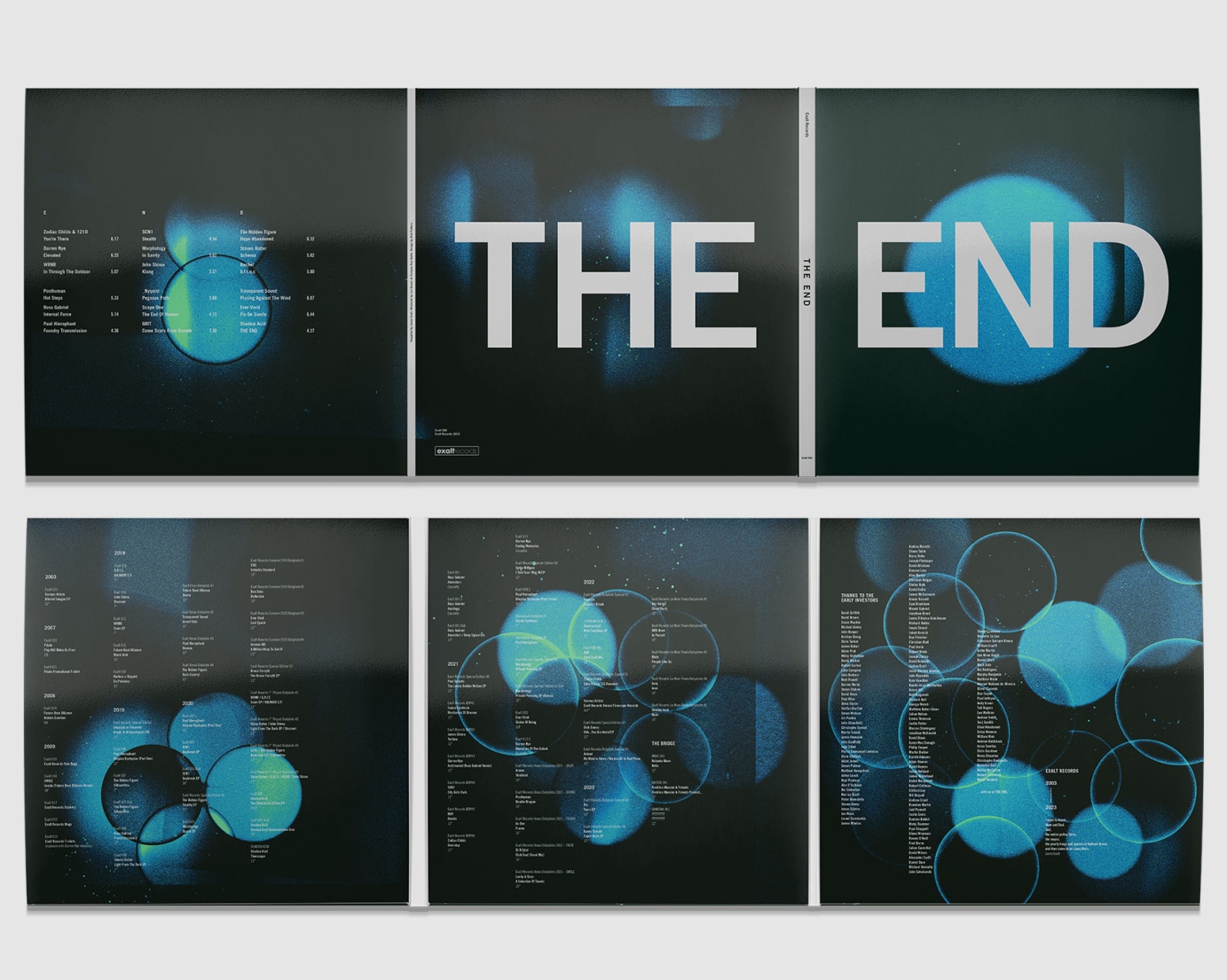
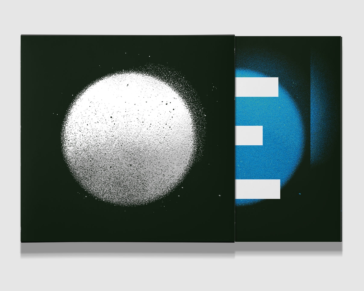
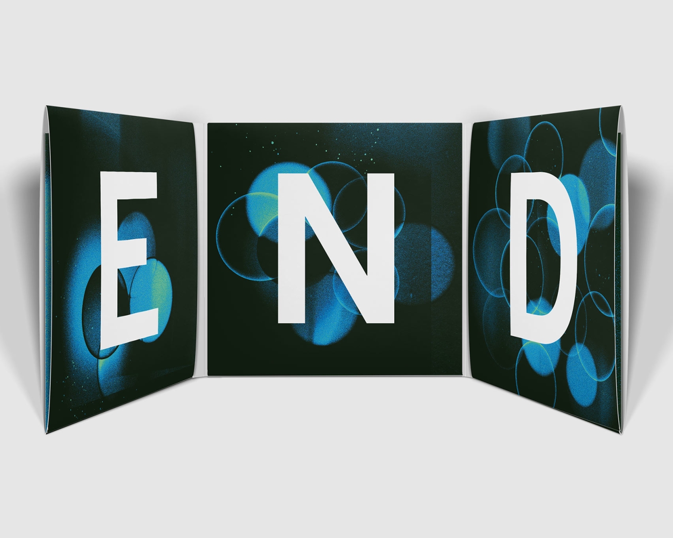
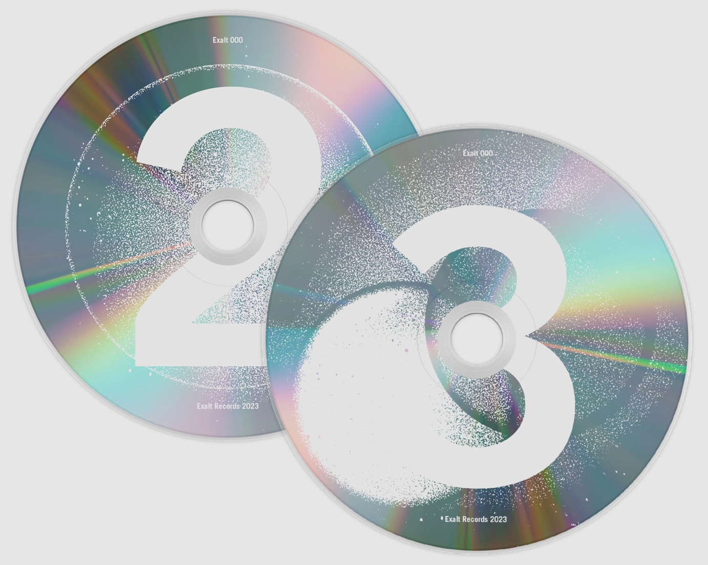
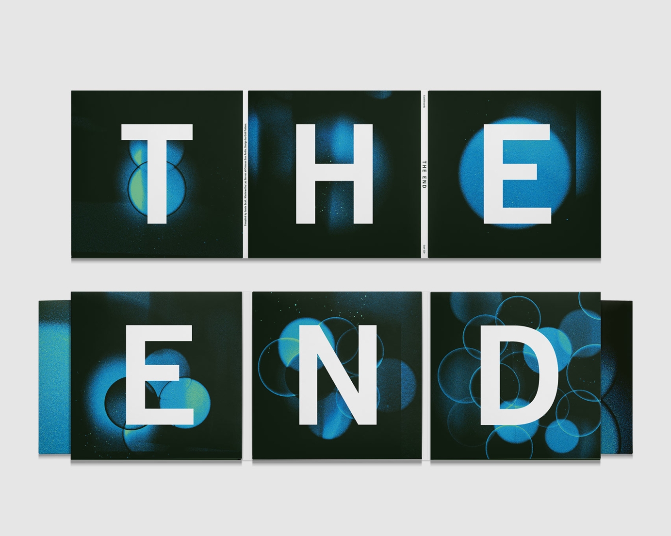
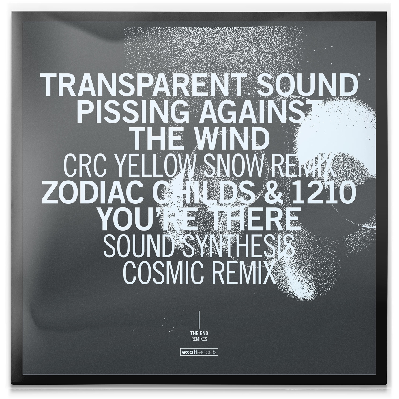
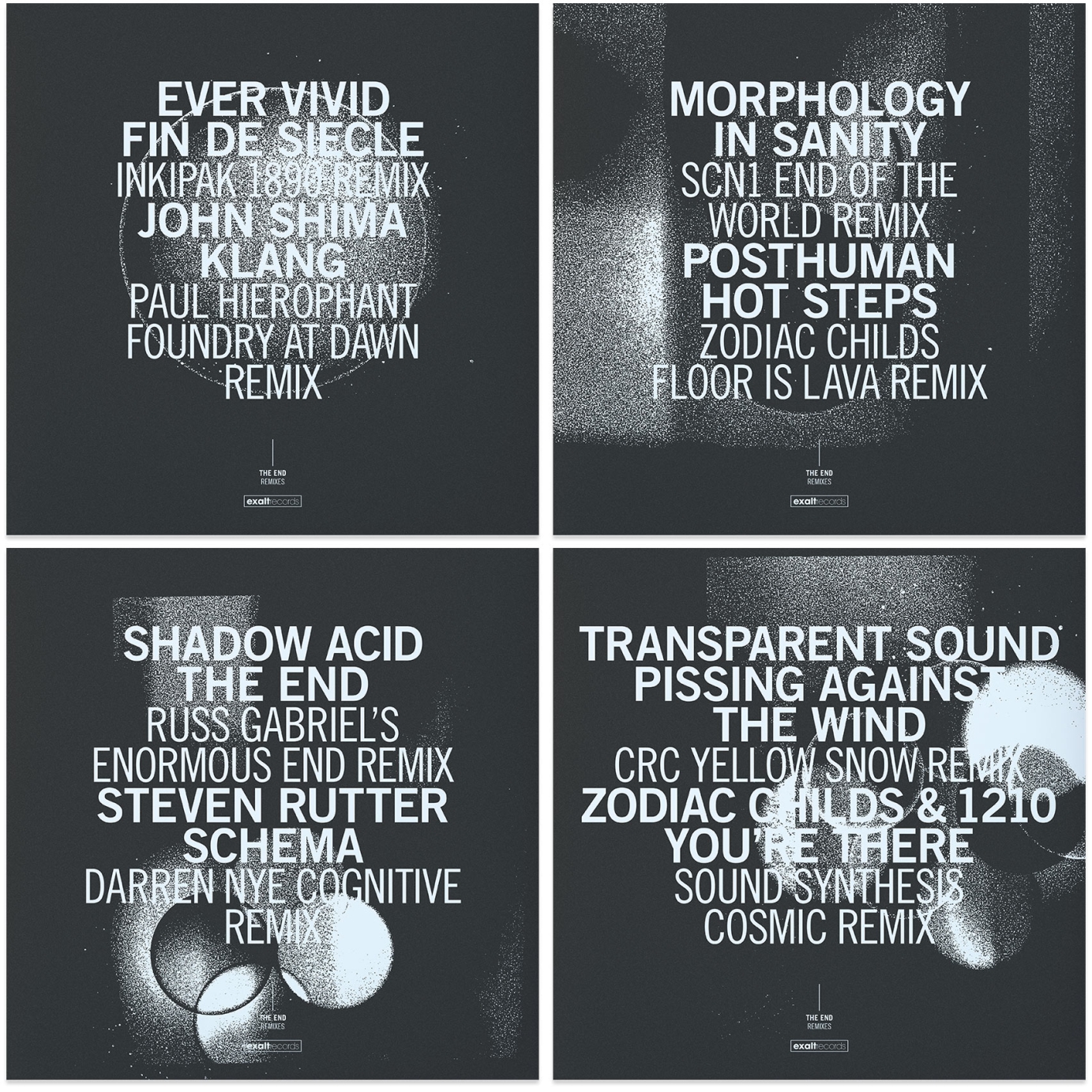
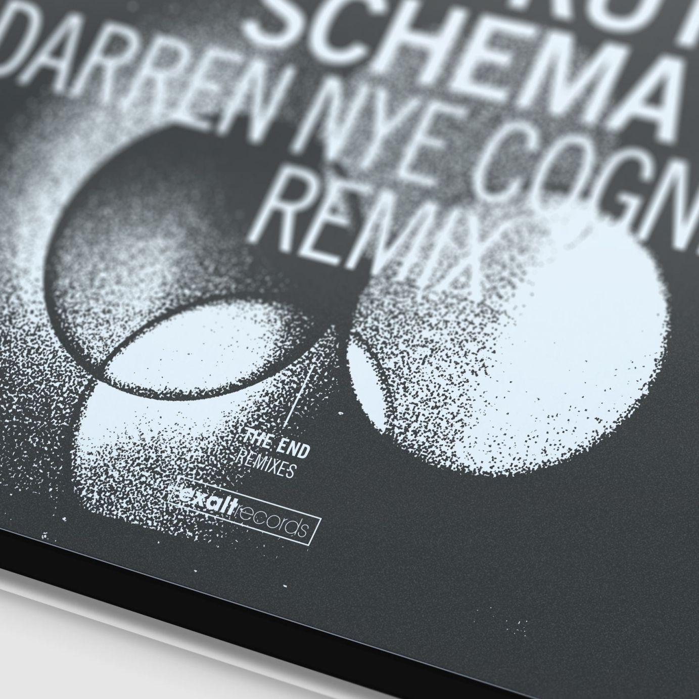
Rather than mourning THE END, I took inspiration from the new beginnings of the number 23 in numerology and came up with a simple circles/cells concept stylised with a "heavy grain" effect. The cover has one circle, representing a single cell, which multiplies over the rest of the artwork, doubling on each subsequent panel — the end isn't the end but a new beginning. The imagery contrasts with the title dominating the LP cover.
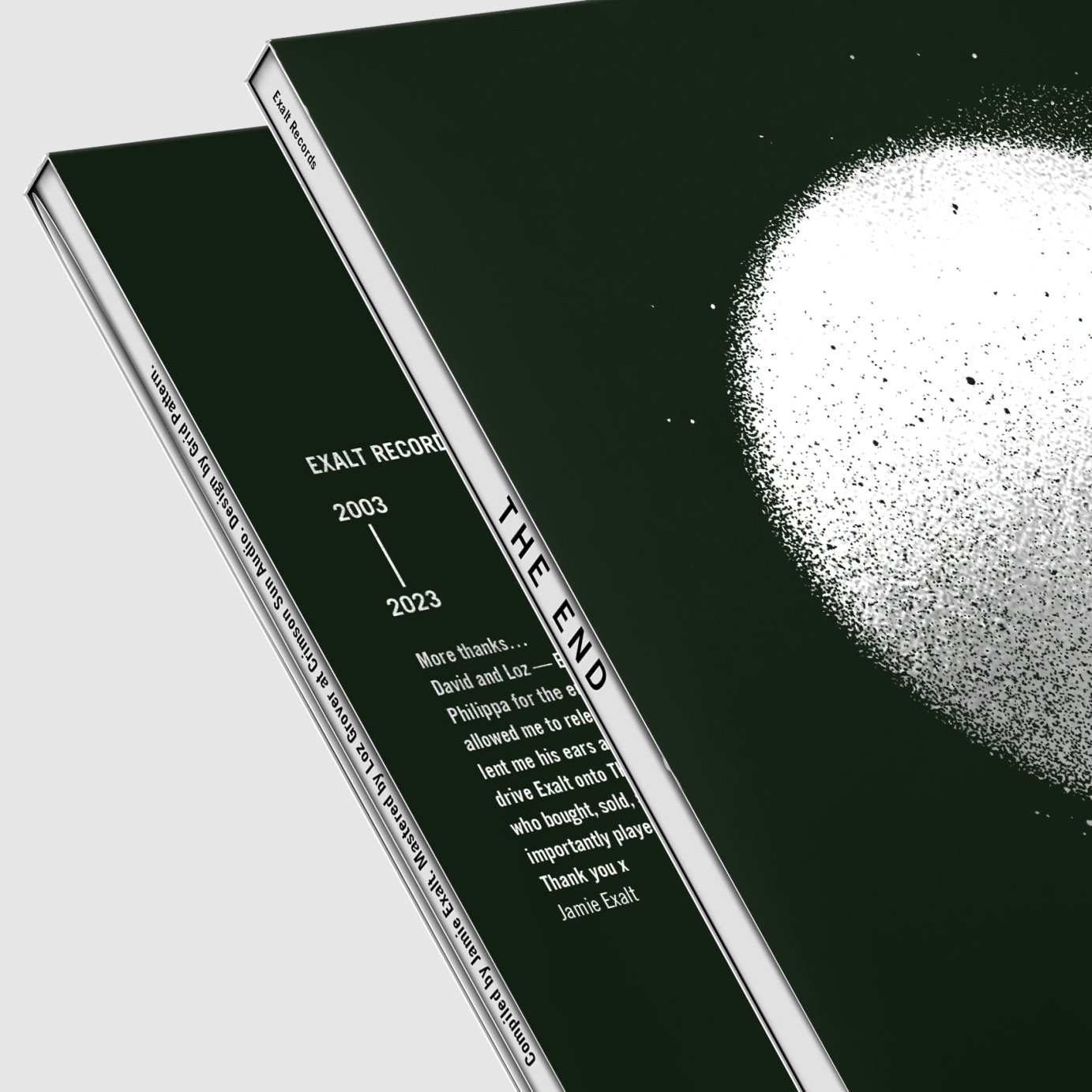
The triple vinyl comes in a six panel, gloss laminated gatefold sleeve, the full title visible over the front and back cover. The white spines separate each panel and each stage of cell multiplication.
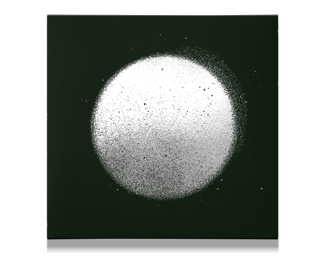
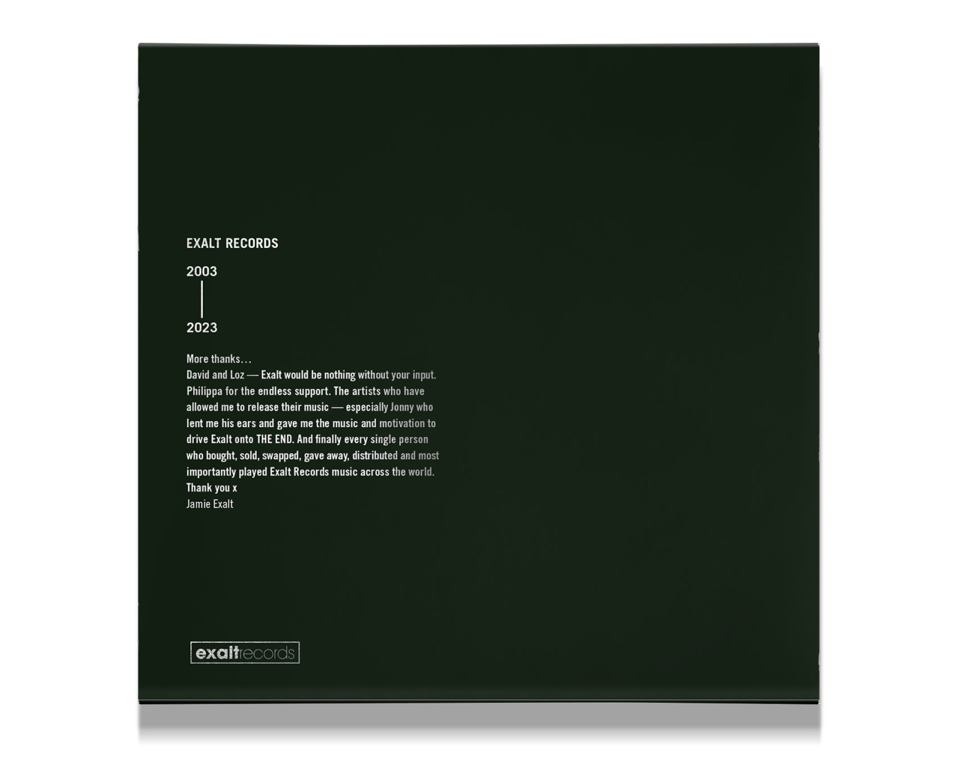
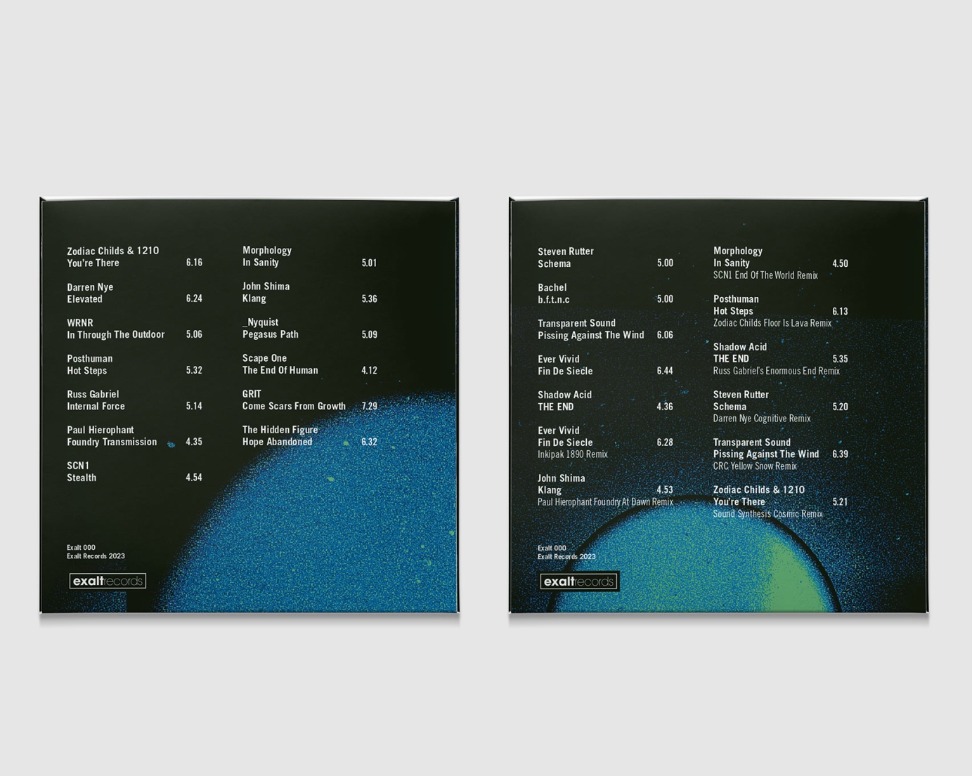
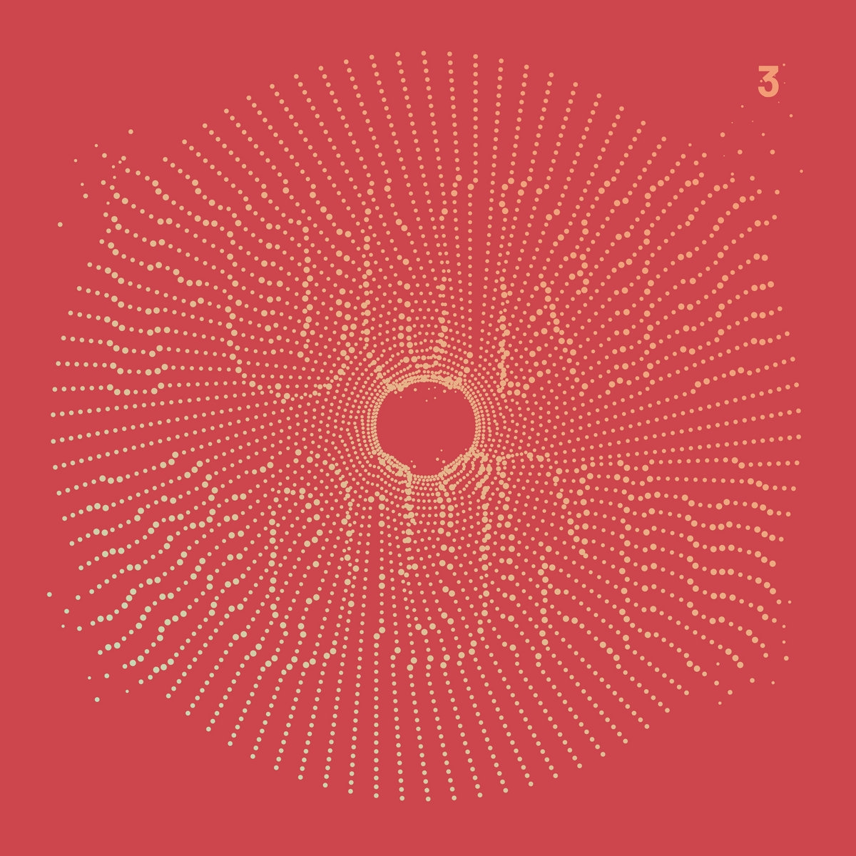
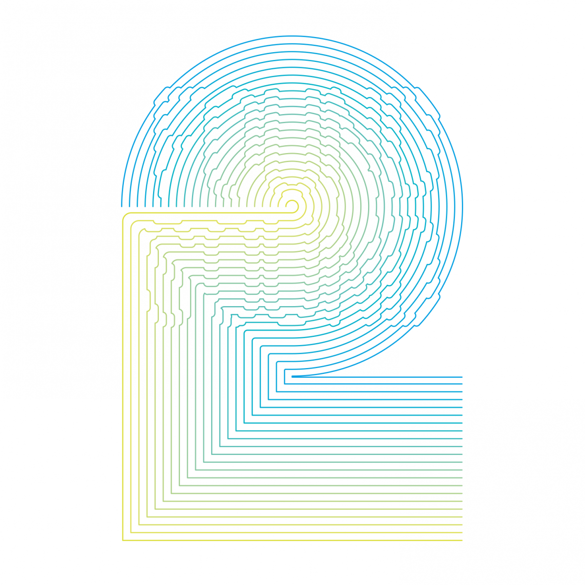
The CD was released after the LP and continues the design rather being a smaller copy — each panel of the oversize digifile sleeve has a single, large letter which spells out the title over all six panels. Track listings are on the back of the CD wallets to keep the sleeve clean and minimal. The front and back of the CD slipcase uses silver foil as a tactile finishing touch. To contrast the LP sleeve, the slipcase, digifile sleeve and wallets are all finished with matt lamination.


