Artwork for A Positive Life — Synaesthetic
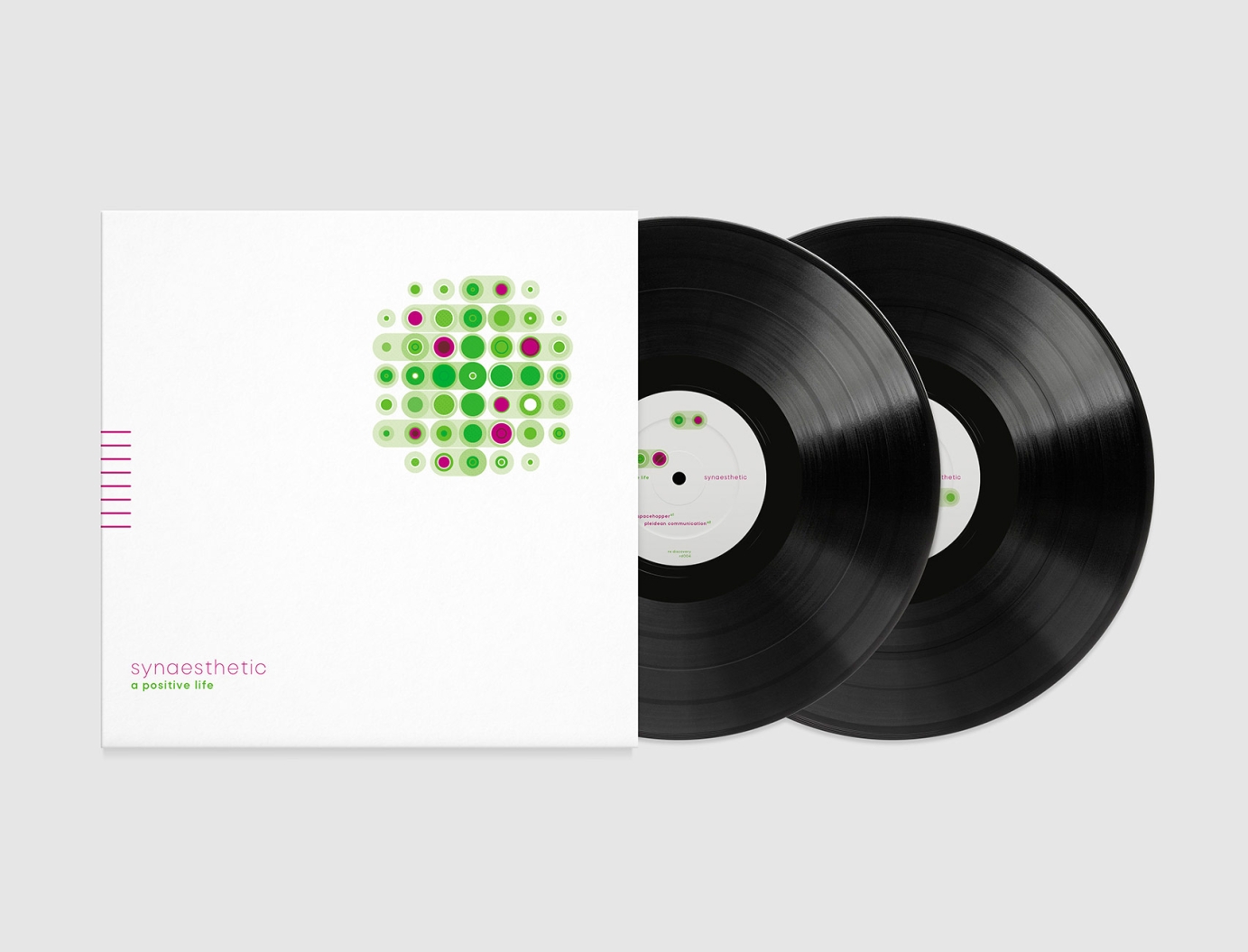
Artwork for the vinyl reissue of an early 90s ambient techno/dub/trance classic on the re:discovery label.
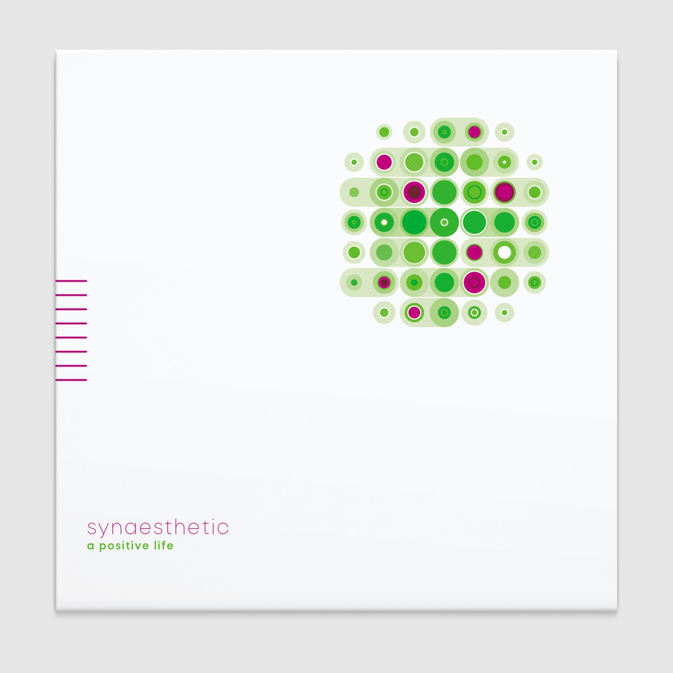
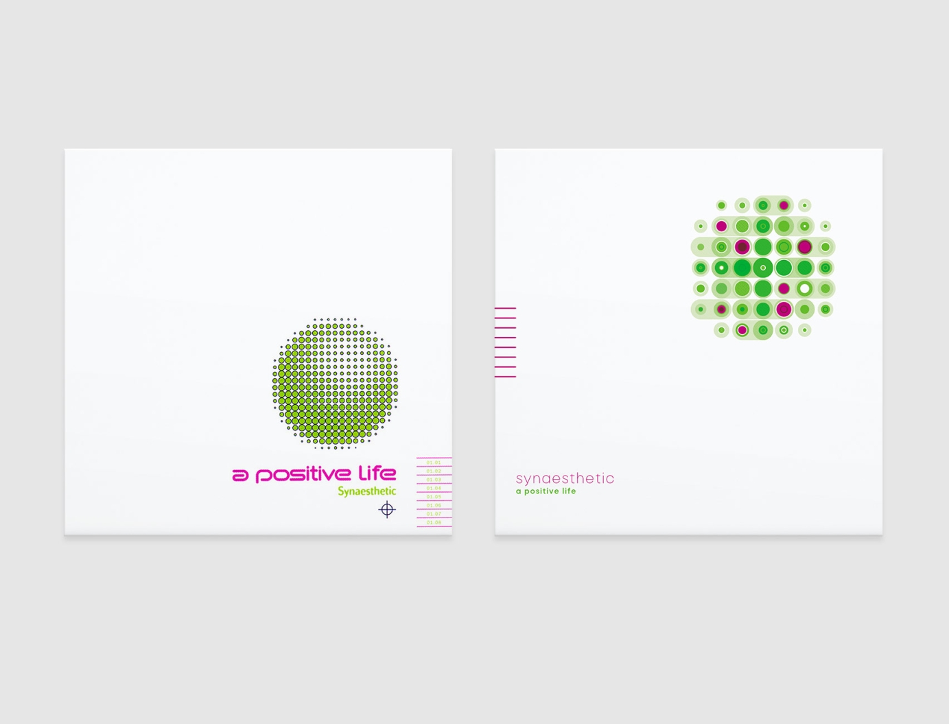
This was a job I got on recommendation after Stefan (A Positive Life) reached out on social media for a designer. He was open to ideas but wanted something with a minimalist aesthetic that also had a connection to the original artwork. In the moodboard he supplied, which featured lots of spherical geometric elements and sci-fi graphics, images of an astrolabe and a United Federation of Planets graphic from Star Trek inspired the reissue's cover.
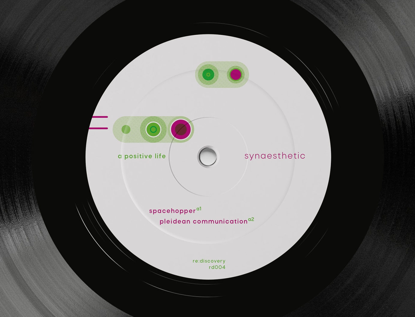
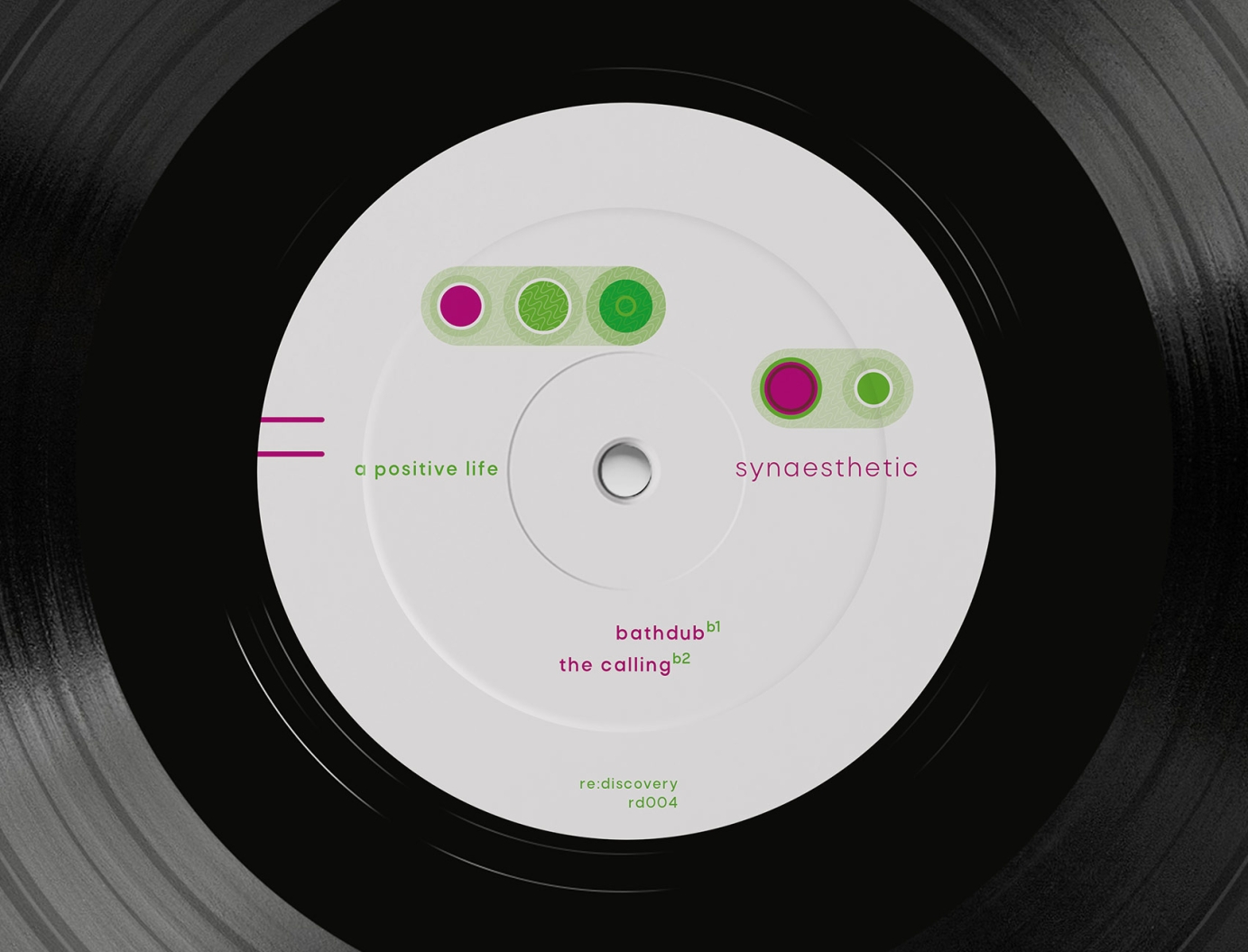
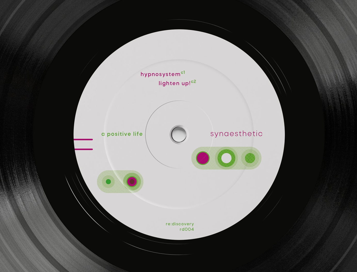
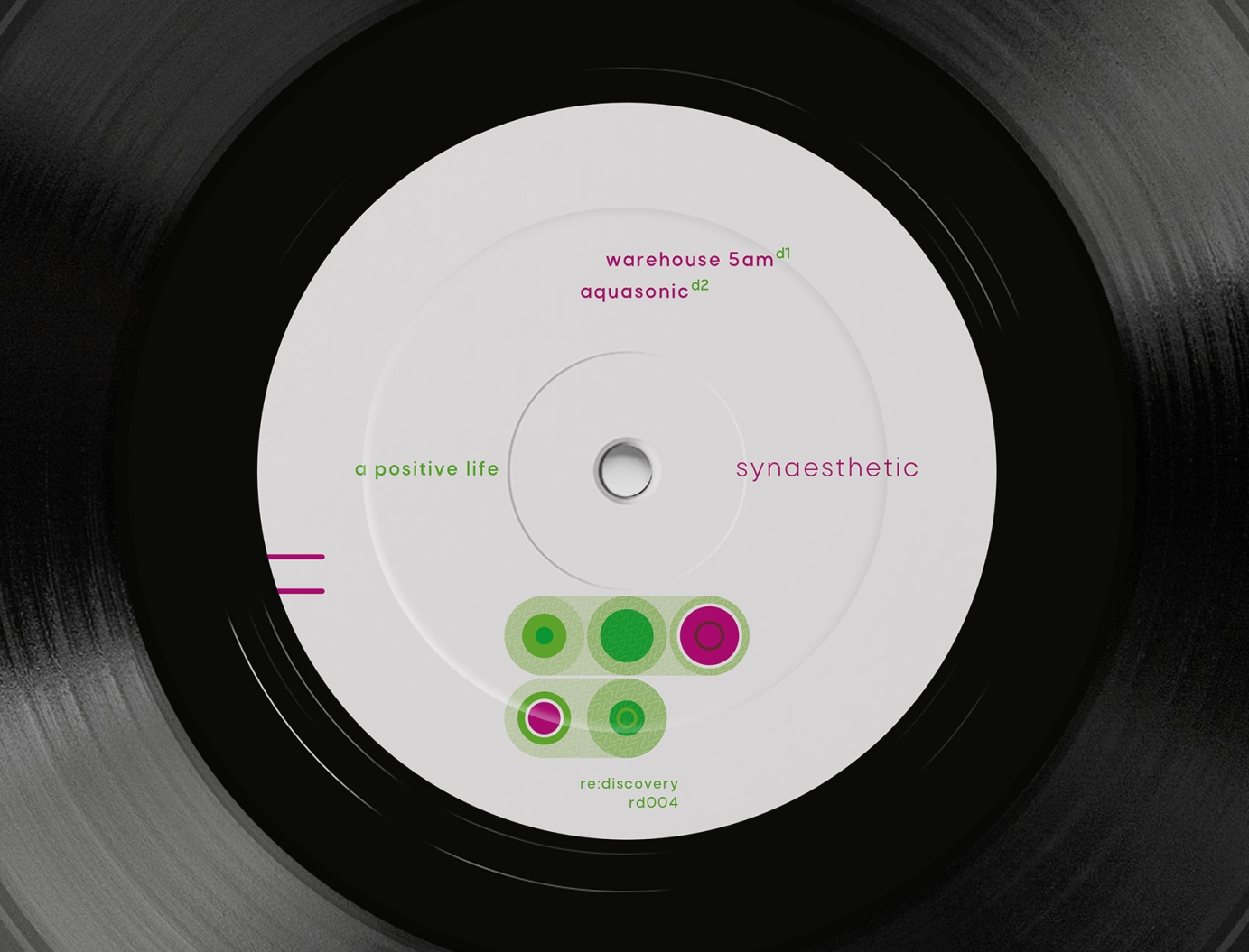
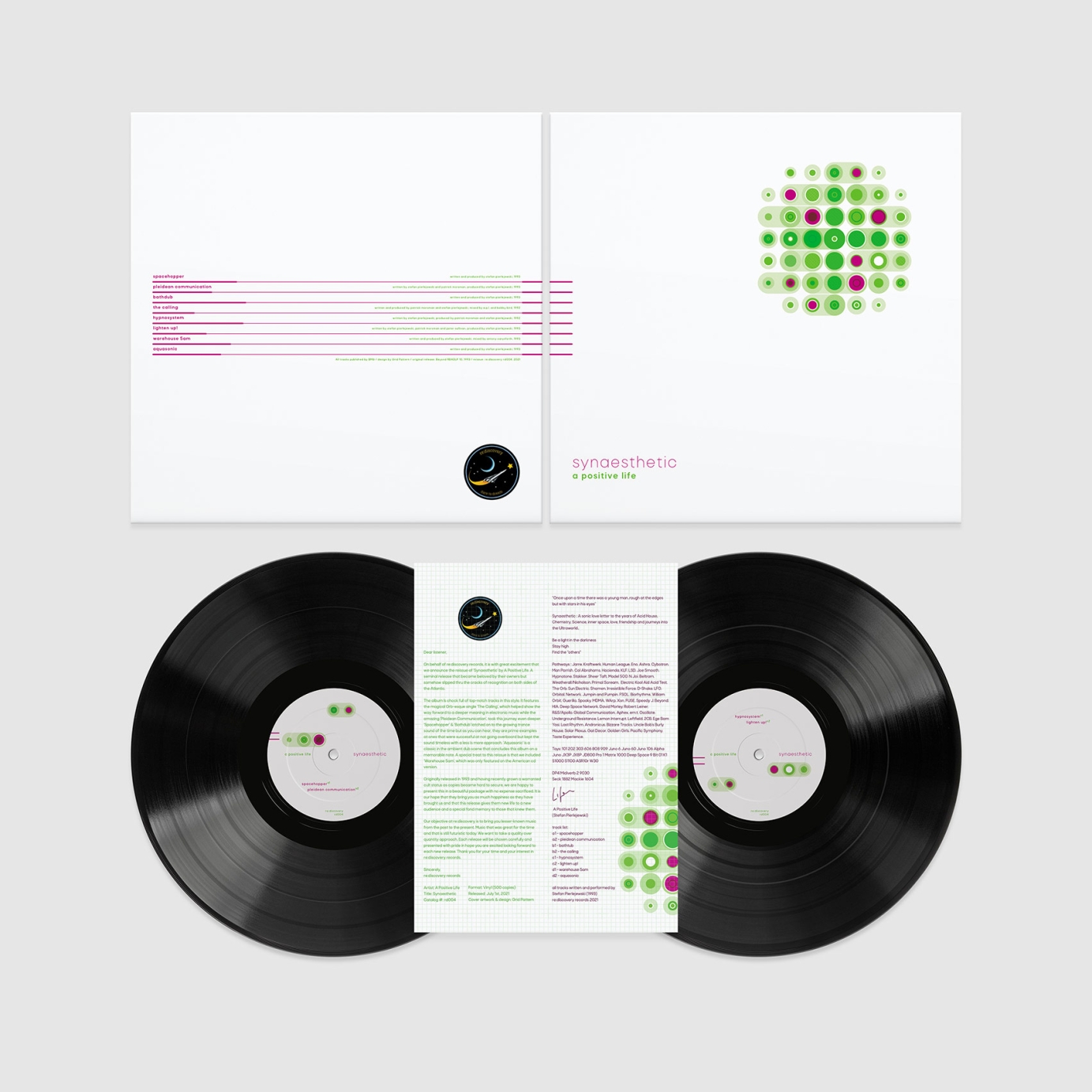
My concept involved creating a circular graphic made of green overlapping and interconnected circles but with eight in purple (one for each track). The placement of every element was considered to create a balanced image and so that I could split the graphic over the four centre labels. Only the purple circles and those connected to them are on each label. Plus signs had also been used on the original's artwork so I worked a very subtle one into the cover graphic.
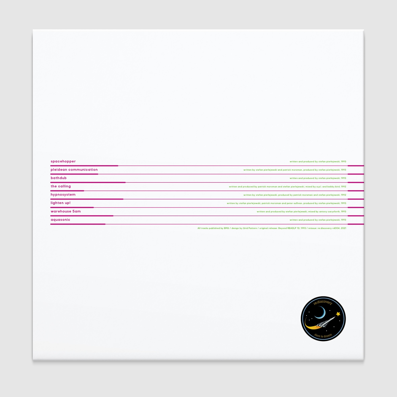
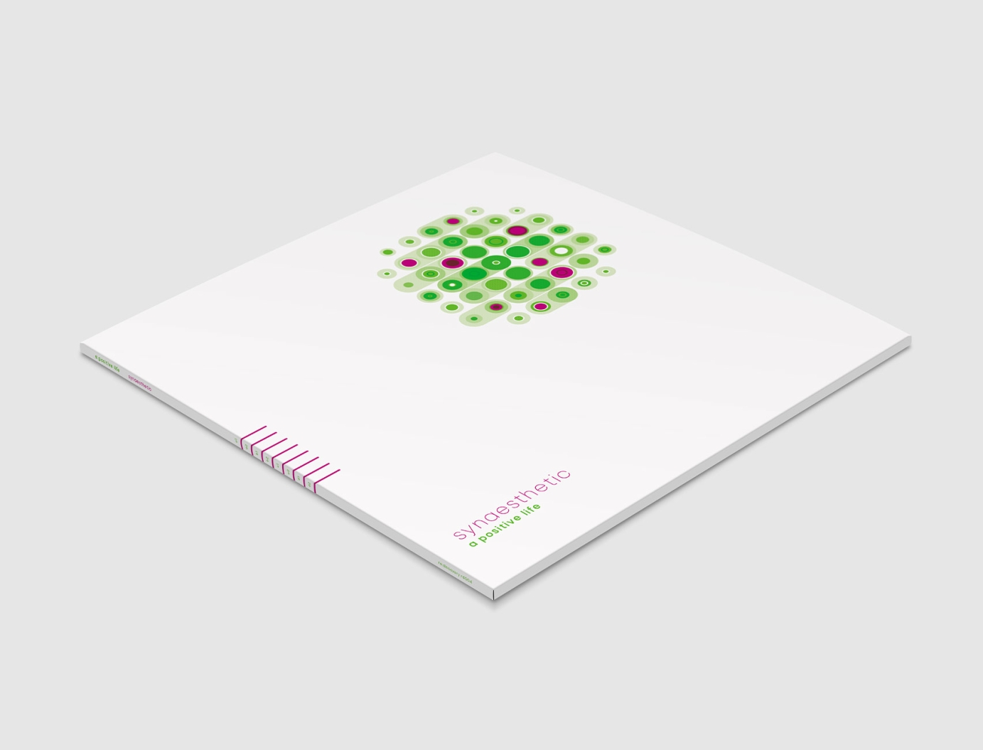
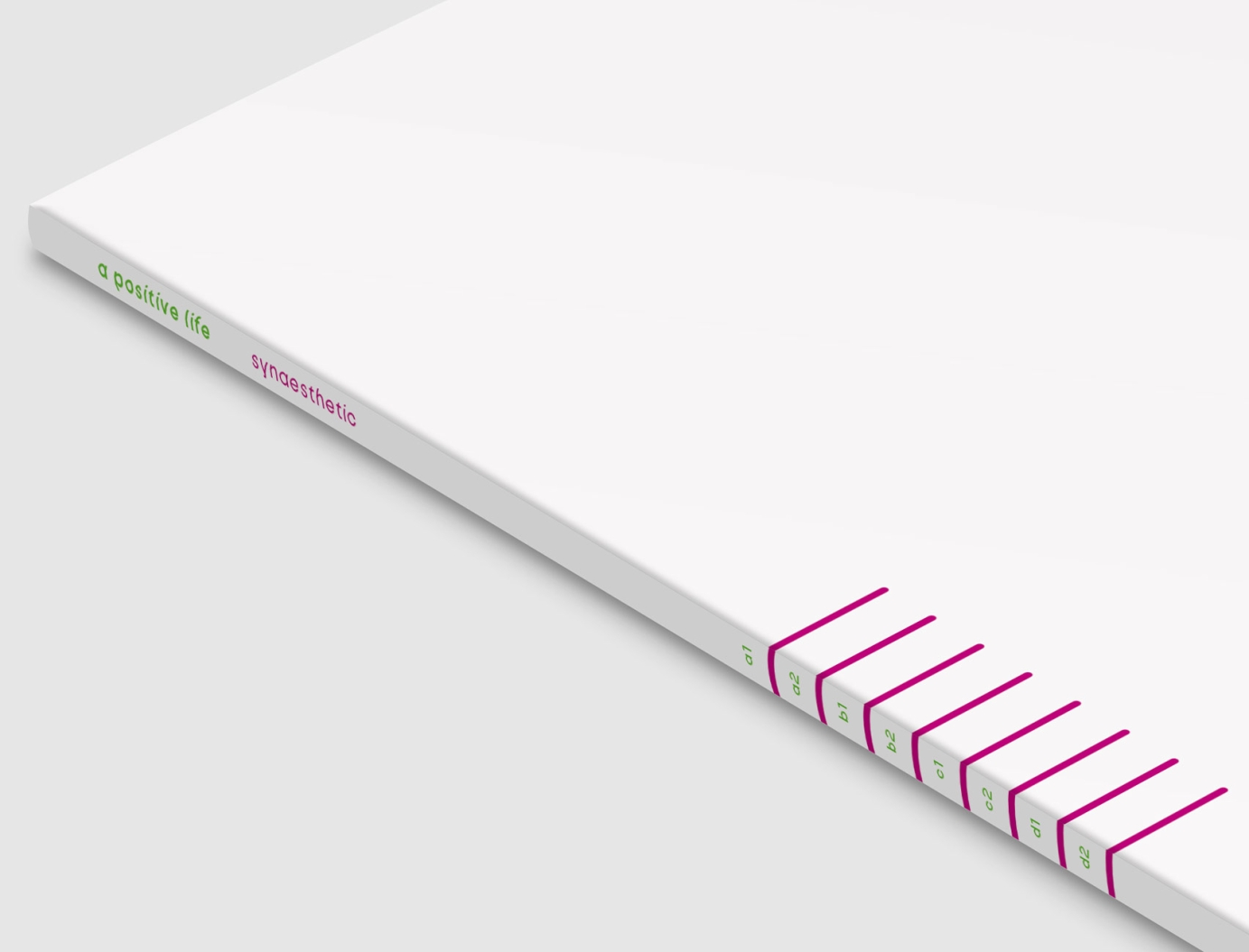
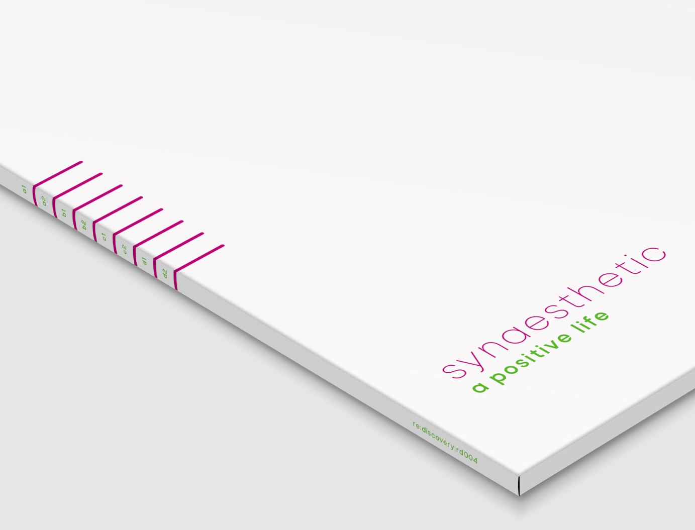
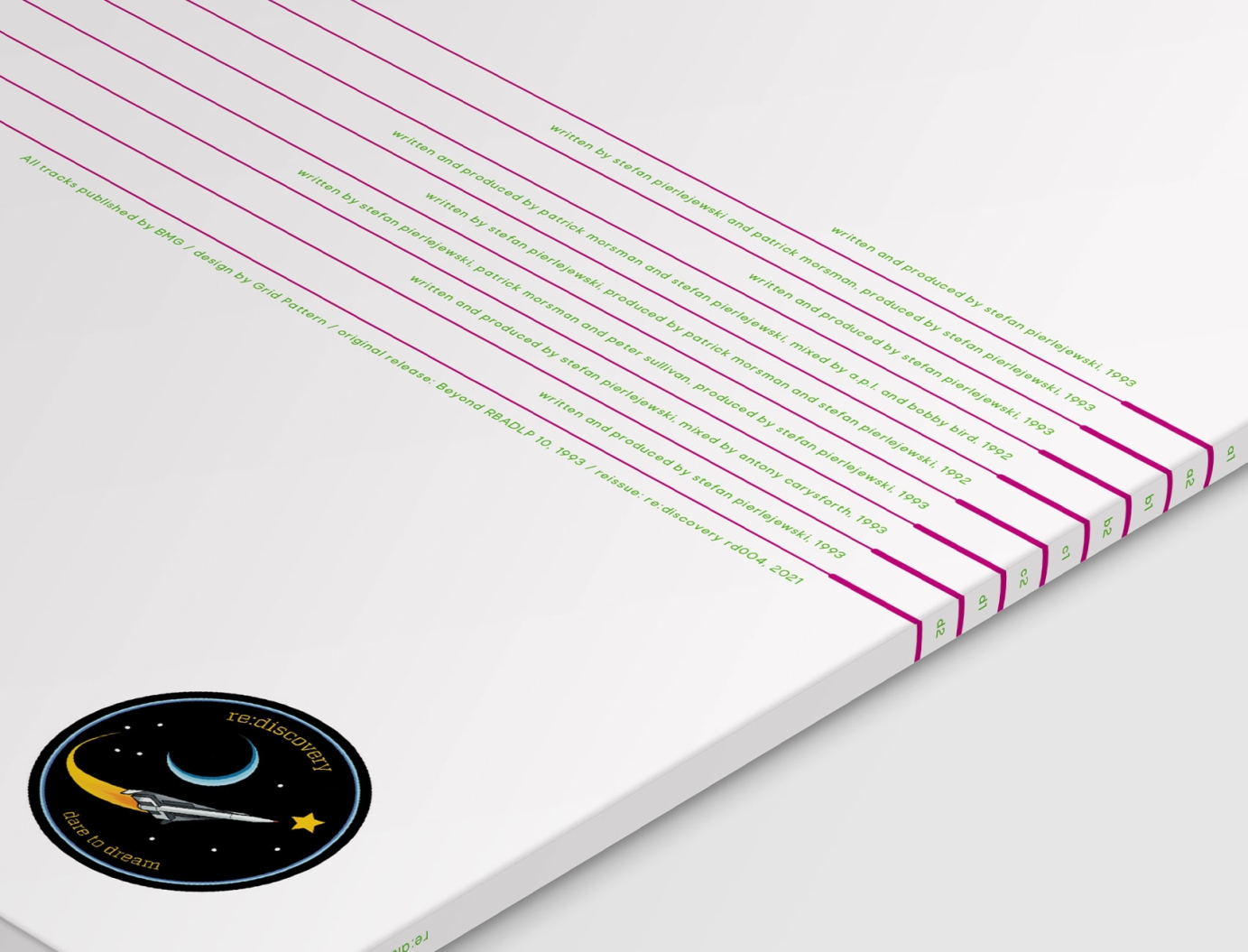
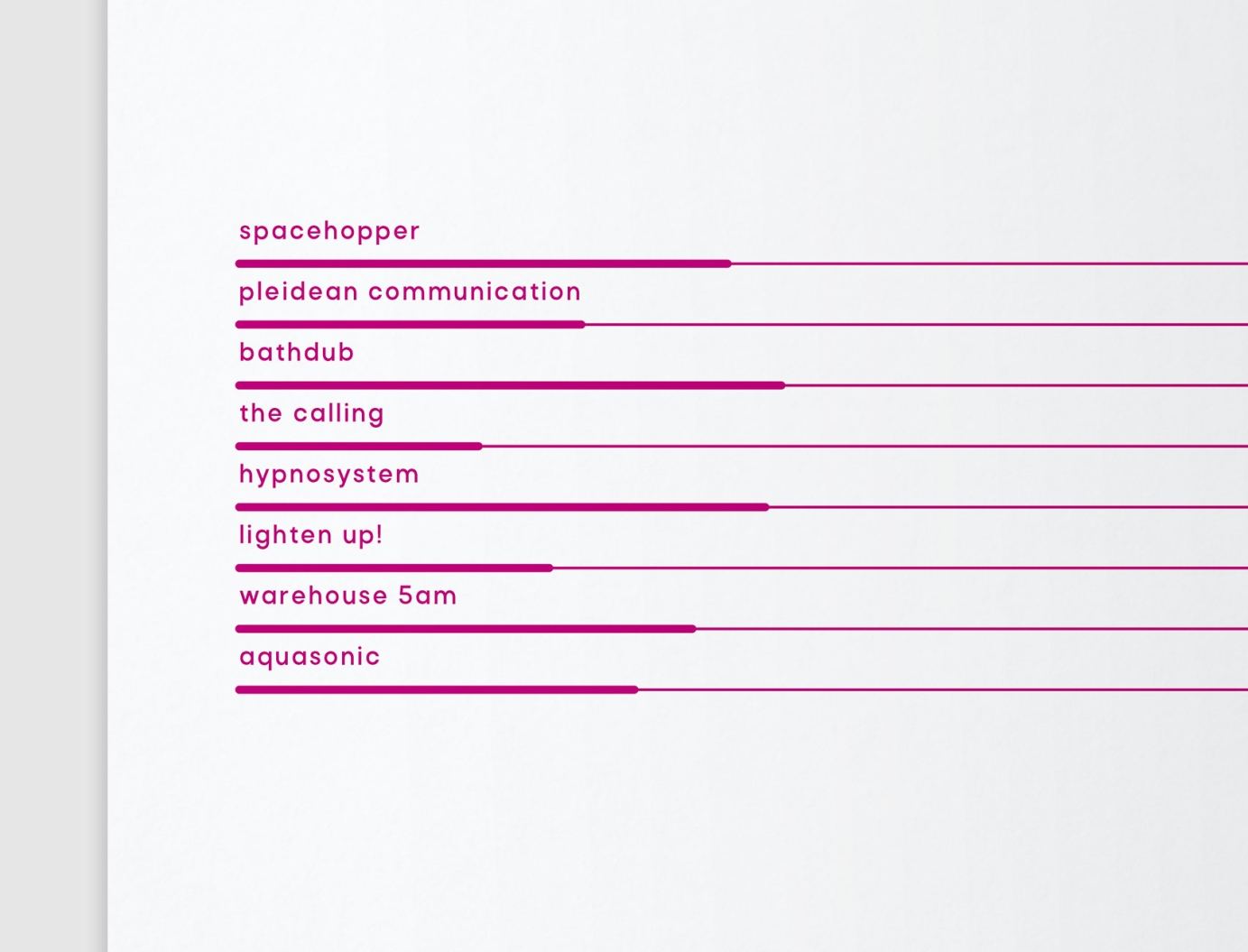
The purple key lines were repositioned to wraparound onto the back, going from thick to thin (reminiscent of a circuit board). The thicker lines under the track titles vary in length according to track duration. The lines also reappear on the centre labels. The clean, modern lines of the Rota font family helped to complete the updated look and feel.
Further down the artwork is shown next to the original (by Mark Bunegar) from 1994 – Stefan wanted it to have a connection to the old artwork.

