Douze logo
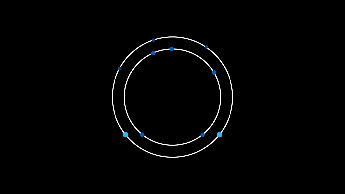
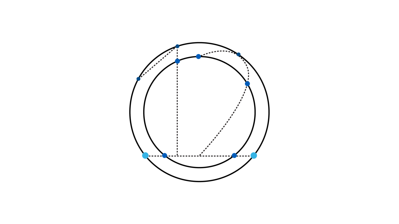
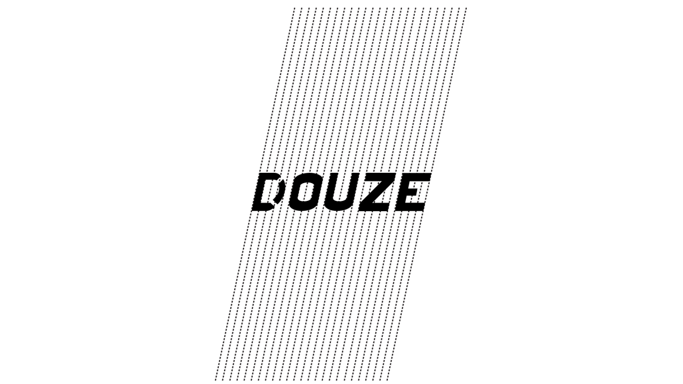
This project consisted of numerous technical aspects that had to be into introduced into the design. All the text is created at a 12 degree angle. With approximately 20 pixels between each guideline.Each circle goes along the alignment to create the number twelve. I then added the two black circular outlines, to have 12 circles in the design including the blue circles (Bird's eye view). The logo lockup concept is essentially the Douze logo inside the circles and then you'll looking at the circle at a frontal view. That's why the line appears to be going through it.
