Quake Energy Drink Packaging
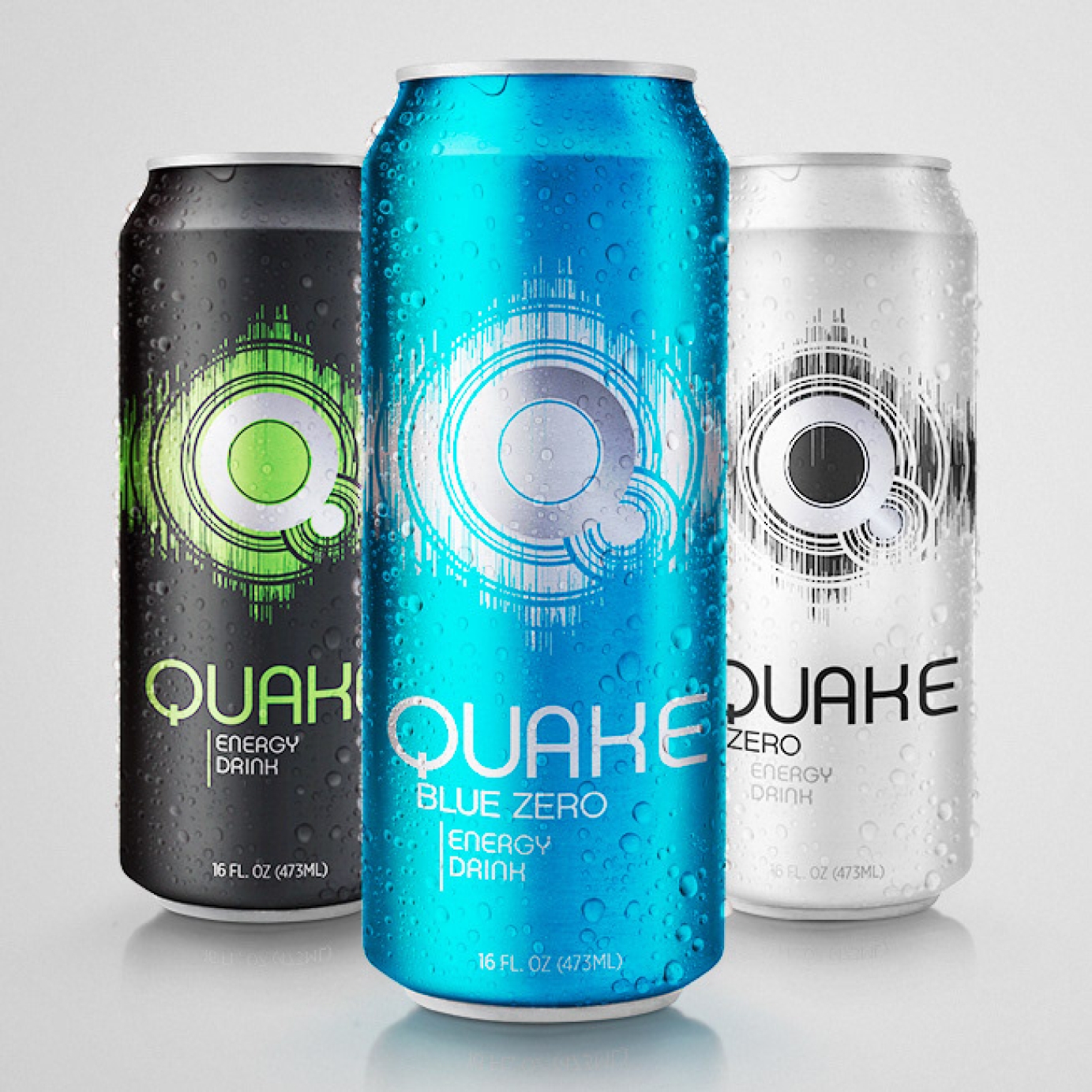
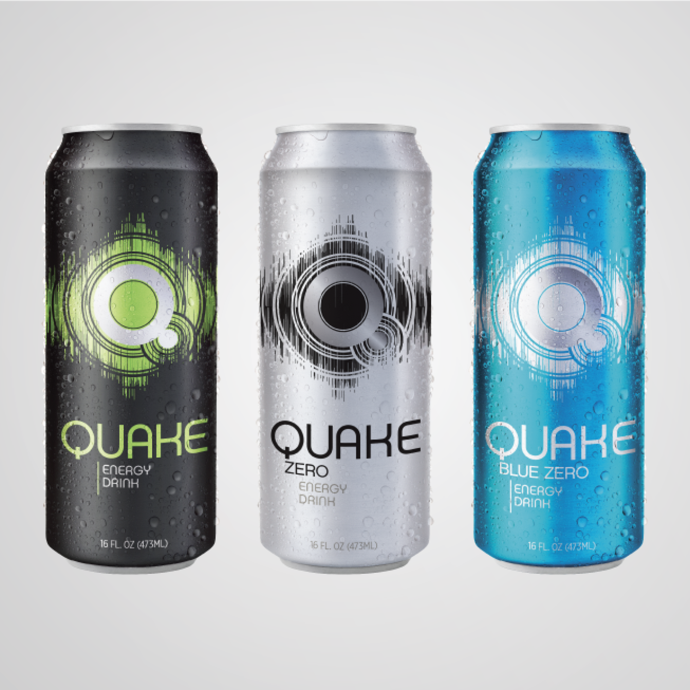
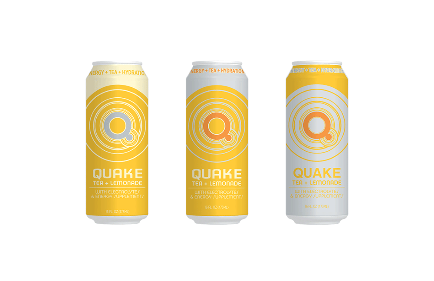
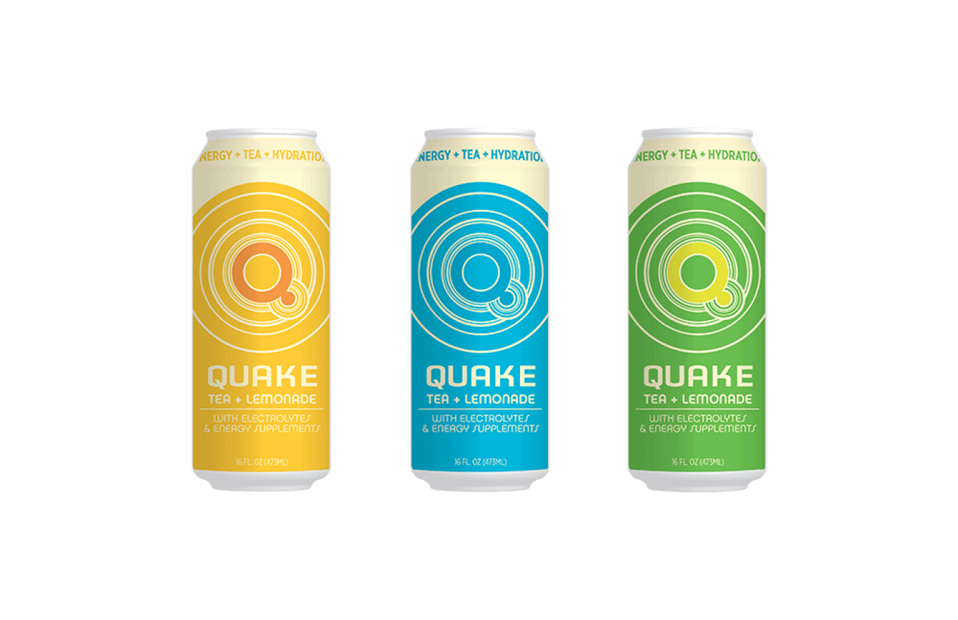
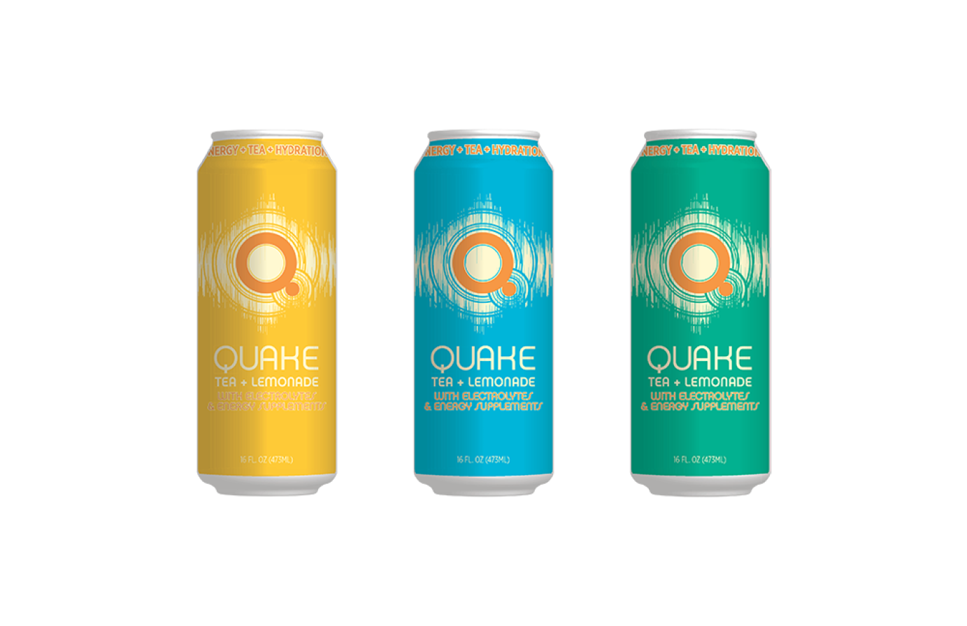
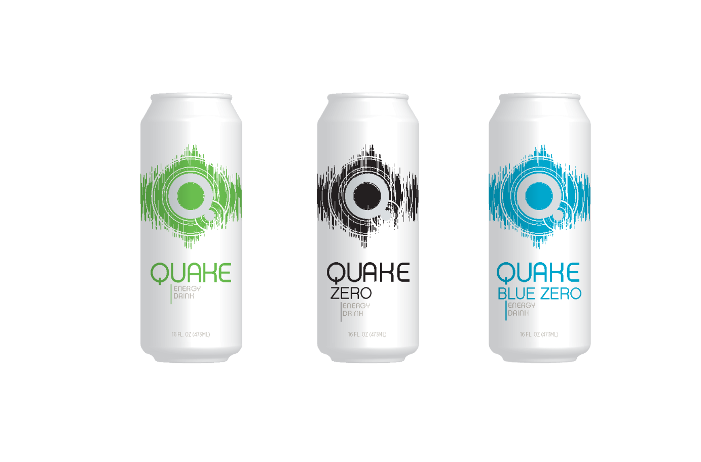
This Wenzel Creative project for Stripes Convenient Stores went through many iterations as outlined below. Ultimately, as the scope shifted to a true energy drink product, the design evolved. A clean, simple direction was developed to contrast with the busier packaging in the energy market segment. Production costs were kept low by minimizing the number of inks per SKU. The Zero and Blue Zero products use two inks, the original flavor uses three. All designs knock out the "Q" logo element to reveal it in aluminum. Creating a distinct, eye-catching contrast at the shelf level. 7-Eleven acquired the brand in 2019. Scroll down to view the evolution of this project.

