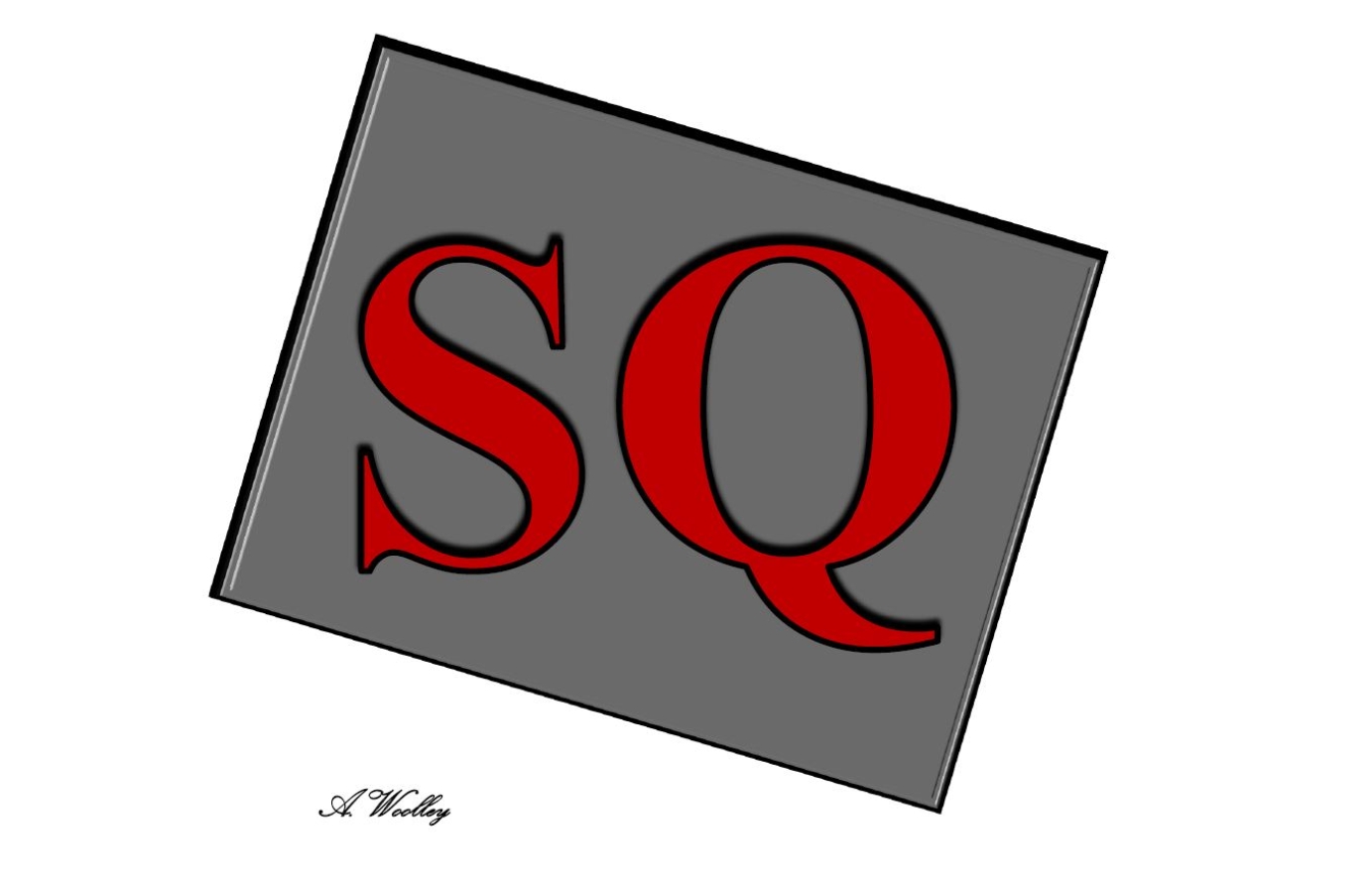
SQ Café Logo
From visiting the café I could see lots of plants, natural wood furnishings and a variety of non-matching lounge chairs. A lot of red accents had been added around the seating areas and service counter. Large windows looked out over the town square. The overall atmosphere was relaxed and the furnishings were very Shabby Chic. I met with the two owners and left with the following information.
- One owner wanted a very simplistic design while the other wanted it to be more ‘arty’.
- Both owners wanted the theme to be black, red and grey to reflect their décor.
- The logos overall impression should be classy, trendy and professional.
The owners both had very clear ideas of how the logo should look, but these ideas were very different. I drew a large range of designs based on both owners preferences and some were completely different. I did this to try to find a design that both owners would be happy to progress with. Both agreed on one design but wanted to alter it in different directions. One wanted a coffee mug and steam to be incorporated into it, while the other wanted to maintain complete simplicity.
I started building some designs. After much discussion a compromise was reached, which had more texture and shapes than one owner had originally wanted and less art than the other owner wanted. In the end, both owners were happy with the result and felt it reflected the café atmosphere.