OVRDOSE' & OVRDOSE Deep - Record labels Rebranding
We were asked by the owner of both labels (Menesix) to rethink the artwork and brand feel for OVRDOSE and the sister label, OVRDOSE Deep.
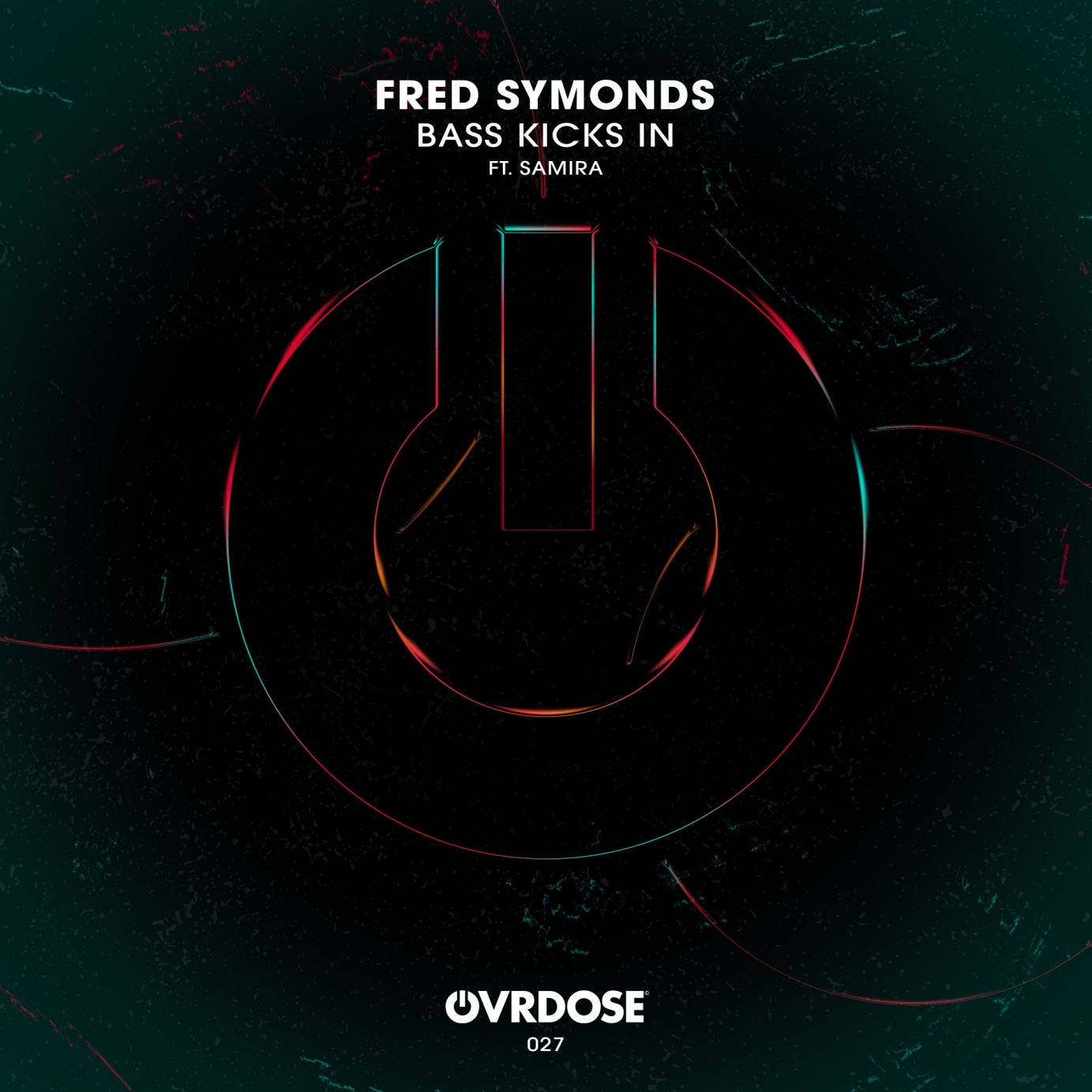
The OVRDOSE revamp saw us utilise a new, black background bearing coloured chrome logo and circular details. The owner wanted something that stepped away from your typical house label look and feel, whilst also appealing to their target audience with a sleek and funky image.
We took a different approach to the OVRDOSE Deep design, focusing on bold pattern usage and bright colours, taking inspiration from flowing water and deep ocean currents. Some technical photoshop touches on the logo make it look as though its fading into the background and we kept the titling and brand logo in the same place as OVRDOSE to enhance brand recognition across both labels.


