Noir Furniture Illustrations
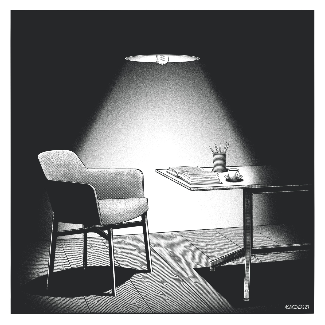
The illustrations were commissioned by Marc Krusin, a London-based furniture designer, for the promotional use on his website and across social media channels. I was given full creative freedom regarding style and the layout of the illustration.
Each illustration was drawn in pen and ink on paper and once approved by the client it was redrawn digitally. I used Adobe Illustrator to construct the furniture and interiors accurately and then Photoshop to apply textures, light and draw other elements using Wacom Cintiq tablet. The images were executed using black only to recreate film noir aesthetic.
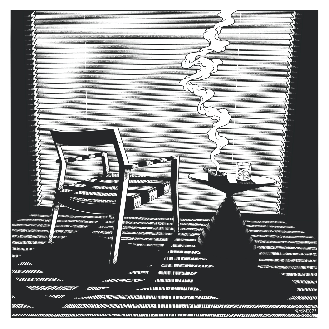
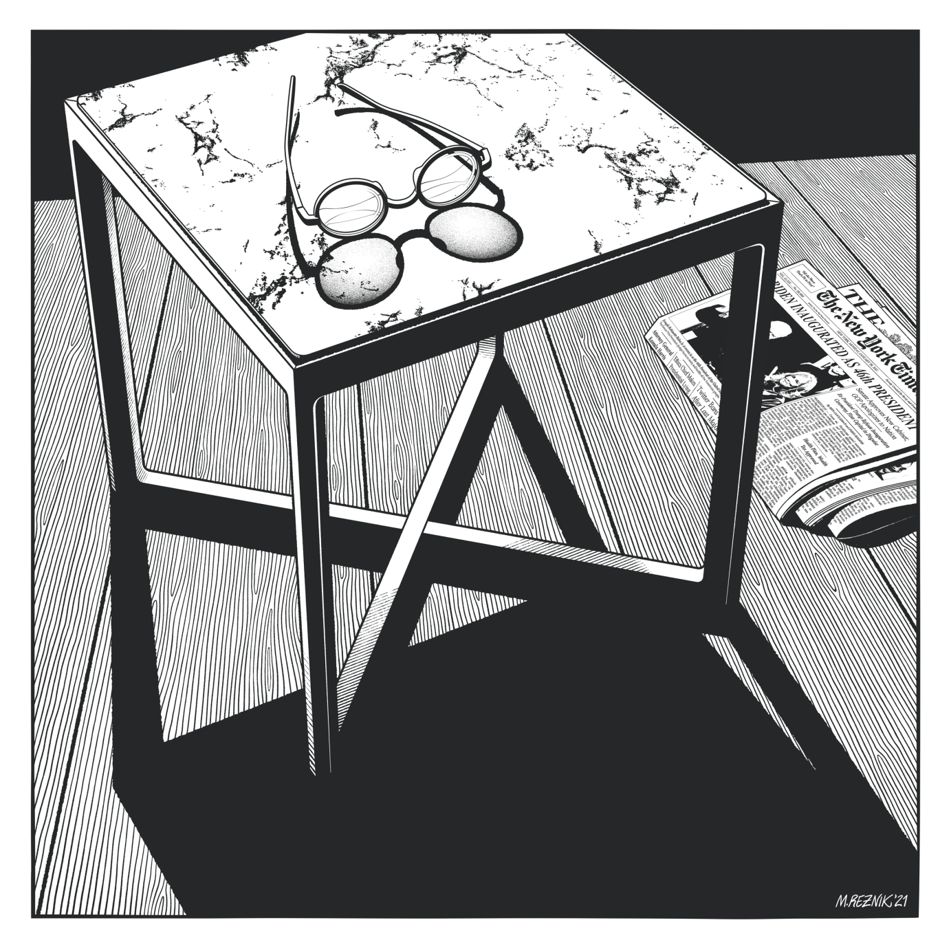
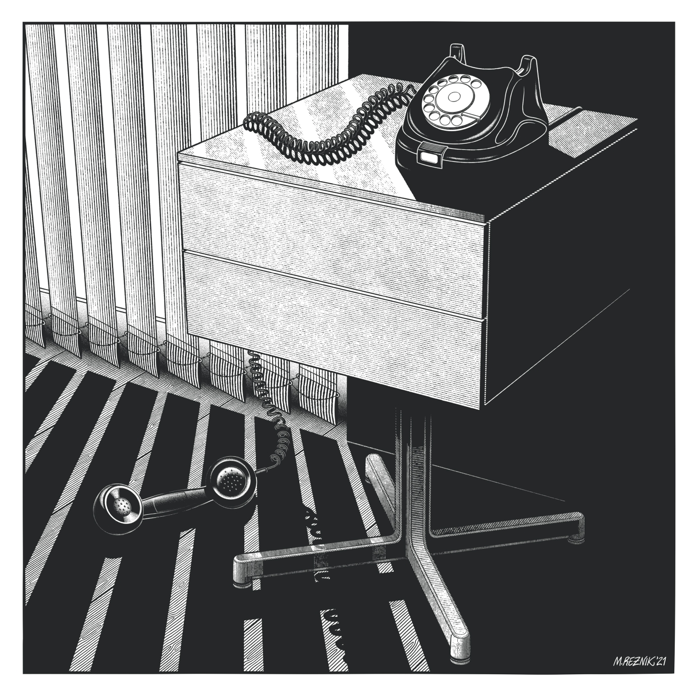
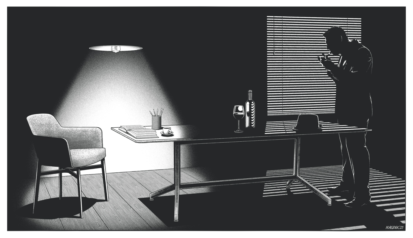
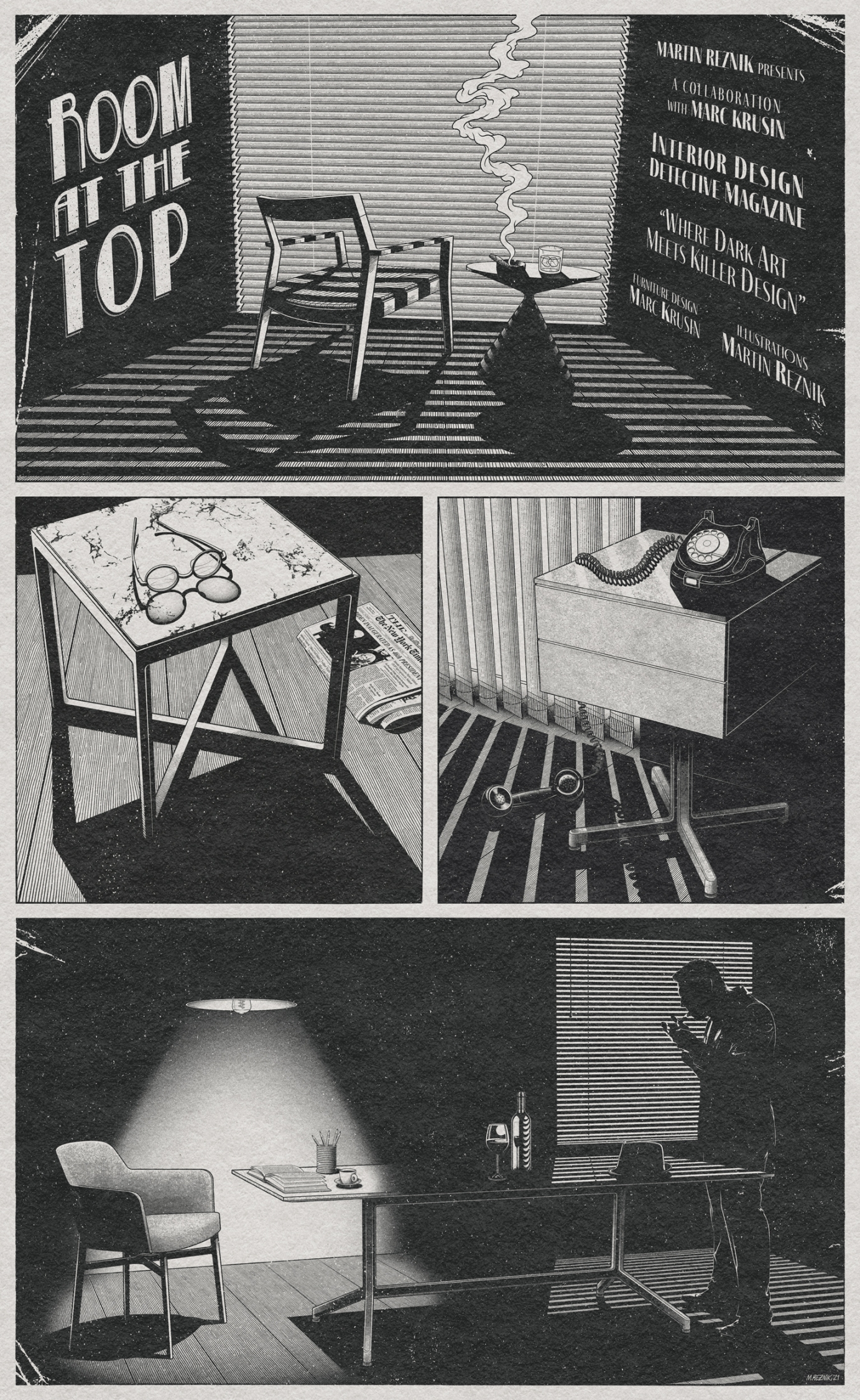
Influenced by comics and film noir I’ve decided to take a rather unusual approach to furniture design illustration. The first image was crucial in setting the tone for the whole series. Placing the viewer behind the furniture and addition of some everyday objects brings a pinch of narrative and mystery to the scene. The geometric composition is counterbalanced by the irregular shape of the cigar smoke. Further images also feature various objects, which are placed in slightly disorganised fashion deepening viewer’s curiosity and possibly suggesting a crime scene (newspaper and phone receiver on the floor, lack of human presence). The perspective in the images implies someone (the viewer) wondering around and surveying the apartment.
Although initially we’ve decided that the human presence will be suggested only by the scattered objects around the apartment, I couldn’t help but wonder about the smoker missing from the first image. I really wanted him to reappear in the last image closing the series, but Marc was strongly against any human figures in the scenes. I had to find a way to convince him. To achieve that I have extended the fourth illustration and included a barely visible silhouette of the smoker against the window, which also only appears as a scroll option on an instagram post. Marc really liked this solution and thought it added an element of surprise and closure to the story.
The comic/noir poster wasn’t part of the commission. I’ve decided to include it as an extra. I thought it brings all the illustrations nicely together and it is an obvious culmination of the style chosen for this project.
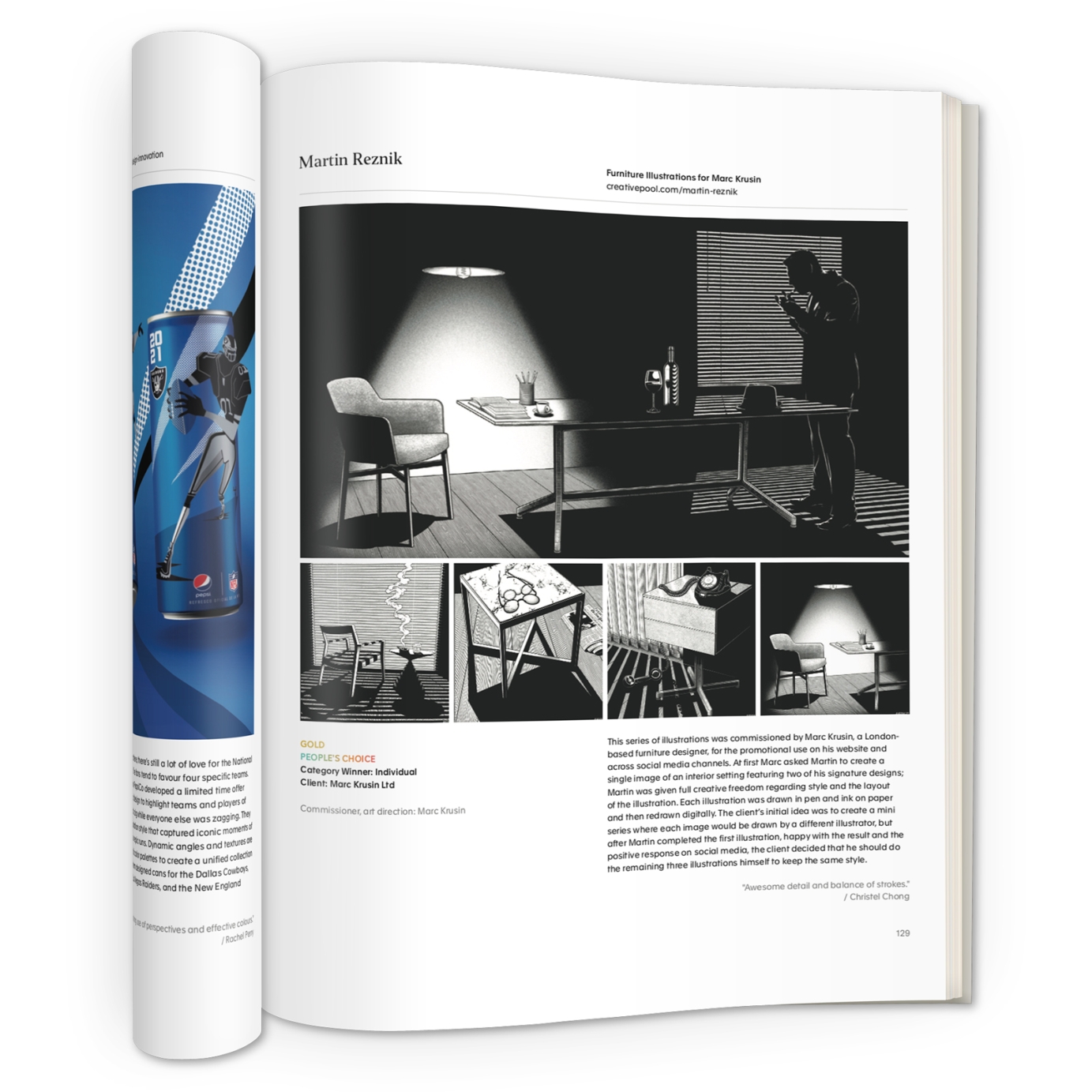
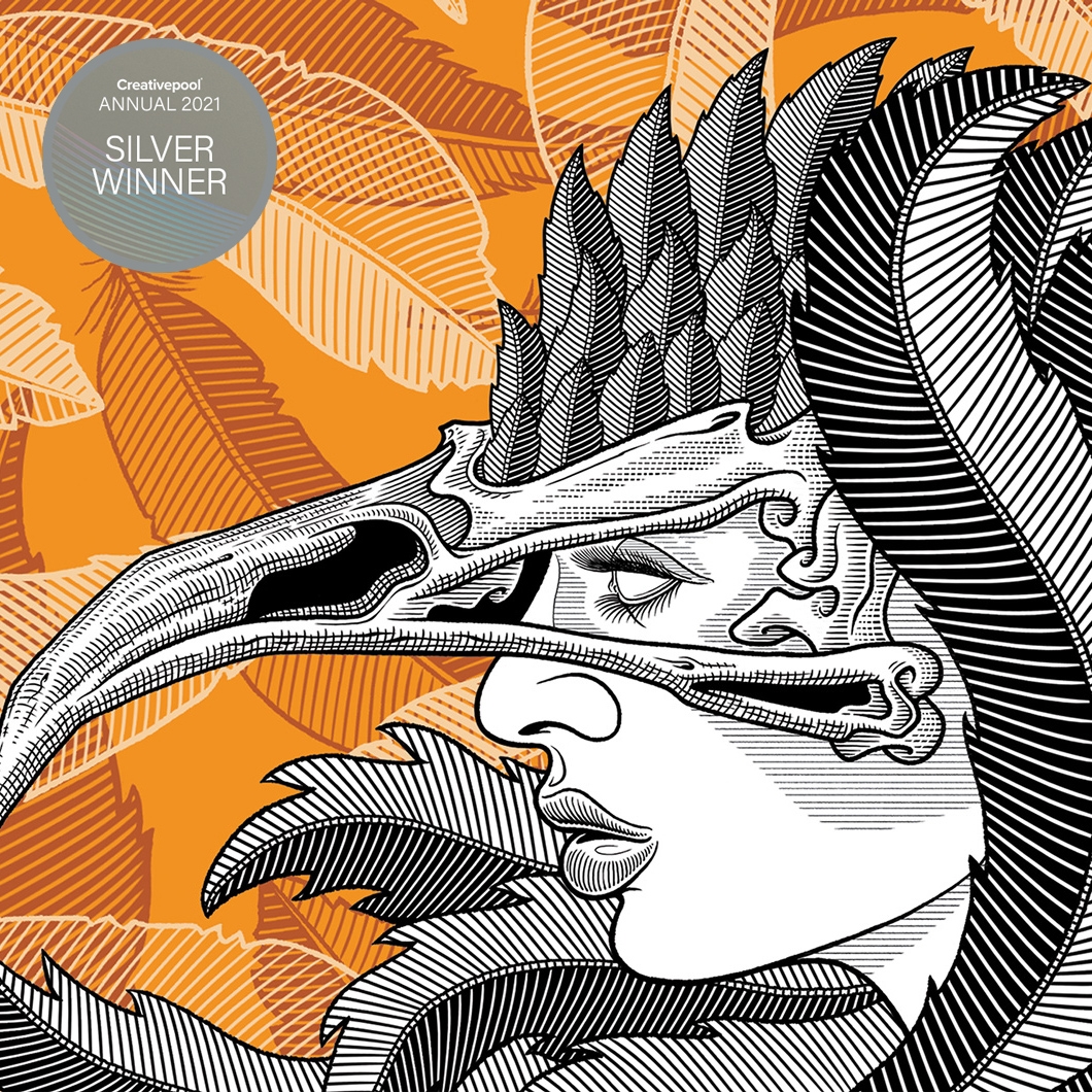
The project won Gold Award and People's Choice Award in the Creativepool Annual 2021 Illustration category.
The first image was also longlisted for the World Illustration Awards 2021 in the Design Product & Packaging category.
